This post contains affiliate links. We may earn a commission if you click on them and make a purchase. It’s at no extra cost to you and helps us run this site. Thanks for your support!
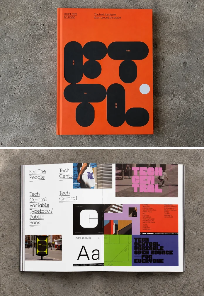
A logotype book only earns shelf space if it survives contact with an actual deadline. So I put From Type to Logo, published by Victionary, through exactly that test. I pulled it out during a wordmark project, flipped through it during client calls, and left it open on my desk for three weeks straight. This is not a summary of the back cover. This is what happened when a working design editor actually used the thing.
Logotype design is having a moment again. Icon-only branding got overplayed through the 2010s, and a lot of companies are now walking it back toward name-based marks that actually say who they are. If you search for a logotype design book right now, most results just restate the Amazon description. I wanted to write something different: a real evaluation, with real criteria, that a designer could actually use to decide whether to buy this book.
Is From Type to Logo Worth Buying for Working Designers?
Short answer: yes, if you design or commission wordmarks for a living. Longer answer: it depends on what you already own. Published by Victionary in 2022, the book runs 272 pages in full-color hardcover, sized 190 by 255 millimeters. It retails around $49.95 and carries ISBN 978-988-7566-59-5. Those numbers matter because they tell you what you’re buying before you open a single page: a substantial, printer’s-quality object, not a thin trend report.
The book’s premise is simple and stated plainly by the publisher. A logotype uses a company’s name or initials as the core visual asset, with typography carrying the branding weight instead of a symbol or icon. From Type to Logo collects international case studies that show how studios pulled that off. It functions less like a coffee table object and more like a working reference, similar in spirit to Counter-Print’s typographic logo collections but with a more international, Asia-forward curation given Victionary’s Hong Kong base.
What’s Actually Inside From Type to Logo
The book organizes around case studies rather than theory chapters. That structure matters. A lot of branding books lead with philosophy and bury the useful part, the actual finished marks and the reasoning behind them, deep in an appendix. This one puts the work up front. Each case study shows the logotype in context: on packaging, signage, stationery, and digital applications; sometimes construction sketches or letterform grids.

Full-color printing across 272 pages is not a small production choice. Cheap paper kills a typography book fast because kerning and stroke weight read differently under bad ink saturation. Victionary’s print quality holds up under close inspection, which matters more here than in almost any other design book category. You are judging letterforms by fractions of a millimeter.
Who the Book Is Actually For
Branding students get the clearest win here. Seeing forty-plus real-world wordmark solutions side by side teaches pattern recognition faster than any lecture. Working designers get something slightly different: a fast way to check whether a direction they’re considering has already been done and done well somewhere else in the world.
Agency creative directors and brand strategists have a third use case entirely. This book works as a client-facing prop. Sitting in a pitch meeting with a founder who insists their new startup “just needs a nice font,” being able to open a physical book and show forty different ways typography alone built brand recognition does more convincing than a slide deck ever would.
Introducing the Wordmark Legibility Threshold
Here’s where I want to bring something original to this review instead of just describing pages. Working through the case studies, I kept noticing the same failure point across weaker logotype attempts I’ve reviewed for clients over the years, and this book’s stronger examples all clear it consistently. I’m calling this editorial framework the Wordmark Legibility Threshold. It’s not an industry-standard term. It’s mine, and I’m defining it here so you can use it too.
The Wordmark Legibility Threshold measures the point at which custom letterform modification, ligatures, cut corners, connected strokes, stops helping a brand and starts costing it recognition speed. Every custom wordmark in this book sits on one side of that line or the other. The strongest examples push letterform customization hard while staying instantly readable at small sizes. The weaker ones, and there are a few, chase originality past the point where the name reads in under a second.
You can apply this threshold to your own work immediately. Shrink your logotype to sixteen pixels. If a stranger can’t read the name in one glance, you’ve crossed the threshold. From Type to Logo is genuinely useful here because it gives you dozens of calibration points, both good and questionable, to train your eye against.
The Logotype Density Index
A second framework worth naming: the Logotype Density Index. This one measures how much visual information sits inside a single wordmark relative to its letter count. A short name like “GO” carries different design pressure than a twelve-letter company name, because every added letterform is another opportunity for the eye to snag or another chance to reinforce the brand personality.
Flipping through the case studies with this index in mind changes how you read the book. Shorter names in the collection generally lean into heavier customization per letter, because they can afford the visual cost. Longer names generally simplify, favoring rhythm and spacing over ornament. Once you notice this pattern, you start seeing it everywhere outside the book too, which is honestly the best compliment I can give a design reference.
A Quick Note on Trend-Chasing
I’ll be direct about something the book doesn’t say outright: not every logotype inside will age well. Trend-driven letterform choices, certain condensed sans treatments, and certain connected-script gimmicks show up more than once. That’s not really a criticism of Victionary’s curation. It’s a feature of documenting real, contemporary work instead of only timeless classics. You get an honest snapshot of 2020s branding, warts included.
How From Type to Logo Compares to Other Branding Books
I own most of the major logotype and typography branding books published in the last decade, so comparison feels fair here rather than promotional. Against Counter-Print’s typographic logo volumes, From Type to Logo pulls a noticeably broader international range of studios, which helps if your own client base isn’t purely European or North American. Against heavier academic branding texts from Thames & Hudson or Phaidon, this book trades theory depth for a volume of real-world examples, and for most working designers that trade is worth making.
Where it falls short: there’s minimal written process documentation behind most case studies. You see the finished wordmark and its applications, but rarely the failed directions, client pushback, or iteration history that would make the book useful for teaching the process rather than just the outcome. If you want that kind of behind-the-scenes narrative, pair this book with a studio-specific monograph instead.
| Category | Detail |
|---|---|
| Publisher | Victionary |
| Format | Full-color hardcover, 190 x 255mm |
| Page count | 272 pages |
| Release date | 2022 |
| ISBN-13 | 978-988-7566-59-5 |
| Best for | Branding students, identity designers, brand strategists |
| Core value | Curated international logotype case studies with applications |
| Main limitation | Light on written process and iteration documentation |
Practical Ways to Use This Book in a Studio
Don’t just read this book once and shelve it. Here’s how it actually earns its keep during real projects.
- Keep it open during early wordmark exploration to check your direction against existing solutions before you present internally.
- Use it as a client education tool when someone pushes back on a name-based identity in favor of an icon they don’t need yet.
- Reference it when training junior designers on letterform customization, using the Wordmark Legibility Threshold as a teaching filter.
- Pull it out during naming workshops, since several case studies show how short names and long names get treated differently.
My Honest Verdict After Three Weeks of Actual Use
This is a working reference, not a passive inspiration scroll. I found myself reaching for it during a client project rather than just admiring it once and moving on, and that’s the real test for any design book. Victionary’s international curation gives it an edge over more regionally narrow logotype collections, and the print quality respects the subject matter properly.
Prediction, and I’ll put my name on this one: as AI logo generators keep flooding the market with generic type treatments, physical case-study books like this one become more valuable, not less. Designers will need sharper eyes for what separates a considered custom wordmark from an algorithmic guess, and books built from real, applied case studies teach that faster than any prompt ever will.
Frequently Asked Questions
Is From Type to Logo good for beginners?
Yes. The case-study format makes it approachable even without prior branding theory, since you learn by comparing real, finished wordmarks rather than reading abstract design principles first.
How many logotype case studies does the book include?
The book presents dozens of international case studies across 272 pages, covering a wide range of industries, name lengths, and typographic approaches.
Does the book explain the design process behind each logotype?
Only lightly. Most case studies show finished marks and their applications rather than detailed iteration history, so pair it with process-focused resources if that’s your priority.
Is this book better than other typography branding books?
It depends on your goal. For breadth of international, contemporary wordmark examples, it’s among the strongest options available. For deep branding theory, a more academic text serves you better.
Who publishes From Type to Logo?
Victionary, the publishing brand of Viction Workshop Ltd., founded by Victor Cheung in 2001 and based in Hong Kong, released the book in 2022.
What is a logotype, exactly?
A logotype is a brand identity built primarily around a company’s name or initials, using custom or heavily treated typography as the main visual device instead of a separate icon or symbol.
Check out other amazing publications in WE AND THE COLOR’s Books category.
Subscribe to our newsletter!