
This post contains affiliate links. We may earn a commission if you click on them and make a purchase. It’s at no extra cost to you and helps us run this site. Thanks for your support!
TAN Curious asks you to look twice at every capital. TanType created this decorative serif font for designers who find classic Didone elegance a little cold. I studied the specimens closely, and my opinion is firm. TAN Curious is a poster font. Set it large and in capitals. Keep the words short.
Ornamental serifs are back on shelves and menus. Brands want warmth after years of neutral grotesques. TAN Curious fits that appetite. However, it demands more discipline than its friendly name suggests.
What Does TAN Curious Look Like Up Close?
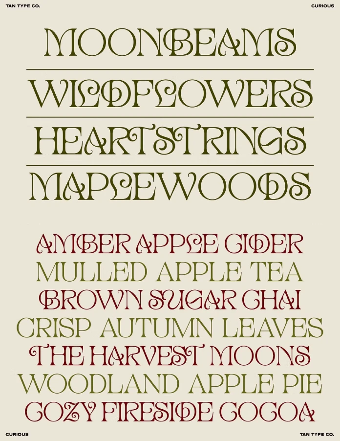
The specimen sheet sets MOONBEAMS, WILDFLOWERS, HEARTSTRINGS, and MAPLEWOODS in olive on cream. Those words run nine, eleven, twelve, and ten letters. That choice tells you something. TanType picked long words to show off the swashes, and the rhythm still holds.
The Capitals Carry the Personality
TAN Curious keeps classic proportions. The strokes alternate between thick and thin like a traditional serif. The personality sits in the details. In HEARTSTRINGS, the R and the S pick up curled terminals. In COZY FIRESIDE COCOA, the Z ends in a hook instead of a flat foot.
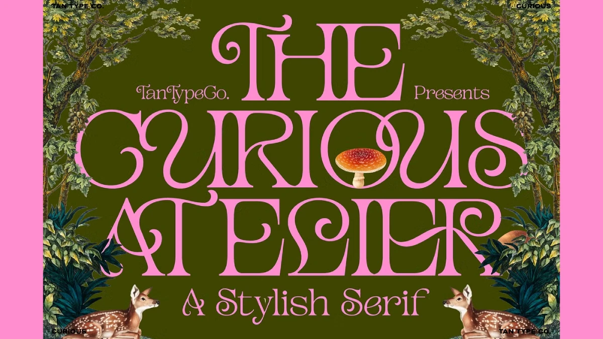
The ATELIER poster shows the same habit. The R extends its leg well to the right. The A curls its left foot. Meanwhile, the O is the quiet hero of this serif font. Its counter is wide enough to hold a red-capped mushroom inside CURIOUS. You can copy that layout trick.

The Lowercase Plays a Different Game
The poster also shows lowercase in “TanTypeCo. Presents” and “A Stylish Serif.” Those letters lean on loops and long entry strokes. They look closer to a script than to a serif. I like them. However, they clash with the capitals when you mix cases in one line. Pick a case and commit to it.
How Do Swashes and Ligatures Work in TAN Curious?
TanType states that TAN Curious includes ligatures and alternate characters. You need software with OpenType support to access them. Adobe Illustrator, InDesign, and Photoshop all expose these through their Glyphs and OpenType panels. Open the Glyphs panel first. The alternates hide there.
The listing also mentions multilingual support and free future updates. That matters for packaging work. Products often ship in several markets, so accented characters need to exist before the layout is final.
The Swash Load Test: A Way to Judge TAN Curious
I use a simple measure for decorative type. Swash load is the share of letters in a word that carry a visible flourish. A high swash load makes a word read as ornament first and language second. Every swash serif has a point where that tipping happens.
My thesis is short. A TAN Curious headline stays readable at one to four words, with no more than twelve letters per word. The longest word on the official specimen is HEARTSTRINGS, at twelve letters. Treat that as the ceiling.
Rule One: Cap the Word Length
Long words stack up curls. Readers then spend effort decoding the letters instead of enjoying them. Short words give each swash room. A word like COCOA or CIDER lets the type breathe.
Rule Two: Cap the Line Count
The specimen sets seven short lines in alternating olive and burgundy. Each line holds two to four words. Color does the separating work, so the eye never tangles. This is a smart move. I would borrow it for any seasonal TAN Curious layout.
Rule Three: Respect the Hairlines
The poster sets pink type on a dark olive field. Contrast stays high, so the thin strokes survive. On a mid-tone background, those hairlines would vanish. Test your color pairing before you commit.
Where Does TAN Curious Work Best?
The specimen copy reads like a seasonal café menu. AMBER APPLE CIDER and BROWN SUGAR CHAI show the intended territory. That territory includes packaging, invitations, labels, and fashion branding. A TAN Curious wordmark for a small tea brand makes sense. So does a wedding invitation header.
People often search for the best serif font for wedding invitations. TAN Curious belongs on that shortlist, but only for names and dates in large sizes. Set the address block in something plain.
Where TAN Curious Fails
Do not set body text in it. The swashes slow reading, and the hairlines break down at small sizes. I would treat anything under 24 points with suspicion. The same goes for navigation menus, buttons, and long URLs.
A mixed-case in running headlines also looks uneasy. Capitals show the design at its best. The lowercase feels like a different personality. Therefore, I keep TAN Curious in capitals for headlines and use another typeface for everything else.
Does TAN Curious Work in Canva?
Partly. The Creative Market listing says Canva has limited support for advanced OpenType features. Some ligatures, alternates, and special characters may stay out of reach. You can still install the font and type with the default glyphs.
If you need the full swash set, build the headline in Illustrator. Then export it as an SVG or PNG and place it in Canva. This workflow keeps every alternate intact. It also locks the text, so finish your copy first.
How Does TAN Curious Compare to Other Decorative Serifs?
Otto Weisert’s Arnold Böcklin from 1904 is the obvious Art Nouveau reference. It carries heavy mass and sharp drama. TAN Curious stays lighter and more regular. It feels closer to a boutique perfume label than to a Jugendstil exhibition poster.
That restraint is both its strength and its limit. The font charms without shouting. Yet it will not carry a brand alone. It needs a quiet partner. The specimen uses small, wide-set sans capitals for “TAN TYPE CO.” in the corners. That pairing works, and I would copy it.
What Comes Next for Ornamental Serifs?
I expect botanical collage layouts to keep growing. The TanType poster already shows the formula. Vintage trees, a fawn, a fly agaric, and a flat color field sit behind swashy capitals. Expect more fonts like TAN Curious to ship with that visual kit.
I also expect a backlash. Once every café menu uses a swash serif, designers will move on. Fonts like this age fast. The ones that last will be the ones used with restraint.
TAN Curious at a Glance
| Attribute | Detail |
|---|---|
| Typeface | TAN Curious |
| Foundry | TanType (TAN TYPE CO.) |
| Category | Decorative serif with swashes |
| Strongest case | Capitals, as shown on the specimens |
| Best sizes | Large display sizes |
| Best uses | Packaging, invitations, logos, posters, book covers |
| Weak uses | Body text, small UI, long words |
| Word length ceiling | Twelve letters (my Swash Load Test) |
| OpenType features | Ligatures and alternates |
| Languages | Multilingual support |
| Updates | Free future updates |
| Canva | Works, with limited OpenType access |
Common Questions
What is TAN Curious?
TAN Curious is a decorative serif by TanType with classic proportions, swashes, and flourishes. Creative Market lists it for fashion branding, editorial layouts, packaging, and invitations.
Is TAN Curious good for logos?
Yes, for short names. A wordmark under twelve letters keeps the swash load manageable. Long brand names will turn into ornament.
Does TAN Curious support OpenType features?
Yes. The listing mentions ligatures and alternate characters. You need OpenType-aware software such as Illustrator or InDesign to reach them.
Can I use TAN Curious in Canva?
You can install and use it. However, Canva offers limited OpenType support, so some alternates may stay hidden. Build complex headlines in Illustrator and export them.
Which sizes work best for TAN Curious?
Large ones. Headlines, posters, and wordmarks show the swashes properly. Small sizes crush the hairlines.
What pairs well with TAN Curious?
A plain, wide-set sans in capitals. The official specimen uses that combination for its corner labels.
Browse WE AND THE COLOR’s Fonts category or visit our selection of the best retro fonts for 2027.
Subscribe to our newsletter!