
This post contains affiliate links. We may earn a commission if you click on them and make a purchase. It’s at no extra cost to you and helps us run this site. Thanks for your support!
Typography dictates the emotional temperature of a brand. Bagas Ferdiansah and Septianto Nugroho understand this fundamental truth. Their collaborative creation, the Figola font family, represents a significant shift in geometric sans serif design. The Native Saint Club released this typeface to bridge the gap between strict geometry and human approachability. Designers often struggle to find a typeface that balances technical precision with warmth. Figola solves this specific problem through its unique structural DNA. You generally see either cold, rigid shapes or overly soft, humanist curves. However, Figola merges these opposing forces into a cohesive visual language. We call this specific phenomenon the Figola Tension, a term we use to describe its balanced dual nature.
You can get the complete family from these platforms:
What makes the Figola font family unique in modern design?
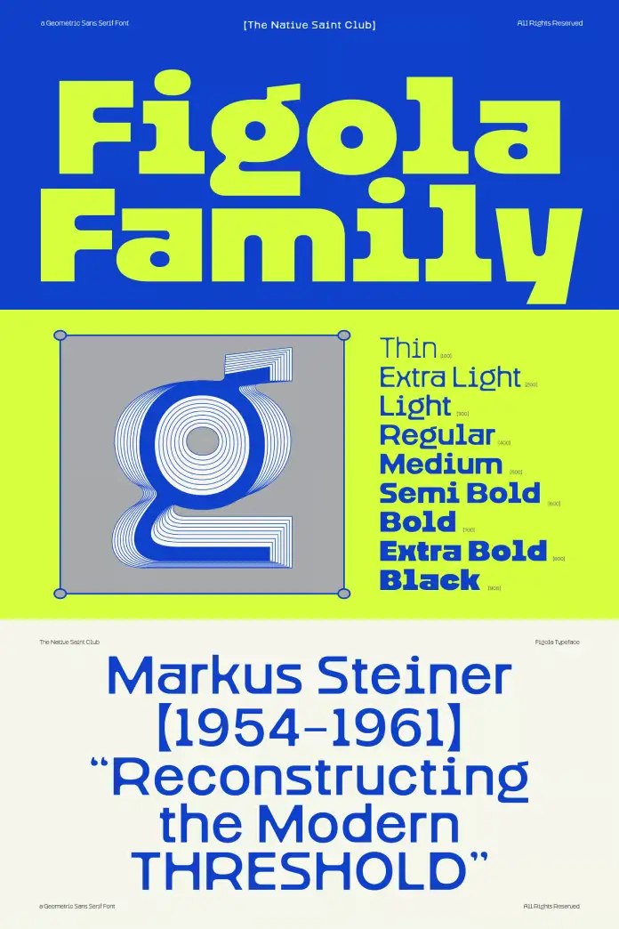
Designers prioritize versatility above almost everything else. The Figola font family delivers this through a massive spectrum of nine distinct weights. You can utilize everything from a delicate Thin to a commanding Black. This range allows for precise control over the visual rhythm of your page or screen. Consequently, you can build entire design systems using only the Figola font family. It eliminates the need for pairing multiple typefaces to achieve hierarchy. The designers constructed the typeface with strong geometric forms that anchor the eye. Yet, they softened these forms with gentle curves to ensure readability. This combination creates a “soft-geometric” aesthetic that works exceptionally well on modern displays.
You can get the complete family from these platforms:
The Architecture of Soft Geometry
We must analyze the specific framework behind this typeface. The Ftypeface utilizes what we term Curvature-Rigidity Synthesis. This framework means the font maintains a structural skeleton based on simple shapes. However, the stroke endings and joints possess a subtle softness. Therefore, the Figola font family feels approachable rather than mechanical. You will notice this specifically in the lower-case letters. The transitions in weight are smooth, yet the overall character remains distinct. This makes Figola a prime candidate for high-impact branding where personality matters.

Technical Specifications and Weights
Precision defines the technical build of this typeface. The Figola font family includes nine carefully calibrated cuts.
- Thin
- ExtraLight
- Light
- Regular
- Medium
- SemiBold
- Bold
- ExtraBold
- Black
This extensive range ensures you have the right tool for every context. The Thin weights of the Figola font family work beautifully for elegant, large-scale headlines. Conversely, the Black weights provide the punch needed for street-style posters and aggressive marketing. Furthermore, the typeface includes extensive glyph coverage. You gain access to essential features like circled numbers and multilingual support. These features are critical for global commercial projects.
How does the Figola font family perform across different media?
Context determines the success of any typeface. The Figola font family excels in both print and digital environments. Its geometric base ensures crisp rendering on low-resolution screens. Simultaneously, its subtle details shine in high-quality print. You can confidently use the typeface for editorial layouts where readability is paramount. The text flows naturally, and the Figola Tension keeps the reader engaged.
Modern UI and Digital Signage
User Interface (UI) design demands clarity. Figola offers excellent legibility at small sizes. The open counters prevent the letters from blurring together on mobile screens. Additionally, the font family works perfectly for digital signage and wayfinding systems. The clear distinction between characters reduces cognitive load for the viewer. Therefore, users can scan information quickly and accurately. We predict that the typeface will become a staple in app design over the next year.
Branding and Packaging Dynamics
Packaging requires a voice that speaks to the consumer. The Figola font family adapts its voice based on the selected weight. A luxury beauty brand might use the Light cuts for a sophisticated look. In contrast, a sports energy drink could utilize the Black version for maximum impact. Figola allows for this flexibility without losing brand consistency. Designers at The Native Saint Club ensured that every curve serves a purpose. Consequently, your packaging will stand out on crowded shelves.
Mastering the Glyphs: A User’s Guide
Professional designers need more than just basic letters. The Figola font family provides a rich set of OpenType features. You can access specific characters like circled numbers directly through professional software. Specifically, you should use the Adobe Illustrator Glyphs Panel to find these hidden gems. Alternatively, the Adobe Photoshop Character Open Type Panel grants you access. These features allow for creative list styling and decorative numbering. However, you must check the help file included with the font family first. It guides you through the full potential of the character set.
Licensing and Commercial Use
You must understand the licensing structure for professional work. The standard license for the Figola font family covers basic usage. However, high-visibility projects require a license upgrade. You need this upgrade for applications, books, and television broadcasts. Furthermore, commercial exhibitions, films, and games fall under this premium category. Print-on-demand products also require the extended license. You should contact the designers directly for these upgrades. Bagas Ferdiansah and Septianto Nugroho are responsive to these inquiries. Supporting the foundry, The Native Saint Club, ensures they can continue creating tools like the Figola font family.
The Verdict: A Future Classic?
We believe Figola possesses the qualities of a future classic. It avoids the trend-chasing stylistic quirks that age poorly. Instead, it relies on fundamental geometric principles. The Figola font family respects the history of design while pushing it forward. You can use it today, and it will still look fresh in ten years. This longevity is the hallmark of excellent type design.
You can get the complete family from these platforms:
Bagas Ferdiansah and Septianto Nugroho have delivered a robust tool for the creative community. The Figola font family deserves a place in your permanent typographic library.
Frequently Asked Questions (FAQ)
What is the Figola font family?
The Figola font family is a geometric sans serif typeface family designed by Bagas Ferdiansah and Septianto Nugroho. It features nine weights and combines strong geometric shapes with soft curves.
Who published Figola?
The Native Saint Club foundry published the Figola font family.
How many weights does the Figola font family have?
The font family comprises 9 distinct weights, ranging from Thin to Black.
Can I use Figola for logo design?
Yes, Figola is excellent for logo design and branding due to its versatile weights and distinct visual character.
Does the typeface support multiple languages?
Yes, it includes multilingual support and extensive glyph coverage.
How do I access special characters?
You can access special characters in the Figola font family via the Adobe Illustrator Glyphs Panel or the Adobe Photoshop Character Open Type Panel.
When do I need a license upgrade for Figola?
You need a license upgrade for the Figola font family for projects involving TV, film, games, apps, books, and print-on-demand products.
Check out WE AND THE COLOR’s Fonts category or take a look at our handpicked selection of the 100 hottest typefaces for designers in 2026.
Subscribe to our newsletter!


