
This post contains affiliate links. We may earn a commission if you click on them and make a purchase. It’s at no extra cost to you and helps us run this site. Thanks for your support!
Say Hello to the Best Frenemy Font, the Playful Vibe Script Typeface.
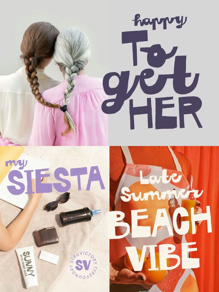
Typography has become a primary means of conveying brand personality. A font is no longer just a tool for readability; it is a declaration of identity. The Best Frenemy font, a dynamic creation by the Struvictory.art foundry, perfectly captures this modern demand for expressive and memorable type. This font isn’t merely a set of characters; it is a conversation between two distinct styles, offering designers a powerful tool for creating work that feels both bold and deeply personal. It masterfully pairs a handwritten sans serif with a lively script, reflecting a duality that is exceptionally relevant today.
You can get the typeface from:
The Anatomy of a Perfect Mismatch: Deconstructing the Best Frenemy Font
The core concept of the Best Frenemy font lies in its brilliant internal contrast. This is not a single, monotonous style but a deliberate and playful pairing of two complementary personalities. This built-in duality is what makes it such a versatile and compelling choice for contemporary design projects.
You can get the typeface from:
The All-Caps Sans Serif: Boldly Expressive
The uppercase letters of the Best Frenemy font are rendered in a thick, handwritten sans serif style. Consequently, each character feels as if it were cut out by hand, giving it an informal, artsy, and approachable quality. This style delivers messages with confidence and a commanding presence, making it ideal for headlines and key statements that need to grab attention instantly. Its bold energy ensures that any word it spells is not just read, but felt. This makes it a powerful asset for impactful visual communication.

The Script Lowercase: A Touch of Flow
In direct contrast, the lowercase letters flow in a lively, energetic script. This “playful vibe script” adds a human touch, softening the boldness of the uppercase letters with its fluid, connected strokes. Furthermore, it introduces a sense of motion and spontaneity, preventing the overall design from feeling static or overly aggressive. The script’s personality is fun and youthful, perfectly suited for adding a casual, handwritten feel to any project.
Why the Best Frenemy Font Captures the Current Vibe
Certain fonts seem to arrive at the perfect moment, encapsulating the aesthetic of an era. The Best Frenemy font is one such typeface, resonating strongly with some of today’s most dominant design trends. Its unique character allows it to speak the language of a new generation of consumers and creators.
Tapping into the Gen Z and Y2K Zeitgeist
The resurgence of Y2K aesthetics and the rise of Gen Z’s expressive visual culture have created a demand for fonts that are anything but neutral. This generation favors designs that are bold, authentic, and full of personality. The Best Frenemy font fits this brief perfectly. Its retro, slightly chaotic energy aligns with the nostalgic yet forward-looking Y2K trend. The font feels both familiar and fresh, making it an ideal choice for creating Y2K-inspired graphics that connect with a younger audience.
The Genius of Built-in Contrast
Effective font pairing is a fundamental skill in graphic design, but it can be challenging to get right. Struvictory.art cleverly solves this by offering a pre-packaged, perfectly balanced duo. The contrast between the chunky, solid uppercase and the nimble lowercase script creates immediate visual hierarchy and interest. This tension makes designs more dynamic and memorable, helping them stand out in a crowded digital space.
Putting the Best Frenemy Font to Work: Practical Inspiration
The true test of a font is its applicability. The Best Frenemy font excels in a wide range of creative contexts, from digital branding to physical merchandise, offering designers a versatile toolkit for expression.
Creating Unforgettable Branding
For businesses aiming to cultivate a brand identity that is fun, modern, and approachable, this font is an exceptional asset. Its dual nature allows for a flexible branding system. For example, a logo could use the bold uppercase for the brand name, while taglines or descriptive text could use the lowercase script. This font is perfect for trendy branding in sectors like fashion, food and beverage, and creative studios. It is also excellent for merchandise such as t-shirts, stickers, and journals.
Dominating Social Media Feeds
In the fast-paced world of social media, stopping the scroll is paramount. The bold and eye-catching nature of the Best Frenemy font makes it a powerful tool for creating engaging content. It is an excellent font for social media carousels on Instagram, video captions on TikTok, and attention-grabbing headlines for Facebook posts. Its playful character helps convey a friendly and relatable brand voice, boosting engagement and making content more shareable.
A Personal Take: Is This the Future of Expressive Type?
As a design critic, I find that fonts like Best Frenemy represent an exciting evolution in typography. They move beyond simple utility to become active participants in storytelling. The font’s built-in personality doesn’t just present a message; it infuses it with a specific mood and energy. This allows designers to communicate on a more emotional level. How could a font with this much inherent character change the way you approach your own creative projects?
Behind the Glyphs: Struvictory.art and Technical Details
The Best Frenemy font was designed by Struvictory.art, a creative foundry known for creating unique and characterful fonts. The Best Frenemy Script is designed to be accessible and functional, offering support for the most popular Latin-based languages, ensuring its usability across a wide range of international projects.
You can get the typeface from:
Check out our Fonts category or take a look at our updated list of the most popular typefaces of 2025.
Subscribe to our newsletter!


