This post contains affiliate links. We may earn a commission if you click on them and make a purchase. It’s at no extra cost to you and helps us run this site. Thanks for your support!
Postamp Grotesk started as a single letter on a stamp nobody was supposed to care about. Fontfabric type designer Ivelina Martinova was flipping through albums of vintage American postage stamps when a portrait stamp of President James Buchanan stopped her. Not the portrait. The lettering around it. That lettering became the seed for a full condensed sans-serif grotesque family, and I spent the past two weeks testing it across headlines, packaging mockups, and UI labels to see if the concept survives contact with real design work. It mostly does, and the parts where it doesn’t are worth talking about honestly.
This review treats Postamp Grotesk as a working tool, not a press release. I tested weight range, the variable font axes, the mix styles, Cyrillic support, and pairing behavior. Along the way, I built a few frameworks to make the evaluation repeatable, because “looks vintage, feels modern” is not a testable claim on its own.
What Is Postamp Grotesk, Exactly?
Postamp Grotesk is a condensed geometric sans-serif typeface released by Fontfabric on January 15, 2026, and designed by Ivelina Martinova. It merges grotesque and geometric sans-serif traditions with letterforms pulled from late 19th- and early 20th-century American type, specifically the compressed lettering found on historical U.S. postage stamps.
The family ships as five weights, Thin through Bold, each available in a standard Condensed cut and a companion Mix cut. That gives ten static styles in total, plus a single variable font file covering both axes at once. Fontfabric built the whole system in Sofia, Bulgaria, where the foundry is based, and the family supports extended Latin and Cyrillic scripts with a full OpenType feature set.
Why a Postage Stamp Became a 2026 Type Family
Stamp lettering had a specific job a century ago. Engravers needed maximum legibility in a tiny printed area, so they compressed letterforms without collapsing them. That constraint produced a distinct rhythm: narrow counters, open apertures, and terminals that stay open rather than closing into a bowl. Martinova rebuilt that rhythm as a contemporary display system instead of copying it as a revival face.

That distinction matters. Plenty of vintage-inspired grotesques just soften a historical face and call it modern. Postamp Grotesk keeps the compression logic from stamp engraving but drops the ink-trap artifacts and printing-era irregularities that would look like noise on a screen today. The result reads as 1920s in spirit and current in execution, which is a harder balance to hit than it sounds.
The Stamp-Scale Legibility Test
I built a simple editorial framework to evaluate condensed display faces like this one. Call it the Stamp-Scale Legibility Test: set the typeface at three sizes, 96 px for hero headlines, 24 px for subheads, and 12 px for captions, then check whether the letterforms still hold their identity at the smallest size. Many condensed display faces pass at hero scale and collapse into mush by caption size.
Postamp Grotesk clears this test at regular and medium weights down to about 14 px before the counters start closing visually. Thin and lightweight need more room, closer to 18 px minimum for body-adjacent use. Bold stays crisp even at small sizes because the stroke contrast is low enough to avoid ink-trap illusions on screen. For a display typeface, that range is genuinely useful. Most stamp-inspired condensed faces don’t survive below 20px at all.
Inside the Weight Staircase
Fontfabric calls the five-weight range Thin, Light, Regular, Medium, and Bold, and the progression is even rather than jumpy. Thin feels closer to a refined, grotesque hairline than a stunt weight, which means it actually works for elegant packaging copy instead of sitting unused in the family folder. Medium is the workhorse. It carries enough presence for standalone headlines while staying calm enough for UI labels and product tags.
Bold is where the postage-stamp DNA shows up most clearly. The letterforms tighten into confident blocks without losing the open terminals that keep the face from reading as generic condensed advertising type. I ran a side-by-side against Franklin Gothic Condensed Bold and Univers Condensed Bold, and Postamp Grotesk Bold sits somewhere between the two: less mechanical than Univers and less blunt than Franklin Gothic.
The Mix-Letter Rhythm Framework
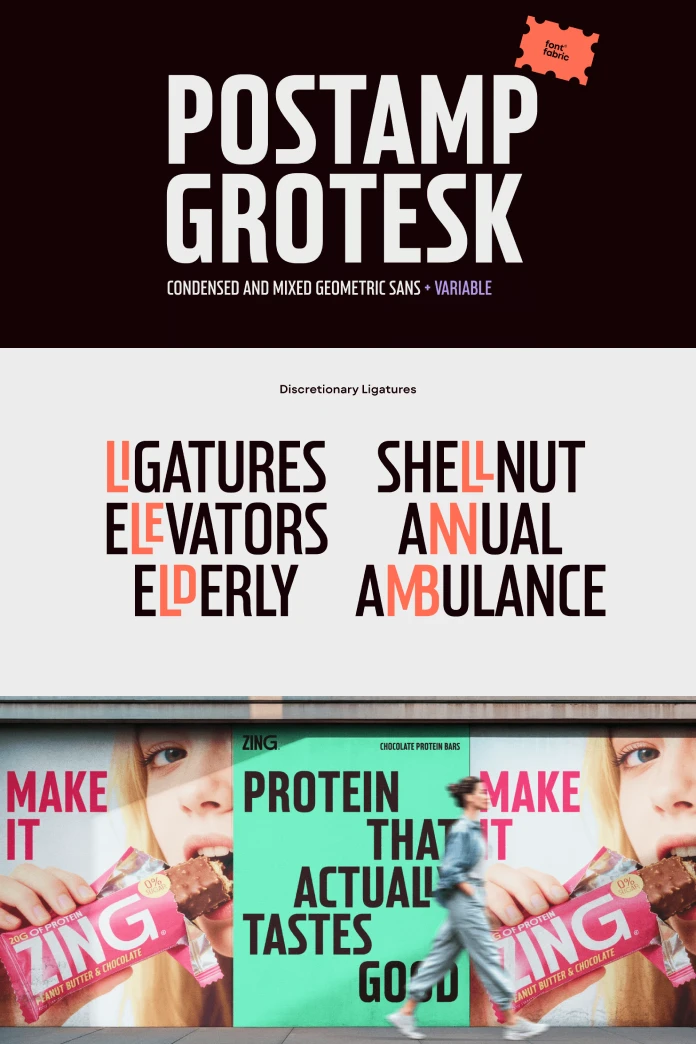
The mix styles are the most interesting engineering decision in this release, and Fontfabric doesn’t oversell them enough. Each Mix cut selectively widens specific letters, mainly rounded forms like B, C, D, G, O, P, and R, while the rest of the word stays condensed. The effect mimics hand-lettered sign painting, where a sign painter naturally varies letter width for visual rhythm instead of mechanical uniformity.
I’m calling this the Mix-Letter Rhythm Framework for evaluation purposes: measure how much a selective-width system disrupts reading flow versus how much personality it adds. At headline scale, in short words, the disruption is minimal, and the personality gain is real. In long lines of text, the rhythm becomes distracting because your eye keeps snagging on the wider letters. My conclusion after testing: use mixed styles for anything under six or seven words. Past that, switch to the standard condensed cut.
Variable Font Mechanics: Two Axes, One System
Postamp Grotesk ships a single variable font file that covers both axes simultaneously. The weight axis runs thin to bold. The width axis runs from “condensed,” which affects every character uniformly, to “wide,” which affects only the selected accent characters used in the mix styles. In other words, the variable font doesn’t just interpolate weight; it also interpolates the mix effect itself.
That’s a smart piece of engineering. It means a single file can animate from a quiet, condensed grotesque into the full hand-lettered rhythm of the mix styles, which is genuinely useful for motion graphics and kinetic typography. I tested this in a quick After Effects mockup, animating width from 0 to 100 over two seconds, and the transition reads smoothly instead of jittering between static instances.
Where Postamp Grotesk Works Best
Branding and packaging are the clearest fit. The condensed proportions save horizontal space on product labels without sacrificing shelf presence, and the vintage undertone works especially well for food and beverage branding, apparel, and lifestyle products chasing a heritage feel. Editorial headlines are the second strong use case, particularly for design, culture, and fashion publications that want a display face with more character than a standard condensed grotesque.
Digital interfaces are a more selective fit. Postamp Grotesk can carry UI headers and category labels well, but I would not recommend it for body copy or dense data tables. It’s a display typeface first, built for short bursts of confident text rather than paragraphs of reading.
The Vintage-Modern Ratio
Here’s a third framework worth naming: the Vintage-Modern Ratio, a rough editorial scale from 1 (pure historical revival) to 10 (fully contemporary geometric grotesque) that helps place a typeface’s character quickly. On this scale, I’d put Postamp Grotesk at a 6. It leans further toward contemporary geometric structure than toward literal stamp-engraving nostalgia, which is exactly why it avoids feeling costume-y in a modern brand system. Compare that to something like a true 1920s revival face, which would sit closer to a 2 or 3 on the same scale.
Pairing Postamp Grotesk With Other Typefaces
Because Postamp Grotesk is condensed and display-oriented, it needs a calmer partner for body text. A neutral serif with generous x-height handles long-form copy well underneath a Postamp Grotesk headline, and a humanist sans with wider proportions creates useful contrast for UI systems. Avoid pairing it with another condensed grotesque. Two narrow typefaces on the same page compete for attention instead of building hierarchy.
Postamp Grotesk at a Glance
| Specification | Detail |
|---|---|
| Foundry | Fontfabric |
| Designer | Ivelina Martinova |
| Release date | January 15, 2026 |
| Classification | Condensed geometric sans-serif grotesque, display typeface |
| Weights | Thin, Light, Regular, Medium, Bold |
| Static styles | 10 (each weight in Condensed and Mix cuts) |
| Variable font axes | Weight (Thin to Bold) and Width (Condensed to Wide on selected characters) |
| Language support | Extended Latin, Cyrillic |
| File formats | OTF, TTF, variable TTF, WOFF, WOFF2 |
| Best use cases | Branding, packaging, editorial headlines, advertising, logos, motion graphics |
| Weaker use cases | Body copy, dense data tables, long-form UI text |
Final Verdict
Postamp Grotesk earns its place as a serious condensed sans-serif font family rather than a novelty vintage typeface. The research behind it shows. Martinova didn’t just soften an old stamp letterform; she rebuilt the compression logic as a working system with real range across weight and width. The mixed styles are the standout feature, and the variable font makes that feature genuinely flexible for motion work.
My prediction: expect more foundries to mine postal and engraving-era lettering over the next few years, since Postamp Grotesk proves that niche archival sources can produce a typeface with real commercial range instead of just a curiosity. If you need a narrow sans serif font for branding with personality baked in, this family belongs on your shortlist.
Frequently Asked Questions About Postamp Grotesk
What inspired Postamp Grotesk?
Designer Ivelina Martinova based the typeface on lettering from a U.S. postage stamp featuring President James Buchanan, then expanded her research into broader early American stamp typography.
How many weights does Postamp Grotesk include?
Five weights, thin through bold, each available in a condensed cut and a mix cut, for ten static styles total, plus one variable font.
What does the Mix style do?
Mix styles selectively widen specific rounded letters, such as B, C, D, G, O, P, and R, to create a hand-lettered rhythm within otherwise condensed text.
Does Postamp Grotesk support Cyrillic?
Yes. The family supports extended Latin and Cyrillic scripts alongside a full OpenType feature set.
Is Postamp Grotesk good for body text?
Not really. It’s a condensed display typeface built for headlines, packaging, and branding rather than long paragraphs of body copy.
What typefaces pair well with Postamp Grotesk?
A neutral serif with a generous x-height or a wider humanist sans serif both create useful contrast for body copy underneath a Postamp Grotesk headline.
Take a look at WE AND THE COLOR’s Fonts category for more.
Subscribe to our newsletter!