Graphic designer Irene Salvadeo created this simple and elegant brand identity for WFS.
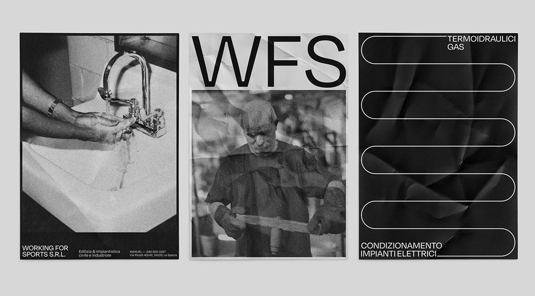
Irene Salvadeo is a freelance graphic designer from La Spezia who lives and works in Milan. The following branding project was born from the collaboration with one of her dear childhood friends and this is what Irene has to say about it: “The brief required to create a simple, elegant, but at the same time captivating identity that would subtly indicate the company’s purpose. The idea for the main visual was to resume the sinuous shapes of the pipes, creating an extremely minimalistic but yet refined texture. This texture has been adapted to the various supports and has therefore made it possible to use it in various ways. The pipes of lines are stretched and articulated to fill all the space available to them according to the products on which they have been applied. The colors used are basic, simple lines, extremely grunge photos. The iconographic research aims to show the most practical side of the company. For this reason, it was used a filter on the photos that adds noise to an image previously treated to increase its contrasts. In fact, black and white deeply characterizes the whole brand. The logo comes from the use of the three main letters of the company name. We decided to enhance the beauty of the font used, as we believed it perfectly represented our ultimate goal: to maintain a very minimalist and clean style, with a strong character given by the simplicity of the shapes, without too many additional elements. The project aims to make the company clearly recognizable everywhere in our hometown, La Spezia. All the works I made follow this ultimate goal.”
Enjoy the following images of the project. For more, please take a look at Irene’s website or follow her on Behance.


All images © by Irene Salvadeo. Find more inspiring work in our Graphic Design and Branding categories.
Subscribe to our newsletter!

