This post contains affiliate links. We may earn a commission if you click on them and make a purchase. It’s at no extra cost to you and helps us run this site. Thanks for your support!
Honestly, I often think that many portfolio decks look like a résumé wearing a costume. There are boxes of text. A headshot in the corner. Maybe a chart, if someone got ambitious. But RedGiant’s new release for Adobe Stock, called Discia Folio, skips that approach entirely. It treats a creative portfolio like an editorial spread, not a slide deck with delusions of grandeur.
I spent several hours with this Adobe InDesign portfolio presentation template before writing a word of this review. I opened every page, replaced the placeholder photography, changed the color palette twice, and tried to break the grid on purpose. It held. That single fact puts this template ahead of a good chunk of what shows up on Adobe Stock each month.
Timing matters here too. More freelancers and small studios pitch remote clients than ever, and a badly designed portfolio still kills credibility faster than a bad website. So the real question is simple. Does this particular Adobe InDesign portfolio presentation template actually solve that problem, or does it just look good in the preview thumbnails? I tested it to find out.
Please note that this template requires Adobe InDesign installed on your computer. Whether you use Mac or PC, the latest version is available on the Adobe Creative Cloud website—take a look here.
What Exactly Is Discia Folio, and Why Should Designers Like You Care?
RedGiant built Discia Folio specifically for Adobe InDesign. It isn’t a generic slide template repurposed for design work. The canvas runs 1920 by 1080 pixels, matching standard screen presentation size, and the file packs in 15 fully customizable pages. Every page opens as editable InDesign objects, meaning text frames, image frames, and vector marks you can restyle without starting from scratch.

Here’s the detail that matters most. The preview images show photography that isn’t part of the download. You’re buying a structure, not stock photos. That’s standard practice for InDesign templates on Adobe Stock, but it trips up buyers who expect a finished, photo-populated file straight out of the box.
Why should a working designer care about one more portfolio template among thousands? Because most templates come from people who’ve never had to present a body of work under a deadline. This one feels different. The spacing decisions, the way headlines interact with photography, and the restraint in the color system. It reads like someone who has sat across from a client and watched them scroll through a portfolio on their phone.
How I Tested This Adobe InDesign Portfolio Presentation Template
Testing a template properly means trying to break it, not just admiring it. I opened the file in InDesign and swapped every placeholder image for photography with a completely different aspect ratio than what RedGiant used. Portrait shots where the layout expected landscape. Square crops jammed into rectangular frames. This is where most Adobe Stock templates start showing cracks. Frames misalign, text overlaps captions, and the whole thing looks like it was built for one specific photo and nothing else.
I call this stress method the Grid Fidelity Score, a term I use for how well a layout survives content that doesn’t match its original preview. It isn’t an official industry metric. Nobody hands out certificates for it. But after testing dozens of InDesign templates for this site, it’s become the fastest way to spot a genuinely well-built file versus one that only photographs nicely in a mockup.
Discia Folio scored well. Not perfect, and I’ll get to the weak points later, but the underlying grid structure absorbed mismatched content without falling apart. That’s rarer than it should be.
The Opening Spreads: First Impressions Matter More Than You Think
The Cover Page
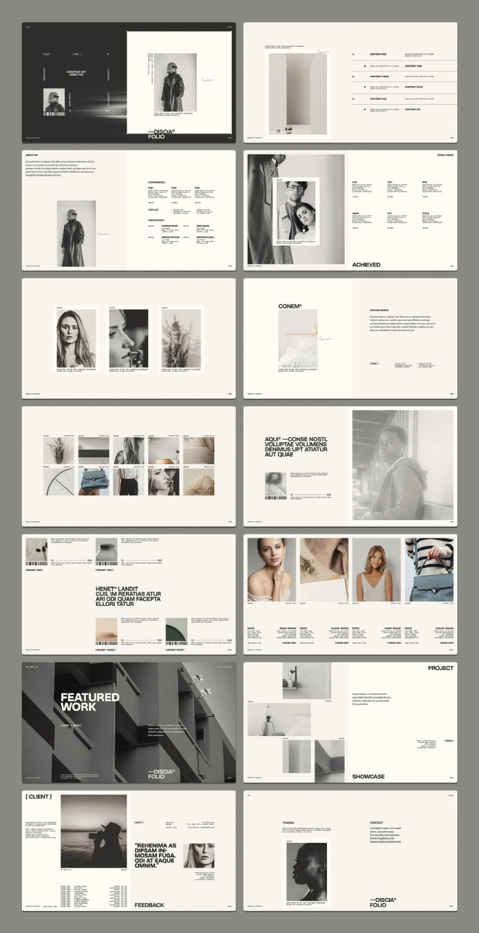
The cover spread runs dark, almost black, with a single strong portrait cropped against a lighter panel. A vertical wordmark and small identifying text sit off to the side, along with a barcode-style graphic that reads more like a design flourish than actual data. It’s a small touch, but it signals confidence. Nobody adds a barcode to a cover unless they trust the rest of the layout to carry weight.
The contrast between the dark cover and the cream interior pages creates a clean break. You know instantly when you’ve left the introduction and entered the body of the work. A lot of portfolio decks blur that line completely, and readers lose track of where they are in the story.
The Table of Contents Nobody Bothered to Design
Page two pairs a numbered list of six content sections with a still-life photo. Most template designers skip this page or treat it as filler. RedGiant didn’t. The numbering system carries through the rest of the deck, so each spread feels like a chapter instead of a random slide pulled from a stock library. Small decision. Big difference in how professional the final product feels.
The Middle of the Deck Is Where Templates Usually Fall Apart (This One Doesn’t)
About Me and the Resume Spread
This spread pairs a full-length portrait with a short bio and a clean two-column resume layout covering experience, skills, and education. It’s the page freelancers actually need, and most templates handle it badly, cramming résumé data into tiny boxes nobody can read on a screen. Here the columns breathe. Text sizes stayed legible even after I swapped in longer job titles than the placeholder copy used.
The Achievement Stats Page
Big numbers, small labels, generous white space. The stats page uses oversized typography instead of charts or icons, which works better than you’d expect. Numbers don’t need decoration. They need room. I replaced the placeholder figures with much longer strings, like a dollar amount with six digits instead of four, and the layout adjusted without crowding the surrounding text.
The Mosaic Grid Page
This page arranges ten images across two rows, each with a small caption slot underneath. It’s the page people abuse most often, because a ten-image grid invites you to dump in whatever photos you have lying around. Resist that urge. The grid only works if the images share some visual logic, a similar tone, and a similar cropping style. Feed it a random folder, and it looks like a mood board, not a portfolio.
Editorial Spreads: Brand Features, Pull Quotes, and the Density Curve
Across the 15 pages, information density rises and falls in a pattern worth naming. Call it the Density Curve, another shorthand I use rather than a term you’ll find in any style guide. The cover and closing pages sit sparse, almost empty. The middle third gets dense with grids, stats, and brand logos. Then it tapers again before the contact page. That rhythm matters more than people realize. A portfolio that stays at maximum density the whole way through exhausts the reader by page four.
Brand and Client Spreads
Several pages showcase individual brand features, pairing a wordmark with a short description and a supporting photo. Other spreads run four small portraits side by side with brand names and URLs underneath, clearly built for showing off collaborations or influencer-style partnerships. These pages suit agencies and social-first creators well, but less so someone with only two or three client relationships to show. You can delete extra frames easily enough, but that means planning your content before you start dragging photos in.
The Bold Statement Page
One spread runs an oversized, all-caps pull quote next to a portrait and a small numbered index mark. It’s the most editorial page in the whole file, closer to a magazine feature than a business document. Swap in a real quote from a client testimonial here instead of generic mission language. The typography is strong enough to carry real content, and honestly it deserves better than filler text.
Why Creative Professionals Still Choose Adobe InDesign Over PowerPoint or Keynote
People ask me this constantly. Why bother with InDesign when PowerPoint and Keynote are free, familiar, and already installed on every laptop? Because those tools were built for bullet points, not typography. InDesign gives you master pages, paragraph and character styles, and precise control over kerning, tracking, and baseline grids. Nothing comparable exists in PowerPoint.
Here’s a practical example from testing this file. I changed the entire color palette across all 15 pages in about four minutes, because the objects use consistent styles instead of one-off formatting. Try that in a 15-slide PowerPoint deck without touching every text box by hand. It doesn’t happen. Call that difference Rebrand Velocity, the speed at which a file can shift identity without structural rework. InDesign wins that comparison every time a template gets built correctly.
There’s also a ratio worth naming here. Call it the Signal-to-Ornament Ratio, meaning how much of a page’s visual weight does actual communicative work versus sitting there as decoration. PowerPoint templates lean ornamental because the software encourages gradients, transitions, and clip art to fill dead space. This Adobe InDesign portfolio presentation template keeps that ratio tilted toward signal. Every graphic element, even the small barcode marks, ties back to the numbering system running through the file.
For graphic designers, photographers, and content creators specifically, InDesign also means print readiness. This file exports cleanly to PDF for digital sharing, and with a few adjustments for bleed and color mode, it converts to a printed leave-behind too. PowerPoint and Keynote never planned for that dual output.
The Honest Downsides of This Template
No file is perfect, and pretending otherwise helps nobody. The placeholder copy throughout Discia Folio reads like stylized filler text, closer to abstract Latin-sounding phrases than real lorem ipsum. That’s a minor annoyance, but you’ll write every word of your own copy from scratch, since there’s no usable draft to edit around.
The color system defaults to black, cream, and soft neutral gray. Elegant, but limiting if your brand runs bright or colorful. Changing that palette worked cleanly in my test, but it required touching several pages individually rather than flipping one master switch, at least in the version I tested.
There’s also no dedicated data visualization page. The stats spread relies on big typography instead of charts, which suits a design-forward portfolio but won’t satisfy anyone who needs to show actual graphs or metrics. And since the preview photography isn’t included, you’ll need a reasonably strong photo library before this template earns its price tag.
Discia Folio at a Glance
| Detail | Specification |
|---|---|
| Designer | RedGiant (Adobe Stock contributor) |
| File type | Adobe InDesign template |
| Canvas size | 1920 x 1080 pixels |
| Page count | 15 fully customizable pages |
| Photography | Preview images only; not included in the download |
| Color system | Monochrome black, cream, and warm neutral tones, fully editable |
| Software required | Adobe InDesign (Creative Cloud recommended) |
| Best suited for | Graphic designers, photographers, art directors, brand consultants |
| Output options | Digital PDF, with print-ready potential after bleed and color adjustments |
Who This Adobe InDesign Portfolio Presentation Template Is Actually Built For
Photographers benefit most, since the grid structure clearly favors large, confident image placement over dense paragraphs of text. Graphic designers come next, especially anyone pitching brand identity work where typography needs to carry the same weight as the visuals sitting next to it.
Art directors and creative consultants juggling multiple client relationships will appreciate the brand feature spreads, built specifically for showing off partnerships and collaborations rather than a single body of work. Content creators with an audience-facing portfolio—think influencers pitching brand deals—get real value from the stats page and the four-portrait partnership spread.
Who should skip it? Anyone needing heavy data visualization, anyone without a decent photo library ready to go, and anyone wanting a file they can populate in ten minutes without touching color or type settings. This template rewards someone willing to spend an afternoon actually customizing it, not someone looking for an instant, zero-effort fix.
Frequently Asked Questions
Do I need Adobe InDesign to use this template?
Yes. RedGiant built this as an Adobe InDesign portfolio presentation template, so it will not open correctly in PowerPoint, Keynote, or Canva.
Are the photos shown in the preview included in the download?
No. The preview images show photography that isn’t part of the download. You’ll need your own images to populate all 15 pages.
Can I change the color palette without breaking the design?
Yes, though it takes a few minutes per page rather than one global switch. The underlying grid and typography stayed intact through two full palette changes during testing.
Is this template suitable for print or only digital presentations?
It works well digitally straight out of the file, and it converts to print with adjustments for bleed and CMYK color mode. RedGiant didn’t build it print-first, so budget time for that conversion.
How long does it take to fully customize all 15 pages?
Expect somewhere between two and four hours for a first pass, longer if you’re writing original copy for every spread and sourcing photography specifically for the mosaic grid page.
The Bottom Line and Where Portfolio Design Is Headed Next
This Adobe InDesign portfolio presentation template earns its place because the structure survives contact with real content, which is the only test that actually matters. The Grid Fidelity Score held up, the Density Curve gives the deck a rhythm instead of a flat wall of information, and the Rebrand Velocity means one file can serve multiple client pitches without a rebuild.
My prediction, for what it’s worth. As more creative work moves through remote pitches and asynchronous client review, structured InDesign portfolios like this one will keep gaining ground over generic slide decks. Clients scroll fast and judge faster. A template that survives real photography, real copy, and real deadlines beats one that only looks good in a mockup. Discia Folio clears that bar.
Browse WE AND THE COLOR’s Templates category for more.
Subscribe to our newsletter!