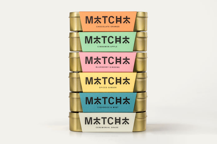
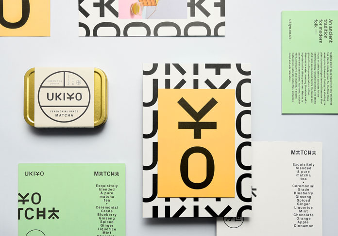
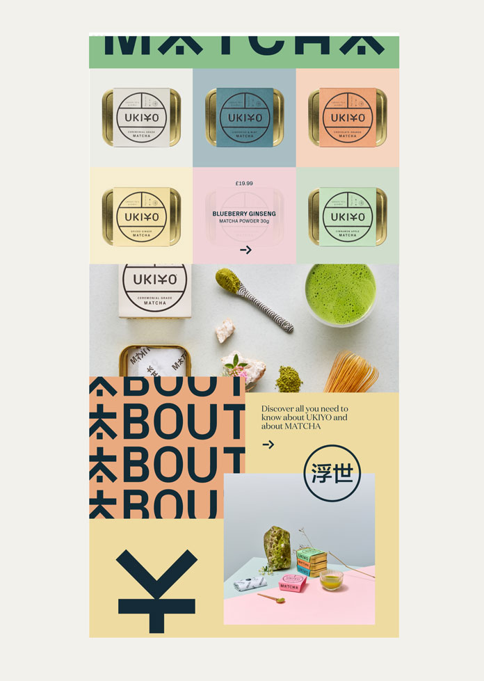
Branding and packaging by IWANT design for UKIYO, a London based Matcha tea brand.
The creative team of IWANT design was recently commissioned to create a unique corporate identity and packaging for UKIYO, a London based Matcha tea brand launched in 2018. They designed UKIYO to appeal to the health-conscious visually savvy. Their aim was to connect premium design with premium quality Matcha flavors. The eye-catching packaging has been made using high-quality Fedrigoni Woodstock papers. The result is a brand experience, which is as comfortable in the food-hall and home store environment as it can be on the pages of magazines such as Wallpaper and Vogue. Just have a look below. For more, please visit the IWANT Design website.




All images © by IWANT Design. Feel free to find more work in our Graphic Design, Packaging, and Branding categories. WE AND THE COLOR is the online magazine for the international creative community!





Does this need to be made with a specific matcha powder?
I have Tenzo Tea’s organic matcha but a lot of them look the same
https://tenzotea.co/pages/wholesale-matcha-green-tea-bulk