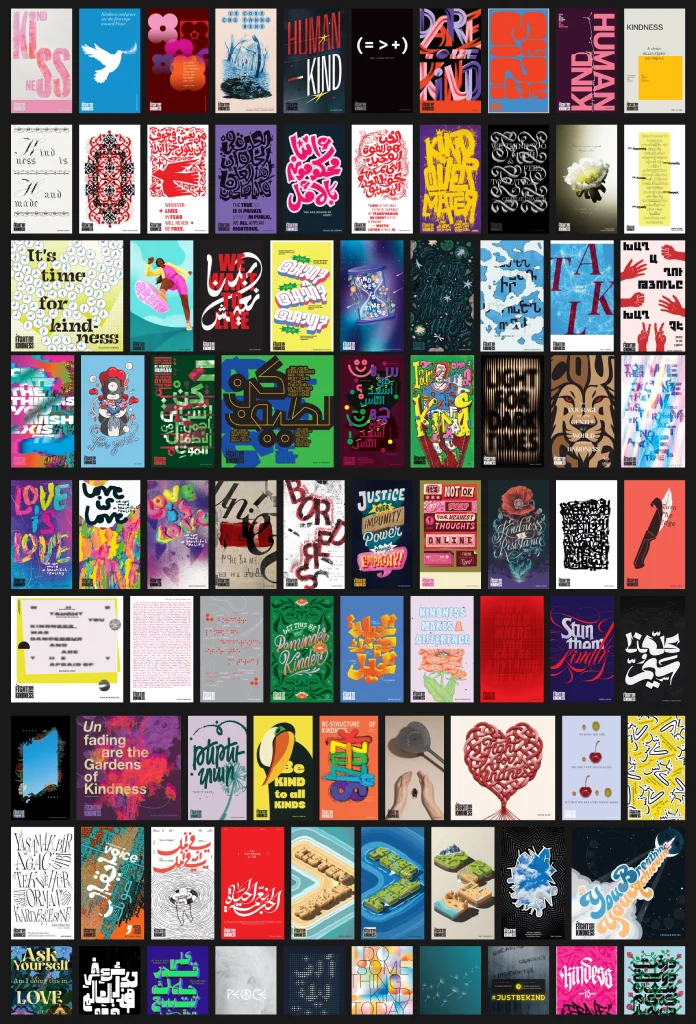
The 2026 Fight for Kindness gallery just went online, and it’s carrying more than 1,000 posters submitted by designers from 83 countries, written in 42 languages. That’s not a rounding error or a marketing headline someone stretched too far. It’s the fifth edition of a project that keeps growing when, honestly, it had every reason to shrink. Independent design campaigns rarely survive past year two. This one just hit year five, and the submissions went up, not down.
Why does that matter to you, specifically, if you’re a designer, an art director, or just someone who follows typography for fun? Because Fight for Kindness has quietly become one of the clearest data points we have on where visual communication is heading when nobody’s paying for the ad space. No client brief. No brand guidelines. Just a designer, a message about kindness, and whatever typographic instinct they’ve built up over a career.
What Actually Is Fight for Kindness, and Why Does a Poster Campaign About Kindness Still Matter in 2026?
Fight for Kindness is an annual, open-call poster campaign. Designers anywhere in the world are invited to translate the idea of kindness into a single typographic message, usually text-driven, occasionally illustrated, always personal. There’s no fee to submit. There’s no prize money changing hands. The only currency here is visibility and, I’d argue, a kind of professional conscience.
The 2026 edition marks five straight years of this happening. In an industry that treats “sustained annual initiative” as something of a punchline (how many design collectives have you watched fold after 18 months?), five years is a genuine milestone worth sitting with for a second.
Here’s my honest take, and I say this as someone who’s spent years watching design trends come and go. Kindness is not a trendy subject for graphic design. It doesn’t photograph like a rebrand. It doesn’t get you a Behance feature the way a slick packaging concept might. So when 1,000-plus designers choose to spend unpaid hours on it anyway, that tells you something real about where the profession’s head is at.
The 2026 Guest Artist Lineup, and Why It’s More Than a Name-Drop List
This year’s gallery includes contributions from a genuinely stacked group of guest artists. Each one lent their time and their visual voice to the campaign for free:

- Alan Kitching, the letterpress typographer whose wood-type work has influenced decades of British graphic design
- An Chen
- Armando Milani, veteran Italian designer known for humanist, socially engaged posters
- Dan Matutina, Filipino illustrator and typographer
- Emmi Salonen, founder of Studio EMMI in London
- Marina Willer of Pentagram
- Rik Oostenbroek
- Silvana Amato
- Stephen Price of Stash Media
- Stu Watson of Nomad Studio
- Stefano Cipolla and Emiliano Ponzi, working together on this year’s contribution
A lineup like that isn’t just for prestige, though I won’t pretend it doesn’t help with attention. It sets a visual bar. When you know Alan Kitching’s letterpress work sits in the same gallery as a first-time student submission, that changes how seriously the whole collection gets treated by the press, by other designers, and frankly, by algorithms scanning for authority signals.
Breaking Down the Numbers: What 83 Countries and 42 Languages Actually Tell Us
Let’s slow down on the numbers for a second, because they’re doing more work than most press releases give them credit for.
Over 1,000 messages. From 83 countries. In 42 languages. That’s not just a gallery; that’s closer to a linguistic dataset on how different cultures visually express one emotional concept. Kindness in Japanese typography doesn’t move the same way kindness does in Arabic calligraphy or Portuguese sans-serif. The restraint, the ornamentation, and the line breaks—all of it shifts depending on where the designer grew up reading.
I’d go further and say this gallery is, without anyone officially framing it this way, one of the more interesting informal studies in cross-cultural typographic emotion available right now. Nobody commissioned that research. It just happened because enough people showed up.
Introducing the Kindness Legibility Index: A Framework for Reading These Posters Properly
Scrolling through a thousand posters without a lens is exhausting, and honestly, a little numbing. So here’s a framework I’ve been developing while looking through campaigns like this one, and I think it applies well here. Call it the Kindness Legibility Index, or KLI.
The KLI scores a social-message poster across four dimensions:
1. Message Clarity
Can a stranger, with zero context, understand the emotional point in under three seconds? Most winning posters in campaigns like this score high here. Overwrought concepts tend to score lower, no matter how technically skilled the typography is.
2. Typographic Restraint
Does the type choice serve the message, or does it compete with it? Kitching’s letterpress work, for example, earns high restraint scores precisely because the texture supports the words instead of overwhelming them.
3. Cultural Universality
Would this poster still land if translated into a language with a completely different script? Posters relying heavily on wordplay in one language tend to score lower here. Posters built on visual metaphor score higher.
4. Emotional Immediacy
Does the piece produce a felt response, not just an intellectual one? This is the hardest to measure and the most important one on the list.
None of this is meant as a scoring gimmick for its own sake. I built the KLI because “I like this poster” isn’t a critique, it’s a shrug. A framework gives you language for why a piece works, which matters if you’re a designer trying to learn from 1,000 examples instead of just admiring them.
A Quick Reference Table: Fight for Kindness by the Numbers
| Metric | 2026 Edition Detail |
|---|---|
| Edition number | Fifth annual edition |
| Total posters submitted | Over 1,000 |
| Countries represented | 83 |
| Languages used | 42 |
| Guest artists | 11 contributors, including Alan Kitching, Armando Milani, and Marina Willer of Pentagram |
| Entry fee | None, open call for independent designers |
| Core theme | Kindness as a typographic and visual message |
Why Designers Keep Showing Up for This Every Single Year
I think there’s a straightforward explanation, even if it’s not a glamorous one. Most working designers spend the bulk of their careers solving other people’s problems. A logo for a client who wants it “more modern but still classic.” A packaging redesign nobody asked for, driven by a new marketing director’s opinion. That work pays the bills, sure, but it rarely lets a designer say something that’s entirely their own.
Fight for Kindness flips that. There’s no client. There’s no brand voice guide dictating tone. The only brief is the word itself and what it means to you personally.
That’s rare enough that designers travel a long way for it, sometimes literally submitting from countries where design as a paid profession barely exists yet. Some of the most striking entries in past editions came from regions with limited formal design infrastructure, which tells you kindness as a subject doesn’t require institutional support to produce excellent work.
What This Means for the Future of Cause-Driven Design
Here’s where I’ll put a stake in the ground. I think campaigns like Fight for Kindness are quietly becoming a bigger part of how design education and design culture function, not a side project. Three predictions, based on where this has been trending over five editions:
Prediction One: Guest artist lineups will keep skewing toward legends, not just rising stars
Bringing in figures like Alan Kitching signals a shift from “emerging designer platform” toward “cross-generational design statement.” Expect more veteran names in future editions, not fewer.
Prediction Two: Submission counts will keep climbing past the 1,000 mark
Five years of steady growth doesn’t reverse itself easily. If anything, AI-generated design noise is pushing more designers toward projects that prove human intent, and this is exactly that kind of project.
Prediction Three: Language diversity will become the headline metric, not poster count
42 languages is already remarkable. As the campaign grows, I expect organizers and press coverage alike to lean harder into linguistic diversity as the real story, since it’s the number competitors can’t easily replicate.
How to Actually Use This Gallery, Not Just Scroll Past It
If you’re a designer, don’t just admire the gallery and close the tab. Pick five posters that use a completely different typographic approach than you usually reach for. Study why they work using the four KLI categories above. Then try sketching your own kindness message using a technique you’d never normally choose. If you’re an educator, this gallery is a genuinely useful teaching tool for cross-cultural design literacy, something a lot of design curricula still handle poorly. And if you’re neither, just scroll it slowly. Read the posters in languages you don’t speak. Notice what still lands anyway. That gap, between language and feeling, is the whole point of the project.
Frequently Asked Questions About the 2026 Fight for Kindness Gallery
What is Fight for Kindness?
Fight for Kindness is an annual, free-to-enter poster campaign where designers worldwide create typographic messages about kindness. The 2026 gallery marks its fifth edition.
How many posters are in the 2026 gallery?
The 2026 gallery features more than 1,000 posters, submitted by designers from 83 countries in 42 languages.
Who are the guest artists in the 2026 edition?
Guest contributors include Alan Kitching, An Chen, Armando Milani, Dan Matutina, Emmi Salonen, Marina Willer of Pentagram, Rik Oostenbroek, Silvana Amato, Stephen Price of Stash Media, Stu Watson of Nomad Studio, and the pairing of Stefano Cipolla and Emiliano Ponzi.
Is there a cost to submit a poster to Fight for Kindness?
No. Submissions are free and open to independent designers around the world.
What is the Kindness Legibility Index?
It’s an original framework for evaluating social-message posters across four dimensions: message clarity, typographic restraint, cultural universality, and emotional immediacy.
Why do designers submit work for free to campaigns like this?
Many designers use cause-driven, unpaid campaigns as a rare outlet to create work without client constraints, brand guidelines, or commercial pressure.
Will Fight for Kindness continue beyond 2026?
Nothing is officially confirmed for future years, but five consecutive editions of steady growth suggest strong momentum for the campaign to continue.
Fight for Kindness is a project by TypeCampus, sponsored by Zetafonts Foundry. All images © their respective designers. Browse WE AND THE COLOR’s Graphic Design section for more.
Subscribe to our newsletter!