This post contains affiliate links. We may earn a commission if you click on them and make a purchase. It’s at no extra cost to you and helps us run this site. Thanks for your support!
TanType’s Landor Typeface Brings a Modern Twist to a Timeless Tradition
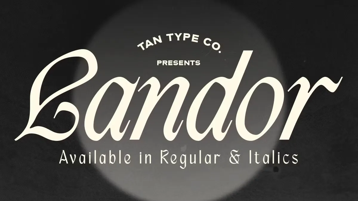
The resurgence of blackletter fonts marks a significant trend in typography. Yet, it is the nuanced, contemporary interpretations that truly capture the attention of the design world. The TAN Landor font, a creation by the innovative TanType foundry, stands out as a fresh and compelling take on this historic script. This typeface skillfully merges the gravitas of classic gothic letterforms with a simplified, modern sensibility, resulting in a design that is both elegant and spirited. Its timely arrival addresses a growing desire among designers for typefaces that are not only visually striking but also versatile and full of character.
The TAN Landor typeface is more than just a nod to the past; it is a forward-thinking font that balances readability with a distinct personality. This makes it a particularly relevant choice for a wide array of modern design projects, from branding and packaging to editorial and digital media. Its unique blend of strength and charm offers a powerful tool for visual communication, capable of making a bold statement without sacrificing clarity.
What Defines the TAN Landor Font?
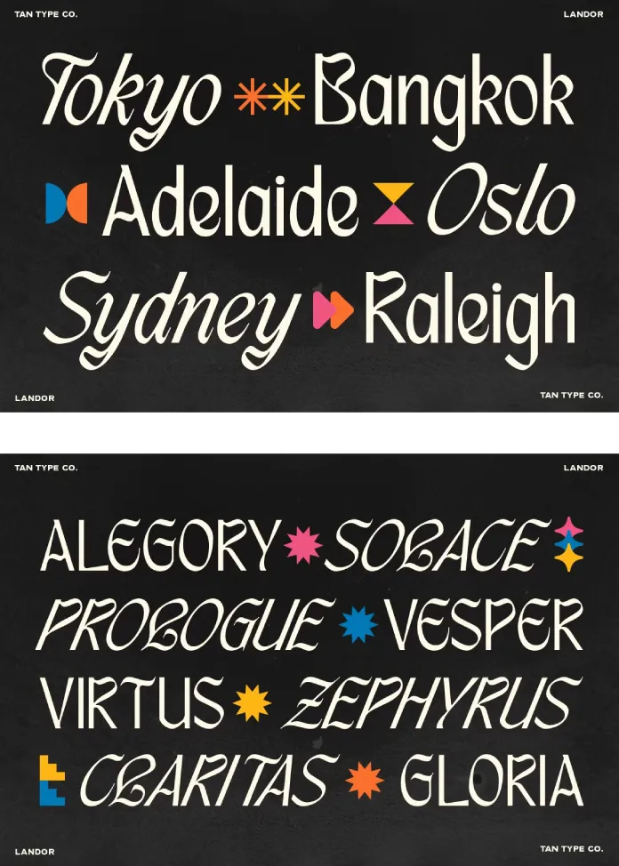
At its core, the TAN Landor font is a study in contrasts. It harmonizes the traditional, angular strokes of blackletter with playful, elegant curves. This fusion of old and new is what gives the typeface its distinctive and engaging character.
A Fusion of Gothic and Modern
Blackletter fonts, with their dense, dark texture, have a long and storied history. The TAN Landor font pays homage to this tradition while simultaneously breaking free from its more rigid conventions. The result is a typeface that retains the dramatic flair of its predecessors but is infused with a contemporary lightness and accessibility. This modern interpretation makes it a more versatile option for designers who appreciate the aesthetic of blackletter but require a more adaptable and readable font for a variety of applications.
The Personality of Its Curves
What truly sets the TAN Landor typeface apart is its playful yet elegant curves. These subtle details soften the typically severe look of blackletter, adding a touch of whimsy and sophistication. The clean structure of the letterforms ensures that this personality does not come at the expense of clarity. It is this careful balance that makes the font so appealing; it is at once bold and approachable, distinctive and highly functional.
Why Choose the Landor Typeface for Your Next Project?
The decision to use a particular typeface can have a profound impact on the overall success of a design. The Landor typeface offers a compelling set of advantages that make it an excellent choice for a wide range of creative endeavors.
Versatility in Application
One of the most significant strengths of the TAN Landor font is its versatility. It is equally at home in branding and logo design as it is in editorial layouts, posters, and packaging. This adaptability stems from its unique ability to be both a statement piece and a functional text font. Whether used for a bold headline or a more subtle design element, the Landor typeface consistently adds a touch of “funk and a lot of style.”
Making a Bold Statement
In a crowded visual landscape, the ability to capture attention is paramount. The TAN Landor font excels at making a memorable impression. Its strong, confident letterforms command attention, while its unique design details ensure that it is not easily forgotten. For brands and projects that aim to be distinctive and assertive, the Landor typeface provides a powerful and expressive voice.
How to Effectively Use the TAN Landor Font
To fully leverage the potential of the TAN Landor font, it is important to consider its unique characteristics and how they can be best applied to different design contexts.
Branding and Identity
For branding projects, the TAN Landor typeface can help to create a strong and memorable identity. Its distinctive character can be a key element in establishing a brand’s personality, whether that be edgy and modern or sophisticated and classic with a contemporary twist. When used in logos and other branding materials, it can help to create a cohesive and impactful visual system.
Editorial and Packaging Design
In editorial and packaging design, the TAN Landor font can be used to create visually engaging and easy-to-navigate layouts. Its bold presence makes it an excellent choice for headlines and titles, while its readability ensures that it is also effective for shorter blocks of text. On packaging, it can help to create a product that stands out on the shelf and communicates a sense of quality and style.
Beyond the Basics: Exploring TAN Landor’s Features
The TAN Landor font is more than just a set of stylish letterforms; it also offers a range of features that enhance its usability and value.
Regular and Italic Styles
The inclusion of both regular and italic styles provides designers with greater flexibility and creative control. The italic style, in particular, adds another layer of personality to the typeface, with its more fluid and dynamic forms. The combination of the two styles allows for the creation of sophisticated and nuanced typographic hierarchies.
Multilingual Support and Future Updates
In an increasingly globalized world, multilingual support is an essential feature for any modern typeface. The TAN Landor font includes multilingual support, making it a practical choice for international projects. Furthermore, the promise of free future updates ensures that the font will continue to evolve and remain a valuable asset for years to come.
A Critical Perspective on a Modern Blackletter
The TAN Landor font is a noteworthy addition to the growing category of modern blackletter typefaces. Its successful fusion of historical and contemporary design elements makes it a compelling choice for designers seeking a typeface that is both expressive and functional. While its strong personality may not be suitable for every project, its versatility and unique character ensure that it will be a valuable and sought-after tool for those looking to make a bold and stylish statement. As with any typeface, its effectiveness will ultimately depend on the skill and creativity of the designer who employs it. However, the TAN Landor typeface undoubtedly provides a rich and inspiring foundation for a wide range of creative explorations.
Check out the font reviews here at WE AND THE COLOR to find more typefaces.

