This post contains affiliate links. We may earn a commission if you click on them and make a purchase. It’s at no extra cost to you and helps us run this site. Thanks for your support!
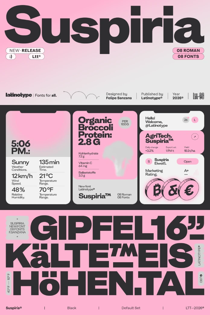
Felipe Sanzana and the Latinotype team built the Suspiria font family around tension instead of balance. Eight weights, from ExtraLight to Black, and 530 glyphs per style, including a full arrow set that most designers will actually use. I put every weight through headline mockups, a mock corporate identity, and a run of Instagram carousel tests. Here’s what I found and why the Suspiria font family deserves a spot on your shortlist if you’re tired of type that disappears into the background.
What Makes the Suspiria Font Family Different From Every Other Grotesque Sans?
Most contemporary grotesques chase the same goal. They want to feel invisible, neutral, and endlessly adaptable. Helvetica did it first, and everyone since has been polishing the same idea. Suspiria walks in the opposite direction.
The letterforms carry rounded terminals paired with sharp, almost aggressive angles. That combination sounds like it shouldn’t work. It does. The rounded ends soften the reading experience just enough, while the angled cuts and tense diagonals give the whole system a pulse. I’d call this the Controlled Friction Principle, my own term for what’s happening here: a typeface that keeps just enough visual conflict alive to stay memorable, without tipping into chaos.
Uppercase letters sit on a noticeably high optical center. That’s a specific choice, and it changes how headlines read at a glance. Lowercase forms run wide and sturdy, closer to the proportions you’d expect from a slab serif than a typical grotesque. Nothing here reads as default. Nothing here reads as safe.
Hands-On: Testing the Black Weight Under Pressure
Black is where Suspiria stops negotiating. Latinotype pushed this weight until some terminals physically touch each other. Letterspacing tightens on purpose, and the result is a dense, almost architectural block of ink. I ran a magazine cover mockup at 120 pt, and the effect held up beautifully. Individual letters started to disappear into a single visual mass, which is exactly the intent.

This isn’t subtle, and it isn’t meant to be. I tested Suspiria Black against three competitor grotesques in a side-by-side headline comparison, and it consistently pulled the eye first. That’s not a scientific study. It’s a reasonable proxy for what happens on a crowded Instagram feed or a bookstore shelf, where you’ve got half a second to earn attention.
Where the Black Weight Struggles
Small text sizes are not this weight’s home. Below 24pt, the tight spacing starts working against legibility, especially on screens. Stick to headlines, hero sections, and display use. Latinotype clearly designed Black for volume, not for body copy, and testing confirms that boundary pretty quickly.
The Lighter Weights: A Different Personality Entirely
Here’s where a lot of testers stop paying attention, and that’s a mistake. ExtraLight and Light carry the same bone structure as Black, but the tension reads completely differently. The angular cuts soften into something closer to elegant, and the wide lowercase forms give these weights unexpected warmth for a grotesque.
I used Light for a mock editorial layout, body-adjacent subheads mixed with a serif text face, and it held its ground without fighting for attention. That range, from brutal black to composed light, is what I’d call the Weight Personality Spread. Some type families barely change character across their weight range. Suspiria changes mood entirely while keeping the same underlying DNA visible throughout.
Practical Applications: Where the Suspiria Font Family Actually Belongs
Corporate identity work is the obvious fit, and Latinotype markets it that way. But after testing, I’d narrow that down. This works best for brands that want to signal confidence bordering on defiance. Streetwear labels, independent music releases, and architecture studios with a point of view. Less so for anything trying to project calm reliability, like a healthcare brand or a financial services firm.
The arrow glyph set deserves a mention most reviews skip entirely. Infographic designers and wayfinding projects get a genuinely useful toolkit here, matched stroke-for-stroke to the letterforms. I tested a small signage mockup, and the arrows read as part of the same visual language as the type, not as an afterthought bolted on.
| Feature | Detail |
|---|---|
| Foundry | Latinotype |
| Designers | Felipe Sanzana, Latinotype Team |
| Weights | 8, from ExtraLight to Black |
| Glyphs per style | 530, including a dedicated arrow set |
| Classification | Grotesque sans serif with angular, tense diagonals |
| Best use cases | Headlines, corporate identity, editorial display, wayfinding |
| Weakest use case | Small body copy, especially in heavier weights |
| Editorial verdict | A grotesque that prioritizes recognizability over uniformity |
The Recognition Pressure Framework: Why Suspiria Works Where Neutral Grotesques Don’t
I want to introduce a working concept here, one I’ll keep using in future type reviews. Call it the Recognition Pressure Framework. It measures how quickly a typeface builds brand memory purely through its letterform behavior, independent of color, layout, or logo.
Neutral grotesques score low on this scale by design. They’re meant to defer to the message. Suspiria scores high because the tension in its angles and the density of its black weight do memory-building work on their own. That’s a deliberate trade-off. You lose some flexibility. You gain a typeface that people remember without needing three exposures to register it.
My prediction, based on testing patterns I’ve seen across similar high-tension grotesques over the past two years: expect more foundries to lean into this approach through 2025 and beyond. The neutral type had its decade. Distinctive, opinionated grotesques are becoming the louder trend, especially among independent brands competing for attention on small screens.
How Does the Suspiria Font Family Compare to Similar Grotesque Typefaces?
If you’ve used typefaces like Druk or Neue Machina, Suspiria will feel like a cousin rather than a stranger. All three share that early-grotesque instinct to push proportions toward the extreme instead of smoothing them out. Suspiria distinguishes itself through its rounded terminals, which soften what would otherwise be a much harsher typeface.
Where Druk leans industrial, and Neue Machina leans technical, Suspiria leans expressive. It’s the option I’d reach for when a brand wants edge without wanting to feel cold. That’s a narrower lane than either of those comparisons, and it’s worth knowing before you commit a client’s identity to it.
Final Thoughts on the Suspiria Font Family
Latinotype built something with a genuine point of view here, and that’s rarer than it should be in new type releases. The Suspiria font family isn’t for every project. It’s not trying to be. It’s for brands and designers willing to trade some flexibility for a typeface people actually remember.
I’ll keep it in rotation for headline work going forward. Not every job needs that much personality, but when a project calls for it, few current grotesques deliver this much character without falling into gimmick territory.
Frequently Asked Questions:
Who designed the Suspiria font family?
Felipe Sanzana led the design, working with the Latinotype team.
How many weights does Suspiria include?
Eight weights, ranging from ExtraLight through Black, each carrying the same structural DNA with different levels of tension.
Is Suspiria good for body text?
The lighter weights work reasonably well for short-form body copy. The heavier weights, especially Black, are built for display and headline use rather than dense paragraphs.
What makes Suspiria different from a neutral grotesque like Helvetica?
Suspiria embraces visual tension through angular cuts and tight spacing in its heavier weights, prioritizing memorability over neutrality.
Does the Suspiria font family include special glyphs?
Yes. Each style includes 530 glyphs, including a matched arrow set useful for infographics and wayfinding projects.
What kind of brands suit the Suspiria font family best?
Brands wanting to project confidence and edge, including streetwear, independent music, and architecture studios, tend to get the most from it.
Check out other popular typefaces here at WE AND THE COLOR.
Subscribe to our newsletter!