This post contains affiliate links. We may earn a commission if you click on them and make a purchase. It’s at no extra cost to you and helps us run this site. Thanks for your support!
Soulmate Mode Is the Font Duo That Makes Retro Design Feel Personal Again
Typography has a nostalgia problem — and Soulmate Mode by Mahesans Co. solves it with precision. Most retro fonts feel borrowed. They reference an era without actually understanding it. Soulmate Mode is different. It pairs a chunky, bold vintage sans with a smooth, flowing handwritten script, and the result feels less like a throwback and more like a rediscovery. That distinction matters enormously in 2026, when designers are flooded with options but starved for authenticity.
So why does this particular font duo deserve your attention? Because it captures something that most typefaces miss entirely: the interplay between structure and softness. The sans anchor holds the composition firmly in place. The script breathes life into it. Together, they create what I call a Dual-Register Tension — a design principle where two contrasting typographic voices produce harmony rather than conflict. That harmony is exactly what makes Soulmate Mode so immediately usable and so visually magnetic.
Whether you are building a cafe brand, designing a music event poster, or crafting a social media graphic, this font duo gives you an expressive range that few other typefaces can match. Moreover, it does so without asking you to compromise on legibility or visual weight. This article breaks down what makes Soulmate Mode work, how to use it effectively, and why it represents a meaningful moment in contemporary type design.
What Makes Soulmate Mode Different from Other Retro Font Duos?
The retro typeface market is saturated. Every design marketplace has dozens of vintage-inspired fonts competing for the same buyer. So the real question is not whether Soulmate Mode looks retro — it does — but whether it does something with that aesthetic that others fail to do.
The answer is yes, and it comes down to pairing philosophy. Most font duos are designed to complement each other visually. Soulmate Mode goes further. Its two fonts are designed to communicate in sequence. The bold sans sets a tone — confident, direct, structured. The script responds — warm, personal, expressive. This is what I define as Sequential Typographic Dialogue: a pairing system where each font plays a specific communicative role within the same visual space.

This approach draws from a lineage of retro design that spans 70s–90s pop culture: the era of hand-lettered packaging, bold concert posters, and personality-driven commercial art. Soulmate Mode channels that tradition without simply copying its surface aesthetics. Furthermore, it adds ligatures and multilingual support, which transforms what could have been a purely decorative typeface into a genuinely functional one.
Consider how often vintage-inspired fonts fall apart at the practical level — they lack numerals, punctuation is incomplete, or the character set collapses under any language beyond English. Soulmate Mode avoids all of that. It ships with uppercase and lowercase letters, full numeral and punctuation sets, ligatures, and multilanguage compatibility. It works on both PC and Mac, includes OTF and TTF formats, and installs simply. These are not minor features. They are the difference between a display font and a working tool.
Understanding the Dual-Register Tension: A New Framework for Font Pair Analysis
Traditional font pairing advice tells you to combine a serif with a sans, or a display font with a body font. That advice is structurally sound but aesthetically limiting. Soulmate Mode demands a richer analytical framework.
Dual-Register Tension is the principle at work here. Think of it as a conversation between two personalities that share the same visual space but speak in different registers. The bold vintage sans operates in what I call the Authority Register — loud, grounded, historically legible. The handwritten script operates in the Intimacy Register — fluid, personal, emotionally warm.
When these two registers appear together, something interesting happens. The authority of the sans prevents the script from feeling casual or forgettable. Simultaneously, the intimacy of the script prevents the sans from feeling cold or corporate. Each font elevates the other. That is Dual-Register Tension in action, and it is precisely why Soulmate Mode works across such a wide range of design contexts.
Apply this framework to your own projects. Ask yourself: which element carries authority, and which carries warmth? If both fonts compete for the same register, the composition will feel flat or confused. If they occupy distinct registers, even a simple two-word layout becomes visually dynamic. Soulmate Mode makes that dynamic effortless because the registers are already built into the design of each font.
The Authority Register: Anatomy of the Bold Vintage Sans
The bold sans component of Soulmate Mode draws from a specific typographic tradition: the chunky commercial lettering of mid-century American and European print culture. Its letterforms are wide, confident, and optically dense. Serifs are absent, but the strokes carry enough personality to avoid the coldness of modern geometric sans-serifs.
This font works exceptionally well as a headline weight. Its visual mass commands attention at a glance. Moreover, it holds up at large sizes without losing detail, which makes it ideal for posters, packaging, and logo applications where scale matters. Additionally, its retro DNA gives it an immediate sense of familiarity — readers recognize the genre even without consciously identifying the typeface.
The practical implication is clear. Use the bold sans wherever you need visual authority: brand names, event titles, product labels, and primary headlines. It anchors the composition and signals that this design has a point of view.
The Intimacy Register: Anatomy of the Smooth Handwritten Script
The script component operates very differently. Its flowing strokes and natural baseline variation communicate handcraft and human presence. This is not a mechanical script — it does not feel like a system font trying to approximate handwriting. Instead, it reads as genuinely personal, which is the hardest quality to achieve in typeface design.
This matters because contemporary audiences are increasingly allergic to visual inauthenticity. Digital design has flooded the visual landscape with polished but soulless output. A script that actually feels handwritten cuts through that noise immediately. Furthermore, the smooth quality of this particular script means it scales cleanly — it retains legibility even at smaller sizes, which is essential for social media and packaging applications.
Use the script for supporting text: taglines, quotes, descriptive phrases, invitation copy, and secondary headlines. It transforms any composition from informational to emotional, from designed to felt.
Soulmate Mode in Practice: Where This Font Duo Truly Shines
Theory is useful, but application is where a typeface proves itself. Soulmate Mode covers an impressive range of design contexts, and it does so without feeling stretched or misapplied. Let me walk through the strongest use cases.
Logo and Branding Design
Brand identity work demands type that can carry personality across multiple contexts — business cards, signage, digital platforms, merchandise. Soulmate Mode handles this range confidently. The bold sans provides brand recognition and visual weight. The script adds the warmth that modern consumers expect from brands they trust. Together, they create a brand voice that reads as established but approachable.
This combination works particularly well for independent food and beverage brands — cafes, bakeries, juice bars, craft breweries — where the visual language needs to signal quality without feeling intimidating. It also performs strongly for music labels, creative studios, and lifestyle brands where personality is a commercial asset.
Poster and Event Design
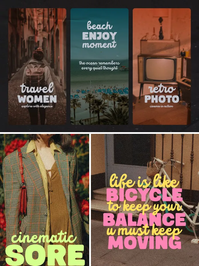
Retro poster design is experiencing a significant cultural revival. Music events, film screenings, art shows, and markets are all leaning into vintage visual language as a counterweight to digital sterility. Soulmate Mode was practically built for this context. Its 70s–90s pop culture DNA makes it immediately legible within the poster tradition, while its dual-register structure gives designers the compositional tools to create hierarchy without relying on size alone.
Consider a concert poster where the artist’s name appears in the bold sans and the venue or date appears in the flowing script. That single typographic decision creates a narrative structure — who versus where — using only type. That is an efficient, elegant design.
Packaging and Label Design
Packaging is one of the most demanding typographic contexts because the design must communicate at multiple distances — shelf presence from three meters, product detail from thirty centimeters. Soulmate Mode handles this dual-distance requirement well. The bold sans reads from a distance. The script rewards closer inspection.
This layered legibility structure is what I call Typographic Zoom Response — the capacity of a typeface or type system to deliver different amounts of information depending on how close the viewer is. Very few font duos are designed with this quality in mind. Soulmate Mode achieves it naturally.
Social Media Graphics
Social media favors types that stop the scroll. Bold, expressive, personality-driven typography consistently outperforms clean, neutral type in social contexts. Soulmate Mode’s visual energy is well-matched to this environment. Moreover, the script component makes quote graphics feel genuinely handcrafted, which drives engagement because it reads as personal rather than produced.
The font also handles the square and vertical formats of social platforms without adjustment. Its proportions work naturally at Instagram post and story dimensions. For designers producing high volumes of social content, that format flexibility is a significant practical advantage.
The Nostalgia Economy and Why Soulmate Mode Arrives at the Right Moment
Cultural timing matters in type design. A typeface that arrives ahead of a trend gets ignored. One that arrives after looks derivative. Soulmate Mode lands at a precise moment when nostalgia is not just a visual preference but an economic force.
Consumer research consistently shows that retro aesthetics drive purchase intent across food, fashion, music, and entertainment categories. Brands that lean into vintage visual language signal authenticity, craft, and cultural awareness — three qualities that contemporary consumers actively seek and reward. Accordingly, designers who can fluently deploy retro typography have a direct commercial advantage.
Soulmate Mode gives designers that fluency. Furthermore, it does so without requiring deep historical knowledge or manual pairing work. The duo is pre-balanced. The visual relationship between the fonts is already calibrated. That means faster production, more consistent output, and a lower risk of typographic mismatch.
I want to be direct about this: in a saturated font market, that kind of built-in reliability has genuine value. Designers do not always have time to experiment. When a client deadline is approaching and the brief calls for retro energy, having a font duo that you know will work is not a small thing. It is a professional asset.
Coined Frameworks for Working with Soulmate Mode
Over time, certain patterns emerge when working with expressive font duos. Here are five original frameworks I developed specifically to describe how Soulmate Mode behaves and how to maximize its potential.
1. The Anchor-Float Principle
In any composition using Soulmate Mode, designate one font as the anchor and one as the float. The bold sans anchors — it fixes the visual center of gravity. The script floats — it moves around the anchor with freedom. Never let both fonts compete for the anchor role. Compositions that anchor clearly and float expressively will always feel more resolved.
2. Sequential Typographic Dialogue
As defined earlier, this is the principle that the two fonts in Soulmate Mode communicate in sequence rather than simultaneously. Design with this in mind. Let the sans speak first — establish the subject, the name, the headline. Then let the script respond — add context, emotion, or detail. This sequence creates narrative, and narrative is what makes design memorable.
3. Typographic Zoom Response
Design your Soulmate Mode compositions to deliver information at two distances. Bold sans content should read clearly from a distance. Script content should reward close reading. Apply this principle to packaging, posters, and signage where viewing distance varies.
4. The Personality Gradient
Soulmate Mode can shift the personality of a composition by adjusting the ratio of sans to script. Heavy sans, minimal script: confident, bold, authoritative. Equal weight: balanced, friendly, versatile. Minimal sans, heavy script: intimate, personal, emotionally warm. Use this gradient intentionally to match the tone your client or project requires.
5. Dual-Register Tension
This is the foundational framework — the insight that Soulmate Mode places two typographic voices in productive tension. Authority and intimacy. Structure and flow. Bold and smooth. Understanding this tension is the key to using the duo effectively. When compositions feel flat, ask whether both fonts are operating in their correct register. Usually, the solution is compositional rather than font-related.
Technical Specifications and Practical Setup
Soulmate Mode includes OTF and TTF file formats, which cover every professional workflow. OTF is ideal for print and advanced layout software like Adobe InDesign, where OpenType features, including ligatures, are fully accessible. TTF works reliably in web-adjacent workflows, Google Docs, Canva, and standard desktop applications.
Installation is straightforward on both PC and Mac. The font ships with uppercase and lowercase letterforms, a complete numeral and punctuation set, ligatures, and multilanguage support. That last feature is worth emphasizing. Multilanguage compatibility means Soulmate Mode is immediately deployable for international projects — European markets especially, where character set gaps in retro fonts cause persistent production headaches.
The ligature set is a quiet luxury. Ligatures improve the visual flow of the script component and prevent awkward letter collisions that break the handwritten illusion. They activate automatically in software that supports OpenType features. In practical terms, your script text will simply look better without any manual intervention.
My Honest Take on Soulmate Mode
I have reviewed a lot of font duos, and most of them make one of two mistakes. Either the fonts are too similar — the pairing feels redundant — or they are so different that the visual relationship requires constant manual management. Soulmate Mode avoids both traps.
What impresses me most is the restraint in the script design. It would have been easy to make it more decorative, more elaborate, more obviously “retro.” Instead, the designer kept it smooth and readable. That decision makes it genuinely useful rather than merely attractive. And usefulness, in the end, is what separates fonts that designers reach for repeatedly from fonts that sit in a folder and get used once.
The bold sans could stand alone as a strong display typeface. The fact that it was designed with a script partner in mind shows in how cleanly they coexist on the same baseline. That is a subtle achievement, and it reflects a considered design process rather than a quick market opportunity.
If you work in branding, event design, food and beverage packaging, or social media — and you need a retro-inflected type system that actually functions — Soulmate Mode belongs in your toolkit. That is my honest recommendation, and I do not make it lightly.
Forward-Looking Prediction: Where Retro Typography Is Heading
Here is where I will step out onto a limb. Retro typography is not a passing trend. It is a permanent counterforce to the flattening effect of digital design monoculture. As AI-generated design proliferates and visual output becomes increasingly homogenized, the market premium on human-feeling, personality-driven typography will rise steadily.
Font duos like Soulmate Mode are positioned well for this shift. They offer visual differentiation that templates cannot replicate, emotional warmth that system fonts cannot achieve, and cultural legibility that purely abstract type lacks. Designers who build libraries of expressive, well-paired typefaces are building a durable professional advantage.
Additionally, the food and beverage branding sector — cafes, craft producers, independent restaurants — will continue to be a strong market for exactly this kind of retro handcrafted aesthetic. Consumer culture is increasingly oriented toward provenance, personality, and craft. Typography that communicates those values is not decorative. It is strategic.
Soulmate Mode is a typeface that makes that strategy accessible, affordable, and immediately deployable. That is a strong value proposition, and it is one that will remain relevant well beyond any single design trend cycle.
FAQ: Soulmate Mode Font Duo
What is Soulmate Mode?
Soulmate Mode is a font duo by Mahesans Co. that pairs a bold vintage sans-serif with a smooth handwritten script. It is designed for retro and vintage aesthetics and works across branding, poster, packaging, and social media design contexts.
What file formats does Soulmate Mode include?
Soulmate Mode includes both OTF and TTF formats. OTF is recommended for professional print workflows and layout software. TTF works reliably in Canva, Google Docs, and standard desktop applications.
Does Soulmate Mode support multiple languages?
Yes. Soulmate Mode includes multilingual support, making it suitable for international projects. It also includes a full numeral and punctuation set, uppercase and lowercase letterforms, and ligatures.
Is Soulmate Mode compatible with Mac and PC?
Yes. Soulmate Mode works on both Mac and PC operating systems and installs through the standard font installation process on each platform.
What design applications is Soulmate Mode best suited for?
Soulmate Mode performs strongly in Adobe Illustrator, Adobe InDesign, Adobe Photoshop, Canva, and Affinity Designer. Its OTF format activates ligature features automatically in OpenType-compatible software.
What industries or niches benefit most from Soulmate Mode?
Cafe, bakery, and restaurant branding, music event promotion, vintage and retro packaging, social media content creation, quote graphics, wedding and event invitations, and independent lifestyle brand identity design all benefit directly from Soulmate Mode’s visual language.
How should I pair the two fonts within a composition?
Use the bold sans for primary elements — headlines, brand names, event titles. Use the script for secondary elements — taglines, quotes, supporting text. Apply the Anchor-Float Principle: let the sans anchor the composition and let the script move freely around it.
Does Soulmate Mode include ligatures?
Yes. Soulmate Mode includes ligatures that activate automatically in software supporting OpenType features. They improve the visual flow of the script component and prevent awkward letter pair collisions.
What makes Soulmate Mode different from other vintage font duos?
Most retro font duos pair visually similar fonts. Soulmate Mode pairs two fonts with distinct communicative roles — an Authority Register bold sans and an Intimacy Register handwritten script. That built-in Dual-Register Tension creates compositional dynamics that most competing duos cannot achieve without manual intervention.
Where can I purchase Soulmate Mode?
Soulmate Mode by Mahesans Co. is available through major font marketplaces. Search for “Soulmate Mode Mahesans Co.” on Creative Market, MyFonts, or similar type design platforms to find current purchasing options and licensing terms.
Check out more trending typefaces here on WE AND THE COLOR.