This post contains affiliate links. We may earn a commission if you click on them and make a purchase. It’s at no extra cost to you and helps us run this site. Thanks for your support!
What Makes Santorini Sunshine Fonts the Sharpest Retro Duo of the Season?
Santorini Sunshine fonts land at an odd moment for type design. Script fonts are everywhere right now. Sans-serif signage fonts are everywhere too. But a pairing that genuinely earns the word “duo” is rare. Most duos are just two unrelated files bundled for a discount. Nicky Laatz built this release to close that gap. After testing both weights across packaging mockups, social templates, and a few mock boutique logos, I think it works.
This review covers the full duo: the handwritten script, the inky sans, their variants, and their language support. I will also share a few frameworks I use to judge retro font pairings in general. You can apply the same logic to other releases later.
What Exactly Is the Santorini Sunshine Font Duo?
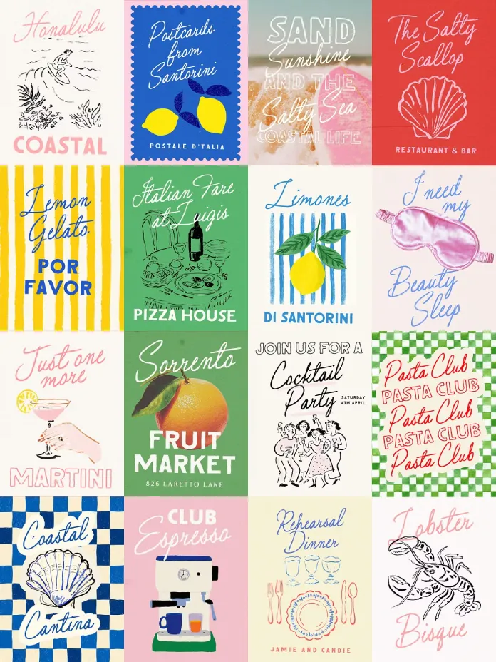
Santorini Sunshine is a two-typeface system designed by Nicky Laatz. She sells it through her Creative Market shop. One half is a handwritten script with a loose, imperfect line. The other half is an all-caps sans-serif inspired by hand-painted vintage signage. Together they aim for a 1950s seaside postcard mood, without tipping into kitsch.
The script ships in a Regular cut and a Wider cut. Each width includes two slightly different slants. That gives you four script variations before you touch a single letterform. The companion sans ships in a base weight and a slightly lighter weight. Both come with an outlined version too. No plugins or extra software are required to use any of it.
The Script Half
The script is the more expressive of the two. It has visible texture and intentional unevenness. Meanwhile, its baseline drifts just enough to feel handwritten rather than vectorized. I tested it at large display sizes on a mock packaging label. There, the imperfection reads as warmth, not sloppiness. That distinction matters. A lot of “imperfect” scripts just look broken at scale. This one, however, holds its shape.

I use a measure I call the Texture Threshold. It marks the largest size where a script’s roughness still reads as charm, not error. The Santorini Sunshine script clears that threshold comfortably up to large headline sizes. Past poster scale, it starts to look slightly thin. Still, for anything from business cards to medium signage, it holds.
The Sans Half
The all-caps sans-serif is the structural anchor of the duo. Its ink-trap edges and rough fill mimic a sign painter’s brush. Therefore, it avoids looking like a vinyl-cut stencil. Paired under the script, it grounds the composition. As a result, the whole lockup doesn’t drift into pure whimsy. I tried the outlined sans-variant under a solid script line. Once placed together, the contrast worked immediately, with no kerning gymnastics required.
How Does the Santorini Sunshine Pairing Perform in Real Layouts?
A font duo lives or dies on cooperation. The two halves need to work together without manual adjustment. So I tested three layout types. I built a product label, an Instagram quote graphic, and a simple event invitation.
On the product label, the script handled the brand name. Meanwhile, the sans handled a supporting tagline in small caps. The size contrast did the heavy lifting, so I barely needed to nudge tracking. On the Instagram graphic, the wider variant filled horizontal space well. It did this without forcing a smaller type size. That’s exactly what a square or vertical social format needs. Finally, on the invitation, the outlined sans worked as a secondary detail line. It sat under the main script heading, adding texture without stealing attention.
I call this kind of cooperation the Zero-Adjustment Pairing standard. Most duos need manual kerning or baseline shifts to look intentional. This pairing mostly skips that step. That alone saves real production time for anyone shipping packaging or social content on a deadline.
Who Should Actually Buy Santorini Sunshine Fonts?
Not every project needs a retro seaside duo. Being honest about that matters more than selling you on it. Here’s where this release genuinely fits.
Boutique and Lifestyle Brands
Maybe your brand voice is warm and a little nostalgic. If so, Santorini Sunshine does a lot of work fast. It’s not trying to look corporate, and neither should your brand. It suits skincare, candle, and small-batch food brands particularly well. The script reads as handcrafted rather than mass-produced.
Event Stationery and Seasonal Merch
Summer markets, beach weddings, and seasonal pop-up merch are an obvious fit. The font’s name alone signals its intended season. Still, the duo holds up year-round for any event with a relaxed, retro tone.
Where It’s a Weaker Fit
This duo is not built for dense body copy or technical documentation. It also struggles with any brand voice that needs to feel precise and modern. The script’s looseness fights against legibility at small text sizes. Use a clean sans-serif for body text instead. Reserve this pairing for headlines, labels, and short accent phrases.
What About Language Support and Technical Specs?
The duo supports eighteen languages. These include Albanian, Aymara, Basque, Danish, English, French, Galician, German, Haitian Creole, and Irish. Coverage also extends to Italian, Luxembourgish, Norwegian Bokmål, Norwegian Nynorsk, Portuguese, Scottish Gaelic, Spanish, and Swedish. That’s a wider net than most handwritten duos bother with. It matters if you design for European markets beyond the usual English-French-German trio.
No special software is required. The files work directly in standard design tools once installed. There is no proprietary plugin or app dependency. For a script-and-sans system this detailed, that simplicity is worth noting.
My Honest Take on Santorini Sunshine After Testing
I like this duo more than I expected to. Retro script-and-sans pairings are a crowded category, and most lean on nostalgia instead of craft. This release, however, earns its nostalgia instead of just borrowing it. The script has real personality without sacrificing legibility at headline sizes. Meanwhile, the sans is structural enough to anchor a layout, not just to decorate it.
Here’s my prediction. Duos that pass the Zero-Adjustment Pairing standard will keep outperforming single-script releases on marketplaces this year. Buyers increasingly want a system, not just a pretty alphabet, because systems save production time. This release is a strong example of that shift. I expect Nicky Laatz to lean further into paired releases because of it.
Frequently Asked Questions About Santorini Sunshine Fonts
Who designed the Santorini Sunshine font duo?
Nicky Laatz designed it. She is a type designer based in Truro, England. She sells the duo through her Creative Market shop, alongside a large catalog of handwritten and retro-styled fonts.
What styles are included in the Santorini Sunshine duo?
The duo includes a handwritten script in regular and wider widths, each with two slants. It also includes an all-caps sans in a base and lighter weight, each with an outlined variant.
Is this duo good for commercial branding projects?
Yes. It suits boutique brands, packaging, event stationery, and social graphics particularly well. It is better reserved for headlines and short copy rather than body text.
Does the Santorini Sunshine duo require special software?
No. The fonts install and work like standard font files in any major design application. No plugin or proprietary app is required.
What languages does Santorini Sunshine support?
It supports eighteen languages, including English, French, German, Spanish, Italian, Portuguese, Danish, and Swedish. That covers most major Western European markets.
Discover other trending typefaces here at WE AND THE COLOR.