
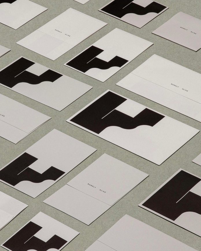
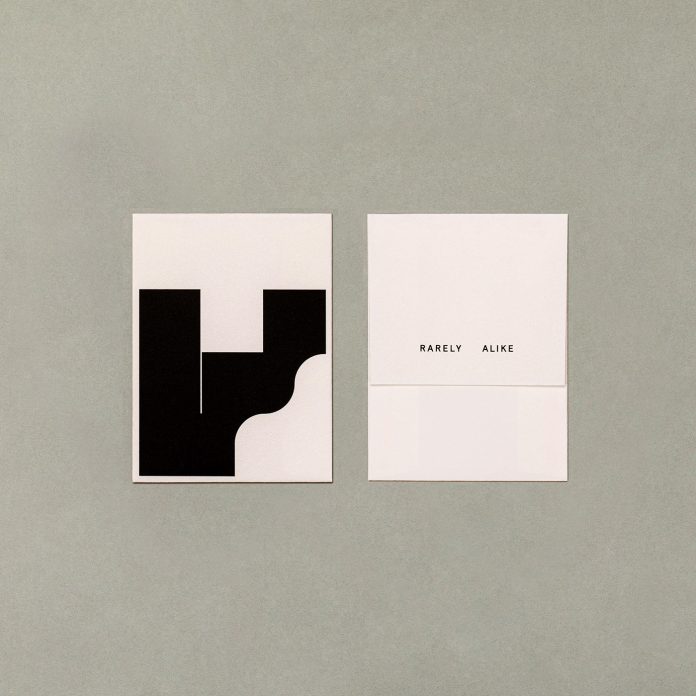
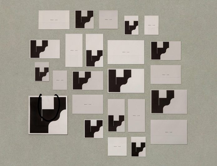
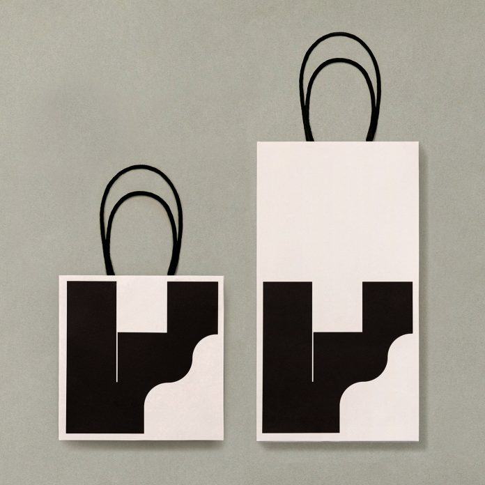
Han Gao of graphic design studio Workbyworks created this minimalist brand identity for Rarely Alike.
Han Gao was asked to work on a brand identity for Rarely Alike, a clothing brand embed with a touch of sculptural aesthetics. The logo mark is an expression of the letter “r”. The identity system incorporates two slightly different colors to emphasize the idea of abnormality in every detail.
Below you can see a few images of the brand identity. For those who want to see more of Han Gao’s creative work, feel free to check out the designer’s portfolio on Behance.
All images © by Han Gao. Do not hesitate to find more inspiring projects in the Graphic Design and Branding categories.
Subscribe to our newsletter!


