
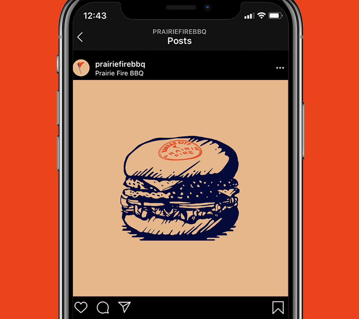
The graphic designers of White Bear Studio have created a visual language for BBQ restaurant Prairie Fire based on a handcrafted logotype and American-style illustrations.
“Prairie Fire’s mouth-watering Kansas City BBQ has landed in the UK and is spreading like wildfire. Having officially set up shop in London’s White City, they needed their new brand identity to transport the grilled and griddled art of Kansas City BBQ around the world, while avoiding overused American clichés.
This brand world needed to be unified and able to be rolled out across the restaurant interiors, packaging, and merchandise to ensure that every touch-point promoted their proposition.”
White Bear Studio’s creative team has created a unique emblem for Prairie Fire communicating their flaming hot BBQ offering along with a distinctive American style in their business. The graphic design concept and copywriting emphasize BBQ cooking and simultaneously future proofs the Prairie Fire restaurant to eventually extend across other product lines. Below you can find some images of the new visual identity. For more of White Bear Studio’s creative work, please visit their website.


All images © by White Bear Studio. We recommend you to browse through our inspiring Graphic Design and Branding categories to find other projects realized by talented graphic designers and leading studios from all over the world.
Subscribe to our newsletter!


