
In the competitive landscape of architecture, a firm’s identity is as crucial as the structures it designs. It is the silent language that communicates vision, precision, and trust. The recent Trek Architecture rebranding by the acclaimed markiewicz.studio serves as a compelling case study in this very language. This is not merely a story about a new logo; it is an exploration of how strategic design can elevate a respected regional player onto the national stage. The project thoughtfully addresses a common challenge: how does an established firm with a strong local reputation evolve its brand to reflect its true capabilities and ambitions for wider recognition?
The Challenge: Bridging Perception and Reality
Trek Architecture, an award-winning studio from the Pacific Northwest, had a solid foundation. The firm was known and respected for its quality, technical skill, and a client-first approach. Yet, a disconnect existed. While a powerhouse locally, its brand identity did not project the full scope of its experience and vision to a broader audience. The existing visual system was fragmented, lacking the cohesion necessary to make a memorable impact beyond its immediate territory.
Identifying the Core Issues
Before any creative work could begin, markiewicz.studio undertook a thorough analysis of the brand’s pain points. Several key issues emerged, painting a clear picture of the challenges ahead.
Visual and Systemic Deficiencies:
- A Fractured Identity: The studio lacked a cohesive visual system, leading to inconsistencies across different platforms and materials.
- Logo Ambiguity: Multiple versions of the logotype were in use without a clear hierarchy, diluting brand recognition.
- Lack of Guidelines: There were no defined rules for communication, tone of voice, or the application of brand assets, creating a sense of unpredictability.
Perception and Market Positioning:
- Understated Presence: The brand was perceived by some as a younger, emerging studio rather than the established and trustworthy partner it was.
- Competitive Differentiation: Without a strong, unique identity, Trek Architecture struggled to stand out clearly from its competitors in a crowded market.
- Limited Media Footprint: The firm had a weak presence in industry publications and a communication strategy that wasn’t structured for growth.
The Solution: A New Visual Language Rooted in Strategy
The core task for markiewicz.studio was clear: to forge a new brand identity that accurately reflects Trek Architecture’s stature. The identity needed to communicate that this is a studio with the resources, skill, and vision to handle highly demanding projects. However, this transformation had to be an evolution, not an erasure. The rebranding had to preserve the elements that were already working and recognized by the local market.

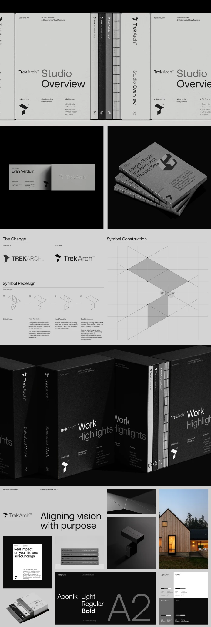
Reimagining the Symbol: From 2D Icon to 3D System
The heart of the old identity was its symbol—a letter ‘T’ constructed from equilateral triangles shown in perspective. Markiewicz.studio recognized the conceptual strength of this mark and chose to refine it rather than replace it. The goal was to unlock its hidden potential and build an entire visual system from its foundational geometry.
The new Trek symbol is a masterstroke of minimalist design. Its key innovation is the ability to transition seamlessly between 2D and 3D space. Conceived as a modular, isometric solid, the symbol can be presented with depth and dimension, reflecting the spatial language of architecture. When flattened into a single color, it transforms into a clean, distinctive, and memorable icon. This duality became the cornerstone of the new visual language. This dynamic quality allows for endless experimentation with form and movement, providing a rich toolkit for motion design and graphic extensions. What does it mean for a brand’s mark to live in both two and three dimensions? It suggests a brand that is both grounded in principle and flexible in application.
A System Built on Clarity and Confidence
The new visual language is disciplined, confident, and functional. It is built upon a rigorous typographic grid, creating distinctive compositions through a powerful contrast in scale between elements. Markiewicz.studio intentionally stripped away excessive decorative details and superfluous effects. This minimalist approach serves a distinct purpose: it highlights competence, stability, and purposeful execution—the very qualities that define Trek Architecture’s work.
The Results: A Transformative Rebranding
The impact of this strategic overhaul was profound. Markiewicz.studio replaced a generic and inconsistent system with a cohesive and powerful visual language.
Tangible Visual and Strategic Outcomes:
- A Scalable System: Trek Architecture now possesses a scalable visual system with a redefined symbol, modular graphics, unified typography, and motion elements designed for long-term growth.
- Clear Brand Hierarchy: The new identity introduced a clear hierarchy and structured design logic, ensuring consistency across all applications.
- Enhanced Brand Perception: Visually, the brand now stands apart from its competitors. The identity reinforces key traits of stability and credibility while simultaneously emphasizing precision, courage, and modernity.
- Cohesive Communication: A new communication strategy was developed, complete with a defined brand personality, tone of voice, and a compelling value proposition. The attributes of Integrity, Vision, and Established were elegantly translated into the visual identity.
Ultimately, the Trek Architecture rebranding by markiewicz.studio is more than just a successful design project. It is a testament to the power of strategic thinking in branding. It demonstrates how a deep understanding of a client’s core values, combined with a bold and disciplined creative vision, can transform a brand’s presence and prepare it for a future of continued growth and influence. The result is an identity that is not only beautiful but also intelligent and built to last.
All images © markiewicz.studio. Don’t hesitate to find other inspiring projects created by leading design studios in the Branding and Graphic Design categories here at WE AND THE COLOR.
Subscribe to our newsletter!


