
In the heart of Lithuania’s financial world, a significant evolution is taking place. Šiaulių Bankas, a name synonymous with regional trust for decades, has embraced a bold new identity: Artea. This pivotal rebranding, expertly guided by andstudio, represents far more than a cosmetic update. It is a calculated and inspiring move, transforming a local institution into a modern, nationally significant financial brand ready to compete on a larger stage. The Artea rebranding is a powerful example of how strategic design can redefine a company’s trajectory. This shift directly addresses a market dominated by foreign banks and meets the demands of a new generation expecting seamless digital experiences.
The Strategic Vision Behind Artea’s Rebranding
Why did a bank with a solid reputation feel the need for such a fundamental change? The answer lies in ambition and adaptation.
Moving Beyond Regional Roots
Šiaulių Bankas held a strong position as a regional financial anchor. However, its identity was intrinsically tied to this local perception, which posed a challenge for national growth. To attract new, younger customers and expand its reach, the bank needed an identity that could convey both its long-standing trustworthiness and a forward-looking vision. Consequently, the Artea rebranding became a cornerstone of its updated strategy. The bank now aims to double its business clients to 40,000 and grow to one million private customers by 2029.
What’s in a Name? The Meaning of Artea
The name “Artea” was a stroke of genius. It originates from the Lithuanian word “artėja,” which means “it is coming closer.” This name beautifully captures the brand’s dual promise. First, it honors the bank’s legacy of personal, close relationships with its clients, an evolution of its original “Arčiau” (closer) strategy. Second, it embodies momentum and ambition, signaling a future that is rapidly approaching. This name now unifies all of the group’s companies, creating a single, powerful brand identity.
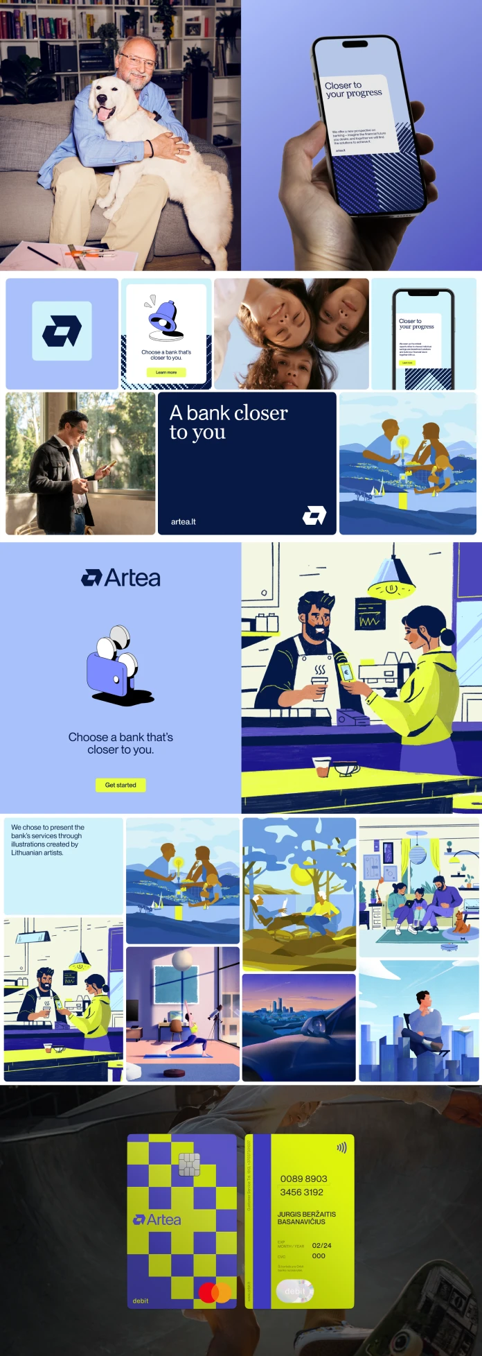
A Masterclass in Visual Identity: The andstudio Approach
The success of Artea’s rebranding hinges on a visual language that is both deeply Lithuanian and universally modern. This is where andstudio’s thoughtful approach shines.
Finding Inspiration in Lithuanian Heritage
Instead of adopting the cold, generic look common in the financial sector, andstudio turned to Lithuania’s rich cultural tapestry. Their team conducted extensive research into traditional Lithuanian patterns found across different regions of the country. They then skillfully abstracted these historical motifs, creating a unique and authentic design foundation. This strategy cleverly avoids both sterile corporate visuals and dated folkloric clichés, resulting in something entirely new. What does it mean for a brand to truly reflect its culture? Artea provides a compelling answer.

Building a Modular and Modern Design System
The abstracted patterns became the building blocks for a flexible, modular design system. This system’s centerpiece is the custom “a” logo, a mark that feels both timeless and contemporary. The beauty of this modular language is its scalability. It adapts effortlessly across every brand touchpoint, from dynamic motion graphics and digital banking platforms to the intricate details on a debit card. A modern blue color palette reinforces a sense of clarity, technological readiness, and trust. Furthermore, the system smartly distinguishes between retail and premium banking segments through subtle visual cues, all while maintaining a cohesive and unified brand presence.
Market Impact and a Future-Focused Strategy
A rebranding project’s ultimate success is measured by its real-world impact. For Artea, the results were immediate and overwhelmingly positive.
When the new brand was officially presented to shareholders on Nasdaq, the market responded with enthusiasm. Artea’s stock price surged, reaching the second-highest level in its history. This remarkable reception was a clear vote of confidence from investors in the bank’s new direction and ambitious goals. It demonstrated that the Artea rebranding was not just a design exercise but a powerful business strategy.
This renewed identity also strengthens Artea’s position as a technologically advanced institution. It provides a modern framework that supports crucial partnerships with technology firms like Validata and Temenos, signaling that the bank is fully equipped for scalable growth and digital innovation. The transformation from Šiaulių Bankas to Artea is a powerful narrative of how a legacy institution can successfully reinvent itself. It proves that by honoring its roots while embracing the future, a brand can inspire confidence, drive growth, and capture the imagination of a nation.
This collaborative project also involved Synthesis Consulting Group for brand strategy, Neat Digital for the website development, and Particle Agency for public relations, with unique illustrations contributed by Lithuanian artists Lina Disciplina, Liudas Barkauskas, and Arūnas Kačinskas.
All images copyrighted by andstudio. Don’t hesitate to browse WE AND THE COLOR’s Graphic Design and Branding categories for more.
Subscribe to our newsletter!


