
This post contains affiliate links. We may earn a commission if you click on them and make a purchase. It’s at no extra cost to you and helps us run this site. Thanks for your support!
Is Patron a Font You Need to Know? A Deep Look at Milieu Grotesque’s Unique Creation
Sometimes you stumble upon a typeface that feels… different. It catches your eye, makes you pause, and you wonder: “What is that?” We’ve all been there. Today, we’re going to talk about a typeface that does just that: the Patron font family from Milieu Grotesque. But it isn’t just a pretty face. It has a history, an inspiration, and a personality all its own. So, are you ready to explore something a bit out of the ordinary?
This isn’t your average sans-serif. Forget the predictable. Patron walks a tightrope between two very different design philosophies. This unique balancing act results in a typeface that is both expressive and surprisingly adaptable. Think of it as a conversation between two distinct voices, two iconic typographers, and their ideas. Curious yet?
The Contrasting Inspirations Behind Patron
So, who are these typographic giants that whispered their ideas into the DNA of Patron? Well, the first is Günther Gerhard Lange. He’s known for his meticulous, precise, and almost architectural approach to type design. Think of him as the engineer, the one who insists on perfect proportions. Lange’s work often feels grounded and rational. Then, we have the other side of the coin: Roger Excoffon. His typefaces are bursting with energy, movement, and a certain playful flair. Excoffon’s work is the rebel, the one who’s not afraid to break the rules. Can you imagine these two completely different approaches to type being used as inspiration for one font family? That’s where the magic of Patron starts.
How Patron’s Typeface Merges Two Distinct Styles
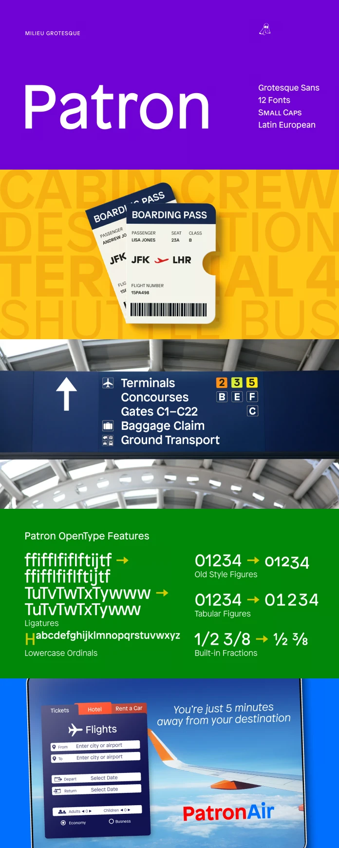
How do you blend precision and playfulness? That’s the question designer Timo Gaessner, of Milieu Grotesque, had to answer. He chose not to pick a side, but to create a dialog between these seemingly opposite forces. The result is a sans-serif that has a rigorous structure reminiscent of Lange’s work and also embraces the unconventional spirit of Excoffon’s style. The designer infused it with features like a generous x-height that gives the font a striking presence and a lot of weight. He also added some flared stroke endings, a nod to Excoffon’s dynamic forms.
The balance in Patron is key to its appeal. It’s not just a random collection of traits. It’s a thoughtful and deliberate combination that creates something new. You get the dependable feel of a classical sans-serif. But you also have a touch of unexpected personality that sets it apart.

Why the Patron Font Family Stands Out in a Crowd
What really sets Patron apart from other fonts in its category is the beautiful tension it carries. Most sans-serif fonts choose to be either very structured or very informal. But Patron finds a beautiful space in between. This characteristic gives it a certain versatility. It’s comfortable in many different settings. It can be powerful and authoritative, but it can also be used in more casual, friendly designs.
You might be asking, “How is this useful to me?”. Think about this, when you need a font that isn’t boring but still gets the message across. Maybe a logo for a brand that is both serious and innovative. Or website copy that needs to be both easy to read and a bit memorable. That’s where Patron shines. It’s not just a font, it’s a tool for communication that has style and substance.
Exploring the Details of the Patron Typeface
Let’s get a little more technical. The generous x-height mentioned before makes the text very legible even at small sizes. The flared stroke endings add just enough personality without compromising its overall readability. The weight distribution is balanced in a way that makes the font feel solid and stable, but not static.
These aren’t accidental details, they are all deliberate choices made by Gaessner. He put a lot of thought into making the Patron typeface. The result is that this isn’t just a font. It’s a complete system for creating strong, impactful typography. Milieu Grotesque has really crafted a special piece of design with this family.
Who Should Use this Typeface?
So, is Patron right for you? Well, it depends on your needs. But it’s definitely worth considering if you are looking for a font that is:
- Unique: If you want something that will make your designs stand out, the Patron is a great candidate.
- Versatile: The balanced nature of this typeface makes it suitable for a wide range of uses.
- Modern: It feels contemporary without chasing trends, it is modern but timeless.
- Expressive: It has the potential to convey different emotions with a subtle dynamic.
Patron in Action: Examples and Applications
Imagine a sleek, modern website for a tech startup. Patron is not only eye-catching, but it is readable and reliable. Now picture a bold, artistic poster for a music festival. The personality of the font can convey a vibrant, energetic vibe. It’s a font that adapts. It’s at home in both corporate and creative environments.
A Typeface Worth Trying
The Patron font family by Milieu Grotesque is not just another sans-serif typeface. It’s a font with a story and a unique character. It’s a well-crafted piece of design. So, if you’re looking for a font that will give your designs a touch of something different, Patron is definitely worth exploring. This typeface understands the rules but is not afraid to bend them. Perhaps, it’s the new secret weapon your design toolkit needs. What do you think, would you give it a try?
You can find more trending typefaces in the Fonts category on WE AND THE COLOR.
Subscribe to our newsletter!


