Crafting Authenticity: Foxtrot Design Studio’s Artistry in Palone Ziarno Coffee Roastery’s Branding
Foxtrot Design Studio‘s canvas expanded when they embarked on the journey to craft the visual identity for Palone Ziarno Coffee Roastery. A small, family-run haven of coffee craftsmanship, Palone Ziarno prides itself on the authenticity of its craft-roasted beans sourced from the continents where coffee thrives, unadulterated by any chemical enhancers. With this commitment to purity in mind, Foxtrot Design Studio delved into the depths of creativity to encapsulate Palone Ziarno’s essence through design. Feel free to read more below. We also recommend checking out Foxtrot Studios’ portfolio on Behance.
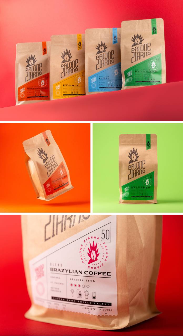
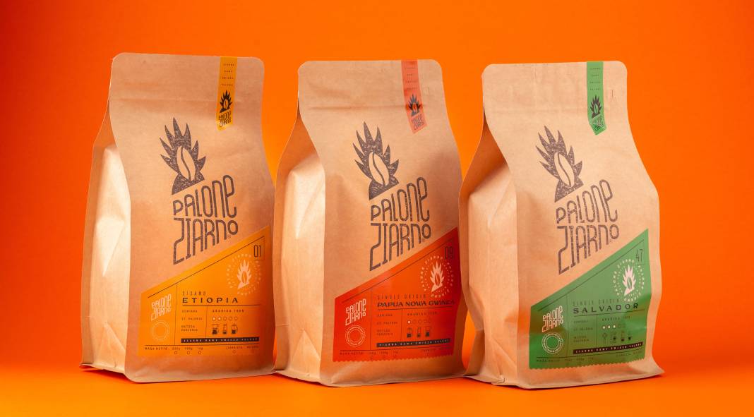
At the heart of their approach lay a vision to retain a raw, eco-friendly aesthetic coupled with a burst of vibrancy on each package. The challenge was to merge the rugged, artisanal feel with a visually striking and distinctive label, which Foxtrot Design Studio embraced wholeheartedly.
Diving into a spectrum of blends, each possessing its unique character, they painted a vivid narrative by infusing bright, contrasting colors into the packaging. The canvas, in this case, was expansive—the generous coffee bags allowed for prominent branding. Here, the genius of Foxtrot Design Studio unfolded. Employing a bespoke technique, each bag bore a unique stamp, the company’s emblem dipped in paint, leaving an irregular, one-of-a-kind finish on every package—a testament to the handcrafted dedication behind each blend.
But the ingenuity didn’t stop there. Beyond the recycled materials and the stamped bags lay a kaleidoscope of colors—a vibrant label for each product. These hues weren’t arbitrary; they served a purpose beyond aesthetics. Each color became the beacon, guiding consumers through a sensory journey. They encapsulated vital information about each blend, as a gateway to understanding the subtle nuances within every packet.
The result was a symphony of contrasts—the rough and the refined, the irregular and the vibrant—melding seamlessly to create an evocative packaging system. It wasn’t just about aesthetics but a careful curation to communicate with the consumer. The clear presentation of information on each label didn’t just inform; it whispered a playful invitation, beckoning the consumer to explore and discover the soul of each coffee blend.
In the hands of Foxtrot Design Studio, Palone Ziarno’s identity transcended mere packaging; it became a tactile, visual narrative—an invitation to savor the genuine and exceptional products within. The amalgamation of earthy authenticity and vibrant allure on each bag not only adorned the shelves but also spoke volumes about the dedication and artistry that define Palone Ziarno Coffee Roastery.
Foxtrot Design Studio’s stroke of genius breathed life into the essence of Palone Ziarno—a testament to the power of design in telling stories and invoking emotions beyond words.
Don’t hesitate to find more graphic design, branding, and packaging design projects featured on WE AND THE COLOR.
Subscribe to our newsletter!

