
This post contains affiliate links. We may earn a commission if you click on them and make a purchase. It’s at no extra cost to you and helps us run this site. Thanks for your support!
Gyst: The Perfect Fusion of Grotesque and Antiqua Principles in Typeface Design.
In typography, the marriage of tradition and innovation often leads to remarkable creations. One such typeface that captures this harmonious blend is Gyst, a neo-humanist sans-serif typeface meticulously crafted by Roland Hörmann of foundry phospho. Gyst pushes the boundaries of typographic design by artfully blending the principles of Grotesque and Antiqua, resulting in a typeface that seamlessly transitions from a modern humanistic sans-serif to a captivating calligraphic serif. With its contrasting strokes, luscious terminals, and a plethora of alternates and ligatures, Gyst embodies the perfect balance of geometric precision and flourishing sophistication.
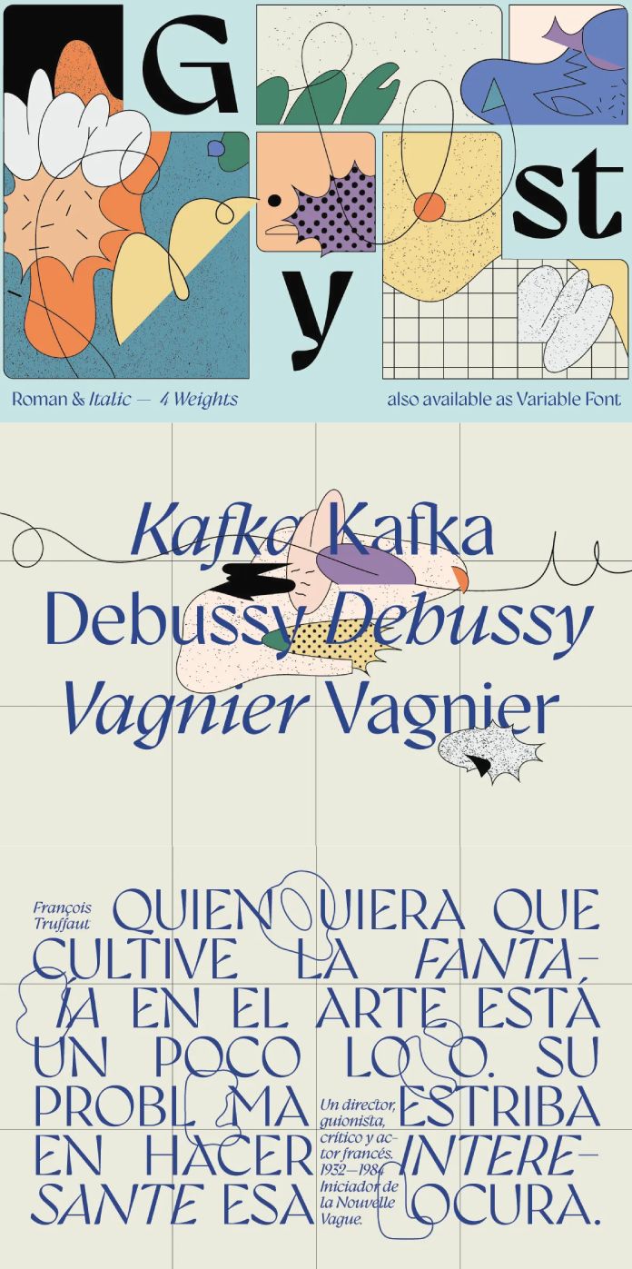
The Evolution of Gyst: Gyst’s unique identity lies in its ability to traverse between two distinct typographic styles, offering designers a versatile tool for various applications. The typeface starts with classic uprights that embody the principles of a modern humanistic sans-serif. These uprights establish a solid foundation, delivering a clean and contemporary aesthetic perfect for body text and legibility.
However, Gyst’s true innovation unfolds when it ventures into its true italics. Here, the serifs come to life, paying homage to the graceful forms of traditional Antiqua typefaces. The calligraphic nature of these serifs adds a touch of elegance and sophistication, making Gyst a compelling choice for display purposes, headlines, and other impactful design elements.
Design Elements of Gyst: Gyst’s design elements beautifully reflect the convergence of Grotesque and Antiqua principles. The contrasting strokes add visual interest and dynamism, creating a delightful interplay between thick and thin lines. This interplay not only enhances the legibility of the typeface but also imparts a sense of depth and character to the text.
One notable feature of Gyst is its razor-edged terminals. These precise and sharp endings contribute to the typeface’s overall grace and distinctiveness. They serve as a reminder of the geometric precision that underlies Gyst’s design while still exuding a sense of sophistication and refinement.

The Richness of Alternates and Ligatures: To further expand its expressive capabilities, Gyst is equipped with an extensive range of alternates and ligatures. These additional glyphs provide designers with endless possibilities to experiment and create truly unique typographic compositions. Whether it’s adding a swash to a capital letter or connecting characters with stylish ligatures, Gyst empowers designers to infuse their work with personal flair and creativity.
To sum it up, Gyst stands as a testament to the creative potential of typographic design. By blending the principles of Grotesque and Antiqua, Roland Hörmann of foundry phospho has created a typeface that seamlessly transitions from a modern humanistic sans-serif to a captivating calligraphic serif. Gyst’s contrasting strokes, luscious razor-edged terminals, and abundant alternates and ligatures make it a versatile tool for both body text and display use.
As designers continue to explore new possibilities in typography, Gyst represents an exciting milestone in the evolution of typefaces. It bridges the gap between tradition and innovation, inviting designers to push the boundaries of typographic expression. With Gyst, the timeless beauty of Antiqua and the modern clarity of Grotesque find their perfect fusion, offering a delightful typographic experience that appeals to both the rational and the emotive senses.
Feel free to find more font reviews on WE AND THE COLOR.
Subscribe to our newsletter!


