Exploring Elegance: A Deep Dive into the Classique Font Family
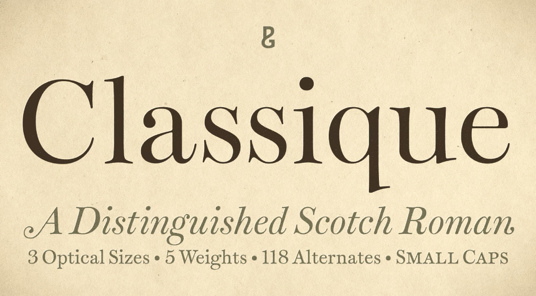
Only fonts capture the essence of timeless sophistication quite like the Classique font family by acclaimed typographer Paulo Goode. Crafted with meticulous attention to detail and a keen eye for elegance, this font family stands as a testament to the enduring allure of classic design principles fused with modern sensibilities.
Embracing Tradition with a Contemporary Twist
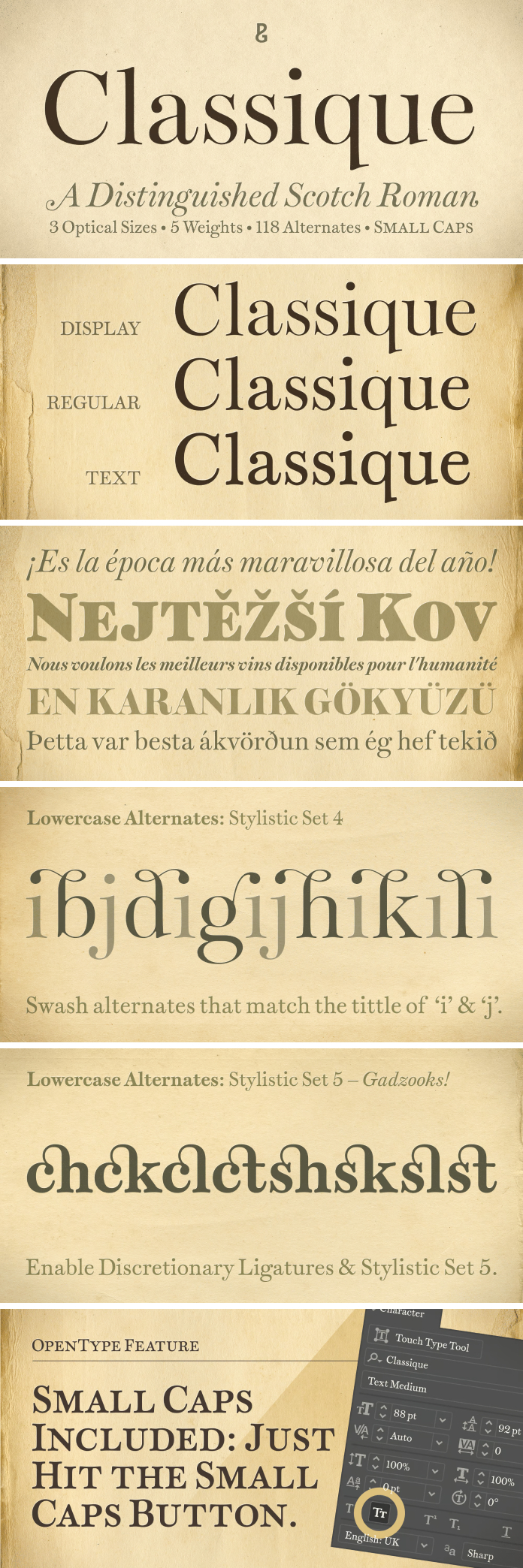
Classique represents a harmonious blend of tradition and innovation. Drawing inspiration from classic serifs while infusing a contemporary flair, each letterform exudes a sense of refinement and grace. The delicate balance between the traditional and the modern is evident in every aspect of the font family, from its graceful curves to its subtle yet impactful details.
Versatility Personified
One of the hallmark features of the Classique font family is its remarkable versatility. Whether gracing the pages of a high-end fashion magazine, adorning the packaging of luxury goods, or lending an air of sophistication to digital interfaces, Classique effortlessly adapts to diverse design contexts with ease. Its range of weights and styles provides designers with the flexibility to experiment and explore various typographic expressions, ensuring that every project is imbued with a touch of timeless elegance.
Precision Craftsmanship
Behind the timeless beauty of Classique lies a dedication to precision craftsmanship. Paulo Goode’s meticulous attention to detail is evident in every aspect of the font family, from the meticulously crafted letterforms to the carefully balanced spacing and kerning. Each glyph is meticulously honed to perfection, resulting in a typeface that exudes a sense of harmony and refinement in every word, sentence, and paragraph.
Seamless Integration
In today’s digital landscape, seamless integration across different platforms and devices is essential. The Classique font family excels in this regard, offering robust support for a wide range of languages and character sets, ensuring that your message is communicated clearly and effectively to audiences around the globe. Whether in print or on screen, Classique maintains its impeccable legibility and visual appeal, making it an ideal choice for projects with a global reach.
Elevating the Design Experience
More than just a typeface, Classique elevates the entire design experience, transforming ordinary projects into extraordinary works of art. Its timeless elegance and understated sophistication add a touch of class to any design, leaving a lasting impression on viewers and conveying a sense of refinement and prestige.
Conclusion
In a world inundated with fleeting trends and fads, the Classique font family by Paulo Goode stands as a beacon of timeless elegance and enduring style. With its seamless blend of tradition and innovation, remarkable versatility, and precision craftsmanship, Classique represents the epitome of sophisticated typography. Whether adorning the pages of a prestigious publication or gracing the digital interfaces of leading brands, Classique elevates every design it touches, leaving a lasting impression on viewers and setting a new standard for typographic excellence.
Feel free to find other recommended typefaces on WE AND THE COLOR.

