This post contains affiliate links. We may earn a commission if you click on them and make a purchase. It’s at no extra cost to you and helps us run this site. Thanks for your support!
The Ordinary Font: Why This Deceptively Simple Typeface is a Designer’s Secret Weapon
Are you looking for a typeface that is not loud and not flashy, but one that just works? One that feels both timeless and modern. A font that communicates clarity, confidence, and elegance without shouting. If you’ve been on that quest, you need to meet the Ordinary font family. It’s a name that might sound simple, but its performance is anything but. This typeface doesn’t need to yell to be heard; its quiet strength is exactly what makes it so powerful.
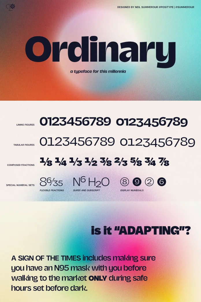
The Ordinary typeface is a serif typeface that feels immediately familiar, like a classic novel you can’t put down. Yet, it has a crispness that makes it perfect for today’s digital screens. It was designed to be a true workhorse. You know, the kind of font you can rely on for almost any project. So, what is it about this particular design that captures the attention of top-tier designers and global brands? It all comes down to a masterful blend of tradition and precision.
The Genius Behind the Ordinary Font Family
Let’s look closer at what sets this typeface apart. The Ordinary font family is not a revival of an old classic. Instead, it’s a contemporary design that pays homage to calligraphic roots. You can see the influence of a steady hand and a sharp nib in its construction. It has a healthy contrast between its thick and thin strokes, which gives it a dynamic, rhythmic quality. This makes long passages of text incredibly easy and pleasant to read.
The serifs—those little “feet” at the end of the letters—are sharp and refined. They aren’t clunky or distracting. They anchor the letters to the baseline, creating a stable and authoritative look. Think of it this way: a lesser font might feel wobbly or inconsistent. The Ordinary font family, however, stands with perfect posture. Each character is meticulously crafted to work in harmony with the next. It possesses a quiet confidence that translates directly to the designs it graces. This isn’t just another font; it’s a finely-tuned instrument for communication.
Meet the Creator: Neil Summerour and Positype
So, who is the artist behind this exceptional tool? The Ordinary typeface is a creation of Neil Summerour, the founder of the Georgia-based type foundry, Positype. Summerour is not just a font designer; he is a celebrated type artist. He gives lectures, leads workshops, and dedicates his life to the craft of letterforms. His work is recognized at the highest levels of the industry.
For instance, he has been honored six times with the Type Directors Club Certificate of Typographic Excellence. He also won the prestigious People’s Choice Award in the 2012 Morisawa Type Design Competition for his Japanese script, Tegaki. His expertise is trusted by some of the biggest names in the world. Have you heard of Oculus, Facebook, or David Bowie? They have all used his typefaces and lettering. The list goes on, including Victoria’s Secret, the BBC, Revlon, L’Oreal, and Panera. Summerour currently serves as the chairman of the Society of Typographic Aficionados, a testament to his standing in the typography community. When you choose the Ordinary font family, you are using a tool forged from decades of experience and a deep love for the art of the letter.
Exploring the Family: The Versatility of the Ordinary Font
A great typeface is rarely a single style. It’s a family. The Ordinary font family offers a fantastic range of weights and styles, making it incredibly versatile. You get everything from a delicate Thin to a powerful Black, with a full suite of weights in between, including Light, Regular, Medium, and Bold.
What does that mean for your designs? It means you have a complete typographic toolkit in one package. You can use the lighter weights for elegant, airy headlines or sophisticated body text. The Regular weight is a true champion of readability, perfect for long-form articles, reports, and books. As you move up to the Bold and Black weights, you get real power. These are perfect for impactful headlines, logos, and call-to-action buttons that demand attention. And, of course, each weight comes with a corresponding italic. The italics for the Ordinary typeface are not just slanted versions of the upright letters; they are true italics with their own calligraphic flair and grace.
Practical Uses for a Timeless Typeface
So, where does the Ordinary font family truly shine? Its versatility makes it a top contender for a wide array of projects. Because of its clarity and professional feel, it’s one of the best serif fonts for branding. It can give a new company an immediate sense of history and trustworthiness. For an established brand, it can offer a refresh that feels classic, not trendy.
Think about editorial design. For magazines, both in print and online, the Ordinary typeface provides exceptional readability. Its balanced rhythm guides the reader’s eye effortlessly across the page. This makes it a fantastic choice for website body copy, where long reading sessions are common. In web design, pairing a bold headline in the Ordinary font family with a simple, clean sans-serif for the user interface creates a beautiful and functional hierarchy. You can also see it working wonderfully for packaging, where it can convey a sense of quality and craftsmanship for a product.
How to Pair the Ordinary Font Like a Pro
Font pairing is an art, and the Ordinary typeface is a wonderful dance partner. Its classic structure allows it to pair beautifully with many other typeface styles. The key is to create contrast.
A classic and foolproof pairing is with a clean, geometric sans-serif. Think of fonts like Montserrat, Lato, or Proxima Nova. Use the Ordinary typeface for your headlines to provide elegance and character, and use the simple sans-serif for your body text for a modern, minimalist feel. This combination is a workhorse for corporate websites, annual reports, and digital publications.
Alternatively, do you want to create a more dynamic and expressive layout? Try pairing the Ordinary font family with a humanist sans-serif, like Gill Sans or Fira Sans. These sans-serifs have more organic, human-like qualities that resonate with the calligraphic roots of Ordinary. For a touch of pure luxury, you could even pair a bold headline in the Ordinary font with a delicate, flowing script font for a short sub-headline or accent. The stability of Ordinary provides the perfect foundation for a more decorative font to shine without overwhelming the design.
Why “Ordinary” is the New Extraordinary
Let’s talk about the name. Calling this meticulously crafted typeface “Ordinary” seems like a paradox, doesn’t it? But it’s actually a stroke of genius. In a design landscape often saturated with novelty fonts vying for attention, a font that is simply “ordinary” becomes a statement. It represents a return to quality, readability, and function.
The name challenges us to reconsider what we value in typography. Is it the loudest font in the room, or the one that does its job so perfectly it becomes invisible, allowing the message to take center stage? The Ordinary font family champions the latter. It builds trust with the reader through its familiarity and flawless execution. It doesn’t need to prove itself with quirky details. Its extraordinariness lies in its perfect, well, ordinariness.
So, the next time your project calls for a serif typeface, don’t just look for something decorative. Ask yourself if you need a reliable, beautiful, and highly functional tool. The Ordinary font is more than just a set of letters; it’s a solution. It’s a testament to the idea that sometimes, the most powerful choice is the one that feels foundational, classic, and effortlessly correct. It’s a font that works with you, not against you, to create designs that are clear, compelling, and built to last.
Feel free to find other trending typefaces here at WE AND THE COLOR.


