
This post contains affiliate links. We may earn a commission if you click on them and make a purchase. It’s at no extra cost to you and helps us run this site. Thanks for your support!
Typography rarely stands still. Every generation redefines how form and function meet on the page and screen. Flink Slab by Identity Letters does exactly that — it brings geometry to life with a tactile, industrial edge that feels unmistakably modern yet deeply rooted in design tradition. Created by Moritz Kleinsorge, this slab serif family isn’t just another addition to the geometric genre. It’s a type system built for designers who demand precision, emotion, and adaptability in one cohesive toolkit.
You can purchase the entire superfamily from:
What Makes Flink Slab Distinct
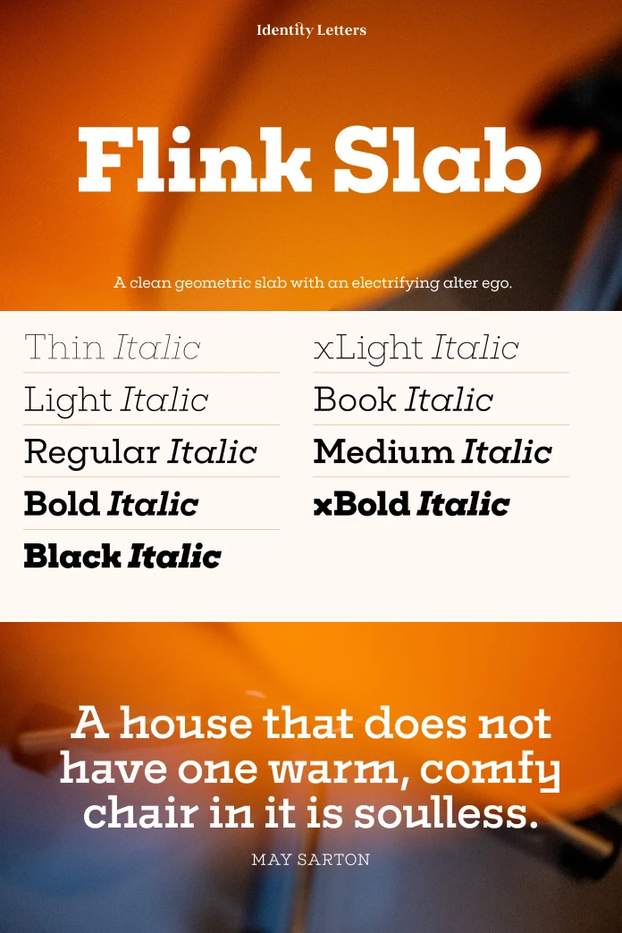
At its core, Flink Slab is a clean geometric superfamily with unbracketed slab serifs that exude confidence. Its design shares a structural DNA with Flink Neue, Identity Letters’ geometric sans counterpart. The result? A pair of type families that align perfectly in proportions, vertical metrics, and rhythm.
You can purchase the entire superfamily from:
This harmony makes it easy for designers to combine the two — think editorial layouts, corporate identities, packaging, or web interfaces that need hierarchy without visual tension. Each Flink Slab font comes with over 1,300 glyphs, supporting extensive multilingual typesetting and detailed typographic refinement.

But the real spark lies in its “Voltage” alternates — high-energy letterforms that amplify the display character of the typeface. These electrifying variations turn the clean geometry into something almost kinetic, channeling the spirit of Futurism with a raw, industrial flavor.
The Character and Philosophy Behind Flink Slab
Flink Slab feels engineered rather than simply drawn. Every curve, corner, and serif suggests control — yet it never feels sterile. It balances precision with personality. The subtle tension between its mechanical construction and human rhythm gives the typeface a unique texture that sets it apart from other slabs.
This is a typeface designed for designers who value intentionality. Whether used in branding, editorial work, or UI, Flink Slab adapts without losing its identity. It’s strong but not loud, bold yet legible, assertive without being aggressive.
It’s worth asking: What does modern typography need most today — character or consistency? Flink Slab quietly argues for both. It proves that structure and soul can coexist.
The Vision of Moritz Kleinsorge and Identity Letters
Designer Moritz Kleinsorge has built a distinct voice in contemporary type design. His work for Identity Letters often explores how geometric rigor can coexist with expressive flair. Flink Slab extends this philosophy. It’s not just a slab-serif version of Flink Neue; it’s a statement about modularity, versatility, and timeless design logic.
The type family’s 108 individual styles offer both range and reliability. From ultra-thin to heavy weights, from text-optimized cuts to display-driven “Voltage” versions — the system feels meticulously engineered for the realities of modern design workflows.
This flexibility gives designers freedom without friction. Typography becomes less about compromise and more about orchestration — every element working in sync across mediums.
Flink Slab in Use: Practical Design Scenarios
The geometric structure of Flink Slab makes it ideal for projects that demand order and clarity — from editorial design and corporate branding to digital interfaces and signage. Yet, the Voltage alternates introduce expressive dynamism perfect for poster design, album artwork, or motion graphics.
Imagine a magazine headline that feels engineered yet emotional. Or a brand wordmark that blends technical authority with creative confidence. Flink Slab thrives in these spaces.
Designers pairing Flink Slab with Flink Neue unlock a harmonious system — slab and sans in perfect dialogue. The visual continuity across both families makes it easier to create unified brand ecosystems without visual noise.
Why Flink Slab Matters Right Now
The current design landscape leans toward clarity and adaptability. Brands seek typefaces that function across analog and digital worlds, maintaining a consistent voice from logo to interface. Flink Slab speaks to this demand with remarkable precision.
Its geometric foundation ensures usability, while its industrial undertones connect it to broader design movements — brutalism, modularity, and raw material aesthetics. It’s typography for an era fascinated by both structure and authenticity.
There’s also something quietly rebellious about Flink Slab. Amid a flood of overly polished fonts, it reintroduces the tactile imperfections of design — the feeling that letters can carry weight, tension, and intent.
A Personal Perspective
As a creative observer, one can’t ignore how Flink Slab bridges eras of design thinking. It echoes the rationalism of early modernism while embracing the energy of contemporary design culture. Its Voltage alternates bring a pulse to otherwise static geometry. It’s a font that rewards close attention — a rare quality in a market oversaturated with instant, forgettable sans-serifs.
Flink Slab doesn’t try to be trendy. It’s built to last. That longevity is its strongest aesthetic statement.
Final Reflection: The Geometry of Emotion
Typography, at its best, is about connection — between form and meaning, designer and audience. Flink Slab captures that connection through geometry that feels alive. It’s not just a tool for composition; it’s a medium for expression, one that merges clarity with attitude.
You can purchase the entire superfamily from:
For designers searching for a typeface that feels engineered yet human, Flink Slab stands as one of the most relevant releases of recent years — a typographic system built not only to serve but to inspire.
Feel free to browse WE AND THE COLOR’s Fonts category for more.
Subscribe to our newsletter!


