
This post contains affiliate links. We may earn a commission if you click on them and make a purchase. It’s at no extra cost to you and helps us run this site. Thanks for your support!
Luck Typeface: A Bold Journey into Retro-Groove Aesthetics
There is currently a powerful wave of nostalgia, and the Luck typeface, a vibrant creation by Laire Banyu and Dyaharum Pungki Revitasari of Jolicia Type, perfectly captures this sentiment. This bold display font is more than just a collection of letters; it is an energetic statement. Moreover, it channels the groovy, free-spirited essence of the 1970s, reimagined for contemporary design challenges. Its distinct personality makes it a compelling choice for designers aiming to inject warmth and character into their work. Why does a typeface like Luck resonate so strongly today?
Understanding the Visual Language of Luck
The Luck typeface presents a visual feast of chunky letterforms and fluid, rhythmic curves. Its design DNA is deeply rooted in the retro aesthetics that defined a generation. However, it avoids being a mere historical imitation. Instead, it offers a fresh, modern interpretation of a beloved style. This makes it incredibly versatile for a wide range of creative projects. Consider the bold weight and playful energy it brings to any design.
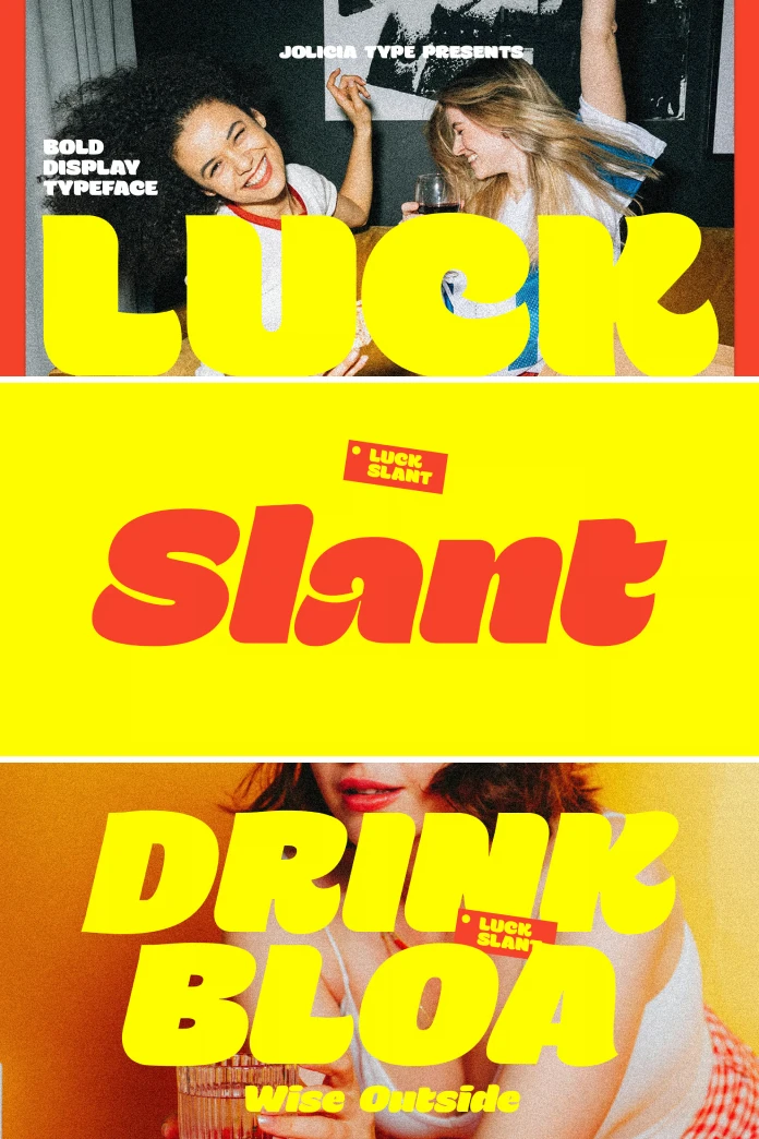
The Upright and Slant Variations
Jolicia Type offers Luck in two expressive styles: Upright and Slant. The Upright version stands with a confident, grounded presence. Its sturdy letterforms command attention, making it ideal for impactful headlines and logos. Conversely, the Slant style introduces a sense of dynamic movement and forward momentum. This version is perfect for designs that need to convey energy and excitement. The availability of both styles provides designers with a flexible toolkit. Consequently, they can tailor the typographic voice to the specific needs of their project.
What Makes the Luck Typeface Stand Out in a Crowd?
In a sea of minimalist sans-serifs, the Luck typeface dares to be different. Its funky, almost psychedelic, curves are its most defining feature. These elements create a sense of playfulness and approachability. The font’s bold strokes ensure high visibility, even at a distance. This makes it an excellent choice for posters, packaging, and social media graphics. Its unique character ensures that any design using it will be memorable.
The Driving Force: Why Retro Fonts are Making a Comeback
The resurgence of retro typefaces like Luck is no accident. In an increasingly digital world, there is a collective yearning for the tangible and the authentic. Vintage-inspired fonts tap into a shared cultural memory. Subsequently, they evoke feelings of comfort, nostalgia, and joy. The Luck typeface capitalizes on this trend by offering a design that feels both familiar and refreshingly new. It bridges the gap between past and present with remarkable elegance.

Finding the Best Font for a 70s-Inspired Logo
When designing a logo with a 70s vibe, authenticity is key. The Luck typeface is a strong contender for several reasons. Its letterforms are imbued with the era’s signature grooviness. Furthermore, its clean lines and solid construction ensure that the logo remains legible and scalable. This balance of personality and functionality is crucial for effective brand identity. How can you leverage its unique style for your next branding project?
How to Use Bold Display Fonts in Modern Web Design
Using a bold display font like Luck in web design requires a strategic approach. It works best for headings, pull quotes, and call-to-action buttons. These are the elements you want to pop. Pairing it with a clean, simple body font creates a clear visual hierarchy. This ensures that the overall design remains readable and user-friendly. The key is to use it sparingly, allowing its powerful personality to shine without overwhelming the content.
Practical Applications and Creative Inspiration
The true magic of the Luck typeface reveals itself in its application. Imagine it on the cover of a vinyl record, the packaging for an artisanal coffee brand, or the branding for a boutique music festival. Its versatility is one of its greatest strengths. It feels equally at home in both print and digital mediums. This adaptability makes it a valuable asset for any designer’s font library.
My personal take is that the Luck typeface is more than a design tool; it’s a mood board. It instantly transports the viewer to a different time while feeling perfectly at home in the present. The designers, Laire Banyu and Dyaharum Pungki Revitasari, have crafted something truly special. They have managed to distill the essence of an era into a functional and beautiful typeface. Ultimately, Luck is a celebration of bold expression and timeless design.
Don’t hesitate to find other popular typefaces on WE AND THE COLOR or check out our selection of the 100 coolest fonts for designers in 2026.
Subscribe to our newsletter!


