Los Dos Chinos Branding by Hachetresele Studio

Los Dos Chinos – coffee shop brand identity design by Hachetresele Studio.

Los Dos Chinos is an old coffee shop in the city of Buenos Aires, Argentina. Everything started in 1862, two men sold their homemade food in the streets of Buenos Aires. After this period of selling their food directly on the street, they opened their own shop around the corner. The new shop quickly became known and very popular. Today, people still love the handcrafted products, which provide a family atmosphere.

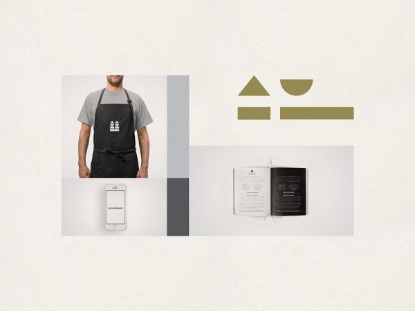
In 2015, the team of Hachetresele Studio was asked to create a redesign of the existing visual identity. Goal was to create a new identity that combines tradition with a modern approach. Hachetresele Studio’s brand solution is based on a clean graphic language with a reduced color palette. The designers have created a new logo from simple geometric shapes. This new brand identity has been used in a variety of items ranging from stationery to packaging materials.

Los Dos Chinos branding materials created by Hachetresele Studio.
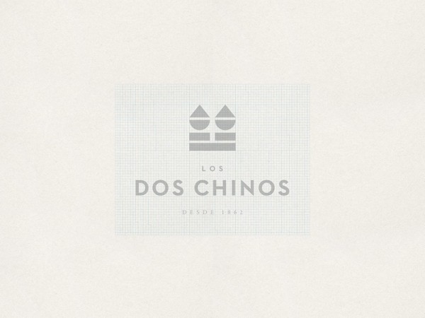
Los Dos Chinos logo design.
The company logo is based on a grid layout.
Brand symbols with basic colors.
First level corporate font: Helvetica Neue in Regular, Bold, and Italic.
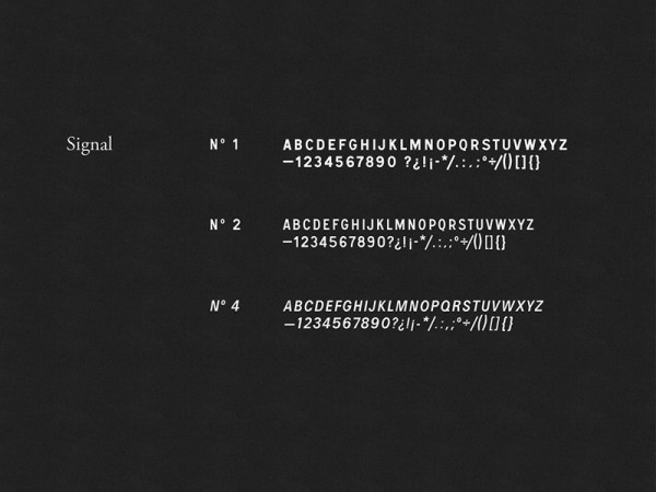
The Signal typeface serves as a secondary corporate font.
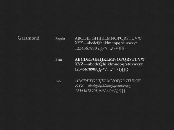
Also the Garamond font family is in use.
Los Dos Chinos is a coffee shop in Buenos Aires, Argentina.
Simple and clean graphic elements as well as the reduced color scheme of the visual identity.
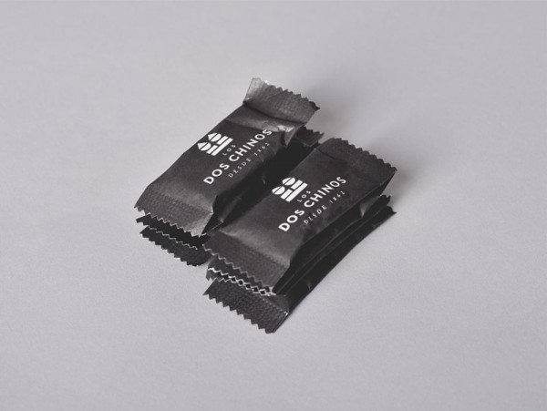
Simple and clean packaging in black and white.
The Los Dos Chinos identity follows simple and clean graphic design rules.
The team of Hachetresele Studio also designed the entire packaging range.
Los Dos Chinos' tasty bakery products.
Los Dos Chinos’ tasty bakery products.

If you like projects like that, I recommend you to have a look at our Graphic Design, Branding, and Packaging Design categories. On WE AND THE COLOR you will find a wide range of different projects.

LEAVE A REPLY

Please enter your comment!
Please enter your name here