This post contains affiliate links. We may earn a commission if you click on them and make a purchase. It’s at no extra cost to you and helps us run this site. Thanks for your support!
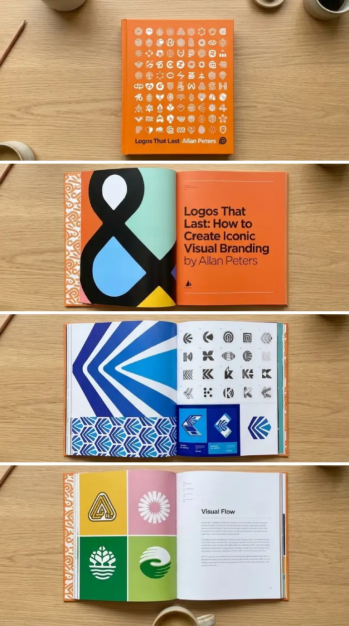
Many logos fail quietly. They launch with fanfare, get slapped on a website, and slowly dissolve into irrelevance — not because the designer lacked skill, but because nobody thought clearly about what the mark was actually supposed to do. Allan Peters thought about that for over two decades. And in Logos That Last: How to Create Iconic Visual Branding, he finally wrote it all down.
Published in November 2023 by Rockport Publishers and recognized by Graphic Design USA with the American Graphic Design Award for Book Design, the book arrives at a moment when the branding conversation has never been louder — or more confused. AI-generated logos, trend-chasing rebrands, and overnight visual identities are everywhere. Meanwhile, the question of what actually makes a logo stick around for decades rarely gets a serious answer.
Peters gives one. And it’s worth paying attention to.
What Makes a Logo Truly Iconic — and Why Most Fall Short?
Think about the logos you recognize without thinking. The Nike Swoosh. The Target bullseye. The Amazon smile. Now ask yourself: what do they have in common beyond simplicity? The honest answer is that they carry intentional permanence — a quality baked in during the design process, not added as an afterthought.
Peters introduces what I’d call the Permanence-First Principle: the idea that longevity is not a byproduct of good design — it’s a design objective in itself. Most designers optimize for the pitch. Peters optimizes for the decade after the pitch. That shift in focus changes everything about how you approach a mark.

So why do most logos fall short? Because they’re built around trends, not truths. A logo designed to feel current in 2024 will feel dated by 2029. A logo designed around a core brand truth — its purpose, personality, and position — has nowhere to go but forward.
Peters learned this while working with Google, Amazon, Disney, Target, and Nike. Those aren’t names you drop casually. They’re proof of a methodology tested at the highest level of brand scrutiny imaginable.
Allan Peters and the Architecture of Iconic Logos
Peters is the Partner and Chief Creative Officer of Peters Design Company. His client roster reads like a cultural institution roll call. His work has been recognized by Clio, Communication Arts, and How Magazine. The New York Times and CNN have called on him for expertise on logos and rebranding. None of that happens by accident.
What makes Peters particularly credible as an author isn’t just the big-brand experience — it’s the personal passion projects woven throughout his career. Those projects, built without client constraints or committee approval, are where his real thinking developed. They’re where he stress-tested frameworks, pushed mark-making instincts, and refined what he describes in the book as his hands-on, step-by-step creative process.
That process, shared publicly here for the first time, is the backbone of Logos That Last. And it challenges some comfortable assumptions in design culture.
The Iconic Mark Framework: Peters’s Core Methodology
Peters structures his approach around what I’m calling the Iconic Mark Framework — a term that captures the book’s underlying logic even if Peters doesn’t label it exactly that way. The framework operates on three simultaneous levels:
1. Conceptual Clarity
Before touching any drawing tool, Peters demands total conceptual clarity. What does this brand actually stand for? Not what the client thinks it stands for — what it provably, demonstrably stands for. This distinction matters enormously. Clients often pitch aspirational values. Peters looks for operational ones — the values already embedded in how the brand behaves.
A logo built on aspiration breaks under pressure. A logo built on operational truth holds.
2. Formal Integrity
Peters is obsessed with craft at the mark level. The geometry of a curve. The weight of a stroke. The optical spacing of a letterform. These aren’t decorative concerns — they’re structural ones. Formal integrity is what separates a logo that reads clearly at 16 pixels from one that collapses the moment it leaves the brand guidelines PDF.
This level of attention to letterform and shape is increasingly rare in a production culture that treats logo refinement as billable hours to minimize. Peters treats it as the work itself.
3. System Expandability
A great logo isn’t just a mark — it’s a seed. Peters consistently asks: what does this logo grow into? Can it anchor a color system? Support a typographic voice? Carry motion? Translate across product packaging, environmental graphics, and digital animation without losing its identity?
The book includes detailed strategies for extending a logo into a dynamic brand system — one of its most practically valuable sections. This is where many logo books stop short. Peters pushes through to the full ecosystem.
How Peters Builds Client Relationships That Produce Better Logos
Here’s something most logo design books ignore entirely: the client relationship is a design variable. Peters addresses this directly and frankly. How you manage the process — how clearly you communicate, how confidently you present, how strategically you handle feedback — directly affects the quality of the final mark.
Peters offers practical guidance on building relationships with clients while maintaining consistency and creative productivity. This isn’t soft advice about “communication skills.” It’s a hard-edged argument that the best logos come from the best-managed processes.
Designers who can’t hold the room lose control of their own work. Peters is clear about that. And his approach to client management reads less like a customer service manual and more like a strategic negotiation guide — one that keeps the design work at the center.
Concept to Completion: What the Case Studies Actually Teach You
The detailed case studies in Logos That Last are not portfolio showcase pieces. They’re forensic documents. Peters walks through designs from initial brief to final delivery — showing decision points, rejected directions, refinement iterations, and the reasoning behind every significant choice.
This matters because most designers only see finished work. They study logos that have already succeeded and reverse-engineer lessons from the outcome. Peters shows the process, including the moments of uncertainty and correction.
What do the case studies teach? Several things worth naming explicitly:
The Pressure-Test Method
Peters consistently puts early concepts under pressure before they solidify. He asks: does this mark still work when it’s wrong-colored, wrong-sized, or placed in a hostile visual environment? Logos that survive pressure tests early rarely fail in the real world. This approach — what I call the Pressure-Test Method — is one of the book’s most transferable insights.
The Iteration Discipline
Iteration in Peters’s process is not random exploration. It’s structured narrowing. Each round of concepts has a clear purpose — expanding the possibility space, then collapsing it toward the strongest solution. This discipline separates productive iteration from circular revision loops that exhaust teams and dilute results.
Turning a Good Idea Into a Great Logo
Peters offers specific tips for elevating a concept from good to great — and this section alone justifies the book’s existence for working designers. The gap between good and great in logo design is rarely a gap in idea quality. It’s usually a gap in execution or courage.
Execution means pushing the formal refinement further than one feels comfortable. Courage means resisting the impulse to hedge a strong concept with safe alternatives. Peters argues that great logos come from designers willing to commit to a direction, to a form, to a position.
He also identifies what I’d describe as the Reduction Threshold — the point in the design process where further simplification would remove meaning rather than noise. Knowing where that threshold sits is a mark of senior-level logo thinking. Peters helps you find it.
Logos That Last and the Long Game of Brand Identity
The book’s title is its thesis. Logos that last aren’t lucky. They’re built with a specific intention and a specific process. Peters is making an argument about time — that the metric most designers ignore, which is durability, is actually the most important one.
Consider what it means for a logo to last 30 years. It has to survive category disruption, leadership changes, cultural shifts, digital transformation, and multiple rebranding pressures from every direction. The marks that survive that gauntlet were almost never designed to be trendy. They were designed to be true.
Peters’s background — loving handcrafted vintage and antique goods, scouring antique malls, appreciating things built to endure — is not incidental to his design philosophy. It’s foundational. He understands, viscerally, what it means for a made thing to hold its value across time. That understanding runs through every page of this book.
How Logo Design Books Usually Fail (and Why This One Doesn’t)
Most logo design books are either portfolios with captions or abstract philosophy with no practical traction. They show you what great logos look like without explaining why they work, or they explain principles without connecting them to actual decisions.
Logos That Last does something different. It holds both levels simultaneously — the conceptual and the practical — and moves between them fluidly. Peters can discuss the philosophy of mark-making in one paragraph and the specific angle of a stroke in the next, and both feel equally grounded.
Adobe named it one of the top 20 books all graphic designers should read and own. That’s not a marketing claim — it reflects something real about the book’s unusual completeness. It works as a reference for beginners and as a recalibration tool for experienced designers who’ve drifted toward production habits.
Who Should Read Logos That Last
Peters says the book is for designers and brand strategists of any level. He’s right, but the experience of reading it differs dramatically by career stage.
If you’re early in your career, the book gives you a mental model for logo design that most designers spend ten years building informally. It compresses that learning significantly.
If you’re mid-career, it challenges habits. Many working designers have optimized their process for speed and client satisfaction rather than quality and durability. Peters quietly disrupts that optimization.
If you’re senior, it validates certain instincts while naming things you may have felt but never articulated — like the Reduction Threshold, or the idea that conceptual clarity must precede formal exploration, not run parallel to it.
Brand strategists will find the client relationship and brand system sections particularly useful. This isn’t a book only for people who draw logos. It’s a book for anyone responsible for how a brand looks and endures.
Personal Thoughts: Why This Book Matters Right Now
Honestly? The timing of Logos That Last feels almost strategic, even if it wasn’t planned that way. The design industry is having a crisis of confidence about what human designers bring to the table in an AI-saturated market. And one honest answer is this: judgment. The kind that comes from two decades of designing for Nike and Amazon and thinking hard about why some marks last and others vanish.
AI tools can generate logos. They cannot yet ask whether a logo is true. Peters’s entire methodology is built around that question, and that’s not something a generative model can replicate without the depth of cultural, historical, and brand-strategic knowledge he’s accumulated.
The book also arrives at a moment when quality is becoming a differentiator again. When mediocre design is infinitely cheap to produce, truly excellent design becomes exponentially more valuable. Peters is essentially writing a manual for that excellence. Every designer working today should take that seriously.
My take: Logos That Last is the most practically useful book on logo design published in the last decade. It’s not the flashiest. It doesn’t promise shortcuts. But it delivers what it says on the cover: a real understanding of how iconic visual branding gets made and how it survives.
Forward-Looking Prediction: The Rise of Durability-First Design
Here’s where I’ll go out on a limb. The next five years will see a significant reorientation in brand design culture toward what I’m calling Durability-First Design — a methodology that explicitly prioritizes longevity as a primary creative objective rather than a hoped-for outcome.
Peters’s book is an early expression of this shift. As AI tools commoditize trend-responsive visual identity, designers who master durability thinking will command premium positioning. The brands that survive the next decade of visual noise will be the ones that invested in marks built to last, not marks built to impress.
The logos that last are already being designed right now, somewhere, by someone working through a process very much like the one Peters describes. The rest are already on their way to obsolescence.
Frequently Asked Questions about Logos That Last by Allan Peters
What is Logos That Last about?
Logos That Last is a comprehensive guide to creating iconic visual branding by Allan Peters, Partner and Chief Creative Officer of Peters Design Company. The book shares Peters’s creative process for designing logos that endure, developed through over two decades working with brands like Google, Amazon, Disney, Target, and Nike. It covers everything from conceptual development to brand system expansion.
Who is Allan Peters?
Allan Peters is an award-winning graphic designer and the Partner and Chief Creative Officer of Peters Design Company (PDCo). His expertise in logos and rebranding has been featured by The New York Times and CNN. He has worked with brands including Nike, Amazon, and Patagonia, and his work has been recognized by Clio, Communication Arts, and How Magazine.
When was Logos That Last published?
The book was published on November 7, 2023, by Rockport Publishers. It is 208 pages and won the 2023 American Graphic Design Award for Book Design from Graphic Design USA.
Is Logos That Last suitable for beginner designers?
Yes. Peters explicitly wrote the book for designers and brand strategists at any level. Beginners gain a structured mental model for logo design that typically takes years to build through experience. More advanced designers will find it valuable for challenging entrenched habits and articulating instincts they may already have.
What makes this logo design book different from others?
Logos That Last combines conceptual philosophy with practical, hands-on process documentation — including case studies that follow designs from initial brief to final delivery. Most logo books focus on either inspiration or instruction. Peters delivers both simultaneously, with the credibility of real-world experience at the highest level of brand design.
Does the book cover brand systems as well as logo design?
Yes. One of its most valuable sections covers strategies for extending a logo into a dynamic brand system — including color, typography, motion, and cross-platform application. Peters treats the logo as a seed for a larger identity ecosystem, not just an isolated mark.
Where can I buy Logos That Last?
The book is available through major online retailers, including Amazon (ISBN-13: 978-0760383179) and bookstores that carry design titles. It’s published by Rockport Publishers.
Why did Adobe recommend Logos That Last?
Adobe listed it as one of the top 20 books all graphic designers should read and own, citing its practical depth and the breadth of Peters’s experience. The book bridges the gap between design theory and applied logo creation in a way few titles manage effectively.
Check out WE AND THE COLOR’s Graphic Design, Branding, and Books categories for more.