This post contains affiliate links. We may earn a commission if you click on them and make a purchase. It’s at no extra cost to you and helps us run this site. Thanks for your support!
The Kostic Serif – Pan European Type Family.
Kostic Serif is a classic transitional font family in the tradition of fonts such as Baskerville, Bookman, Caslon, and Times. Tall and clean letters characterize this type family. Its extensive character set supports all European languages including Greek and Cyrillic. Kostic Serif is a great text font especially for classic literature. A large x-height makes this typeface very legible also in small text sizes. The numerous OpenType features include proportional lining and oldstyle numbers, tabular figures, superscript and subscript, numerator and denominator figures, fractions and countless ligatures.
Typeface designer Zoran Kostic started to work on this serif font family in 2002 and completed the Regular and Bold version plus matching italics. Nikola Kostić used some unfinished files and started to work on a redesign for Kostic Serif in 2010. She retained basic proportions and widths of the font. Below you can find a couple of images that show some of the specifications of this outstanding typeface.
You can buy this serif font family on MyFonts.com

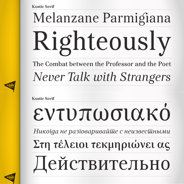
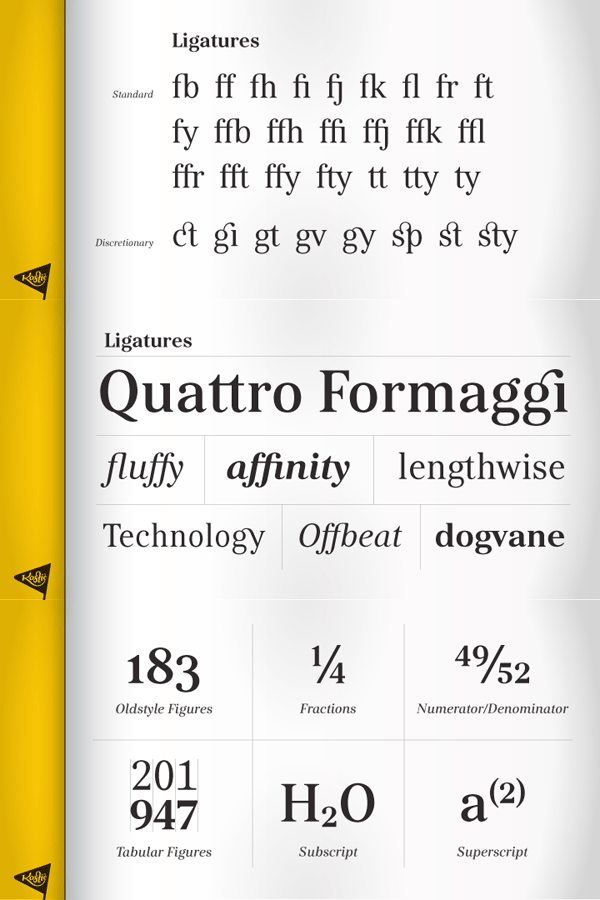
This beautiful type family is available for purchase on MyFonts.com








I would invite anybody interested in this font to check Emigre Mrs Eaves designed in… 2009. No further comment necessary.
And Matrix, for that matter. Mr. Kostic obviously knows Emigre very well.
Yes, I do admire and respect the work of Zuzana Licko. Yes, I was inspired by some of her ligatures, and other historical designs – so what? Neither of us invented the concept of ligatures – they’ve been in use for hundreds of years. I am certainly not the only designer who made the “gi” ligature after her (take a look at Calluna from Jos Buivenga for example). My designs are done from the ground up – the proportions and shapes are completely original. I fail to see the connection to Matrix though.