
This post contains affiliate links. We may earn a commission if you click on them and make a purchase. It’s at no extra cost to you and helps us run this site. Thanks for your support!
Katl: The Typeface That’s Modern, Effortlessly Chic, and a Little Different.
Have you ever seen a font and just thought, “Wow, that’s clean and chic, but also a little quirky?” Well, that’s Katl. Designed by Jolicia Type, it’s a sans-serif, which you probably guessed. Think of it like the effortlessly cool person at a party. It doesn’t try too hard, but it definitely stands out.
You can download the font family from these platforms:
What makes it so special?
First off, it’s modern. It just has this sleek, current vibe. Jolicia Type nailed that perfect blend of simple and sophisticated. It’s not shouting at you, you know? Instead, it’s just quietly confident. Have you seen typefaces that try too hard? Katl definitely isn’t one of them.
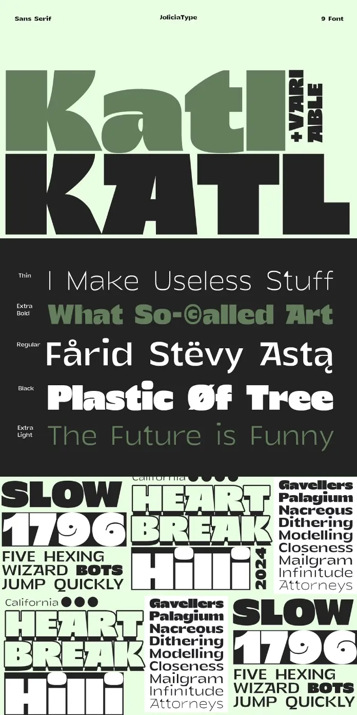
This thing has got range too. You want delicate and light? It has “Thin.” Need something more powerful? It has “Black.” There are nine weights, can you believe it? It really is ready for anything. So, think about that. What kind of project are you working on right now? Katl might just have the perfect weight for it.
And here’s where it gets really fun: It’s a variable font. Okay, what does that mean? You can basically tweak the weight to whatever you need. You’re in control! It’s like having a custom font without having to do any of the hard work. Pretty cool, right? Isn’t this just genius?

Where would you even use this?
Everywhere, really. Branding? Yup. Katl can make your brand feel modern and trustworthy. Editorial design? Definitely. Think sleek magazine layouts or online publications. Web design? Absolutely. It’s easy to read, even at smaller sizes. Basically, it’s a workhorse. What kind of projects could you see this working on?
Think about logos. Katl can be subtle and refined. It’s never going to be overbearing. It can do that clean corporate look. Or even something more fashion-forward. It has this incredible flexibility.
And headlines? Yeah, it does headlines. Use that Black weight, and it’ll be striking. Need a more delicate touch? Thin is there for you. Isn’t that just amazing?
And body text? Yes! It works so well. It’s clear, easy to read, and doesn’t distract from the content. This makes it suitable for longer texts and reports too. Have you ever had a typeface that is so versatile?
Why is this so important?
Katl embodies modernity, that’s the key. It feels fresh, current, and it’s made with precision. It’s elegant without being stuffy. It’s versatile without being boring.
Jolicia Type created this, and, man, they just got it right, you know? It’s a typeface that’s ready for anything. So, I ask you, have you considered using a variable font like this before? It can really make a difference in your designs.
Let’s Recap
- It’s a sans-serif.
- It’s modern and sleek.
- It comes in nine weights.
- It’s a variable font.
- It’s versatile enough for anything.
So, next time you’re looking for a typeface that’s not just good but great, remember Katl. It might just be the missing piece in your design puzzle. What do you think about this typeface? Does it spark some ideas?
I think it’s a gem. Don’t you? Go check it out and see what you think for yourself. You might just fall in love.
You can download the font family from these platforms:
All images © by Jolicia Type. Check out other trending typefaces on WE AND THE COLOR or read about the most popular fonts based on current typography trends for 2025.
Subscribe to our newsletter!


