
This post contains affiliate links. We may earn a commission if you click on them and make a purchase. It’s at no extra cost to you and helps us run this site. Thanks for your support!
The Extra Chunk Please Typeface is a Bold Geometric Font Your Designs Need Now
Are you searching for that perfect display font? You know the one. It needs to be modern, yet friendly, and a bit quirky. Bold, but not aggressive. Clean, yet full of personality. It’s a common quest for designers, brand builders, and content creators everywhere. Finding a type that truly speaks your project’s language can feel like searching for a needle in a digital haystack. Sometimes, the options seem endless, yet nothing quite hits the mark. Does this sound familiar? You might spend hours trying different styles, hoping for that spark of recognition, that moment when the letters on the screen perfectly capture the feeling you’re aiming for. It’s more than just aesthetics; it’s about communication, about setting a tone before a single word is truly read.
Think about the impact type has. It shapes perception, guides the eye. It can also make a message feel urgent, sophisticated, playful, or trustworthy. Choosing the right font is a foundational step in visual communication. And that brings us to a delightful discovery making waves in the design community: the Extra Chunk Please font from Supfonts. This isn’t just another typeface; it’s a statement piece. It blends characteristics that often seem contradictory – strong geometry with a soft, approachable feel. If your design needs a voice that’s confident, contemporary, and incredibly clean, you might want to lean in a little closer. The Extra Chunk Please font could be the answer you’ve been seeking. Let’s explore what makes this particular font capture attention and why it’s becoming a go-to choice for so many discerning eyes.
You can purchase the typeface at these platforms:
What Exactly is the Extra Chunk Please Font?
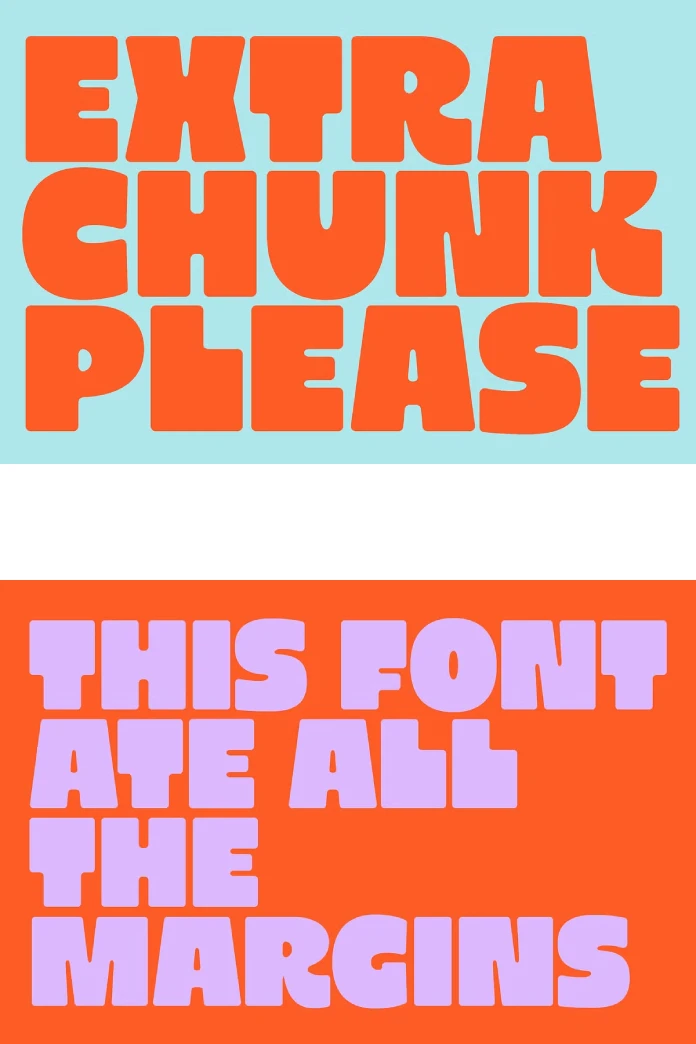
At its core, Extra Chunk Please is a modern display font. But what does that really mean for your projects? Imagine bold, confident shapes. Think clean lines and geometric precision. Now, soften those edges just a touch. Add a sprinkle of playful minimalism. That’s where Extra Chunk Please finds its unique charm. It manages to be substantial, almost architectural, without feeling heavy or imposing.
The designers at Supfonts crafted Extra Chunk Please with a specific vision: to merge boldness with approachability. Its letterforms are strong and intentionally designed. You’ll notice the geometry isn’t harsh; instead, subtly rounded edges give it a friendly, almost huggable quality. This careful balance makes it incredibly versatile. It avoids the coldness sometimes associated with pure geometric fonts, yet retains a powerful sense of structure and modernity. It feels solid, reliable, but also inviting. This combination is quite compelling, don’t you think? It allows the font to stand out without shouting, offering a sophisticated yet relaxed vibe.

You can purchase the typeface at these platforms:
The Anatomy of Impact: Dissecting Its Style
Let’s look closer at the elements that give Extra Chunk Please its distinct personality. As a display font, its primary role is to grab attention, typically in larger sizes like headlines, titles, or key messages. Its inherent “chunkiness” provides significant visual weight, making it immediately noticeable. However, it’s not just about being big and bold.
The genius lies in the details. The rounded corners are crucial. They prevent the boldness from becoming abrasive, lending a softer, more organic feel. The character design is strong, meaning each letter is distinct and well-defined, contributing to overall clarity even with its substantial form. This clarity is vital. Have you ever seen a bold font that becomes muddy or hard to read? Extra Chunk Please sidesteps that pitfall. It’s designed for clean, typography-focused layouts where the font itself is a major design element. It doesn’t need excessive decoration; its form is the statement. This minimalist approach ensures it feels current and avoids looking dated quickly.
Extra Chunk Please in Action: Where Does It Shine?
Knowing its characteristics is one thing, but where does Extra Chunk Please truly make a difference? Its unique blend of traits makes it suitable for a surprisingly wide range of applications. Consider these prime examples:
- Minimal Branding & Packaging: Need a logo or product name that feels modern, clean, and trustworthy? Extra Chunk Please delivers. Its boldness ensures brand recognition, while the rounded edges make it feel approachable and consumer-friendly. Imagine it on a coffee bag, a tech startup’s logo, or a skincare line – it conveys quality without pretension.
- Bold Editorial Design: Think magazine headlines, feature spreads, or impactful pull quotes. In editorial contexts, Extra Chunk Please can create a strong visual hierarchy, drawing the reader’s eye to key information. Its clarity ensures readability even at large sizes, making a powerful graphic statement on the page.
- Clean Menus & Posters: Whether it’s a chic cafe menu or a striking event poster, this font offers both style and legibility. For menus, section headers in Extra Chunk Please can look fantastic. On posters, it serves as a powerful focal point, conveying information clearly and with contemporary flair.
- Social Media Graphics: In the fast-scrolling world of social media, grabbing attention instantly is key. Extra Chunk Please excels here. Its bold, clean look ensures your message stands out in crowded feeds. Perfect for quote cards, promotional announcements, or brand statements that need to pop. You need visuals that stop the scroll, right? This font helps achieve that.
The common thread? Extra Chunk Please works best where you need type to be both a visual anchor and a clear communicator. Its inherent style elevates simple layouts and complements minimalist aesthetics beautifully.
Beyond the Looks: The Technical Side of Extra Chunk Please
A font isn’t just about aesthetics; its technical features are crucial for practical use. Supfonts equipped Extra Chunk Please with capabilities that make designers’ lives easier. What are these helpful features?
First, there’s Multilingual Support. Designing for a global audience? This is essential. Extra Chunk Please includes the necessary characters to set text in various languages, broadening its usability significantly. You won’t hit a wall when you need to include accents or special characters for different regions.
Second, Full Punctuation is included. This might sound basic, but it’s vital for professional typography. Missing punctuation marks can derail a project. Extra Chunk Please provides a complete set, ensuring you can typeset accurately and comprehensively without needing to substitute symbols from other fonts.
Finally, it’s PUA Encoded. What does PUA (Private Use Areas) encoding mean for you? It means that any extra glyphs, stylistic alternates, or special characters included in the font can be accessed easily in most design software, even without OpenType-savvy programs. This simplifies workflow and unlocks the font’s full creative potential without technical headaches. These thoughtful inclusions demonstrate Supfonts’ commitment to creating not just beautiful, but also highly functional tools for designers.
Why is Extra Chunk Please Resonating Now?
So, why the buzz around Extra Chunk Please? It seems to hit a sweet spot in current design trends. There’s a strong movement towards designs that are clean, minimalist, yet warm and human-centered. This font embodies that duality. Its geometric foundation speaks to modernity and order, while its rounded softness adds approachability and a touch of playfulness.
It offers designers a way to be bold without being cold, and minimalist without being boring. It feels fresh, optimistic, and incredibly versatile. Can you picture it enhancing your next project? Whether you’re crafting a brand identity, designing a website header, or creating eye-catching social content, the Extra Chunk Please font provides a compelling option. It’s a tool that feels both contemporary and enduring, capable of making a significant visual impact through its confident, friendly forms. It’s a reminder that sometimes, a little extra chunk is exactly what a design needs.
You can purchase the typeface at these platforms:
Don’t hesitate to find other trending typefaces in the Fonts section on WE AND THE COLOR.
Subscribe to our newsletter!


