Corporate identity design by Anagrama Studio for Mexican production company Distrito Films.
Established in 2000, Distrito Films is an independent film production company based in Mexico City. Since then, Distrito Films has grown to one of Mexico’s top production companies. They work with talented directors and actors to produce films for the global market. To achieving a bigger reach in countries such as United States, France, Spain, Canada, Chile, Argentina, and Brazil, Distrito Films has commissioned the creative people of Anagrama Studio to to renew their existing visual experience. Feel free and read more below the first image.
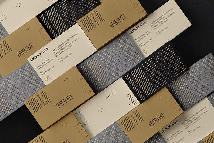
The Distrito Films rebranding case study.
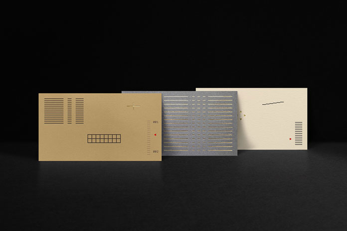
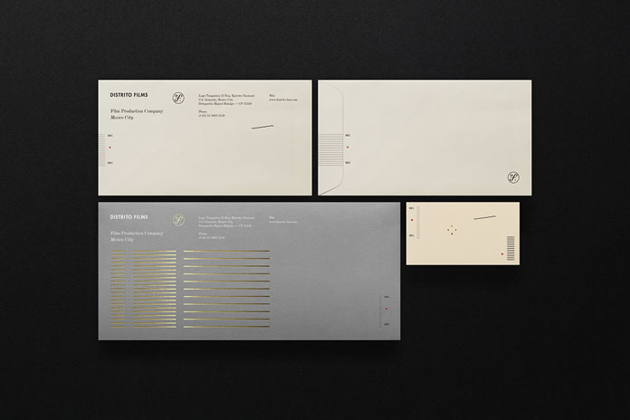
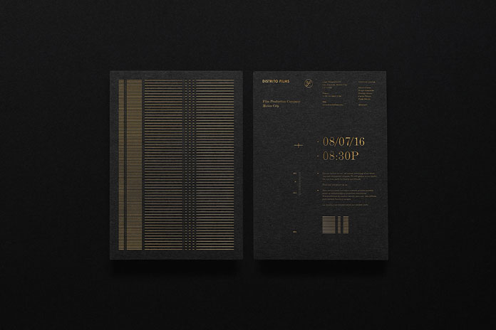
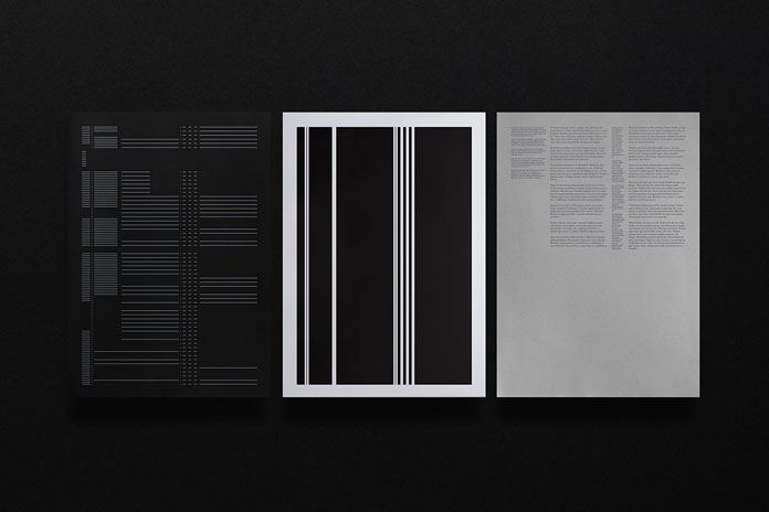
After an initial briefing and countless hours of brainstorming, the design team came up with the idea of creating a corporate identity based on symbolism in cinema. Their design solution refers to the typical multiburst test patterns that occur during the calibration process of a video. The chosen color palette refers to the colors generated during the adjustment of sharpness and color temperature. The whole corporate identity is deeply characterized by the technical aspects of the film industry.
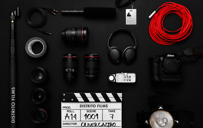
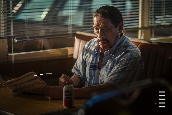
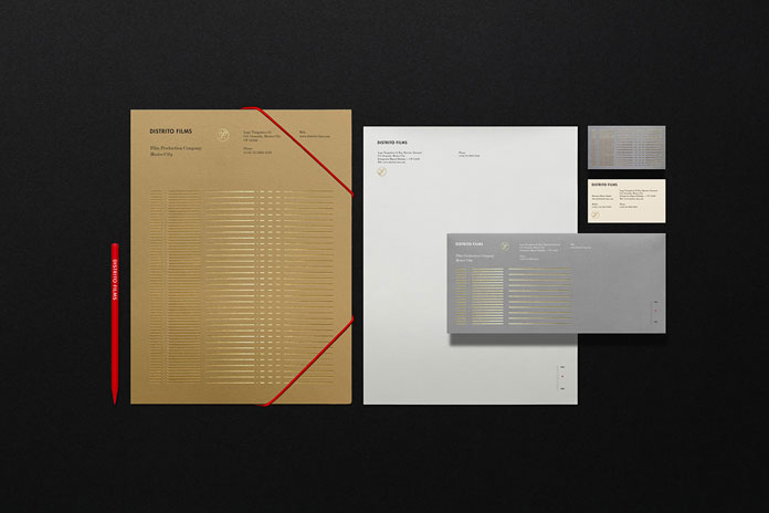
Anagrama’s new identity solution adds a more contemporary look and feel to Distrito Films’ personality. Below you can find a few more examples of the new brand identity. For more of Anagrama’s graphic work, please visit some of their older projects here or visit their website.
Discover more graphic design and branding projects on WE AND THE COLOR.

