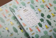
A golden brand and packaging design by Bravo for Cocoa Colony.
Bravo is a creative studio with offices in Singapore and New York City. They have recently developed a striking visual identity and packaging for chocolate brand, Cocoa Colony. More information below.
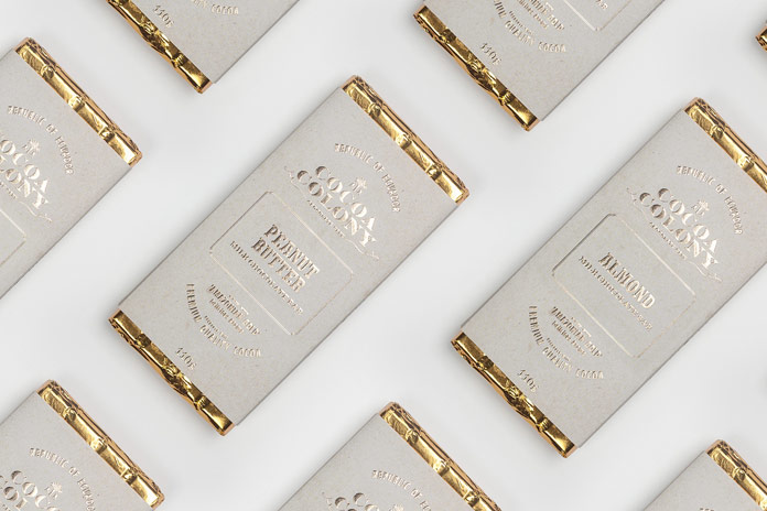
Cocoa Colony is based on a story of two brothers who were stranded in South America due to a shipwreck off the coast of Ecuador. During their time in South America, the two brothers discovered the many benefits of cocoa beans, which were often called as “Amazonian Gold”.
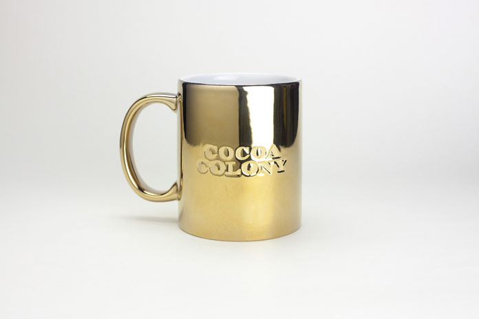
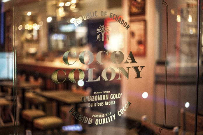
With elaborate details as well as meticulous typography and material choices, Cocoa Colony’s “golden” brand identity retells the story of the two brothers who found themselves stranded in Ecuador. The entire design conveys a romantic touch of the Colonial Period.
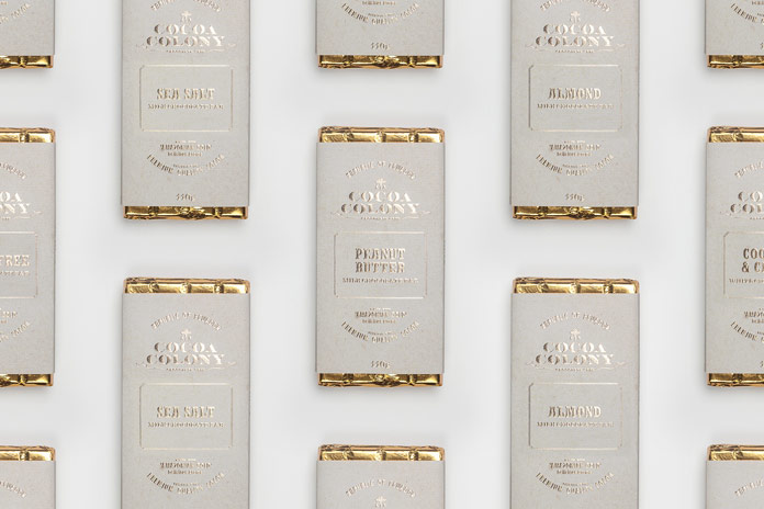
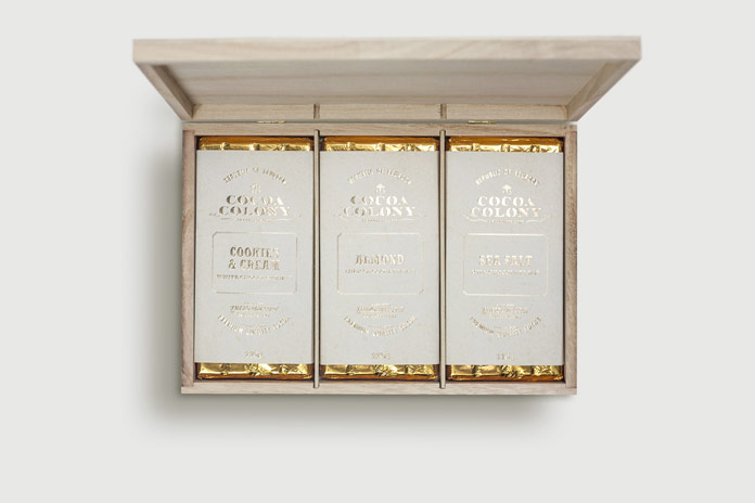
Studio Bravo developed the entire visual experience from scratch in order to create an authentic chocolate brand. Their creative work included the overall identity concept as well as logo design, packaging, and store signage. The following images give you an impression of the sophisticated result of Bravo’s work. If you want to know more about the studio, feel free and check out their website: bravo.rocks


Do not hesitate and check out more amazing projects in our Graphic Design, Branding, and Packaging Design categories. Just like all categories on WE AND THE COLOR, these sections are filled with outstanding work from around the globe. WE AND THE COLOR is your source for the daily dose of graphic design inspiration!


