This post contains affiliate links. We may earn a commission if you click on them and make a purchase. It’s at no extra cost to you and helps us run this site. Thanks for your support!
Read our Comprehensive Review of Great Studio’s Calibra Font Family.
Overview and Inspiration
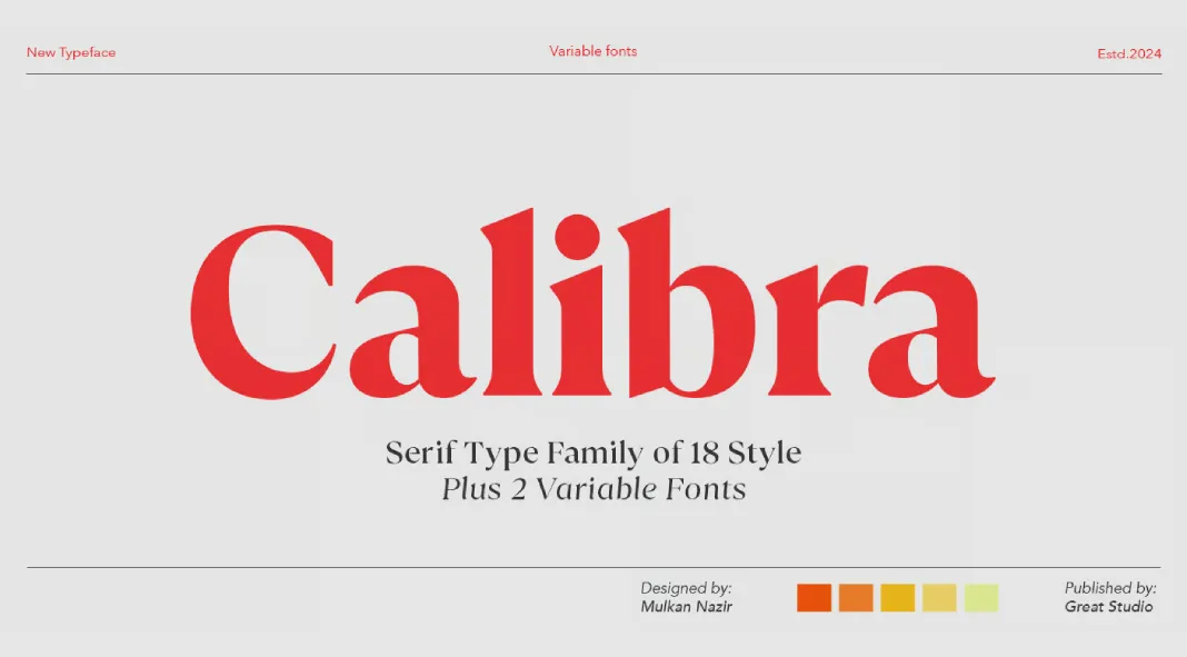
The Calibra font family, designed by Mulkan Nazir of Great Studio, is a contemporary typeface that marries classical transitional typography with modern design sensibilities. It stands out for its striking contrast, an attribute influenced by traditional serif fonts but reinterpreted for contemporary use. This fusion of historical and modern elements gives Calibra a unique versatility, making it highly adaptable for a broad range of design applications.
Design Characteristics
Calibra presents a range of weights, from Thin to Black, offering designers ample flexibility in creating typographic hierarchies. As the font gains weight, the natural curves, bloated terminals, and angled stems begin to assert a more distinctive personality. These features are especially prominent in heavier weights, adding depth and visual interest to the design.
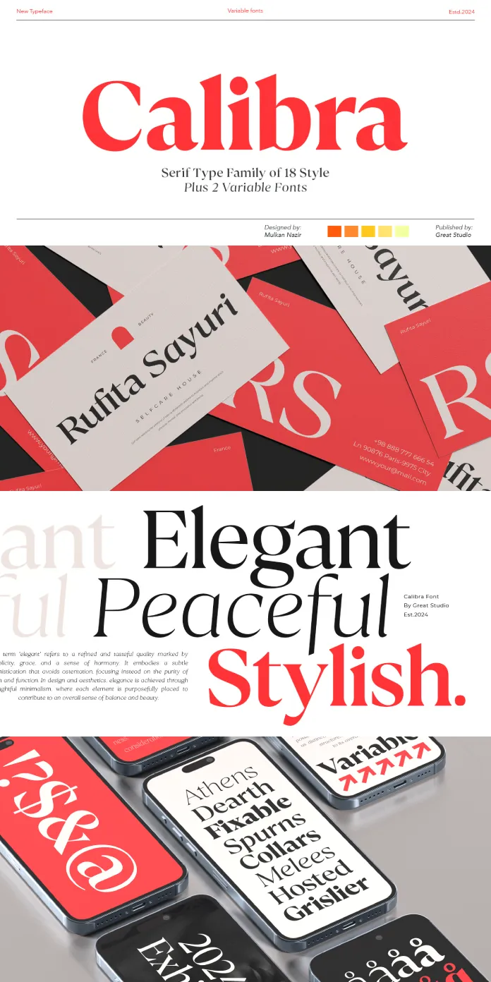
The thinner cuts of Calibra exhibit a refined subtlety. With reduced contrast and optical adjustments, they maintain a warm and soft appearance, making them ideal for delicate typographic work. The font’s italic styles, in particular, deserve special mention for their elegance and fluidity. These italic forms strike a balance between formality and expressiveness, making them suitable for both display and text settings.
Variable Font and Functionality
The inclusion of two variable versions, Variable Regular, and Italic, enhances the font’s flexibility for digital use. These variable fonts allow designers to explore and fine-tune a range of stylistic nuances, from subtle shifts in weight to more dramatic changes in stroke contrast. This adaptability makes Calibra an excellent choice for responsive web design, where typographic fluidity across devices is essential.
Applications and Usability
Due to its refined design, Calibra excels in a variety of design contexts. Its versatility makes it suitable for headlines, titles, and branding projects, where visual impact is paramount. The font’s high contrast and unique character traits in heavier weights lend themselves well to logo design and packaging, offering a sophisticated yet approachable aesthetic.
For longer text settings, the lighter weights of Calibra provide readability without sacrificing elegance. The optical corrections made in these cuts ensure that the font maintains its soft and warm qualities, even in body text. Calibra also includes extensive language support, making it a reliable choice for international projects.
Conclusion
Great Studio’s Calibra typeface is a masterfully designed font family that bridges the gap between tradition and modernity. Its range of weights, beautiful italic forms, and variable font options offer designers a wide palette for creative expression. Whether used in branding, editorial design, or digital interfaces, Calibra delivers both aesthetic beauty and functional versatility, making it a valuable addition to any designer’s toolkit.
All images © by Great Studio. Feel free to browse through WE AND THE COLOR’s Fonts section to find other trending typefaces.

