BABTEC – brand identity relaunch.
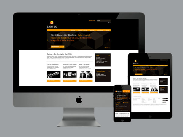
EIGA, an established Hamburg, Germany based interdisciplinary design studio was commissioned to create a fresh brand relaunch and a new multimedia communication concept for Babtec. The redesign was necessary in order to reinforcing the market position of the quality management software company.
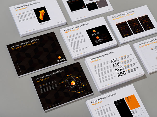
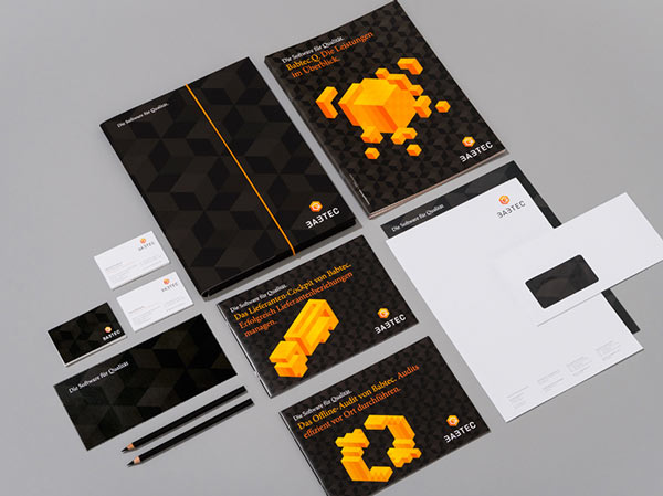
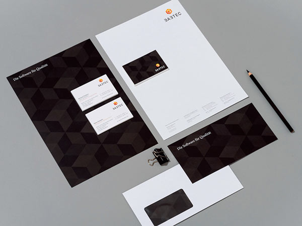
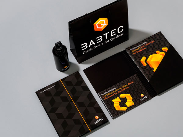
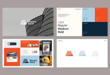
EIGA Design developed the Babtec QUBE as new striking brand logo. This graphical solution conveys a clearly structured design. The qube forms the basis for the grid of all brand illustrations. The logo offers a sense of quality and security as well as value. In addition, the qube symbolises the digital aspect and modular structure of all BABTEC software solutions. All branding and communication materials including stationery, printed collaterial, the new website as well as architecture, interior and motion design are based on the grid layout. EIGA Design created a range of communication materials, which reflect the high standard and qualitiy of this remarkable software company.
