

Dirk Petzold

Dirk Petzold is a graphic designer, content strategist, and the founder of WE AND THE COLOR. With a sharp eye for visual culture and a deep passion for emerging trends, Dirk has spent over a decade building one of the most respected platforms in the creative industry. His mission is to inspire and connect designers, artists, and creative minds across the globe through high-quality content, curated discoveries, and thoughtful commentary. When he's not creating or curating, you'll likely find him running mountain trails or exploring new ideas at the intersection of design and technology.
All content on WE AND THE COLOR is human-curated and edited, with AI assistance in research, writing, and image editing.
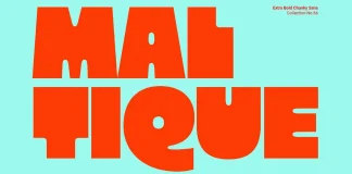
Maltique Font by Zarma Type Is an Extra-Bold, Chunky Sans-Serif Display...
Let's get one thing straight before we go further. The Maltique font from Zarma Type isn't trying to whisper. It's built to shout across...
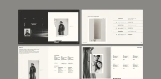
This New Adobe InDesign Portfolio Presentation Template Fixes the One Thing...
Honestly, I often think that many portfolio decks look like a résumé wearing a costume. There are boxes of text. A headshot in the...
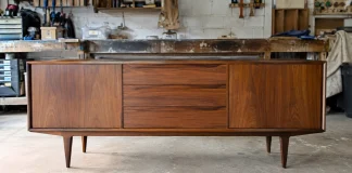
8 Amazon Supplies We Used for Upcycling Mid-Century Modern Thrift-Store Furniture
Upcycling thrift-store furniture sounds like a hobby for people with a garage, a truck, and unlimited patience. It isn't. My friend does this most...
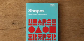
Geometric Shapes Still Run Graphic Design. This Book by Shaoqiang Wang...
I bought this book on a whim back in June, mostly because the cover pattern looked sharper than anything else on my shelf that...
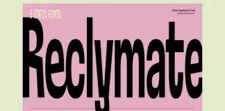
Reclymate Font Family by Zarma Type
Reclymate Proves a Condensed Font Doesn't Have to Feel Cramped
Reclymate, built by Zarma Type, was drawn narrow from the start, not squeezed after the...

Six Adobe InDesign Templates I Downloaded Years Ago From Adobe Stock...
Honestly, my Adobe Stock download library is a mess. Hundreds of purchases are in there, most opened once, then forgotten within a week. But...
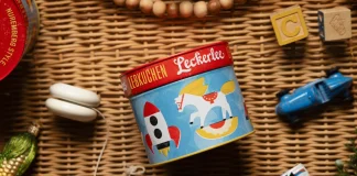
Leckerlee Lebkuchen’s Tin Packaging Design Just Turned 15. Here’s What 46...
Back in 2012, WE AND THE COLOR ran a feature on a small gingerbread company's holiday tins. The illustrations were bright, the folk-art patterns...
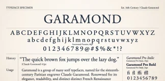
The Garamond Typeface & Why There’s No Such Thing As “One”...
Ask ten designers which Garamond font they use, and you'll get eleven answers. That's not really a joke about designers being indecisive, though—guilty as...

How a 1941 Doctor’s House in Valencia Became a Case Study...
The Doctor's House isn't a flip. It isn't a gut job either. It's a 345-square-meter argument, built in brick and steel, that old houses...

Adobe Stock Still Beats Envato Elements and Creative Fabrica, Just Not...
I spent six weeks running the same design tasks through Adobe Stock, Envato Elements, and Creative Fabrica. Same logo concept, same social carousel, same...

What Separates a Timeless Brand Identity From a Trendy One
A timeless brand identity is not one that never changes. Identities that last usually evolve as the business, audience and platforms around them change....
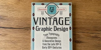
Vintage Graphic Design Book Review: Heller & Fili’s Love Letter to...
A review of Vintage Graphic Design, Steven Heller and Louise Fili's sourcebook of type, monograms, and ornaments from the golden age of printing.
I bought...