This post contains affiliate links. We may earn a commission if you click on them and make a purchase. It’s at no extra cost to you and helps us run this site. Thanks for your support!
Honestly, my Adobe Stock download library is a mess. Hundreds of purchases are in there, most opened once, then forgotten within a week. But six Adobe InDesign templates keep surviving every cleanup, every new laptop, and every folder purge I’ve done since. I bought them years ago, back when I still took the occasional client job before WE AND THE COLOR became my full focus. I still open them today, sometimes for the site, sometimes for a favor, and sometimes just to steal a grid idea for something else entirely. This isn’t a roundup of new releases. It’s a report from someone who used the same Adobe InDesign templates long enough to know which ones actually hold up.
Please note that all of these six templates require Adobe InDesign installed on your computer. Whether you use Mac or PC, the latest version is available on the Adobe Creative Cloud website—take a look here.
What Actually Makes an Adobe InDesign Template Worth Keeping for Years?
Most templates die fast. You buy them, use them once for a specific brief, then quietly abandon them because the grid refuses to flex for a second project. I call this the Reuse Threshold, a term I use for the number of genuinely different jobs a template needs to survive before it earns a permanent spot in your kit. In my experience, that number is three. If a layout still works for a third unrelated project, it usually keeps working indefinitely.
The second test I run is what I call Grid Discipline, my own shorthand for how well a template’s underlying structure holds up once every placeholder gets stripped out. Weak templates fall apart the moment you swap fonts or change the page count. Strong ones keep their proportions no matter what you throw at them. All six Adobe InDesign templates below pass both tests, which is rarer than it should be.
The Six Adobe InDesign Templates That Made the Cut
Here’s the short version before the individual reviews. Each of these is a genuine, tested Adobe InDesign template I’ve reused across multiple unrelated projects, not just admired from a preview image.

| Template | Best For | Pages | Format | Designer |
|---|---|---|---|---|
| Brand Manual & Style Guide Template | Brand guideline documents | 32 pages | A4 | GrkiCreative |
| Yellow Proposal Brochure Layout | Business proposals | 22 pages | A4 and US Letter | Sirisako |
| Minimal Architecture & Design Portfolio Template | Print portfolios | 12 pages | US Letter | Refresh |
| Adobe InDesign Magazine Template | Magazine layouts | 22 pages | US Letter | Refresh |
| Annual Report Layout | Corporate reports | 20 pages | A4 | Tom Sarraipo |
| Product Catalog Template | Product catalogs | 5 layout options | US Letter | Afahmy |
The Brand Manual & Style Guide Template Still Anchors My Client Handoffs
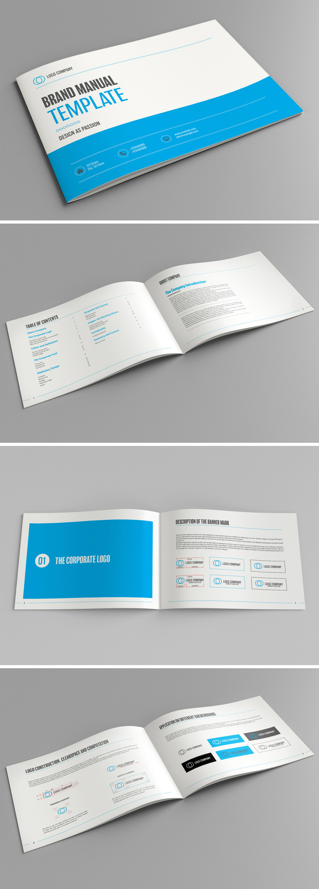
This one, designed by Adobe Stock contributor GrkiCreative, is the Adobe InDesign template I’ve customized the most times. It ships with 32 pages built around a restrained blue accent and covers eight distinct brand categories, plus a front and back cover. That range matters. Most brand manual templates cover logo usage and colors, then stop. This one keeps going into typography pairings, imagery direction, and application examples, which saves real time when a client asks, “What about our social templates too?”
The file is set up in A4, and it’s fully print-ready, though I mostly export mine as a PDF for digital delivery. The editing structure holds up under Grid Discipline testing extremely well. I’ve swapped the entire color story twice without breaking a single spread.
The Yellow Proposal Brochure Layout Wins on Speed, Not Subtlety
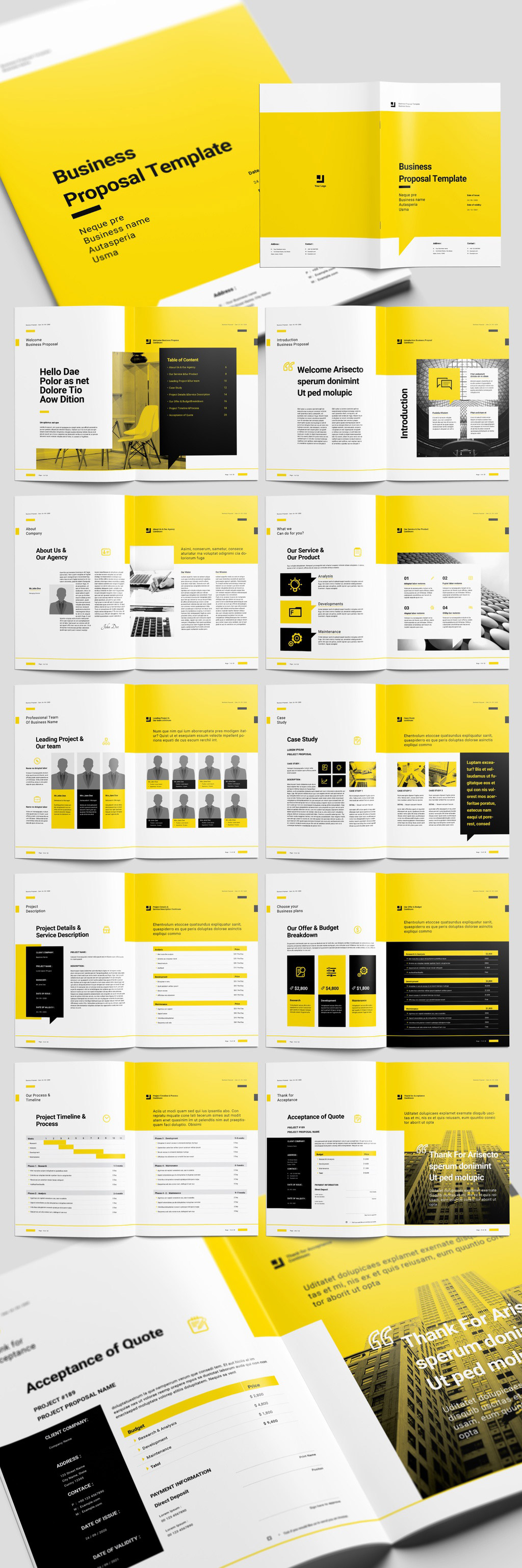
Designed by Sirisako, this proposal brochure pairs yellow with black accents across 22 CMYK pages. It’s available in both A4 and US Letter, which sounds minor until you’re sending the same proposal to clients in Germany and clients in the United States within the same week.
I don’t reach for this Adobe InDesign template when subtlety matters. I reach for it when a proposal needs to look confident fast, and the contrast does exactly that. The colors are fully editable, so calling it “the yellow one” is really just a description of how it ships, not a limitation. Swap the palette, and the structure carries the rest.
The Minimal Architecture & Design Portfolio Template Is the One I Recommend Most
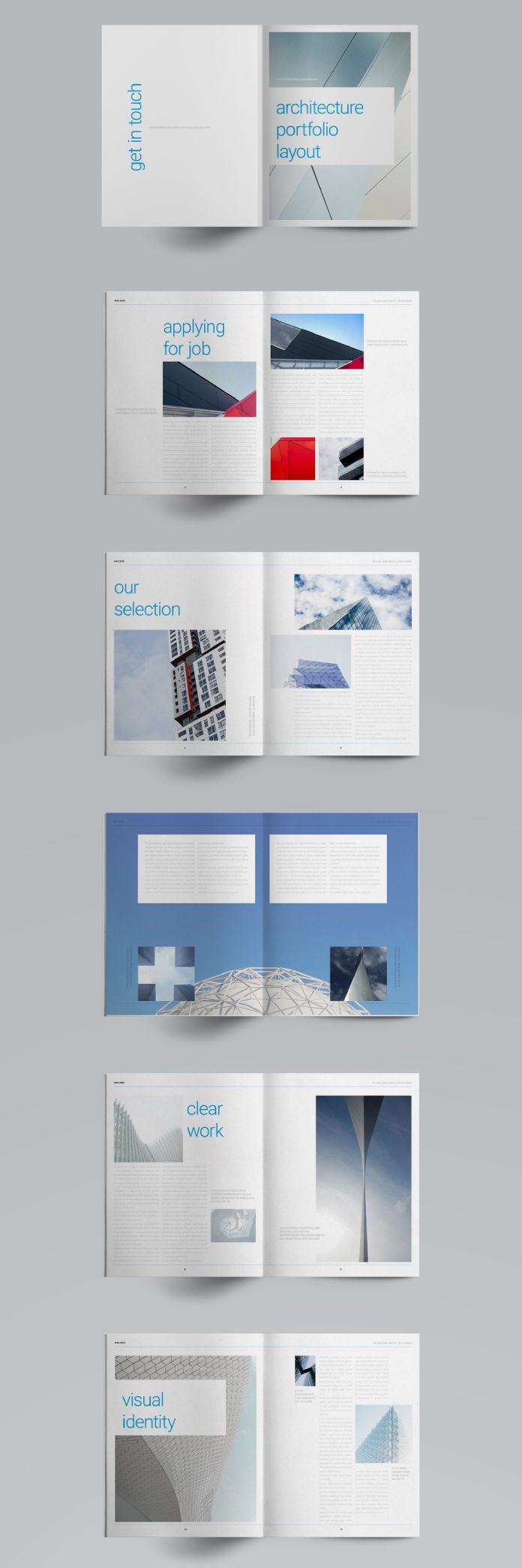
This portfolio layout by Refresh is smaller than the others, just 12 pages in US Letter, and that’s precisely why it survives. A print portfolio doesn’t need bulk. It needs restraint, generous white space, and a grid that gets out of the project photography’s way.
I’ve handed variations of this template to two younger designers I’ve mentored informally, and both told me the same thing: it’s the rare portfolio template that doesn’t fight the work it’s supposed to showcase. The pages cover a cover spread, and project showcases without forcing a rigid narrative structure onto them. If you want other people to remember your work rather than your layout choices, this is the Adobe InDesign template that gets out of the way.
The Adobe InDesign Magazine Template Handles Almost Any Topic
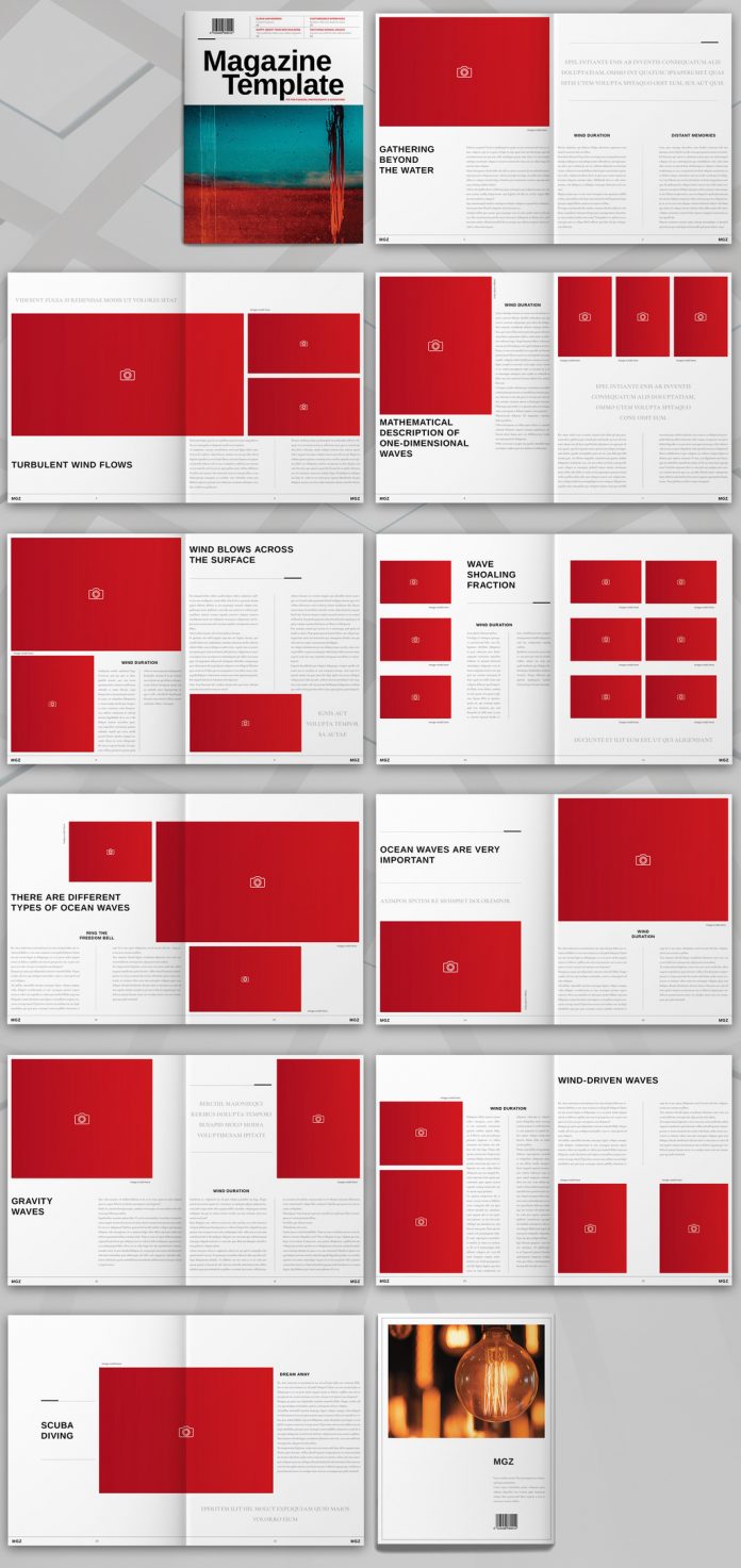
Also from Refresh, this magazine template comes in US Letter with 22 fully editable, print-ready pages. What’s kept it in rotation for years isn’t a flashy feature. It’s the opposite. The layout stays neutral enough to carry a design magazine spread one week and a lifestyle feature the next, without ever screaming “template.”
I’ve also used this Adobe InDesign template for mockups when pitching editorial concepts to collaborators, since it lets people see a full spread instead of imagining one from a moodboard. That’s a small thing, but it closes deals faster than any amount of talking.
The Annual Report Layout Is the Newest Addition, and It Earned Its Spot Fast

The most recent of the six, this annual report layout by Tom Sarraipo uses 20 pages in A4, built on a palette of beige, charcoal, and warm greys instead of the usual corporate blue. It comes with master pages already configured, so recurring elements like page numbers and margins stay consistent without manual setup on every spread.
What convinced me to keep this one wasn’t the aesthetics, even though they’re genuinely good. It was the structure. The financial and business review sections use a grid built specifically for charts and short text blocks, so numbers don’t fight paragraphs for space. For anyone who has tried to cram a bar chart into a layout that wasn’t designed for one, that alone justifies the download.
The Product Catalog Template Covers Five Layouts in One File
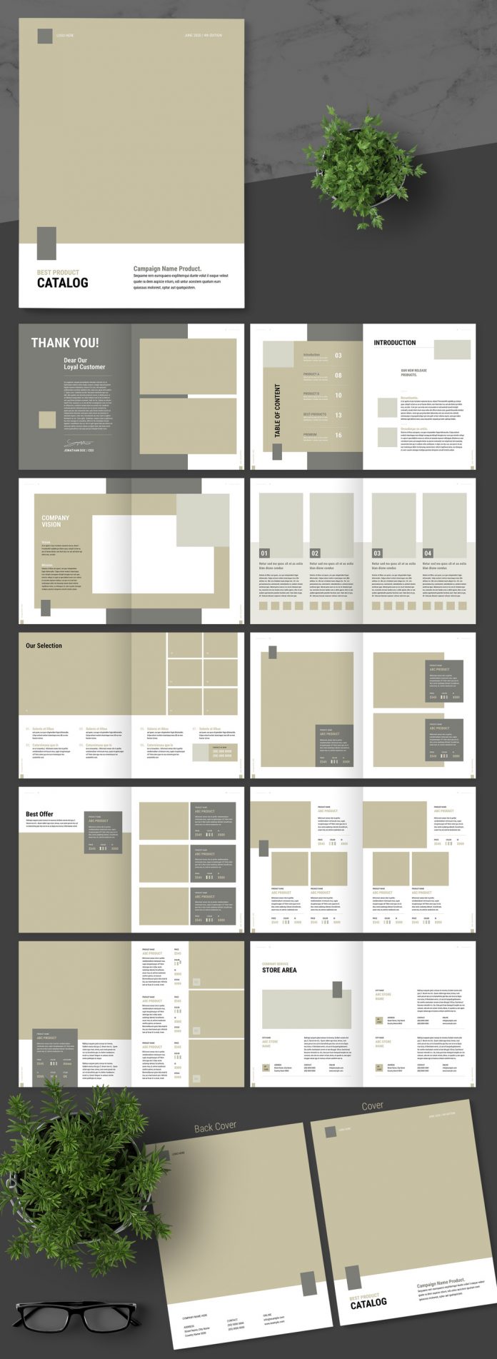
Designed by Adobe Stock contributor afahmy, this catalog template ships in US Letter with five distinct layout options inside a single file, originally styled around a brown accent. That variety is the whole point. A catalog rarely needs one repeated page format. It needs a cover layout, a grid page for small items, a spotlight page for hero products, and a pricing table, all living in the same document.
I’ve reused this Adobe InDesign template for everything from actual product catalogs to lookbooks that had nothing to do with retail. The underlying page architecture doesn’t care what you’re cataloging.
Why These Six Outlasted Dozens of Others I’ve Deleted
Three traits show up in every template on this list. First, they all ship print-ready in CMYK, which sounds basic until you’ve had to fix a template built only for screen. Second, each one uses a real grid system instead of loosely arranged text boxes, so Grid Discipline holds even after aggressive edits. Third, none of them depend on a specific font to look intentional. Swap the typeface, and the layout still reads as designed, not broken.
That combination is harder to find than you’d expect. Most Adobe InDesign templates on any marketplace look great in the preview and fall apart the moment real content replaces the placeholder text. These six didn’t, and that’s the entire reason I still open them years later instead of starting from a blank document.
How to Use an Old Adobe InDesign Template Without It Looking Dated
I run every reused template through what I call a Refresh Pass, a short checklist rather than a full redesign. It takes maybe twenty minutes and keeps a five-year-old layout from looking like one.
First, replace the type pairing. Even a strong grid feels stale if the fonts are the same ones everyone downloaded from the same Adobe Stock listing. Second, adjust the color story slightly; even a five percent shift in saturation changes how current something feels. Third, check the margins against current print standards, since bleed requirements occasionally shift between printers. Fourth, swap any stock photography for something specific to the project, because generic placeholder imagery is the fastest way to make a template look like a template.
None of this touches the underlying structure. That’s the entire benefit of reusing a well-built Adobe InDesign template instead of building from zero every time. The grid did the hard work years ago. The Refresh Pass just keeps the surface honest.
Frequently Asked Questions
Are old Adobe InDesign templates still safe to use?
Yes, as long as the file opens correctly in your current InDesign version. Adobe maintains strong backward compatibility, and none of these six templates have caused compatibility issues across multiple software updates.
Do I need an active Adobe Creative Cloud subscription to use these templates?
You need Adobe InDesign specifically, which is included in most Creative Cloud plans. A one-app InDesign subscription also works if you don’t need the full suite.
Can I resell projects made from a purchased Adobe InDesign template?
Adobe Stock’s standard license allows you to use templates in client work and commercial projects. Reselling the template file itself, or a near-identical copy of it, is not covered.
Why do some Adobe InDesign templates hold up longer than others?
It comes down to grid construction. Templates built on flexible, well-labeled master pages survive content changes far better than ones built with loosely placed text and image frames.
Is it better to buy individual templates or a subscription bundle?
If you reuse a handful of layouts constantly, as I do with these six, individual purchases often work out cheaper long-term than a rotating subscription model, especially since a strong template doesn’t need replacing every year.
Browse WE AND THE COLOR’s Templates category for more.
Subscribe to our newsletter!