This post contains affiliate links. We may earn a commission if you click on them and make a purchase. It’s at no extra cost to you and helps us run this site. Thanks for your support!
I bought this book on a whim back in June, mostly because the cover pattern looked sharper than anything else on my shelf that week. Three months later, I can assure you that’s the one design book you keep grabbing when a client asks for something “clean and geometric.” That phrase gets thrown around constantly in branding meetings, and geometric shapes in graphic design are having a real moment again, from flat brand marks to op-art packaging. So I decided to test this book the way I test software. I used it daily, pushed it into real projects, and checked whether it held up past the first flip-through. Here’s what three months of actual use taught me.
So What Is This Book Actually For?
Shapes: Geometric Forms in Graphic Design is not a textbook, and it doesn’t pretend to be one. There’s no chapter on the golden ratio and no math homework. Instead, editor Shaoqiang Wang collects real, published projects that use basic geometric shapes (circles, squares, triangles, and every combination in between) as the main design tool. Think of it as a case study archive rather than a course.
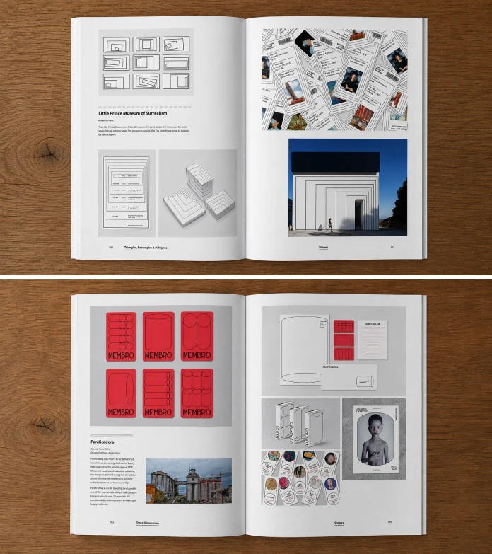
The book runs 240 pages, published by Hoaki, now in its third English-language paperback edition after earlier printings from Promopress. Forewords come from Genis Carreras, known for turning philosophical concepts into geometric shape illustrations, and Korbinian Lenzer, a working graphic designer. That pairing tells you a lot before you even reach page one. This book cares about shapes as communication tools, not shapes as decoration.
Here’s the quick reference version, for anyone who wants the facts before the opinions.
| Detail | Information |
|---|---|
| Title | Shapes: Geometric Forms in Graphic Design |
| Editor | Shaoqiang Wang |
| Forewords | Genis Carreras, Korbinian Lenzer |
| Publisher | Hoaki |
| Edition | 3rd (paperback) |
| Publication Date | September 16, 2025 |
| Language | English |
| Print Length | 240 pages |
| ISBN-13 | 978-8410650190 |
| Format | Paperback, 8.27 x 11.22 inches |
Who Actually Made This Book
Shaoqiang Wang isn’t a random compiler. He’s a professor and graduate supervisor at the Guangzhou Academy of Fine Arts, director of the Guangdong Museum of Art, and editor of Design 360° magazine. He’s also served as a jury member for some of China’s biggest design and illustration awards. This matters, because a case study book lives or dies on curation. A weak editor pads pages with filler projects. Wang doesn’t do that here. Most spreads feel selected, not scraped together to hit a page count.

The Psychology Behind Basic Shapes, According to This Book
Before getting into my testing notes, it’s worth explaining why geometric shapes in graphic design carry so much weight in the first place. This book doesn’t spell it out in a single tidy chapter, but the pattern across its case studies makes the logic obvious once you start noticing it.
Circles read as movement, unity, and approachability. Brands aiming for warmth or community lean on them constantly, and the packaging section here proves it with example after example of circular badges and rounded containers. Squares and rectangles read as stability and structure, which explains why so many financial, legal, and tech identities in the book default to hard right angles. Triangles carry tension and direction. Designers use them to point, to warn, or to suggest motion, and the wayfinding examples lean on this instinct heavily.
None of this is new theory. But seeing it proven across dozens of real, shipped projects instead of a single textbook diagram makes the point land harder. That’s the actual value of a case study book over a theory book. You’re not told the rule. You watch it get applied, break, and get applied again in a different market.
My Three-Month Test: How I Actually Used the Book
I didn’t just read this cover to cover once and call it a review. I kept it on my desk for three months and used it the way a working designer actually uses a reference book: in bursts, under deadline pressure, and usually while frustrated with my own layout.
Week One: The Skim
My first pass was fast, maybe forty minutes total. I flipped through looking for anything that made me stop and stare. About a dozen spreads did that on the first pass alone, which is a good sign. Most design books get maybe three or four genuine “wait, look at this” moments before the visual fatigue sets in.
Month Two: Pulling It Into Client Work
This is where the book earned its keep. I was building a brand identity for a small fitness studio, and the client kept saying, “Make it feel structured, not soft.” Instead of guessing, I pulled up the book’s packaging and branding sections and used three specific shape combinations as a starting moodboard. The client picked one within a day. That almost never happens.
Month Three: The Coffee Table Test
By month three, the real question was simple. Did it stay on my active desk, or did it migrate to the shelf where design books go to die? It stayed. I still open it before client calls involving logo or packaging work, mostly to reset my eyes after staring at a screen too long.
The Repeat Use Check
I also tracked something most reviews skip entirely: how often I actually reopened the book without a specific project forcing me to. Over three months, I counted eleven separate sessions that weren’t tied to active client work. Most design books I own get opened once, admired, and then left alone for a year. This one kept pulling me back, usually late in the day when I needed a reset instead of a search.
Introducing the Shape Yield Index
Reviews that just say “great inspiration book, five stars” don’t help anyone buying with real money. So I built a simple scoring framework, the Shape Yield Index, or SYI, to make this review actually useful and repeatable for other design books in this category.
The Shape Yield Index scores a design reference book across three factors, each rated from 1 to 10:
Case Study Density (CSD)
This measures how many distinct, well-documented projects appear per page, without padding from repeated angles of the same logo. Shapes scores an 8 here. The book favors breadth over repetition, and very few spreads feel like filler.
Cross-Sector Range (CSR)
This measures how many different design fields the case studies actually cover: branding, packaging, editorial, wayfinding, digital, and apparel. Shapes scores a 9. Few single-topic design books cover this much ground without feeling scattered.
Studio Applicability (SA)
This measures whether the book functions as an actual working reference you can search under deadline, versus something you only enjoy once. Shapes scores a 6. There’s no index sorted by shape type, so finding “triangle-based packaging” means flipping pages, not searching a table of contents.
The formula is simple: SYI equals the sum of the three scores, divided by 30, multiplied by 100.
| Factor | Score (out of 10) |
|---|---|
| Case Study Density | 8 |
| Cross-Sector Range | 9 |
| Studio Applicability | 6 |
| Shape Yield Index (composite) | 77 out of 100 |
A Shape Yield Index of 77 lands this book solidly in “buy it” territory. Anything above 70 means the book earns its shelf space in a working studio, not just a personal library.
What’s Actually Inside: The Case Study Categories
The projects inside break down roughly into six working categories, and this range is honestly the book’s biggest strength.
- Branding and logo marks, where a single shape or shape pair becomes the whole identity system. This section is the deepest, and it’s where the book earns most of its Case Study Density score.
- Packaging, where geometric patterns solve shelf-standout problems without adding printing cost. Several examples use a single repeated shape across a whole product line, which is a smart, budget-friendly move worth stealing.
- Editorial and layout design, where shapes organize grids instead of just decorating them. This section connects nicely to older layout theory without ever getting academic about it.
- Wayfinding and signage, where geometric shapes carry meaning across languages and literacy levels. It’s a smaller section, but a genuinely useful one for anyone doing environmental design work.
- Digital and motion-adjacent work, showing how static shapes translate into interface elements, app icons, and simple animated stings. This section feels newer than the rest, and it shows.
- Apparel and merchandise, a smaller section but a useful one for studios doing brand extensions into physical products.
Each project gets a spread or a half spread, plus a short caption naming the studio and the concept. Don’t expect long essays. This book leans visual, and that’s clearly intentional. If you want written analysis of why each choice works, you’ll need to supply that thinking yourself, which honestly isn’t a bad exercise for a working designer anyway.
How It Compares to Other Geometry-Focused Design Books
Geometric shapes in graphic design get covered from very different angles depending on the book, so context matters here.
| Book | Main Focus | Best For | Weak Spot vs. Shapes |
|---|---|---|---|
| Shapes: Geometric Forms in Graphic Design (Wang) | Applied case studies across industries | Working designers needing fast, real-world reference | No shape-based index |
| The Geometry of Design (Elam) | Proportion systems, math behind composition | Students studying design theory | Almost no branded case studies |
| Grid Systems in Graphic Design (Müller-Brockmann) | Typographic grids and layout structure | Editorial and layout specialists | Barely touches shape-as-symbol work |
| Logo Geometry (Sherman) | Technical construction of logo marks | Logo designers building vector grids | Narrow scope, logos only |
If you want theory, buy Elam. If you want grid discipline, buy Müller-Brockmann. If you want logo construction math, buy Sherman. But if you want a fast source of real, shippable ideas across many formats, Shapes covers more working ground than any of the three.
Where the Book Falls Short
No review is honest without complaints, so here are mine.
First, there’s no index organized by shape type. If you specifically need triangle-heavy packaging examples, you’re flipping through the whole book, not searching a page reference. Second, the text is thin. Captions name the studio and concept, but there’s little analysis of why a shape choice worked. Third, because this is a third edition built on prior Hoaki and Promopress geometric-design collections, longtime readers of Wang’s other titles may recognize a handful of repeated projects.
Who I Recommend Buying This Book To (and Who Should Skip It)
Buy this if you’re a freelancer or small studio building a shape-based moodboard library or a branding team pitching younger, direct-to-consumer clients who respond to bold, simple marks. It’s also genuinely useful for junior designers still building visual vocabulary.
Skip it if you need academic grid theory or if you want step-by-step tutorials showing exactly how to construct a shape system from scratch. This book shows the results, not the process.
Where Geometric Design Is Headed Next
Based on what I’m seeing across current branding work, here are five predictions worth writing down and checking later.
Prediction one: Hard-edged single-shape logo marks will keep gaining ground over soft blob shapes through 2027, because vector-based marks animate cheaper for social and motion use.
Prediction two: Packaging design will lean harder into geometric pattern systems instead of photography, since pattern-based packaging scales across product lines without new photo shoots.
Prediction three: Wayfinding and signage design will absorb more geometric branding language, as more transit and retail systems chase visual consistency across many locations.
Prediction four: Expect more design books, including future editions of this one, to add searchable digital companions, because static print references without a shape-based index will start to feel outdated.
Prediction five: Basic geometric shapes will keep outperforming illustrated mascots in fast-turnaround branding work, simply because a shape system scales to a favicon and a billboard without redrawing anything.
The Bottom Line
Shapes: Geometric Forms in Graphic Design earns a Shape Yield Index of 77 out of 100 after three months of daily studio use. It won’t teach you design theory, and it won’t hold your hand through a tutorial. But as a fast, visually rich source of real geometric shape ideas across branding, packaging, editorial, and signage, it beat every other book on my shelf this quarter. I’d buy it again.
Frequently Asked Questions
Is Shapes: Geometric Forms in Graphic Design good for beginners?
Yes, but treat it as inspiration rather than instruction. Beginners get real, published examples of geometric shapes in graphic design, though the book won’t teach construction techniques step by step.
What makes geometric shapes so common in modern branding?
Geometric shapes read fast, scale cleanly across sizes, and reproduce well in cheap printing and small app icons alike. That combination makes them a practical choice, not just a trend.
How is this book different from other geometric design books?
Most competing titles focus on either theory or a single format, like logos alone. Shapes covers branding, packaging, editorial, wayfinding, and digital work in one collection, which is rare.
Does the book include any tutorials or how-to content?
No. It’s a curated case study collection with short captions, not a step-by-step guide. Pair it with a construction-focused book like Logo Geometry if you want technical instruction too.
Is the third edition worth buying if I already own an earlier edition?
If you own the 2021 Promopress edition already, the overlap in projects may not justify a repurchase. New buyers should simply grab the current 2025 Hoaki paperback.
What is the Shape Yield Index used in this review?
It’s a scoring framework built for this review, combining Case Study Density, Cross-Sector Range, and Studio Applicability into one composite score out of 100, so design reference books can be compared consistently.
Why do circles, squares, and triangles show up so often in branding?
Each shape carries a built-in emotional shortcut. Circles suggest unity and motion, squares suggest stability, and triangles suggest direction or tension. Designers lean on these instincts because viewers read them instantly, without conscious effort.
Where can I buy Shapes: Geometric Forms in Graphic Design?
The current paperback edition is published by Hoaki and widely available through major book retailers, including Amazon, with ISBN-13 978-8410650190.
Feel free to find other amazing books on art and design here at WE AND THE COLOR.
Subscribe to our newsletter!