This post contains affiliate links. We may earn a commission if you click on them and make a purchase. It’s at no extra cost to you and helps us run this site. Thanks for your support!
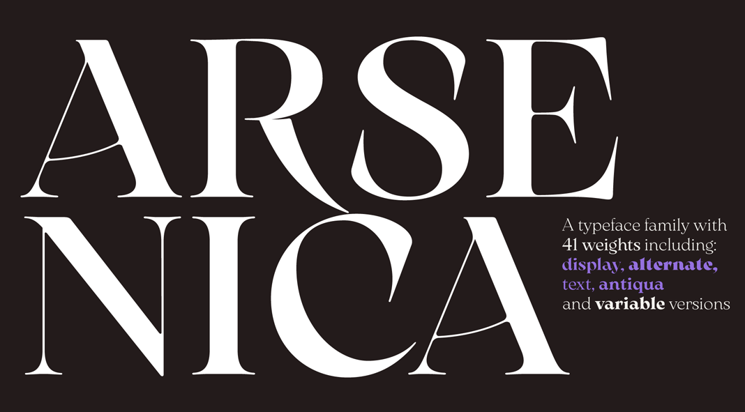
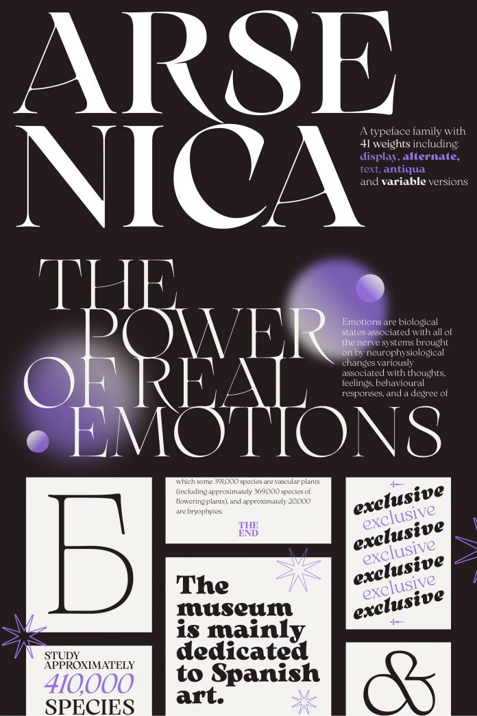
Arsenica, a typeface inspired by Italian poster design from the beginning of the century.
Published by foundry Zetafonts, the Arsenica font family was designed by Francesco Canovaro and developed by a skilled team including Mario De Libero, Andrea Tartarelli, and Cosimo Lorenzo Pancini.
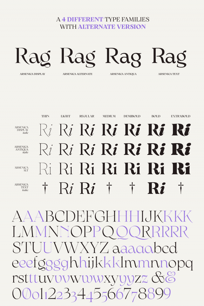
The design of the Arsenica typeface is mostly influenced by good old Italian poster design. Canovaro first designed the Arsenica Antiqua family, made as a serif display typeface that keeps the original Old Style low-contrast with wide proportions and some quirky stylistic inventions. With the Arsenica Display family, he expanded the weight range to include ultrabold weights and lighter weights to give the design a distinct calligraphic touch. In order to bring these letterforms into a contemporary environment with alternate letterforms, Francesco Canovaro developed the Arsenica Alternate family. Last but not least, Arsenica Text has been developed by expanding the design space in the optical size axis, creating a low contrast, strongly readable old-style typeface that works great for long body copy typesetting. The final result is a superfamily consisting of 41 weights. All weights come with numerous OpenType features and support multiple languages. Just click on one of the following links to learn more.
If you want to discover more trending typefaces for different typographic needs, feel free to check out our Fonts category.

