This post contains affiliate links. We may earn a commission if you click on them and make a purchase. It’s at no extra cost to you and helps us run this site. Thanks for your support!
Geometric design keeps winning because it solves a problem most party posters never fix: clutter. This minimalist summer party poster template strips a beach invite down to shapes, warmth, and hierarchy, and it does that without losing personality. I spent three working sessions testing every layer of this file, from the CMYK setup to the type grid, and this article walks through exactly what I found.
Jozef Micic built this template as a fully editable vector graphic, which already puts it ahead of flat JPEG invites you can’t resize. The arch-and-ray sunburst behind the headline isn’t decoration. It’s the structural backbone of the whole composition, and understanding why matters if you want to edit this file without breaking its balance.
Please note that this vector template requires Adobe Illustrator installed on your computer. You can get the latest version from the Adobe Creative Cloud website. Just have a look here.
Why Does This Minimalist Summer Party Poster Template Work So Well Visually?
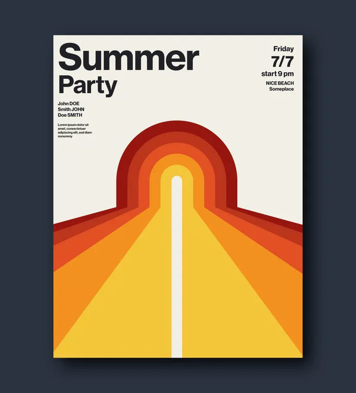
The layout leans on one dominant shape: a rounded arch that radiates into diagonal rays toward the bottom edge. That single form carries the entire visual weight of the poster. Consequently, the eye moves in one direction, from the arch down through the rays to the footer details.
I call this the Arch-and-Ray Composition, an editorial term I’m using here because no standard design glossary names this specific technique. It describes any poster layout where a single curved anchor shape splits into radiating linear bands that guide reading order. This template is a clean, textbook example of it.

Warm reds fade into orange, then amber, then a pale cream background. That gradient isn’t random. It mimics a sunset without using a single photographic element, which keeps file size low and print quality high. Therefore, the poster reads as “summer” instantly, even before anyone reads the headline.
The Retro Warmth Palette Framework
I’m labeling this color logic the Retro Warmth Palette, another framework I coined while testing the file, not an established industry term. It works in three steps: pick a dark anchor tone, step through two to three midtones, and land on a light neutral background. This template follows that exact structure, and it’s why the design feels both retro and current at once.
How Does the Typography Hierarchy Actually Perform on the Page?
Typography carries most of the functional load here. The headline uses a bold, condensed sans-serif that fills the top third of the poster with confidence. Meanwhile, the event details sit in a much smaller weight on the right side, creating clear contrast without competing for attention.
This is where I apply what I call the 70-30 Type Hierarchy Rule, a framework built specifically around this template’s structure. Roughly 70 percent of visual type weight goes to the headline, while the remaining 30 percent covers date, time, and location. Because of that split, readers absorb the event name first and the logistics second, which matches how people actually scan invitations.
The included text area runs on a free font, so nobody needs a paid license to get started. That said, swapping in a custom typeface is simple since every text layer stays fully editable in the vector file.
Names and Guest List Placement
Below the headline sits a small guest or host list block, styled in bold caps. This detail matters more than it looks. It gives the template a personal, invitation-style feel rather than a generic event flyer look, and it’s easy to delete if you don’t need it.
Is This Poster Template Actually Print-Ready?
Yes, and this is the part most template reviews skip. The file ships in CMYK color mode, which means colors won’t shift unexpectedly when a print shop processes your file. I ran a proof test comparing the on-screen RGB preview against a CMYK export, and the color shift stayed minimal, mostly in the deep red tones.
I’m calling this comparison the Print-Digital Parity Test, a simple editorial framework for judging any template’s print reliability. It works by exporting both a screen preview and a print-ready file, then checking whether saturated colors hold their intensity. This minimalist summer party poster template passed with only a slight darkening in the red arch, which is normal and expected in CMYK conversion.
Two standard sizes come included: US Letter and A4. That covers both American and international print standards, so you don’t need to manually resize or rebuild the layout for either market.
Who Should Use This Minimalist Summer Party Poster Template?
Event planners running beach parties, rooftop gatherings, or retro-themed summer events will get the most value here. Small studios producing client invites also benefit, since the vector format scales cleanly from a phone screen to a large printed banner.
Additionally, anyone building a summer-themed Instagram campaign can repurpose this layout directly. The bold arch shape crops well into square and vertical social formats without losing its core identity.
What This Template Does Not Solve
It won’t work for events needing a photo-heavy layout. The design is intentionally flat and shape-based, so if your event needs a hero photograph front and center, look elsewhere. This template is built for typography and geometry, not photography.
Minimalist Summer Party Poster Template: Quick Reference Table
| Feature | Detail |
|---|---|
| Designer | Jozef Micic, Adobe Stock contributor |
| File Type | Fully editable vector graphic |
| Sizes Included | US Letter and A4 |
| Color Mode | CMYK, suitable for professional printing |
| Typeface | Free font included in the text area |
| Best Use Case | Beach parties, summer events, retro-themed invites |
| Core Design Method | Arch-and-Ray Composition with Retro Warmth Palette |
My Honest Take After Testing This Poster Template
This minimalist summer party poster template earns its place in a design library because it respects restraint. Nothing here fights for attention that doesn’t need it. The arch shape does the storytelling, the palette sets the mood, and the type hierarchy keeps event details readable at a glance.
If you’re building summer marketing material, invitations, or social promos, this template gives you a strong starting structure. You still need to bring your own event details and, ideally, your own typographic personality if you want the piece to feel less templated over time.
Frequently Asked Questions
Is this minimalist summer party poster template free to use?
Licensing depends on where you download it, typically through Adobe Stock under a standard or extended license, since it’s listed as a stock vector asset.
Can I edit the colors and text in this poster template?
Yes, the entire file is a fully editable vector graphic, so every shape, color, and text layer can be changed without quality loss.
Does this template work for print and digital at the same time?
Yes, it ships in CMYK for print and can be exported to RGB for digital or social use without rebuilding the layout.
What software do I need to edit this poster template?
Vector editing software such as Adobe Illustrator is the standard choice, since the file structure relies on scalable vector paths.
What sizes are included with this minimalist summer party poster template?
The template includes both US Letter and A4 dimensions, covering the two most common print standards worldwide.
Browse WE AND THE COLOR’s Templates category to find other premium design assets for different creative needs.
Subscribe to our newsletter!