This post contains affiliate links. We may earn a commission if you click on them and make a purchase. It’s at no extra cost to you and helps us run this site. Thanks for your support!
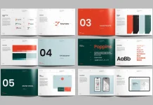
This company profile brochure template for Adobe InDesign was designed by Jozef Micic. It comes with ten pages and two paper sizes, US Letter and A4. It’s available for download from Adobe Stock with plenty of well-designed, fully customizable infographics. The template is meant for businesses that need a print-ready company profile rather than a plain sales sheet. To test this template, I spent several hours working through the actual file in both formats. So, I replaced the placeholder content with real text and numbers to see how much of the design holds up under normal use.
Please note that this digital presentation template requires Adobe InDesign to be installed on your computer. Whether you use Mac or PC, the latest version is available on the Adobe Creative Cloud website—take a look here.
What Distinguishes this Company Profile Brochure Template From the Rest?
The file comes in two sizes, US Letter and International A4, both set up in CMYK for offset or digital print. Ten predesigned pages come customizable from cover to close, without locked frames or layers you can’t reach.
The palette sits on three colors. A dusty sage green carries the structural blocks. A warm coral red marks callouts and section flags. Off-white and near-black handle everything else. That’s a tight palette for a printable company profile brochure template, and it works in the designer’s favor because nothing fights for attention on the page. Most competing InDesign brochure templates I’ve tested lean on five or six accent colors just to look busy in a marketplace thumbnail. This one trusts two, plus black and white, and lets the geometry carry the visual weight instead.
A Page-by-Page Look at the Layout
Cover and Contact Spread
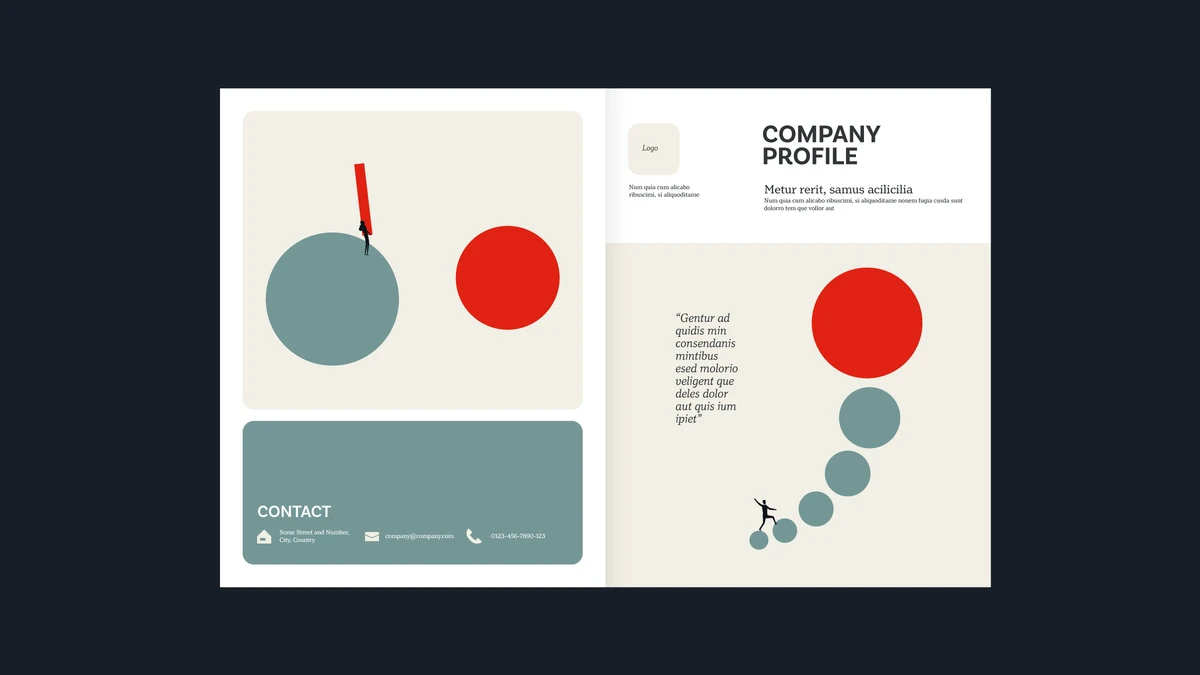
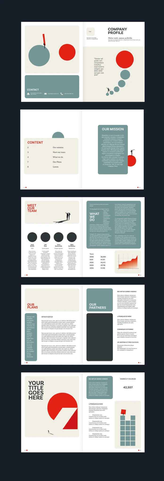
Page one opens with a geometric illustration: two solid circles and a climbing red mark, paired with a company name placeholder and a pull-quote box. Page two closes the front spread with a dedicated contact block, icon-led address, email, and phone fields sitting inside a solid sage panel. Putting contact information at the front of the document, rather than on page nine, is a small decision that makes the file more usable.

Mission and Contents Spread
A left-hand table of contents lists five entries: mission, team, what we do, plans, and a final placeholder page the buyer renames for their own use. The right page holds a full mission statement inside a solid color panel, with a small illustrated figure looking through a telescope, perched on a red circle. It’s a nice touch, but it belongs to the decorative side of the template, not the data side.
Team and Growth Chart Spread
This is the page where the infographic claim actually gets tested. Four circular headshot placeholders sit above short bio fields for four team roles. Next to them, a real area chart tracks five years of a placeholder growth metric: 38,450 in 2020, climbing to 41,057, then 43,513, then 47,776, and 51,158 by 2024. That’s a functioning data visualization inside a company profile brochure template, not a decorative graphic dressed up to look like one, and it’s genuinely useful if you’re building something closer to an annual report than a plain sales sheet.
Plans and Partners Spread
The plans page runs long blocks of placeholder body copy inside sage panels, four short sections stacked under headline labels, the kind of layout you’d expect from a brochure kit built for pitch meetings. The partners page opposite it repeats the same visual pattern with one large solid color block reserved for a partner logo or photograph. It works fine, but visually it’s the least distinctive spread in the file.
Custom Title and Stats Spread
The final spread is where the design holds together best. A bold “your title goes here” placeholder sits over a red pie-segment graphic and a tiny walking figure, doing double duty as both a section divider and a data visual. Across the gutter, a big stat callout (42,557) sits above a block-grid icon built from small sage squares, styled as a simplified bar chart shaped like buildings. It’s well-drawn icon work, and the one spot in the file where the designer clearly thought past pure decoration.
How Many of the Pages Are Actually Infographics?
The product listing describes this as a template “with infographics,” plural, spread across the kit. Counting the pages that actually carry data tells a somewhat different story.
Out of ten pages, three carry real data visualization: the growth chart, the big stat block, and the grid icon. The other seven lean on decorative geometry, circles, illustrated figures, and solid color panels. They look good, but none of them function as data displays.
I use a simple ratio when I look at brochure kits like this one: divide the number of pages carrying genuine data visualization by the total page count. Below 0.2, a template is mostly decorative despite an “infographic” label. Between 0.2 and 0.4, it’s a moderate kit, useful if you’re only reporting one or two real metrics. Above 0.4, it’s built for reporting-heavy profiles with several charts.
By that math, this template lands at 0.3, a moderate ratio, and one that roughly matches what a company profile document actually needs. A ten-page brochure doesn’t need twelve charts. But if the word “infographics” in the product title sets your expectations toward a data-dense report template, it’s worth adjusting them before you buy.
Comparing the US Letter and A4 Versions
Dual-format company profile brochure templates are common on Adobe Stock, and the quality varies. Some kits export identical content into two page sizes and let text overflow wherever it lands. To check this one, I opened both size variants, looked at every text frame for reflow after resizing, and paid attention to where the layout might break.
Nothing gave me trouble. Paragraph styles carried across both file variants cleanly, and the margin math holds at both 8.5 x 11 inches and 210 x 297 millimeters. That’s worth pointing out, because it isn’t a given. A4 runs roughly six percent taller and narrower than US Letter, and templates that don’t account for that difference usually show it in cramped headlines or awkward white space on one version. This one doesn’t.
One catch worth flagging: the color panel proportions on the growth chart page run slightly narrower in the A4 version, since the chart is a fixed-width graphic element rather than a redrawn vector per format. If you’re localizing this printable brochure template for a European print run, check that one page before sending files to a printer.
Working in the File: Layers, Styles, and Fonts
Open the .indd file, and the layer panel tells you a lot about how the designer built this template. This one splits cleanly into three layers: background shapes, images and icons, and text. That separation matters more than it sounds. It means you can swap the coral red for your own brand color across every circle and panel in one pass, using Edit > Find/Change or a simple swatch override, instead of hunting down each shape individually across ten pages.
The designer already named and applied paragraph and character styles, with real formatting logic behind them rather than manual visual tweaks. Headlines, body copy, captions, and the contact block each carry their own style, which is the difference between a template you can actually maintain and one that falls apart the moment you add a paragraph. Like most Adobe Stock InDesign kits, expect the fonts to link out rather than embed. Budget ten minutes to track down and install the required font files before your first real edit, since InDesign will substitute a placeholder font otherwise, and every line length in the document will change.
One limitation worth noting: the growth chart on the team spread is a flattened vector, not a linked chart built from live data. Updating the numbers means redrawing the bars by hand rather than typing new values into a table. That’s a reasonable trade-off for a template at this price point, but plan for extra time if your actual growth numbers don’t match the placeholder curve.
A Printing Checklist Before Sending Files to a Print Shop
A few things worth checking before any file from this template leaves your desk for a commercial printer:
- Confirm bleed settings match your printer’s spec, typically 3 mm or 0.125 inches on every edge.
- Flatten transparency effects on the circle graphics before export, since some RIP software handles InDesign transparency inconsistently.
- Embed or package all fonts using File > Package, so nothing substitutes silently at the print shop.
- Convert any placeholder RGB images you’ve added back to CMYK before final export, since the template starts in CMYK but new images don’t inherit that automatically.
- Export a high-resolution PDF/X-1a for offset printing, or a standard press-quality PDF for most digital print vendors.
Who This Company Profile Brochure Template Suits
This brochure kit fits three situations well. Agencies pitching new business who need something sharper than a generic one-pager. In-house marketing teams building an “about us” leave-behind for trade shows. And freelance designers who want a real starting structure instead of a blank InDesign document, since editing an existing style sheet almost always beats building one from zero.
It fits one situation badly: companies that need a data-heavy annual report with ten or more charts. A dedicated financial report template is the better tool for that job. This one is a profile brochure, not a disclosure document, and the design reflects that on purpose.
Company Profile Brochure Template Specifications
| Attribute | Details |
|---|---|
| Format options | US Letter (8.5 x 11 in) and International A4 (210 x 297 mm) |
| Total pages | 10 predesigned, fully customizable pages |
| Color mode | CMYK, print-ready |
| Software required | Adobe InDesign (CC or a compatible recent version) |
| Designer | Jozef Micic, Adobe Stock contributor |
| Pages with real data visualization | 3 of 10 (0.3 ratio) |
| Color palette | Sage green, coral red, off-white, near-black |
| Best for | Agency pitch decks, annual “about us” brochures, freelance starter files |
| Not ideal for | Data-heavy annual reports needing ten or more charts |
Frequently Asked Questions
What software do I need to open this company profile brochure template?
You need Adobe InDesign. The designer built this file natively in InDesign, so InDesign CC or a recent compatible version opens the layered files, master pages, and paragraph styles without any conversion step.
Does the company profile brochure template work for both US Letter and A4 print jobs?
Yes. The download includes both size variants, and the designer built each one independently rather than rescaling one into the other. Margins, paragraph styles, and grid proportions hold up across both formats, with one minor exception on the growth chart page noted above.
How many pages actually contain data visualization instead of decoration?
Three of the ten pages in this company profile brochure template carry genuine data visualization: a five-year growth chart, a large stat callout, and a grid-style icon chart. The remaining seven pages use decorative geometric elements rather than functional infographics.
Do I need advanced InDesign skills to customize this template?
No. Paragraph and character styles are already set up, so most edits come down to swapping placeholder text and photo frames. Rebuilding the growth chart with your own numbers takes more effort, since it’s a static vector graphic rather than a linked chart object.
Is CMYK color mode enough for professional offset printing?
Yes. CMYK is the standard color mode commercial print vendors expect. Confirm your specific printer’s color profile and bleed requirements before sending final files, since those details vary by print shop.
Can I use this template for client work, or only personal projects?
That depends on the license attached to your Adobe Stock plan. Standard and extended licenses cover different commercial use cases, so check your specific license terms on Adobe Stock before using the file in paid client work.
Can I edit the growth chart to show my own company’s numbers?
Yes, but it takes manual work. The chart is a static vector graphic rather than a linked data object, so you’ll redraw the bars or the curve by hand to match your own figures instead of typing new numbers into a spreadsheet.
What fonts does this company profile brochure template use?
The file links out to external font files rather than embedding them, which is standard practice for this category of InDesign template. Install the linked fonts first, or InDesign will substitute a system font, and every text frame will reflow incorrectly.
Hungry for more? If so, feel free to browse WE AND THE COLOR’s Templates category.
Subscribe to our newsletter!