This post contains affiliate links. We may earn a commission if you click on them and make a purchase. It’s at no extra cost to you and helps us run this site. Thanks for your support!
Black and white is the right shell for a portfolio that shows any kind of work, even color work. The Adobe InDesign brand portfolio presentation template by E-Type proves it on page one. Every frame sits on black or white, so nothing else on the page carries hue.
So, I went through every preview page of this black-and-white InDesign portfolio template. Then I tested the spots where layouts sometimes break. Below, I cover what the file contains and how it treats color. I also flag where it falls a little short. Along the way, I introduce a scoring method for monochrome layouts.
By the way, you can download this template for free with an Adobe Stock trial subscription. Just saying.
Please note that this template requires Adobe InDesign to be installed on your computer. Whether you use Mac or PC, the latest version is available on the Adobe Creative Cloud website—take a look here.
What Is an Adobe InDesign Brand Portfolio Presentation Template, Exactly?
An Adobe InDesign brand portfolio presentation template is a pre-built layout file that organizes a designer’s work into screen-ready pages.

It supplies the grid and the type hierarchy. You supply the work and the words. Therefore, the template saves you the structural decisions and leaves the creative ones to you.
E-Type, an Adobe Stock contributor, built this version in black and white. The file contains 16 predesigned pages, and each page stays fully customizable. Besides that, the pages measure 1920 × 1080 px in a horizontal 16:9 format that fits modern screens.
The preview photos serve display purposes only. The download does not include them. So you bring your own images, and this editable InDesign portfolio template expects exactly that. Likewise, people usually find files like this under terms such as Adobe Stock InDesign template or monochrome portfolio layout.
What Sits Inside the 16 Pages
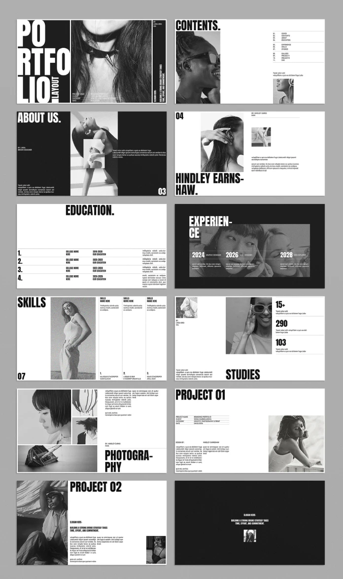
The preview shows twelve layouts. However, the listing counts sixteen pages. I base this section on the twelve I can see. Here is what this Adobe InDesign brand portfolio presentation template holds.
Cover and Contents
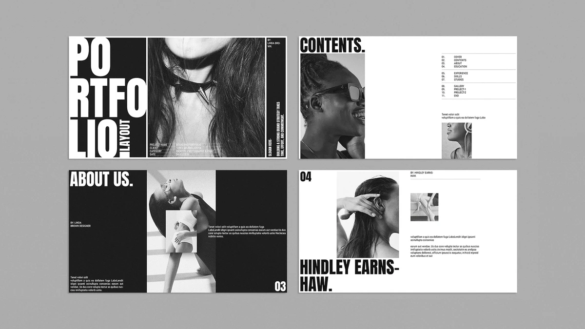
The cover stacks the word PORTFOLIO in giant white capitals on a black panel. A smaller LAYOUT runs sideways beside it. Then a fashion photo fills the middle, and a vertical slogan strip hugs the right edge. A data block at the bottom holds the project details.
Count the elements. Five compete for attention. Frankly, this cover tries too hard.
The contents page behaves better. It lists eleven entries in three ruled groups. Meanwhile, two portraits fill the left side, and the lower right stays empty.
Profile and Credential Pages
The About page pairs a black panel with a large photo and a smaller inset image. Next, a portrait sits beside an oversized name. After that comes Education.
The Education page carries no image at all. I rate it the best layout in the file. Thin rules and heavy numerals do all the work. Each of four numbered rows pairs a college name with a year range and a text block.
Experience flips to a dark field. A wide photo band then carries three timeline columns, each with a year and a job title.
Proof and Work Pages
The remaining five pages follow one pattern. Each pairs imagery with a tight text block. In addition, the Studies page adds three big numerals for your own figures.
The Closing Page
The last page is a black field with one slogan line and one small thumbnail. Again, the placeholder slogan from the cover returns here. It works as a quiet sign-off.
Why the Adobe InDesign Brand Portfolio Presentation Template Makes Color Content Pop
The template uses black and white only. Still, that does not stop you from adding color photos and graphics. The opposite holds, because color stands out more on a monochrome background. Therefore, this Adobe InDesign brand portfolio presentation template works for black-and-white content and for color content.
To measure that effect, I use a method I call the Chroma Readiness Score. The Chroma Readiness Score (CRS) rates how well a monochrome layout hosts color content on a 15-point scale. Each of the three sub-scores earns up to five points.
Ink Budget Scores 3 of 5
Ink Budget measures how a layout splits dark pages and light pages. Four of the twelve preview pages run dark. Those are the cover, About, Experience, and the closing page. The other eight run white.
A one-in-three dark ratio gives the deck a rhythm. However, pages 7 through 11 all run white. That stretch holds your skills and your projects. Color images gain the most from a black field, yet the work section never gets one.
I would flip the Project 02 page to black. That one change would earn a fourth point.
Landing Zones Score 5 of 5
A landing zone is a frame large enough for one image to dominate its page. Ten of the twelve preview pages offer one. By contrast, the Education page offers none, and the closing page offers only a thumbnail.
Place a saturated photo in any of them, and it becomes the only color on the page. The eye has nowhere else to go. The Photography page splits its landing zone into four frames. Therefore, use that page for a mood board, not for a hero shot.
Break Debt Scores 3 of 5
Break Debt counts how often the display type must split a word to fit. The preview shows three breaks: EARNS-HAW, EXPERIEN-CE, and PHOTOGRA-PHY. The headline face is a heavy, condensed grotesque. It follows Impact, which Geoffrey Lee drew for Stephenson Blake in 1965. Faces like that leave no room for long words.
Your own words will not break where the template breaks. For example, replace Experience with Work and the problem disappears. Longer client names need a manual hyphen or a smaller point size. How long is your longest client name?
Together, the three sub-scores give the Adobe InDesign brand portfolio presentation template 11 of 15 points.
| Sub-score | What it measures | Score | Evidence in the preview |
|---|---|---|---|
| Ink Budget | Balance of dark and light pages | 3 of 5 | Four dark pages, but none among the work pages |
| Landing Zones | Frames where one image can dominate | 5 of 5 | Ten of twelve pages offer one |
| Break Debt | Forced word splits in display type | 3 of 5 | Three mid-word breaks in headlines |
| Chroma Readiness Score | Total across all three | 11 of 15 | Strong host for color, weak on type flexibility |
Color Rules I Would Follow
First, give each page one hue family. The black or white field then holds everything else. Two saturated photos on one spread cancel each other, so pick a winner. Besides that, match any accent color to the brand you present. The deck then still feels like one identity.
Keep graphics flat, too. Gradients blur the clean edge between image and field. In fact, that edge is the best thing this layout offers.
How I Tested the Layout Before Writing This Review
I ran five checks on the Adobe InDesign brand portfolio presentation template. Each one targets a spot where templates usually fail.
- Contents against folios. The list names Education as 04, yet the profile page already wears folio 04. Likewise, Skills appears as 06 in the list and as 07 on its own page. The list runs one page behind from Education onward.
- Placeholder names. Two author names, Linda Brown and Hindley Earnshaw, appear across the pages. Sonia Marmeladova also appears as the client. Run Find/Change for all three before you export.
- Placeholder dates. The Experience page lists 2028, a year that has not arrived. Meanwhile, the cover carries 04/02/2026. Overwrite both.
- Color swap. I placed saturated color photos into the dominant frames, one page at a time. The page itself stayed black or white. As a result, the photo carried all the hue.
- Type stress. I read every headline against its frame. Headlines already break words at the frame edge, so longer words will break in new places.
How the Layout Echoes Editorial Design History
The cropped portraits and wide white margins recall Alexey Brodovitch’s pages for Harper’s Bazaar. He art directed that magazine from 1934 to 1958. However, Brodovitch used type with restraint, and this layout shouts instead.
The oversized capitals feel closer to a streetwear lookbook than to a 1950s fashion spread. I like that tension. It suits an Adobe InDesign brand portfolio presentation template aimed at brand work that wants attitude.
How to Present the 1920 × 1080 px Layout on Screen
The 16:9 format of this Adobe InDesign brand portfolio presentation template opens several routes. Each route to present an InDesign portfolio on screen keeps something and loses something.
Full-Screen PDF
Export an interactive PDF from InDesign through File and Export. Then open it in Acrobat and press Ctrl+L on Windows or Cmd+L on a Mac. The pages fill the screen edge to edge. Besides, text stays sharp and searchable.
Image Slides in Other Apps
Export each page as a PNG or JPEG at 1920 × 1080 px. Then place the images in PowerPoint, Keynote, or Google Slides. This route adds speaker notes and animations. However, text turns into pixels, so you lose search and links.
Screen Sharing and Video
Share the PDF in full-screen mode during a video call. Alternatively, record your screen and talk through each page. Small body copy suffers on laptops during calls, so enlarge it first.
Conference Room Displays
Most TVs and projectors accept 1920 × 1080 px without letterboxing. Even so, body copy fails at that distance. Raise the body size before you walk into the room.
How to Prepare the File Before You Present
A good Adobe InDesign brand portfolio presentation template still needs a clean handover. Follow these five steps before you send the deck anywhere.
- Replace the names. First, open Find/Change and search for each placeholder name. Then fix the contents list against the folios.
- Place your images. Next, select a frame and press Ctrl+D on Windows or Cmd+D on a Mac. The image then lands inside that frame.
- Check the Links panel. Afterward, confirm that every image shows a normal status. Missing links break exports.
- Raise the body size. Then bump body copy for your screen. Test it from the distance your audience will sit.
- Export. Finally, export the interactive PDF or the page images. Open the result once before you send it.
Where the Adobe InDesign Brand Portfolio Presentation Template Falls Short
Body copy runs at caption scale. On the project pages, it sits in two narrow columns. At arm’s length on a laptop, it reads fine. On a projector, however, it vanishes.
The Adobe InDesign brand portfolio presentation template also speaks in one voice. Heavy capitals carry every title, so every page shouts at the same volume. If your work needs a quiet register, this layout will fight you.
Both the busy cover and the all-white work pages cost points. Fortunately, you can fix both in InDesign without touching the grid.
Who Should Use This Template, and Who Should Skip It
Use It If
Photographers and brand designers get the most from this Adobe InDesign brand portfolio presentation template. Their work carries color that needs a neutral frame. In addition, freelancers who pitch on video calls gain a clean 16:9 deck.
Skip It If
Skip it if your work is soft and quiet. The heavy capitals will bully it. Likewise, skip it if you write long case studies, because the columns run narrow. This brand portfolio template for designers rewards strong images and short text.
Adobe InDesign Brand Portfolio Presentation Template at a Glance
This table sums up the facts that matter before you download.
| Attribute | Detail |
|---|---|
| Template type | Adobe InDesign brand portfolio presentation template |
| Creator | E-Type, Adobe Stock contributor |
| Marketplace | Adobe Stock |
| Software | Adobe InDesign |
| Pages | 16 predesigned, fully customizable pages |
| Page size | 1920 × 1080 px, horizontal, 16:9 |
| Color scheme | Black and white; accepts color images and graphics |
| Included images | None; the preview photos serve display purposes only |
| Presentation options | Full-screen PDF, image slides, screen sharing, conference room displays |
| Best for | Photographers and brand designers who show color work |
| Chroma Readiness Score | 11 of 15 |
| Main weakness | Hyphenated headlines and an out-of-sync contents list |
What Comes Next for Monochrome Portfolio Layouts
I expect five shifts through 2028.
- By 2027, 1920 × 1080 px will overtake the A4 page as the default portfolio size on Adobe Stock.
- Black-and-white shells, like this Adobe InDesign brand portfolio presentation template, will gain share among freelancers who show photography and branding.
- Template sellers will ship a color test page with every Adobe InDesign brand portfolio presentation template by 2028. Consequently, buyers will judge color behavior before they pay.
- Headline break rules will move into InDesign paragraph styles, and Break Debt will shrink.
- AI-generated images will fill more portfolio frames. In turn, a strict monochrome layout will hide the seams between photographed and generated work.
Q&A: What You May Ask About this Adobe InDesign Brand Portfolio Presentation Template
What is the Adobe InDesign brand portfolio presentation template by E-Type?
It is a black-and-white, 16-page InDesign layout that E-Type sells on Adobe Stock. The design targets brand portfolios and screen presentations.
How many pages does the template have?
The Adobe InDesign brand portfolio presentation template has 16 predesigned pages. Every page stays fully customizable.
What size is the Adobe InDesign brand portfolio presentation template?
The pages measure 1920 × 1080 px in a horizontal format. That is a 16:9 ratio.
Can I use color photos in a black-and-white template?
Yes. Color photos and graphics stand out more on the monochrome background. This Adobe InDesign brand portfolio presentation template therefore suits both black-and-white and color content.
Does the download include the photos from the preview?
No. The preview photos serve display purposes only, and the Adobe InDesign brand portfolio presentation template ships without images. Add your own.
How do I present the template on a screen?
Export the Adobe InDesign brand portfolio presentation template as an interactive PDF and open it in full-screen mode. Alternatively, export images and place them in PowerPoint, Keynote, or Google Slides.
Is this a good brand portfolio template for designers?
It suits designers who know InDesign basics and show strong imagery. However, the Adobe InDesign brand portfolio presentation template needs manual fixes for long headlines and the contents list.
What should I change first?
Replace the placeholder names in the Adobe InDesign brand portfolio presentation template. Search for Hindley, Linda, and Sonia in Find/Change, then overwrite the 2028 date on the Experience page.
Don’t hesitate to find other professional templates on WE AND THE COLOR. The collection includes a wide range of InDesign templates too.
Subscribe to our newsletter!