

This post contains affiliate links. We may earn a commission if you click on them and make a purchase. It’s at no extra cost to you and helps us run this site. Thanks for your support!
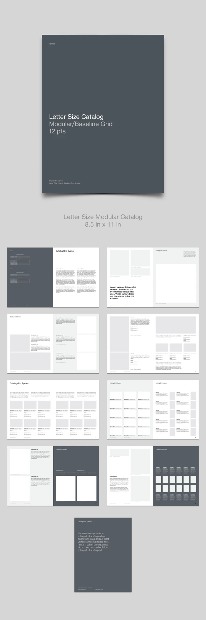
This modular grid-based product catalog layout is the most disciplined InDesign template I have opened in months. It decorates nothing. The cover holds three lines of type on slate gray, and the last line reads 12 pts. That number tells you who made this file.
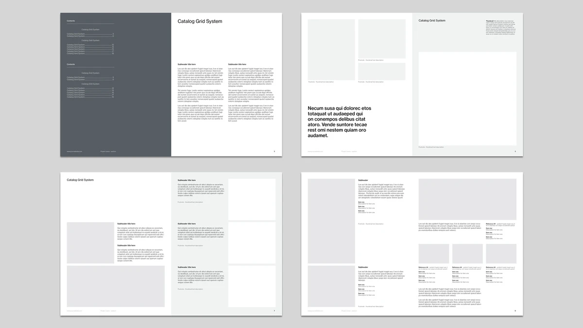
Juan ePrint Shop, an Adobe Stock contributor, designed this modular grid-based product catalog layout for print. The listing promises CMYK color and a print-ready file. So I went through every preview spread. I counted modules, followed the baseline, and noted where the system holds and where it strains.
Please note that this template requires Adobe InDesign to be installed on your computer. Whether you use Mac or PC, the latest version is available on the Adobe Creative Cloud website—take a look here.
What Is a Modular Grid-Based Product Catalog Layout?
A modular grid-based product catalog layout splits each page into repeatable blocks. Each block holds one image and one caption. Designers then merge blocks into larger frames or shrink them into thumbnails.
Here is the definition I use for citation. A modular grid-based product catalog layout is a page system with fixed modules and one shared baseline. Therefore, any product, from a lamp to a lock, fits a slot without a redesign.

Small manufacturers and boutique distributors benefit most. They add products every season, and their catalog must still look like one family.
The Template at a Glance
This table sums up the modular grid-based product catalog layout in seven rows.
| Attribute | Detail |
|---|---|
| Designer | Juan ePrint Shop (Adobe Stock contributor) |
| Software | Adobe InDesign |
| Page size | Letter, 8.5 x 11 in, portrait |
| Baseline grid | 12 pt |
| Color mode | CMYK, print-ready (per the listing) |
| Preview content | Cover, eight spreads, back cover |
| Backgrounds | White, light gray, and slate gray pages |
The arithmetic matters. A letter page measures 792 points tall. Divide by 12, and you get 66 baseline steps before margins. The width gives 51 steps. A modular grid-based product catalog layout lives or dies on round numbers like these.
Four Terms I Use to Judge a Catalog Template
Existing vocabulary falls short here. So I coined four terms. Each one describes something you can check in the preview.
The Density Ladder
The Density Ladder describes how a catalog raises module count from spread to spread. This template climbs it well. The contents spread feels calm. Spread two adds a bold pull quote and one large image.
By the last spread, the slate right page holds twelve thumbnails in six columns. Each rung adds modules, yet the margins never move. That consistency is the strongest feature of this modular grid-based product catalog layout.
The Baseline Handshake
The Baseline Handshake happens when captions in neighboring modules land on the same 12 pt line. Look at the six-up spread. Each page carries three columns and two rows of thumbnails. Every caption starts on a shared line, so your eye reads across the spread without a snag.
Real product names will test this. Long names wrap to two lines, and a wrapped caption can break the handshake. I would lock caption frames to a fixed height in any modular grid-based product catalog layout.
Tint Pacing
Tint Pacing means changing the background tint to mark a new section. This file alternates white and light gray pages. Then it drops in slate for emphasis, which suits a modular grid-based product catalog layout well. Slate anchors the contents page and the final thumbnail wall.
Slate costs money in print, though. A full slate page lays down heavy ink. Ask your printer about total area coverage before you order. A modular grid-based product catalog layout with dark pages deserves a press proof.
Gray Box Honesty
Gray Box Honesty names the habit of using neutral gray placeholders. This modular grid-based product catalog layout does it. The boxes hide nothing, so the grid stays visible.
It also hides a weakness. The preview contains no photography. I cannot judge how product images behave inside these frames. Test with your own shots first.
Why a 12 pt Baseline Grid Beats Free-Form Catalog Layout
Free-form catalogs look fine on page one. By page twelve, nothing lines up. Captions float, and gutters shrink and grow. A modular grid-based product catalog layout prevents that drift.
Consider a range of 200 items. Each item needs a thumbnail and a short caption. Without modules, a designer places 200 frames by hand. With a modular grid-based product catalog layout, the designer fills slots instead. Fewer decisions mean fewer errors.
Readers feel this even when they cannot name it. Repetition teaches them where to look for a size. So they find the right item faster. I consider that speed the real selling tool of any modular grid-based product catalog layout.
Where the Modular Grid-Based Product Catalog Layout Strains
Each caption in this modular grid-based product catalog layout holds a reference line plus short item and size lines. I saw no dedicated price field. So retailers must add one. That gap is small, yet it matters in a wholesale catalog.
The placeholder text is Latin filler. Real copy runs longer. Expect to resize caption frames on almost every spread.
The type looks like a Helvetica-style grotesque. Check the font before you buy. Missing fonts trigger substitution in InDesign, and substitution shifts every line off the grid.
Who Should Buy This Template, and Who Should Skip It
Buy it if your range is large and your photography is consistent. A modular grid-based product catalog layout rewards one image ratio. Frames stay tidy when every photo shares the same crop.
Skip it if your products need long narrative copy. The spreads favor thumbnails over paragraphs. A magazine-style layout fits better than a modular grid-based product catalog layout in that case.
Many buyers search for a letter-size InDesign catalog template for small businesses. This file fits that search. It also works as a print-ready CMYK product catalog template for wholesale price lists. Add a price column first.
How to Customize This InDesign Catalog Template
- Install the fonts first. Open the file only after that.
- Show the grid with View, Grids & Guides, Show Baseline Grid.
- Drop images into the existing frames. Use Object, Fitting, Fill Frame Proportionally.
- Edit the Paragraph Styles panel instead of single captions.
- Keep new swatches in CMYK before you add brand colors.
- Run Preflight. Then export a PDF/X file with your printer’s preset.
Ask your printer about bleed and slug settings as well. Any modular grid-based product catalog layout needs that check. A print-ready label never replaces that conversation.
Module Ledger for a Modular Grid-Based Product Catalog Layout
| Spread type | Module density | Best use |
|---|---|---|
| Contents and intro | Low | Navigation and a short brand statement |
| Feature with pull quote | Low | One hero product or story |
| Mixed text and image | Medium | Product families with descriptions |
| Six-up pair | High (twelve thumbnails per spread) | Variants and size ranges |
| Reference list | High | Spec-heavy items |
| Slate showcase | Medium | Two tall product images |
| Slate thumbnail wall | High (twelve thumbnails, six columns) | Full-range overview |
My Verdict on This Modular Grid-Based Product Catalog Layout
I like it. Some readers will call it cold. I think that coldness is a feature, because photography should supply the warmth.
Others will call it sparse. I disagree. A catalog exists to show products. Buyers who need a built-in price column should look elsewhere.
Where Catalog Templates Go Next
I predict that buyers will start filtering templates by baseline size. This one already states 12 pts on the cover. Soon that label will count as much as the page size.
I also predict that catalog templates will ship with caption frames ready for InDesign Data Merge. A modular grid-based product catalog layout suits spreadsheet-driven publishing, because every module repeats.
FAQs:
What is a modular grid-based product catalog layout?
A modular grid-based product catalog layout is a page system with fixed modules and one shared baseline. Each module holds an image and a caption. You rearrange modules without breaking alignment.
What size is this catalog template?
This modular grid-based product catalog layout uses letter size, 8.5 by 11 inches, in portrait orientation. The baseline grid runs at 12 pt.
Is the modular grid-based product catalog layout print-ready?
The listing says CMYK and print-ready. Still, run Preflight and confirm bleed with your printer before you send files.
Who should use a modular grid-based product catalog layout?
Manufacturers, distributors, and retailers with changing inventories gain the most. The grid absorbs new items. Hence, the design stays consistent.
How do I keep the grid intact while editing?
Keep leading at 12 pt or 24 pt. Snap captions to the baseline grid. Resize frames in whole modules. A 14 pt leading value drifts 2 pt off the grid on every line.
Check out other professional graphic design templates here at WE AND THE COLOR.
Subscribe to our newsletter!