
This post contains affiliate links. We may earn a commission if you click on them and make a purchase. It’s at no extra cost to you and helps us run this site. Thanks for your support!
Let’s Explore Cubron Grotesk: The Modern Typeface Marrying Geometry with Soul
Among sans-serif fonts, a newcomer is making a distinct impression. The Cubron Grotesk font family, a creation of designer Ufuk Aracıoğlu for his Horizon Type foundry, presents a compelling option for designers seeking both clarity and character. This geometric sans-serif does not shout for attention; instead, it earns it through its thoughtful construction and subtle warmth. It strikes a masterful balance between confident neutrality and engaging personality, making it a remarkably versatile tool for modern communication challenges. What gives a typeface its unique voice, and how can that voice shape a brand’s identity? Cubron Grotesk invites us to explore these questions.
The Anatomy of a Modern Classic: What Defines Cubron Grotesk?
At its core, Cubron Grotesk is a geometric sans-serif. This means its letterforms are built upon a foundation of simple, clean shapes like circles and squares. However, it avoids the cold, mechanical feel that can sometimes plague this genre. Aracıoğlu has infused the typeface with a gentle warmth, ensuring it remains approachable and legible. It is a workhorse designed for consistency across both print and digital applications, a crucial requirement in today’s multi-platform design world.
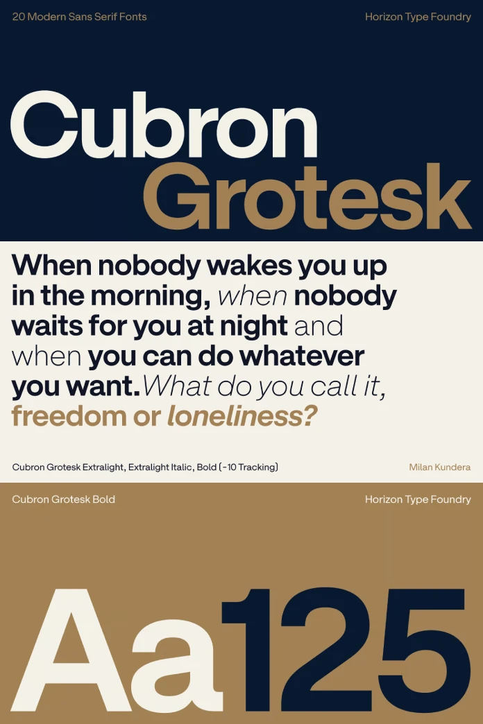
The family’s robust structure is a key asset. It boasts 10 distinct weights, ranging from a delicate thin to a powerful black. Each weight is accompanied by a precisely drawn italic version. This extensive range provides designers with a rich typographic palette. Consequently, you can establish a clear and consistent visual hierarchy, from bold, impactful headlines to quiet, readable body copy, all within a single font family.
Beyond the Basics: Stylistic Alternates for a Custom Voice
Here is where the Cubron Grotesk font family truly distinguishes itself. A typeface with a single, unchangeable personality can be limiting. Recognizing this, Horizon Type has included nearly 20 stylistic alternates. These alternates allow a designer to fine-tune the font’s tone of voice. Do you need to convey sharp clarity? Switch to alternates with more acute angles and assertive forms. Is a softer, more minimalist feel required? There are purer, more streamlined options available. This built-in adaptability empowers you to tailor the typography to the specific emotional context of the message, whether you’re building a brand identity, laying out a magazine, or designing a user interface. This feature elevates Cubron Grotesk from a simple font to a sophisticated communication system.
How to Use Cubron Grotesk for Maximum Impact
The true test of any typeface is its performance in real-world scenarios. The Cubron Grotesk font family proves its mettle through its sheer flexibility.

Crafting Memorable Brand Identities
For branding projects, this font offers a stable yet flexible foundation. Its clean geometry provides a sense of professionalism and modernity. The stylistic alternates then allow for the creation of a truly unique logotype and brand voice. A tech startup might use the sharper, more angular characters to project an image of innovation and precision. Conversely, a lifestyle brand could leverage the softer, rounded forms to appear more approachable and human-centered.
Designing for Readability in Print and Web
When it comes to editorial design or user interface (UI) design, readability is paramount. The well-spaced letterforms and consistent stroke widths of the Cubron Grotesk font family ensure excellent legibility, even in long blocks of text and at smaller sizes. Its performance on screen is as reliable as it is in print, adapting with ease from bold headings to serene paragraphs. The ability to shift from a voice of quiet confidence for body text to one of bold clarity for calls-to-action makes it an invaluable asset for any UI/UX designer.
Why Cubron Grotesk is a Font for the Future
The need for clear, adaptable, and emotionally resonant typography remains constant. Cubron Grotesk is not merely a follower of trends; it is a direct response to the needs of contemporary designers. It provides a reliable voice that can be modulated as needed—sometimes for quiet assurance, other times for bold declaration.
Ufuk Aracıoğlu and Horizon Type have delivered more than just a set of characters; they have provided a tool for nuanced expression. It is sharp when you demand clarity and fluid when you need grace. This typeface doesn’t seek the limelight, yet it has a magnetic quality that draws the eye. It is this blend of understated confidence and hidden depth that positions the Cubron Grotesk font family as a significant and enduring contribution to the world of typography. How will you use its voice to tell your story?
Don’t hesitate to browse WE AND THE COLOR’s Fonts section or check out our selection of the 50 best fonts according to current typography trends in 2025.


