This post contains affiliate links. We may earn a commission if you click on them and make a purchase. It’s at no extra cost to you and helps us run this site. Thanks for your support!
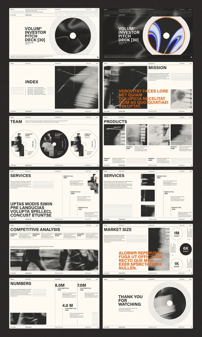
This sample pitch deck presentation template is the quietest startup deck I have opened in a while. Adobe Stock contributor RedGiant created it for InDesign, and it totally skips gradients, icons, and stock-photo cheer. I think that restraint is the smartest design decision in the file. A calm deck stands out because it feels confident. So does this one.
Please note that this template requires Adobe InDesign to be installed on your computer. Whether you use Mac or PC, the latest version is available on the Adobe Creative Cloud website—take a look here.
What Is a Sample Pitch Deck Presentation Template, and Who Needs One?
A sample pitch deck presentation template is a pre-built slide layout set. You replace the placeholder text and images with your own story. The structure, grid, and type hierarchy stay in place.
This one targets founders, freelancers, and small studios who already own InDesign. It also suits designers who build decks for clients. If you pitch investors, partners, or clients, you can use it.
Quick Specs at a Glance
The file measures 1920 x 1080 px, a 16:9 ratio. It holds 12 predesigned pages. Every element is editable in Adobe InDesign. The photos in the preview are for display only. The download does not include them.

Why Does This Pitch Deck Template Look the Way It Does?
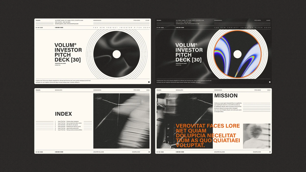
The look borrows from record sleeves. A large vinyl-style disc anchors the cover and the closing page. Thin concentric rings frame it. I like this choice. It gives the deck a memorable object instead of a logo slot.
Each page also carries a slim header strip. It shows a brand mark, a page label, a document number, and a small barcode. The footer repeats a date, a name, and a web address. This frame works like a letterhead. It makes the deck feel official.
The palette is cream, black, and one orange accent. Orange appears on only a few headlines. That single color does the work of a highlighter. Therefore, your key claim always lands first.
The Cover Comes in Two Moods
The preview shows a light cover and a dark cover. The dark version adds a rainbow-edged orange swirl inside the disc. It looks louder. I would use the light one for investors and the dark one for creative clients.
Which 12 Pages Does the Template Include?
The page order follows a classic investor story. It moves from promise to proof. Here is the sequence I found.
- Cover: the disc, a title block, and a director name.
- Index: a numbered list beside a blurred monochrome photo.
- Mission: a large orange statement over a grainy image.
- Team: three portraits cropped inside record discs.
- Products: four image columns with captions.
- Services (two layouts): numbered service titles with short copy.
- Competitive Analysis: four brand columns above a wide image.
- Market Size: three circles that read 1M, 6K, and 1K.
- Numbers: three large figures, such as 8.0M and 7.0M.
- Thank You: the disc returns with contact details.
The Team page deserves praise. Putting faces inside discs feels fresh. It also solves a real problem. Uneven headshots look consistent once the circle crops them.
What Is the Quiet Deck Principle?
I coined the Quiet Deck Principle while reviewing this file. It states that a pitch deck earns trust when design volume stays below content volume. Investors then hear your numbers, not your styling.
This sample pitch deck presentation template follows that rule. The big type is black. The accent is orange. Everything else stays small and gray. As a result, one headline per page carries the message.
The Three Measures of a Quiet Deck
I score decks on a simple scale. I call it the Slide Load Index. It counts how many separate ideas one slide asks you to read. A score of one is ideal. Three is too many.
Most pages here score two. The Services layouts reach three. Those pages feel dense. However, the numbered titles keep the order clear.
How Do You Customize This InDesign Pitch Deck Template?
Customization is easy. Open the file in InDesign. Click a text frame. Type your copy. Swap the images by placing your own files into the frames.
You can also change the orange. Edit the swatch once. Every accent updates. Furthermore, the grid lets you move blocks without breaking alignment.
Use the Placeholder Honesty Test
Here is a second idea I use. I call it the Placeholder Honesty Test. Replace every Latin line with your real sentence. Then check whether the layout still holds.
Long headlines cause trouble on the Mission page. The orange block sets caps at a large size. A short claim fits well. A long claim crowds the image. So write a tight sentence first.
What Can You Do With a 1920 x 1080 Pitch Deck?
The 1920 x 1080 format matches full HD screens. It fits laptops, projectors, and most conference displays. Here are the main ways to use it.
Screen Presentations and PDF
Export the pages to PDF. Open the file full screen. Every slide fills the display without cropping. You can email the same PDF to investors after the meeting.
Interactive PDF and Online Sharing
InDesign exports interactive PDFs with buttons and page transitions. You can link the Index entries to their pages. You can also publish the deck online through InDesign and share a web link.
Animation for Advanced Users
Experienced users can add motion. InDesign offers animation presets, timing, and motion paths. Animations play in online publishing and fixed-layout EPUB output. Static PDF export does not play them.
Images, Video, and Social Posts
You can also export single pages as JPEG or PNG files. Post them as carousel slides. Each slide reads well on a phone. The big headlines stay legible at small sizes.
Where Does This Sample Pitch Deck Presentation Template Fall Short?
I have two critiques. First, the preview photos do not ship with the file. You must supply your own images. The blurred, grainy style is hard to match with bright stock photos.
Second, the template assumes you own InDesign. Founders without a Creative Cloud plan cannot open it. If you work in PowerPoint or Keynote, skip it.
Still, I would take these limits over a bloated deck. This file does less. It does it well.
How Does It Compare With a Typical Startup Deck?
| Feature | This InDesign Template | Typical Startup Template |
|---|---|---|
| Format | 1920 x 1080 px, 16:9 | Often 1920 x 1080 or 4:3 |
| Pages | 12 predesigned pages | 20 to 40 mixed pages |
| Software | Adobe InDesign | PowerPoint, Keynote, Canva |
| Look | Modern, restrained, one accent color | Bright, icon-heavy |
| Images | Not included | Often included |
| Animation | Possible through InDesign | Built in, basic |
| Best for | Designers, studios, creative founders | General business users |
What Will Pitch Decks Look Like Next?
I expect three shifts. Each follows the Quiet Deck Principle.
First, investors will favor shorter decks of 10 to 12 pages. Second, tactile motifs like discs and sleeves will spread among creative startups. Third, designers will treat decks as brand assets, not one-off files.
AI summaries will also read your deck. Clear headlines and labeled numbers help those tools extract your claims. A template with plain page titles, like this one, already helps.
Frequently Asked Questions
What is a sample pitch deck presentation template?
It is a ready-made slide layout set for investor or client pitches. You add your content and keep the structure.
Which software do I need for this template?
You need Adobe InDesign. All pages and elements are editable there.
What size is the template?
It measures 1920 x 1080 px. That size suits screen presentations.
How many pages does it include?
It includes 12 predesigned, fully customizable pages.
Are the photos included?
No. The photos in the preview are for display only. The download excludes them.
Can I add animations?
Yes. Advanced users can add animations in InDesign. They play in online publishing and fixed-layout EPUB.
Can I export it as a PDF?
Yes. InDesign exports it as a standard or interactive PDF.
Who created the template?
Adobe Stock contributor RedGiant created it.
Does it work for non-startup pitches?
Yes. The Services and Products pages suit agency and client proposals. The Market Size page shows three circles, with 1K as the smallest figure.
Don’t hesitate to browse WE AND THE COLOR’s Templates category for more.
Subscribe to our newsletter!