This post contains affiliate links. We may earn a commission if you click on them and make a purchase. It’s at no extra cost to you and helps us run this site. Thanks for your support!
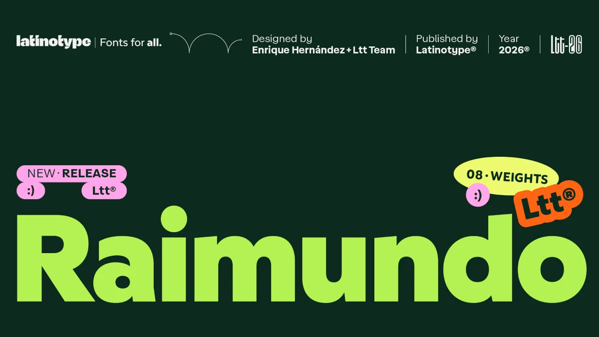
The Raimundo font family makes a bet that most sans serifs avoid. It wants you to remember it. Enrique Hernández and the Latinotype team drew it for food retail and FMCG packaging. They gave it a voice to match.
That bet is timely. Shelves and feeds fill up with neutral grotesques, and most of them look alike. A brand that sets its name in yet another one disappears. So the Raimundo font family pushes the other way, with a rough, friendly voice. I think that is the right call.
This guide defines the Raimundo font family and judges where it works. It also introduces three test frameworks of my own. They are editorial constructs, not industry standards.
What Is the Raimundo Font Family?
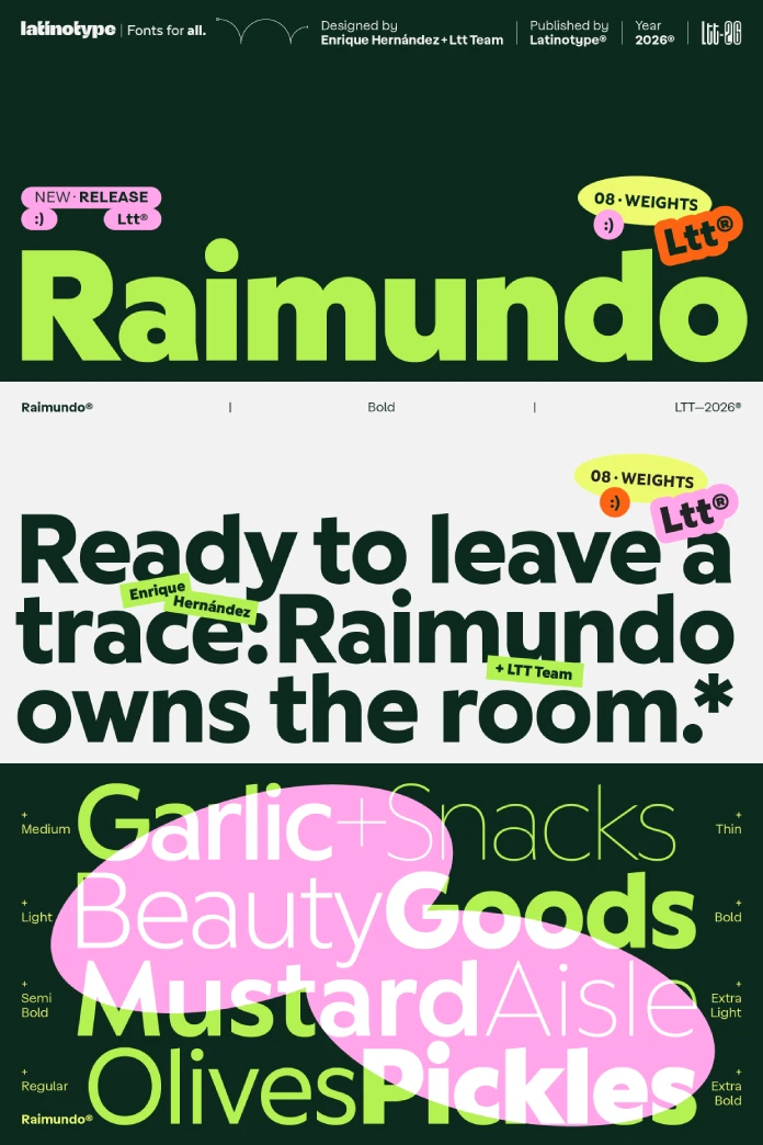
The Raimundo font family is a sans serif by Latinotype with eight weights, from Thin to ExtraBold, and 541 glyphs. Enrique Hernández and the Latinotype team designed it. MyFonts sells it as a family of eight styles.
Latinotype targets food retail, FMCG packaging, digital products, and brand identities. Its description calls the voice raspy and confident, with a joke behind every line. That is a lot of personality for a sans. Still, you can test the claim.

Who Is Behind the Raimundo Font Family?
Latinotype works from Concepción and Santiago, Chile. Luciano Vergara and Daniel Hernández founded it. MyFonts dates the foundry to 2007. Adobe Fonts says 2008.
Slanted counts more than 200 original fonts in its library. The foundry built its name on colorful display and script faces. The Raimundo font family is a sans, so it sits next to Texta, a 32-style workhorse by Daniel Hernández.
How Does Raimundo Sit Between Geometric and Grotesque?
Latinotype places the Raimundo font family between geometric and grotesque. The forms are rounded, with tension in the right places. The counters stay open, and the foundry says that helps at small sizes.
I read this as a hedge with a purpose. Futura runs cold on a cereal box. Helvetica runs corporate. A blend can run warm, and warm sells snacks.
The Alternate Dial: What Changes With a, e, and g
The Raimundo font family ships alternates for a, e, and g. Latinotype says they move the expression from neutral to expressive. I call this the Alternate Dial. It describes any alternate set that changes a typeface’s temperament and leaves its skeleton alone.
Compare Texta, the foundry’s neutral sans. Its Alt version swaps lowercase a, g, and y for geometric constructions. Texta uses alternates to calm things down. Raimundo uses them to turn things up.
Check how your layout app exposes the alternates before you promise a client anything.
Why Do Eight Weights Matter on a Package?
Eight weights give a brand a full hierarchy from one family. The Raimundo font family covers that range. Thin can carry a legal line. ExtraBold can carry the product name. MyFonts lists eight styles for eight weights, so I see no italics in the listing.
I judge a family like this with the Voice-to-Weight Ratio. It asks how much character survives at each weight. A family with a loud ExtraBold and a bland Thin scores low. Latinotype claims every weight in the Raimundo font family can stand alone. Test that claim first.
Here is my routine. Set one headline in all eight weights at 24 pt. Then shrink the same lines to 9 pt. Mark the weight where the voice disappears.
I would not print Thin below 10 pt on uncoated stock. Ink spread eats thin strokes, and no foundry description changes that.
Where Does the Raimundo Font Family Work Best?
Food packaging rewards recognition over elegance. A shopper scans a shelf and moves on. So the brand name must read fast, and the letters must carry the mood. This is where the Raimundo font family aims, and the aim is sound.
The Shelf-Distance Test
The Shelf-Distance Test checks a wordmark at three distances. Arm’s length is about 20 inches. Shelf distance is about 6 feet. Thumbnail size is 150 pixels wide. A typeface passes when the brand name reads at all three.
Rounded forms with open counters should pass the thumbnail check. Tight counters clog at 150 pixels. That is the practical reason to pick a friendly sans serif font for food packaging over a default grotesque.
Raimundo for Digital Products and Brand Identities
Latinotype also lists digital products. I would use ExtraBold for headings and a middle weight for interface labels. Long body copy needs its own trial. I would not commit a reading layout to any characterful sans without one.
Brand identities are the stronger fit for the Raimundo font family. The foundry promises a face people recognize before they finish reading. A wordmark is the cheapest place to test that promise.
Are the Typographic Emoticons a Gimmick?
The Raimundo font family includes typographic emoticons. Latinotype says they fit consumer-facing brands without feeling forced. I disagree in part. An emoticon inside a logo dates that logo within a season.
Keep them out of the logo. Use them in packaging copy and social posts, where a wink costs nothing. Because they live in the font, they scale and recolor like any letter.
What Does the Raimundo Font Family Cost?
At the time of writing, MyFonts lists the complete Raimundo font family of eight fonts at $149. Single styles start at $39. A 60% promotion on the page cuts the family to $59.60.
Four single styles at the starting price already cost $156. So the family bundle wins by $7 at list price. Prices change, so check the live page before you buy.
Raimundo Font Family at a Glance
| Attribute | Detail |
|---|---|
| Name | Raimundo |
| Foundry | Latinotype (Concepción and Santiago, Chile) |
| Designers | Enrique Hernández, Latinotype Team |
| Classification | Sans serif, between geometric and grotesque |
| Styles | 8 weights, Thin to ExtraBold |
| Glyphs | 541, including typographic emoticons |
| Alternates | a, e, and g |
| Italics | None listed |
| Intended use | Food retail, FMCG packaging, digital products, brand identities |
| List price | Family of 8 for $149, single styles from $39 |
| Where to buy | MyFonts |
Where Is the Raimundo Font Family Headed?
These are predictions, not facts. They rest on my reading of the category.
First, emoticon glyph sets will spread across FMCG-focused families within two years. Packaging teams want a wink that matches the type, and foundries will answer.
Second, brands will license one alternate-rich family instead of pairing two fonts. Alternates make that possible. The a, e, and g in the Raimundo font family are an early example.
Third, friendly rounded sans serifs will crowd the grocery aisle. Recognition will then depend on small details, such as a single alternate g. Check that detail on your own screen before you commit.
Frequently Asked Questions About the Raimundo Font Family
Who designed the Raimundo font family?
Enrique Hernández and the Latinotype team designed it. Latinotype published it.
How many weights and glyphs does the Raimundo font family have?
It has eight weights, from Thin to ExtraBold, and 541 glyphs.
What is the Raimundo font family best for?
Latinotype lists food retail, FMCG packaging, digital products, and brand identities.
Does the Raimundo font family include italics?
The MyFonts listing shows eight styles for eight weights. No italics appear in it.
Which Latinotype font is similar to Raimundo?
Texta is the closest sibling in the category. It is a neutral sans with 32 styles. Its Alt version swaps a, g, and y for geometric forms.
How much does the Raimundo font family cost?
MyFonts lists the complete family at $149. Single styles start at $39.
Don’t hesitate to take a look at WE AND THE COLOR’s Fonts category here at WE AND THE COLOR.
Subscribe to our newsletter!