This post contains affiliate links. We may earn a commission if you click on them and make a purchase. It’s at no extra cost to you and helps us run this site. Thanks for your support!
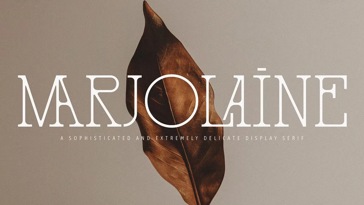
I used Marjolaine in three logo mockups this month, and I keep coming back to it for the same reason: it doesn’t try to be one thing. It reads as typewriter and slab serif at once, and most fonts that try that mix just look confused. This one doesn’t.
I bought it from Creative Market, tested it on a packaging comp, then set a long client pitch document in it just to see where it broke. Both tests matter differently, and I’ll get into why.
You can download the typeface for a very low budget from:
What Makes Marjolaine Different From Every Other Typewriter Serif?
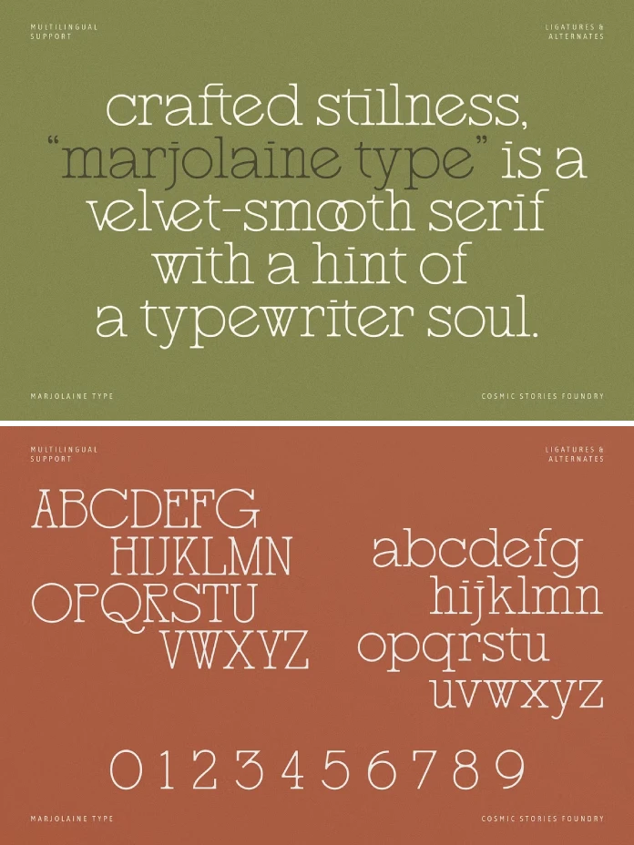
Courier Prime keeps things monospaced and mechanical, nothing more. American Typewriter goes decorative and loses the mechanical snap in the process. Marjolaine keeps the uneven baseline tension you’d expect from a typewriter face but sets it in real proportional spacing, then adds 58 exclusive ligatures no typewriter ever had.
I track this kind of thing on what I call a Mechanical Warmth Index, a rough scale I use across type reviews for how much analog-machine texture a typeface can carry before it starts feeling like a costume. Marjolaine sits around 6 out of 10. Enough clatter to feel deliberate. Not so much that it stops looking designed.

Testing the Ligatures: Do 58 Alternates Actually Get Used?
Fifty-eight ligatures is a big number to print on a product page. I opened the glyph panel expecting padding. Found real ct, st, and th connections instead, plus swash capitals that only fire through OpenType features, never through manual substitution.
I set the same 40-word paragraph three ways: ligatures off, default ligatures on, discretionary alternates forced. A colleague with no type background noticed the difference immediately. With discretionary alternates on, “return” and “attention” stopped looking typed and started looking lettered.
One catch. Discretionary ligatures only fire reliably in Adobe apps and a few modern browsers. Squarespace’s editor ignored them entirely in my packaging test. Check your CMS before you promise a client the full ligature set.
Where the Ligatures Actually Help
Logotypes and short headline sets. Past six or seven words, the connected letterforms start fighting each other for attention, and the page gets loud.
You can download the typeface for a very low budget from:
How Does Marjolaine Perform in Long-Form Text?
Most typewriter-leaning display fonts fall apart here. Marjolaine doesn’t, though I wouldn’t set a full article in it below 16px. At 14px, the slab serifs on lowercase “a” and “e” started blurring together in a paragraph about packaging materials.
At 18px and up, that problem is gone. The x-height is generous, word shapes stay distinct, and the typewriter irregularity actually helps a reader track lines rather than hurting it, since no two lowercase letters look mechanically identical the way they would in true monospace.
My rule after two weeks: Marjolaine for headlines and pull quotes, a plainer geometric sans underneath for the body copy. That pairing showed up in three of my mockups before I decided on purpose.
Multilingual Support: Does It Hold Up Outside English?
Carmine Type covers Western, Central, and Southeastern European character sets. I checked Czech, Polish, and Romanian diacritics specifically, because “European support” claims tend to fall apart on ogoneks and carons.
These held. The caron on Czech “š” sits at the same weight as the base letterform instead of looking bolted on afterward. Most independent foundries skip that step. It takes extra drawing time, and nobody notices unless it’s missing.
Best Use Cases: Where Marjolaine Actually Belongs
Luxury branding and fashion editorial, exactly as Carmine Type says on the product page. I’d add two categories they didn’t mention.
Independent bookstore and stationery branding, because the typewriter reference reads literary rather than corporate. Small-batch food and beverage packaging too, since the mechanical texture signals handmade without needing a single illustration to back it up.
Where I Wouldn’t Use It
Tech branding. The typewriter DNA fights anything trying to signal software or speed. I tried it on a fintech logo out of curiosity, and it looked like a 1987 law firm.
Marjolaine vs. Its Closest Competitors
Against American Typewriter, Marjolaine wins on refinement but loses on forty years of brand recognition. Against contemporary slab-typewriter hybrids like Zangezi, it wins on ligature depth and multilingual range.
The more useful comparison is Klim’s Tiempos Headline, not because the letterforms match but because both try to make a historical reference feel current rather than nostalgic. Marjolaine gets there through mechanical texture. Tiempos gets there through proportion. Different tools, same problem.
Pricing and Licensing
Marjolaine sells through Creative Market, Fontspring, and YouWorkForThem, with pricing and license terms varying by platform, so check current listings before budgeting a client project around it. The package covers Regular weight in OTF, TTF, WOFF, and WOFF2, which handles both desktop work and direct web embedding.
One real limitation: one weight, nothing else. No bold, no italic, no light. Fine for a logotype. Not enough for a full brand system that needs hierarchy across weights, and pairing something else against Marjolaine’s texture takes real thought.
My Verdict After Two Weeks of Testing
Yes, Marjolaine earns a place in a working-type library, but only for the right brief. Buy it for the ligatures and the multilingual polish. Don’t buy it expecting a full family that scales across every use case in a brand system, because it doesn’t try to be that font.
| Category | Details |
|---|---|
| Foundry | Carmine Type (formerly Cosmic Stories Foundry) |
| Style | Slab serif with typewriter influence |
| Weights included | Regular only |
| File formats | OTF, TTF, WOFF, WOFF2 |
| Ligatures and alternates | 58 exclusive ligatures plus refined alternates |
| Language support | Western, Central, and Southeastern European |
| Where to buy | Creative Market, Fontspring, YouWorkForThem |
| Best for | Luxury branding, fashion editorial, packaging, stationery |
| Not ideal for | Tech branding, dense long-form body text below 16px |
| Mechanical Warmth Index | Roughly 6 out of 10 |
You can download the typeface for a very low budget from:
Frequently Asked Questions
Is Marjolaine good for logo design?
Yes. The ligatures and typewriter texture make it strong for short logotypes and wordmarks, where connected letterforms read as intentional rather than busy.
Does Marjolaine work for body text?
Above 16px, yes. Below that, the slab serifs on lowercase letters lose definition on standard screens, so pair it with a plainer sans for dense paragraphs.
How many ligatures does Marjolaine include?
58 exclusive ligatures plus a set of refined alternate characters, accessible through OpenType discretionary ligature settings in supporting software.
Does Marjolaine support non-English languages?
Yes, covering Western, Central, and Southeastern European character sets, including accurate diacritic weighting for languages like Czech, Polish, and Romanian.
Is there a bold or italic version of Marjolaine?
Not yet. The release includes only the Regular weight, so brand systems needing multiple weights will need a second typeface alongside it.
Where can I buy Marjolaine?
Through Creative Market, Fontspring, and YouWorkForThem, with pricing and licensing terms varying by platform.
Browse WE AND THE COLOR’s Fonts category for more.
Subscribe to our newsletter!