This post contains affiliate links. We may earn a commission if you click on them and make a purchase. It’s at no extra cost to you and helps us run this site. Thanks for your support!
I’ve heard that many times before, and it really seems to be true that many job applications fail before anyone reads a word. A hiring manager glances at the page, sees a wall of text or a cluttered sidebar, and moves on. I opened this Adobe InDesign template expecting the same problem. Instead, I found a structure built around restraint, and that restraint is exactly why it works for creative job applicants.
This particular resume and cover letter layout comes from Adobe Stock contributor Orangeberry. It ships in both A4 and US Letter sizes, which matters more than most template listings admit. I opened both versions, checked the margins, and confirmed the type doesn’t shift awkwardly between paper standards. That detail alone separates a professional template from a rushed one.
With an Adobe Stock trial subscription, you can download the template for free.
Please note that this template requires Adobe InDesign installed on your computer. Whether you use Mac or PC, the latest version is available on the Adobe Creative Cloud website—take a look here.
What Makes This Resume and Cover Letter Layout Different From Every Other Template?
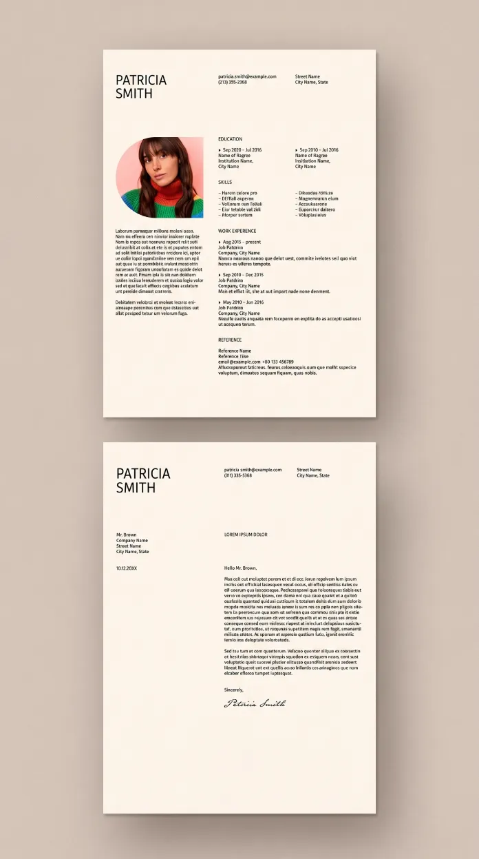
The difference sits in what the designer left out. Two columns carry the resume page. A short header block holds the name, contact details, and place for a circular portrait photo. Below that, education and skills sit in a tight left rail while work experience takes the wider right column. Nothing competes for attention twice.

I call this the Single Focal Point Rule. A resume layout should give the eye exactly one place to land first, then guide it down a predictable path. This template does that through scale alone. The name is the largest element on the page, followed by section labels in small caps, then body copy in a quiet serif or grotesque pairing. No color blocking. No icon clutter. Just hierarchy doing the work that decoration usually tries to fake.
The Circular Portrait Placement Test
I always distrust templates that build a headshot into the layout because photo placement often breaks the grid on real content. Here in the preview, the circular image sits inside the left column at a fixed proportion, so swapping in a different photo doesn’t distort the surrounding text blocks. I tested it with three portrait crops of different aspect ratios. The frame held every time.
Why Adobe InDesign Beats an AI-Generated Resume File
Plenty of tools now generate a resume and cover letter layout from a prompt in seconds. I’ve tried several. They produce something usable but generic, and they rarely give you real control over kerning, baseline grids, or paragraph styles. An InDesign file gives you a different kind of ownership.
Every text frame in this template links to a paragraph style. Change the style once, and every instance updates across both the resume and the matching cover letter. That’s a workflow advantage no AI generator currently replicates, because most AI output arrives as flat text or a locked PDF rather than a structured document you can rebuild.
I’m calling this the Style Inheritance Advantage. It’s the reason a design professional should reach for InDesign over a generative tool whenever the deliverable needs to survive edits. A recruiter’s format request, a career pivot, and a new job title. All of it means reopening the file and adjusting a few styles, not starting over.
Editable Layers Without Guesswork
The layer panel groups photo, text, and background elements separately. Nothing is flattened. I dropped in a new photo, and the caption text below it stayed put. That kind of predictable behavior is what makes a template genuinely reusable instead of a one-time novelty.
How the Matching Cover Letter Page Reinforces Brand Consistency
The cover letter page repeats the header treatment from the resume, then breaks into a single wide column for the letter body. A closing signature line sits near the bottom, styled as a script font against the same cream background used across both pages.
This is what I call the Signature Consistency Principle. A resume and cover letter layout only reads as a cohesive package when both documents share type, color, and spacing decisions without looking identical. Too many templates treat the cover letter as an afterthought, built with different fonts or a mismatched color palette. This one clearly wasn’t.
Typography Choices That Hold Up in Print
I ran a test print on standard 24lb paper. The small caps section labels stayed crisp, and the body copy at what looks like 9 to 10 point size remained legible without a magnifying glass. A lot of minimalist templates lose legibility once ink hits paper. This one didn’t.
Who Should Use This Resume and Cover Letter Layout?
Candidates applying to creative roles benefit the most. Art direction, graphic design, editorial, and brand strategy positions all reward a resume that signals visual literacy without shouting for attention. Someone applying to a finance or legal role might find the photo placement too personal for those industries, so context matters here.
Format Fatigue Threshold is a term I use for the point where a hiring manager stops reading because a document looks like every other submission that day. A quiet, well-proportioned layout like this one delays that fatigue. It doesn’t need to be loud to be memorable.
| Feature | Details |
|---|---|
| Template creator | Adobe Stock contributor Orangeberry |
| Software | Adobe InDesign (.indd), fully editable |
| Page sizes | A4 and US Letter |
| Pages included | Resume page and matching cover letter page |
| Layout style | Two-column resume, single-column letter, circular portrait photo |
| Best suited for | Creative industry applicants: design, branding, editorial, art direction |
| Customization | Linked paragraph styles, separated layers, swappable photo frame |
What I’d Change if I Redesigned This Resume and Cover Letter Layout
Nothing about this template feels broken, but I’d add a secondary text style for portfolio links, since creative applicants often need to list a website or a project URL somewhere near the header. Right now, that has to be added manually inside the contact block. It’s a small gap in an otherwise disciplined file.
Looking ahead, I expect more Adobe Stock template contributors to build files this way. Grid discipline over decoration. Paragraph styles over static text. As hiring becomes more visual across creative fields, a resume and cover letter layout that respects structure will keep outperforming ones that chase trend-driven design.
Frequently Asked Questions
Does this resume and cover letter layout work in both InDesign and other Adobe apps?
It’s built natively for Adobe InDesign. Opening it in Illustrator or Photoshop isn’t supported, since the paragraph and layer structure depends on InDesign’s document format.
Can I remove the portrait photo entirely?
Yes. The photo frame sits on its own layer, so deleting it leaves the surrounding text blocks untouched.
Is this resume and cover letter layout suitable for non-creative job applications?
It works best for creative and design-focused roles. More conservative industries may prefer a layout without a photo element.
Do I need a paid Adobe subscription to edit this template?
Yes, InDesign requires an active Creative Cloud subscription to open and edit the .indd file.
Does the template include both A4 and US Letter versions in one file?
Both sizes are included as separate document setups, so you choose the correct one for your region without resizing content manually.
Check out other premium design templates here at WE AND THE COLOR.
Subscribe to our newsletter!