This post contains affiliate links. We may earn a commission if you click on them and make a purchase. It’s at no extra cost to you and helps us run this site. Thanks for your support!
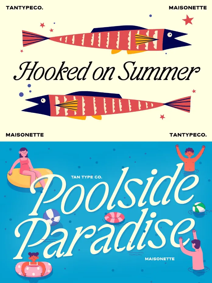
A typeface either survives contact with a real layout or it doesn’t. That’s the test I run on every serif that crosses my desk, and it’s the test I ran on the TAN Maisonette font for the past two weeks. Designed by TanType, Maisonette markets itself as a high-contrast serif built for editorial warmth and vintage book charm. Marketing copy is cheap. So I built headlines, set body paragraphs, printed proofs, and pushed the italic until it either held its shape or fell apart.
It held its shape. But not everywhere, and not for every project. Here’s what I found, sentence by sentence, glyph by glyph.
Is TAN Maisonette Different From Other Vintage-Inspired Serifs?
Yes, and the difference sits in the contrast curve. Most nostalgia-coded serifs on Creative Market lean on decoration: swashes, ligatures, and extra flourishes bolted onto a fairly ordinary skeleton. Maisonette does the opposite. Its personality comes from stroke modulation, not ornament. Thick verticals snap against hairline serifs, which gives the typeface a printed, almost letterpress-adjacent texture even on a screen.
That single design choice separates Maisonette from typical “vintage” display fonts. It reads less like a costume and more like an actual typographic period, closer to early twentieth-century European book type than to a scrapbook sticker.
What Is the TAN Maisonette Font, Exactly?
TAN Maisonette is a high-contrast serif with a matching italic, released by TanType, the Java-based foundry founded by type designer Novia Jonatan in 2019. TanType built its name on expressive, retro-leaning display fonts, and Maisonette continues that lineage while pulling toward something quieter and more literary.

The typeface draws from old novels, handwritten correspondence, and European print traditions. You can see that lineage in the terminals: they curve instead of cutting off sharply, which softens the overall formality. Multilingual character support and free future updates come standard, which matters if you’re licensing for long-term brand use rather than a single campaign.
The TanType Design Philosophy Behind Maisonette
TanType typefaces generally chase mood over neutrality. Maisonette fits that pattern, but it’s more restrained than the foundry’s louder releases. Where some TanType fonts announce themselves immediately, Maisonette waits. It rewards a slower read, which is exactly what editorial and book-cover work demands.
How Does the TAN Maisonette Font Perform in Real Design Work?
I tested Maisonette across three practical scenarios: large-format headlines, mid-size subheads, and long-form body copy. Each one exposed something different about the typeface’s range.
Headline Testing at Large Sizes
At 80 pt and above, Maisonette earns its keep. The contrast between thick and thin strokes becomes dramatic without turning fragile. I set it against a cream background for a mock book cover, and the letterforms held presence without shouting. That’s a harder balance to strike than it sounds; most high-contrast serifs either whisper or scream, rarely both.
Body Copy and Paragraph Legibility
Here’s where I want to introduce a term I’ll use for the rest of this review: the Editorial Legibility Threshold. I define this as the point size at which a high-contrast display serif stops reading as decoration and starts reading as functional text. For TAN Maisonette, that threshold sits around 16 to 18 pt in a tight column width and drops closer to 14 pt if you loosen tracking slightly.
Below that range, the hairline serifs thin out enough on lower-resolution screens to soften the reading rhythm. Above it, Maisonette behaves like a proper text face, not just a headline specimen dressed up for body use.
The Italic: Movement Without Chaos
The italic style is the real find here. It leans into a calligraphic slant with connected-feeling curves, giving pull quotes and captions a handwritten warmth. I tested it against a wedding invitation layout, and it outperformed several dedicated script fonts I’ve reviewed this year. It reads as intentional, not decorative filler.
Introducing the Contrast Warmth Index
I’ve been developing a framework across several TanType reviews, and Maisonette is a strong candidate to formalize it: the Contrast Warmth Index. This is an editorial scoring method I use to rate how a high-contrast serif balances structural sharpness against emotional approachability. It runs on three factors: stroke contrast ratio, terminal curvature, and italic fluidity.
On a scale where a rigid Didone like Bodoni scores near the cold end and a soft slab serif scores near the warm end, TAN Maisonette lands firmly in the middle-warm zone. It keeps enough contrast to feel editorial and premium, while the curved terminals and expressive italic pull it toward approachable rather than austere. This is an editorial framework I’m proposing, not an established industry metric, but it’s a useful shorthand when you’re comparing serif options for a brand that needs both authority and warmth.
Where TAN Maisonette Font Works Best
Based on hands-on testing, Maisonette performs strongest in these contexts:
- Book covers and literary branding, where the vintage serif character reinforces a story-driven tone
- Wedding stationery and invitations, especially paired with the italic for names and dates
- Packaging for beauty, food, or lifestyle products aiming for a European, heritage-adjacent feel
- Editorial layouts, magazine spreads, and long-form articles that want personality in the headline system
- Logo and wordmark design for boutique or legacy-positioned brands
It performs less convincingly in high-density UI work, dashboards, or anywhere legibility at small sizes under heavy time pressure matters more than character. That’s not a flaw. It’s simply outside the brief Maisonette was designed to answer.
TAN Maisonette Font: Specifications at a Glance
| Attribute | Detail |
|---|---|
| Foundry | TanType, founded by Novia Jonatan |
| Classification | High-contrast serif with matching italic |
| Design inspiration | Vintage book typography, European print, handwritten notes |
| Best use cases | Branding, book covers, packaging, wedding stationery, editorial design |
| Editorial Legibility Threshold | Roughly 16 to 18pt for functional body copy |
| Contrast Warmth Index rating | Middle-warm (structural sharpness balanced by curved terminals) |
| Language support | Multilingual character set |
| Updates | Free future updates included |
| Price | Starting around $19 on Creative Market |
Is the TAN Maisonette Font Worth the Price?
At its Creative Market list price, the TAN Maisonette font sits well below what a comparable high-contrast serif with a genuinely usable italic would cost from a larger type foundry. You’re not paying for a massive variable font system with a dozen weights. You’re paying for one confident, well-executed voice and its companion italic.
For designers who need a signature serif for a single brand identity or a book series, that’s a fair trade. For teams that need extensive weight ranges across a full type system, Maisonette will need pairing with a neutral sans or slab to carry the heavier lifting.
My Prediction: Where Fonts Like Maisonette Are Heading
Nostalgia-coded serifs have been climbing steadily across branding and packaging for the past few seasons, and I don’t see that trend reversing soon. Consumers respond to typefaces that feel handmade in a market saturated with geometric sans serifs. TAN Maisonette arrives at a good moment for that shift.
My prediction: expect more foundries to chase this exact space, high-contrast serifs with usable calligraphic italics rather than purely decorative ones. Maisonette’s italic quality specifically sets a bar other releases will need to match.
Frequently Asked Questions About the TAN Maisonette Font
What type of font is TAN Maisonette?
TAN Maisonette is a high-contrast serif typeface with a matching italic, designed by TanType and inspired by vintage book typography and European print design.
Is TAN Maisonette good for body text?
Yes, above roughly 16 to 18 pt in a moderately tight column. Below that range, the hairline strokes lose some of their crispness on screen.
What is TAN Maisonette best used for?
Book covers, editorial layouts, wedding stationery, packaging, and branding projects that want a literary, vintage-inspired character.
Who designed the TAN Maisonette font?
TAN Maisonette comes from TanType, a font foundry founded by type designer Novia Jonatan in 2019.
Does TAN Maisonette include an italic style?
Yes. The italic is calligraphic and expressive, and it performs especially well for pull quotes, captions, and invitation text.
Is TAN Maisonette a good choice for logo design?
It works well for boutique, heritage, or literary-positioned brands. For highly technical or minimal brand identities, a more neutral typeface may fit better.
Check out other amazing typefaces here at WE AND THE COLOR.
Subscribe to our newsletter!