
This post contains affiliate links. We may earn a commission if you click on them and make a purchase. It’s at no extra cost to you and helps us run this site. Thanks for your support!
TanType’s Sunset Font Provides the Ultimate Vibe for Nostalgic, Sun-Kissed Design
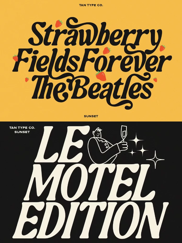
Typography is experiencing a soulful revival. Designers are moving past the era of cold, impersonal fonts. Instead, they now seek typefaces with genuine character. The TAN Sunset font by TanType perfectly captures this shift. It offers a warm, inviting alternative that feels both nostalgic and incredibly current. This playful summer script embodies the carefree spirit of a perfect summer evening. Consequently, it provides a powerful tool for creating brands and designs that connect on a human level. The Sunset typeface is not just about readability; it is about feeling.
The TAN Sunset font is a beautiful paradox. It is both simple and stylish. It feels whimsical yet remains strong and confident. This font finds its inspiration in the lingering sweetness of summer days. Imagine the last golden hours at the beach. That feeling of warm, effortless fun is baked into every curve and stroke of this typeface. It was designed to evoke a smile, to tap into a shared memory of sun-drenched nostalgia. This font invites you to create designs that are not just seen, but also felt.
What Makes the TAN Sunset Font So Captivating?
At first glance, the TAN Sunset font appears to be a casual script. However, a closer look reveals a sophisticated design at work. Its charm lies in a masterful balance of features that make it both unique and highly usable.
The structure of the Sunset typeface is built on confident, bold strokes. This gives it a strong presence that stands out in any design. Yet, these bold lines are softened by “flirty,” flowing curves. This creates a dynamic interplay between strength and playfulness. The letters connect with a breezy, natural flow, mimicking the rhythm of casual handwriting. This quality makes the font feel personal and approachable. It sheds the rigidity of more formal scripts.
This font has a distinct retro flavor. Its letterforms subtly echo the free-spirited typography of the 1970s. However, it cleverly avoids feeling dated. Instead, the TAN Sunset font translates that vintage aesthetic for a modern audience. Why does this resonate so strongly today? That nostalgic element taps into a collective desire for authenticity and simpler times. It evokes feelings of warmth, freedom, and happiness. This makes it a powerful asset for any project aiming to create a positive emotional impact.

The Strategic Advantage of the Sunset Typeface in Design
The true power of the TAN Sunset font lies in its versatility. While it has a distinct personality, it adapts beautifully to a wide range of applications. Designers are choosing it for its ability to instantly inject warmth and character into a project.
For branding, the TAN Sunset typeface is a game-changer. It is perfect for logos, taglines, and marketing materials for lifestyle brands, cafes, boutiques, and creative businesses. Imagine it as the logo for a beachfront coffee shop or a sustainable fashion label. It immediately communicates a friendly, laid-back, and authentic brand ethos. This font helps businesses move beyond a corporate feel and build a brand that feels like a friend.
The utility of the TAN Sunset font extends far beyond branding. Its playful elegance makes it an excellent choice for wedding invitations and event posters. On social media, its eye-catching style ensures that graphics stand out in a crowded feed. Furthermore, it works beautifully for packaging design, adding a handcrafted touch that can make a product feel more special and artisanal. It adds a touch of seaside charm to any project it graces.
How to Use the TAN Sunset Font Like a Pro
To maximize the impact of this beautiful script, a thoughtful design approach is key. Its expressive nature requires careful consideration of its context and companions. How can you ensure it shines in your next design?
The TAN Sunset font is the star of the show. Therefore, it needs a strong supporting cast. Pairing it with a clean, understated sans-serif font for body text is an excellent strategy. This creates a clear visual hierarchy and ensures readability. A font like Poppins or Montserrat provides a neutral, modern backdrop that allows the personality of the Sunset typeface to take center stage in headlines. This contrast creates a design that is both visually interesting and easy to navigate.
A font this evocative should not exist in a vacuum. To enhance its nostalgic, summery vibe, build a complete visual world around it. Pair the TAN Sunset font with a warm, sun-kissed color palette. Think terracotta oranges, dusty pinks, and creamy yellows. You can also complement it with grainy textures or vintage-filtered photography to amplify its retro appeal. By creating a cohesive mood board, you transform the font from a simple choice of letters into the cornerstone of a compelling and immersive design story.
Check out other trending typefaces on WE AND THE COLOR or explore our selection of the 100 coolest fonts for 2026.
Subscribe to our newsletter!


