This post contains affiliate links. We may earn a commission if you click on them and make a purchase. It’s at no extra cost to you and helps us run this site. Thanks for your support!
Tan Maple is the Unapologetically Bold Typeface Your Designs Crave
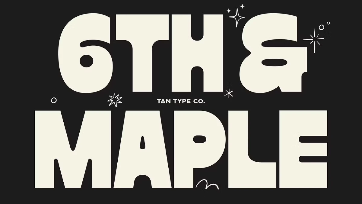
The significant shift towards more expressive typography makes the emergence of fonts like Tan Maple by TanType not just timely, but essential. We are witnessing a collective desire for visual impact. Furthermore, there is a demand for typography that speaks with a clear, confident voice. Tan Maple answers that call with a resounding, blocky shout.
This typeface is a statement piece. It’s a declaration of boldness in a world that often whispers. For designers looking to make an immediate and lasting impression, understanding the power of such a typeface is crucial. So, why is a font like Tan Maple gaining traction now? Because it taps into a fundamental need for authenticity and strength in visual communication. Ultimately, it’s a font that doesn’t just convey a message; it embodies an attitude.
What Exactly is Tan Maple?
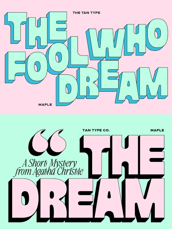
Tan Maple is a bold, heavy typeface designed by TanType. At its core, it is chunky and blocky, projecting an image of confidence and strength. The shapes are solid and grounded. Yet, they possess a subtle flow that prevents them from feeling static or rigid. This is a font that feels both modern and edgy, full of an unapologetic attitude.
Imagine a font that stands its ground. That is the very essence of Tan Maple. Its heavy weight and commanding presence make it ideal for headlines, posters, and any project that needs to capture attention instantly. This isn’t a font for the fine print; it’s a font for the main event.
The Rise of Bold and Expressive Typography
The current trend in typography is seeing a significant move towards bold and expressive fonts. In fact, designers are looking for typefaces that can carry a brand’s identity and make a powerful statement. This is a clear departure from the more neutral and understated fonts that have dominated for years. The renewed interest in serif and bold fonts suggests a desire for more character and distinction in modern design.
So, where does the Tan Maple font fit into this trend? It is a perfect example of a typeface that meets this growing demand. Its bold and chunky design allows it to be a focal point in any composition. In short, it’s a font that doesn’t just support the design; it often becomes the design itself.
Key Characteristics of Tan Maple:
- Bold and Heavy: Its most defining feature is its substantial weight, making it impossible to ignore.
- Chunky and Blocky: The letterforms are solid and substantial, which gives a sense of stability and impact.
- Modern and Edgy: Despite its blockiness, it has a contemporary feel with a distinct personality.
- Multilingual Support: This important feature enhances its versatility for a global audience and diverse projects.
How to Wield the Power of the Tan Maple Font
Using a font as powerful as Tan Maple requires a thoughtful approach. Its assertive nature means it will not be suitable for every application. However, in the right context, it can elevate a design from mundane to truly memorable.
Best Use Cases for the Tan Maple Font:
- Branding and Logos: It is perfect for brands that want to project an image of strength, modernity, and confidence.
- Headlines and Titles: Its high impact makes it ideal for grabbing a reader’s attention on websites, in magazines, or on book covers.
- Poster Design: When you need to make a bold statement that can be seen from a distance, Tan Maple is an excellent choice.
- Social Media Graphics: In a fast-scrolling digital environment, this font can help your message stand out decisively.
When considering Tan Maple font pairings, you should select a more neutral and lighter-weight font for the body text. This will create a clear visual hierarchy. It will also prevent the design from feeling overwhelming. Ultimately, the contrast between the bold headline and the simpler body font will make the overall composition more dynamic and readable.
A Design Critic’s Perspective on Tan Maple
From a design critic’s perspective, Tan Maple is a breath of fresh air. It’s a font that knows exactly what it is and doesn’t try to be anything else. Indeed, its unapologetic boldness is its greatest strength. While it may not be the most versatile font in a designer’s toolkit, it is exceptionally good at what it does.
What I find most compelling about Tan Maple is its ability to feel both playful and strong. The chunky letterforms have a certain friendliness to them. Meanwhile, the overall impression is one of unwavering confidence. It’s a font that I can easily see being used for a trendy streetwear brand, a modern art exhibition, or a forward-thinking tech company. Therefore, the potential applications are surprisingly broad for such a distinctive typeface.
Tan Maple encourages designers to be more daring. It also inspires them to create work that is not afraid to make a statement. It’s a font that reminds us that sometimes, the boldest choice is the right choice. So, the next time your design needs a shot of adrenaline, consider reaching for Tan Maple. You might just be surprised at the impact it can make.
Check out other amazing typefaces on WE AND THE COLOR or explore our selection of the 100 coolest fonts for 2026.
Subscribe to our newsletter!

