This post contains affiliate links. We may earn a commission if you click on them and make a purchase. It’s at no extra cost to you and helps us run this site. Thanks for your support!
Choosing the right font shapes a design’s visual identity. Designers rely on typography to set the mood, improve readability, and reinforce a project’s message. In 2025, the demand for fresh, high-quality typefaces is soaring. Free fonts now rival paid options, offering professional-grade styles. These range from classic serifs and sans-serifs to creative scripts and bold display fonts—all free to download.
This article highlights the 20 best free fonts for 2025. Each typeface stands out for its design, appeal, and versatility. These fonts offer designers valuable tools to create visuals that align with modern trends. Check the licenses for commercial use as needed.
- Satoshi
- Spartan MB
- Chillax
- Apex Mk3
- Margaret
- HK Grotesk
- Maler
- Botera
- Deliverance
- Clash Display
- Cabinet Grotesk
- Nevrada
- Lil Stuart
- Perfect Moment
- Heming
- Remboy
- OffBit
- Canobis
- Nano
- Wriggle
1. Satoshi
Designed by Indian Type Foundry, Satoshi (download) is a contemporary sans-serif typeface. It has rapidly gained popularity among designers for its exceptional versatility and modern design. Created with both functionality and style in mind, Satoshi embodies the essence of minimalism. This free font is characterized by its clean, crisp lines and geometric forms. This font exudes simplicity while maintaining a level of sophistication that makes it highly adaptable across various design formats.
One of the main strengths of Satoshi is its readability. Its well-balanced letterforms are crafted to perform seamlessly in both digital and print settings. This way, it’s suitable for diverse applications such as web design, user interfaces, mobile apps, and printed editorial layouts. The font’s modern sans-serif attributes make it easy to pair with other typefaces, enhancing its usability in complex design projects. Whether used for body text, headers, or subheadings, Satoshi manages to deliver a refined, professional appearance without overshadowing other design elements.
The neutral and highly adaptable nature of Satoshi is what sets it apart from other sans-serif fonts. It maintains a subtle yet distinctive personality that aligns well with contemporary aesthetics. This font’s design ensures that it works exceptionally well in minimalistic layouts, supporting clean and uncluttered visuals. Its weights and variations allow for creative freedom, accommodating different levels of emphasis within a single project.
Designers favor this free font not just for its visual appeal but for the practical advantages it offers in terms of legibility and user experience. The typeface’s proportions are meticulously balanced, ensuring it remains comfortable to read even at smaller sizes. This attribute makes it particularly valuable for long-form content, e-books, and mobile-responsive websites, where clarity is paramount.
In addition, Satoshi’s design echoes the classic characteristics of timeless sans-serif fonts. Furthermore, it incorporates modern nuances that resonate with today’s design trends. This blend of familiar and new makes it a reliable choice for branding projects that require a contemporary yet professional tone. From corporate presentations to sleek portfolio designs, Satoshi consistently provides a solid typographic foundation.
2. Spartan MB
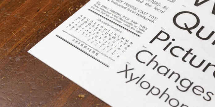
Spartan MB (download) is a modern sans-serif typeface renowned for its practicality and versatility. It’s an excellent choice for a wide range of professional projects. Its design reflects the need for clean, structured layouts that support the legibility and visual harmony essential in contemporary design. Spartan MB is more than just another sans-serif option. It’s a comprehensive font family that offers significant flexibility across various design applications. It’s the result of its seven distinct weights, spanning from light to bold.
This variety in weights allows designers to create multi-layered typographic hierarchies without needing to switch typefaces. The seven weights include light, regular, medium, semi-bold, bold, extra-bold, and black. Each is crafted with meticulous attention to detail to ensure that every character retains clarity and structure.
The geometric precision of this free font contributes to its contemporary feel. The typeface’s letterforms are constructed with a keen sense of proportion and balance, creating a polished, neutral aesthetic. This neutrality allows Spartan MB to pair well with other typefaces from our selection of the best free fonts. Either as the main typeface or as part of a font combination. Its versatility is particularly beneficial in projects requiring clear, uncluttered layouts, such as corporate presentations, business reports, or editorial designs.
Another advantage of Spartan MB is its performance in both digital and print mediums. On digital platforms, the clean lines and well-spaced characters make it highly readable, even at smaller sizes. This adaptability is especially valuable for user interfaces and responsive web design. It’s perfect where typographic clarity must be preserved across different screen sizes and resolutions. In print, this free font holds its form effectively. It’s ideal for brochures, business cards, and posters that demand crisp, legible text.
Spartan MB’s minimalistic yet robust nature aligns it with modern design principles that favor simplicity without compromising style. Designers seeking a typeface that seamlessly integrates with structured, professional layouts will find Spartan MB an indispensable asset. Its versatility allows for the effective communication of ideas, ensuring that visual elements complement textual content without distraction.
3. Chillax
Next in our list of the best free fonts for 2025 is Chillax (download). It’s a modern sans-serif typeface that has become increasingly popular among designers for its simplicity and elegance. Its design reflects the contemporary demand for clean, uncluttered typography that adapts seamlessly across various media. With its balanced proportions and smooth curves, Chillax offers a sophisticated yet approachable look. This free font is an essential typeface for projects that require a touch of modern professionalism.
One of Chillax’s key strengths lies in its adaptability. The free typeface is designed to perform well in a multitude of settings. Chillax is an ideal choice for digital interfaces, branding efforts, presentations, and more. Its refined letterforms maintain legibility at both large and small sizes. It ensures that it can be used for everything from main headings to body text. This versatility makes it especially appealing for web design and digital applications where consistency and readability are crucial.
Chillax’s aesthetic is characterized by its streamlined sans-serif structure. Unlike more rigid or overly stylized typefaces, this free font strikes a balance between minimalism and character. This attribute allows it to enhance the visual appeal of a project without drawing undue attention to itself. The typeface’s neutral design makes it an effective choice for both professional and creative projects. That enables it to complement a variety of visual themes and color palettes.
In branding, Chillax excels by lending a modern yet timeless quality to logos, packaging, and promotional materials. Its clean design ensures that branding elements are clear and impactful, resonating well in both digital and print formats. Whether applied to a tech startup’s visual identity or a luxury brand’s marketing campaign, Chillax delivers a subtle elegance that supports the brand’s message.
When it comes to digital interfaces, Chillax is engineered for high readability. That results in user-friendly experiences on websites and mobile applications. Its open, well-proportioned characters help maintain text clarity across different screen resolutions, a critical feature for ensuring usability and accessibility. This makes it a smart choice for user experience (UX) designers who prioritize legible, aesthetically pleasing text elements within their interfaces.
Presentations are another realm where Chillax shines. The typeface’s clean and simple structure allows slides to remain visually appealing without overwhelming the viewer with overly decorative text. Its flexibility in weight and style means it can be used to differentiate between headings, bullet points, and body text. This way, it creates a hierarchy that enhances the flow of information and ensures the main points stand out.
Furthermore, Chillax’s modern, minimalist design is highly relevant in the current design landscape, where simplicity often equates to elegance. The font’s smooth lines and subtle curves contribute to a welcoming visual effect that doesn’t sacrifice professionalism. This balance between modernity and readability sets Chillax apart as a top choice for projects that require a typeface that feels current yet timeless.
Overall, Chillax is more than just a simple sans-serif; it is a versatile and elegant tool for various design needs. Whether used in branding, presentations, or user interfaces, its modern aesthetic and practical qualities make it a typeface worth integrating into any designer’s arsenal. Its blend of simplicity and adaptability ensures that Chillax remains a relevant choice for design projects well into the future.
4. Apex Mk3
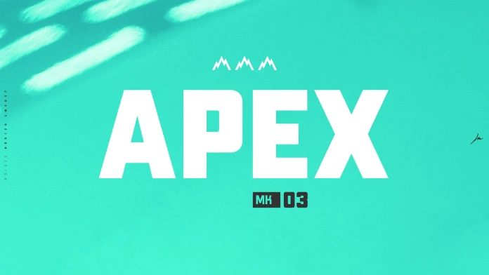
On place four in our list of the best free fonts is Apex Mk3 (download). It’s a striking, bold geometric typeface that has been designed to command attention in any design project. With its sharp, clean lines and modern structure, it stands out from other free fonts. The typeface is an ideal option for titles, headlines, and display text, making it a powerful tool in visual communication. This free font was specifically crafted with impact in mind. It is highly effective in settings where the typographic element needs to immediately capture the viewer’s gaze.
The geometric design of Apex Mk3 gives it a distinctive, almost architectural feel. Its letterforms are built on the principles of precision and clarity, offering a modern aesthetic that avoids unnecessary flourishes. The uniformity and symmetry of its shapes make it ideal for projects that require a bold visual statement. It’s particularly the case when space and attention need to be dominated by a single typographic element. This design approach ensures that Apex Mk3 holds its ground even in crowded compositions or alongside more complex visual elements.
One of the most notable aspects of Apex Mk3 is its ability to draw attention. Yes, it’s one of those perfect free fonts for posters, branding, and advertising materials. Basically, everything where a strong, immediate visual impression is essential. Whether used for event posters or movie titles, it ensures that text doesn’t get lost in the visual noise. Apex Mk3 immediately establishes a visual hierarchy. The font’s geometric nature enhances legibility even at large sizes. It ensures the message is clear and the typography remains sharp, even when displayed in high-impact formats.
For branding projects, it’s a versatile choice that can help define the identity of a brand through its powerful presence. The font’s clean lines convey professionalism, while its boldness communicates strength and modernity. These qualities are valuable when creating a memorable logo or establishing a brand’s visual identity. That’s important, especially in competitive markets, where standing out is key. Brands that want to project confidence, modernity, and distinctiveness can leverage Apex Mk3 to make an unforgettable impression on their audience.
The use of Apex Mk3 also extends into digital design, where it adapts perfectly for web headers, banners, and advertisements. Its bold character design ensures that it remains legible and impactful. That’s the case even at smaller sizes, which is critical for maintaining readability across varying screen resolutions and devices. As digital platforms continue to prioritize clean, impactful design, Apex Mk3’s clarity and boldness make it a go-to choice for designers creating visually stimulating online content.
Moreover, the use of Apex Mk3 in editorial design can bring a sense of urgency and energy to publications. Whether in a magazine, brochure, or promotional flyer, this typeface ensures that the text stands out. It gives editors a dynamic typographic tool to attract readers’ attention. Its geometric and minimalistic structure allows it to pair well with more subtle free fonts. That helps to create a dynamic typographic contrast that enhances the overall design.
Overall, Apex Mk3 is a versatile, bold geometric typeface that is engineered to make an impact in high-visibility environments. Whether applied in posters, branding, digital platforms, or editorial content, its commanding presence and modern design make it a popular choice among designers who want their typography to stand out. As branding and advertising continue to rely heavily on strong visual statements, Apex Mk3 provides a sophisticated and practical solution for projects that demand bold, impactful typography.
5. Margaret
Margaret (download), a sophisticated serif font crafted by Kacper Janusiak and the K94 Studio team, embodies timeless elegance. Its design captures the essence of classic typography, incorporating a balance of sharp serifs and soft curves that provide a distinctive and refined appearance. This font’s versatility makes it ideal for headlines, branding projects, and logotypes, where it lends an air of prestige and credibility. Margaret’s structure features high contrast between thick and thin strokes, enhancing its legibility and making it stand out prominently in both digital and print formats. The detailed attention to its serif accents and overall character proportions reflect a deep understanding of traditional type design principles, while modern touches give it an edge for contemporary projects.
Unlike most other free fonts, this typeface seamlessly fits into luxury branding, editorial headlines, and logo designs where a touch of sophistication is required. Its classic charm is particularly effective in creating a narrative of elegance and tradition, making it a preferred choice for projects involving high-end products or services. The carefully considered letterforms allow Margaret to communicate a strong visual identity while remaining versatile enough for varied applications. With its poised and well-constructed serifs, it invites viewers into a rich, visual experience that feels upscale yet approachable. This balance between classic inspiration and modern usability makes Margaret a font that resonates with designers aiming for impactful and enduring results.
For those seeking to elevate their design projects with a free yet professional typeface, Margaret delivers both style and functionality. The K94 Studio team’s meticulous approach is evident in the font’s consistent weight distribution and kerning, ensuring smooth readability across different mediums. It’s not just a display font; it adapts beautifully to titles, taglines, and brand emblems, making it a multipurpose tool for a range of creative endeavors.
6. HK Grotesk
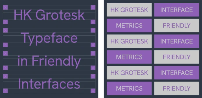
HK Grotesk (download) comes as number six in our selection of the best free fonts. It’s a classic sans-serif typeface that stands out for its broad applicability and timeless design. Its clean, simple, and highly legible letterforms make it an ideal choice for a wide variety of professional design projects. With its origins rooted in the tradition of grotesque sans-serifs, it embodies both functional elegance and contemporary appeal. The versatility of HK Grotesk enables it to seamlessly perform in diverse contexts, ranging from body text to headers, across both print and digital mediums.
Designed with a neutral, straightforward structure, HK Grotesk excels in professional design environments where clarity and precision are paramount. Its geometric base paired with subtle humanist touches allows the typeface to feel both modern and approachable. The result is a free font that can be used across a variety of applications without overwhelming the viewer or detracting from the overall aesthetic of the design. Its utility in both large and small sizes ensures it can function across multiple levels of content hierarchy, making it particularly useful for projects that demand versatility, such as corporate branding, editorial layouts, and advertising campaigns.
For body text, HK Grotesk offers an excellent balance between readability and personality. Its letterforms are spaced optimally, with sufficient white space to prevent visual crowding, which is crucial when handling large amounts of text. Whether used for lengthy articles in magazines or as a readable font for web content, it supports the content’s legibility, ensuring the text flows smoothly and is easy on the eyes for extended reading. The typeface’s proportions also enhance its legibility at smaller sizes, which is a key consideration for digital applications, where pixel-perfect clarity is often needed.
For headers and display text, HK Grotesk makes a confident statement. Its strong structure and clean, even strokes ensure that it stands out when used in larger sizes, commanding attention without feeling overly aggressive. This quality is especially beneficial in contexts like titles, banners, posters, and other display elements, where typography often plays a central role in guiding the viewer’s focus and conveying the tone of the message. The straightforward nature of the font ensures that the viewer’s attention is directed to the content itself, without distraction.
One of the key advantages of HK Grotesk, in comparison with other free fonts, is its balance of modernity and timelessness. While it follows the grotesque sans-serif tradition, which emerged in the 19th century as one of the first modern sans-serif categories, the typeface avoids looking overly retro or out of place in today’s design landscape. It maintains a timeless quality that ensures it won’t feel dated over time, which makes it a reliable choice for projects intended to last. This is particularly important in branding, where companies seek to establish a visual identity that can endure for years without needing frequent redesigns.
Another significant factor that makes HK Grotesk so appealing is its professional versatility. The font is available in a wide range of weights, allowing designers to create typographic hierarchies that visually separate headings, subheadings, and body copy without the need for drastic design contrasts. Its weight distribution makes it adaptable to projects requiring subtlety or boldness, depending on the context. This versatility also lends itself well to user interface (UI) and web design, where font weights can be used to differentiate between interactive elements, like buttons, navigation menus, and content sections.
Additionally, HK Grotesk performs excellently in both print and digital formats. In print design, whether it’s for brochures, business cards, or annual reports, the typeface’s crisp letterforms ensure clarity even in smaller print sizes. For digital design, HK Grotesk retains its sharpness and readability on various screen sizes, from mobile devices to large desktop monitors. This makes it a suitable choice for both web design and UI design, where usability and visual consistency are key.
The neutrality of HK Grotesk also makes it a flexible pairing partner in typography. It pairs well with a variety of other typefaces, allowing it to be used in combination with more decorative free fonts or other sans-serifs without overwhelming the design. For example, pairing it with a serif font for body text or contrasting it with a more stylized display font for headers can create a harmonious and balanced visual flow.
In branding, HK Grotesk has proven its worth in creating clean, professional identities that communicate trustworthiness, modernity, and clarity. Whether used for logos, product packaging, or marketing materials, its minimalist approach ensures that it remains adaptable to a wide range of industries. This adaptability is what makes HK Grotesk an ideal choice for corporate branding, tech startups, creative agencies, and even luxury brands that want a refined, modern aesthetic.
In conclusion, HK Grotesk is a versatile, timeless, and reliable typeface that serves a wide range of professional design needs. Its balance between modern geometric design and classic grotesque elements makes it an excellent choice for body text, headers, and everything in between. Whether used for editorial content, branding, advertising, or digital interfaces, HK Grotesk delivers legibility, elegance, and professionalism across a broad spectrum of applications. Its adaptability ensures it remains a go-to typeface for designers seeking a font that offers both clarity and style.
7. Maler
We continue to progress in our list of free fonts with Maler (download), a unique and highly versatile brush font that brings a bold, all-caps style with the added benefit of supporting both Latin and Cyrillic characters. This combination of stylistic boldness and multilingual support positions Maler as a powerful choice for designers working on multilingual projects, where the need to create cohesive designs that communicate across different languages is paramount.
One of the key aspects that sets Maler apart is its distinctive, all-caps brush-like design. The uppercase style adds a sense of strength and assertiveness, making it an ideal choice for projects where typography needs to take center stage. Whether used for headlines, posters, or editorial layouts, the bold letterforms of Maler instantly capture attention and create a strong visual impact. This characteristic makes it perfect for high-visibility projects like event posters, product packaging, and even fashion branding, where the typography needs to stand out and convey a powerful message to the audience.
What further enhances the appeal of Maler is its ability to seamlessly integrate both Latin and Cyrillic scripts. The demand for multilingual typography is growing, especially for brands and publications looking to expand their reach to international markets. Maler addresses this need by providing a unified solution that ensures consistency in design, no matter which language is used. This dual-script capability is particularly valuable for projects that involve Eastern European, Russian, or Slavic audiences, where the Cyrillic alphabet is required, but where the overall visual identity must remain unified and cohesive across multiple languages.
For editorial work, the combination of bold all-caps and multilingual character support makes Maler a strong contender for magazine covers, book titles, and flyers, where creating a bold typographic statement is essential. The strength of the font ensures that the titles or headings remain legible and powerful, even when printed in large sizes or displayed on digital platforms. The clean, sharp lines of Maler make it not only striking but also incredibly effective in conveying a sense of professionalism and authority, which is crucial for high-profile editorial content aimed at a broad audience.
The versatility of Maler in terms of multilingual support cannot be overstated. It makes the font an excellent choice for international brands or global campaigns that need to adapt their message for different linguistic markets while maintaining a consistent visual identity. From advertisements targeting both Western and Eastern Europe to product packaging that needs to accommodate languages such as Russian, Ukrainian, or Serbian, Maler provides the necessary tools for effective cross-language communication.
Beyond its use in editorial and branding contexts, Maler’s bold brush design also lends itself well to poster design. When creating promotional posters for events, concerts, or film festivals, Maler’s attention-grabbing all-caps letters stand out against busy backgrounds, ensuring that key information, such as event names, dates, and locations, is easily visible and legible from a distance. The font’s geometric, structured form helps it retain clarity and visual impact even in large formats, which is an important consideration for any high-traffic advertising.
Another reason Maler is a standout choice for contemporary design projects is its timeless appeal. While bold and modern in its structure, it doesn’t feel overly trendy or tied to any one particular era of design. Its design speaks to timeless strength, making it suitable for both vintage-style projects and those looking to create a fresh, contemporary look. Whether used in book covers, posters, or online banners, Maler brings a sense of weight and credibility to the design, while still fitting into the visual language of modern design aesthetics.
In addition to its bold visual impact, Maler is designed to be versatile in different layout contexts. Its consistent letter width and structured forms ensure that it works well in both large headlines and smaller body text, depending on the weight used. While its all-caps design makes it ideal for emphasis and prominence, the typeface is also legible and adaptable enough for subheadings and captions in designs that require a subtle but impactful typographic presence.
Furthermore, because Maler is available for free download, it becomes a highly accessible choice for designers working on budget-conscious projects who still require a high-quality, professional font that performs well in a variety of uses. Its availability without licensing costs makes it a go-to option for freelancers, small businesses, and nonprofit organizations looking for a free font that offers a strong typographic statement without breaking the bank.
In conclusion, Maler stands out as a versatile and robust font choice, perfect for any design project that requires bold, modern typography paired with multilingual support. Whether you’re working on posters, branding, editorial designs, or international marketing materials, Maler’s powerful all-caps style combined with its ability to seamlessly integrate Latin and Cyrillic characters makes it a go-to font for designers who need to make a strong visual statement across a diverse range of languages.
8. Botera
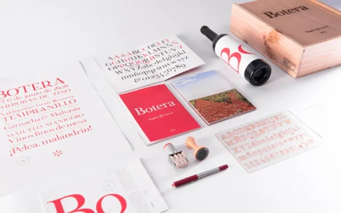
Botera (download) is a refreshing take on the stencil genre, offering a sophisticated and unique twist that sets it apart from traditional stencil fonts. With its elegant, stylish design, Botera adds a touch of refinement to a style often associated with military and industrial themes. This innovative typeface brings a level of class and subtlety to projects that require a bold, attention-grabbing font but want to avoid the harsh, utilitarian feel that can often accompany stencil lettering.
What makes Botera stand out is its combination of traditional stencil characteristics with elegance. Unlike many stencil fonts, which can often feel heavy-handed or utilitarian, Botera incorporates fine lines and smooth curves that give it a sophisticated edge. The letterforms are carefully designed to maintain the stencil aesthetic, with breaks and cuts in each character, but these breaks are integrated in a way that feels artful rather than abrupt. This makes it an ideal choice for design projects where both boldness and refinement are desired.
Botera’s design also benefits from well-thought-out proportions. The spaces between the letterforms and the clean-cut edges of each character give the typeface a feeling of balance. It doesn’t overwhelm the viewer with overly heavy or wide cuts, making it versatile enough to work in both large display contexts and more subtle uses such as in branding, editorial layouts, and high-end packaging. This versatility is one of the reasons Botera stands out in a crowd of stencil fonts that often lean toward one-dimensional, military-style aesthetics.
Botera’s elegant take on stencil typography makes it particularly well-suited for projects where the designer is seeking a unique edge without sacrificing sophistication. Branding projects that aim to convey both strength and refinement can benefit greatly from Botera. Its stylish, clean lines allow it to communicate a sense of modernity while still staying grounded in a classic stencil style.
One of the most common applications for Botera is in poster design, where it can be used to draw attention to key messages while maintaining a sense of class. Its design allows for the text to stand out without feeling too aggressive or loud, which makes it perfect for art exhibitions, luxury events, or fashion campaigns. The modular nature of stencil fonts also gives designers the ability to use Botera in distinctive layouts, especially when the project involves creative use of negative space, such as in minimalist posters or digital ads.
Furthermore, editorial design often calls for free fonts that can add a bit of personality to the layout without overshadowing the content. Botera fills this role beautifully. Its clean and modern appearance allows it to function in magazine headlines, book covers, and high-end catalogs where the designer seeks a sophisticated typeface that still makes a statement. Botera offers a distinctive twist on stencil design, giving editorial pieces a unique visual identity that stands apart from more generic type choices.
Stencil fonts have traditionally been linked to utilitarian purposes, often used in contexts that require bold, clear communication, such as military markings, industrial signage, or construction projects. However, Botera breaks away from these associations by blending its robust form with refined and modern touches. The result is a font that retains the recognizable style of a stencil but with an added element of polish and sophistication.
This nuanced approach to stencil design has found a place in luxury brands, high-end events, and contemporary design projects that seek a bold yet tasteful typeface. Whether used for product packaging, advertising, or design consultancy branding, Botera offers a fresh approach that speaks to a new generation of design. Its versatility ensures it fits into a wide variety of contexts, whether the project calls for bold typography that makes a statement or subtle lettering that adds a layer of sophistication.
The strength of Botera lies not only in its ability to function as a display font but also in its capacity to be used across multiple formats and scales. From large format posters to smaller promotional materials, Botera maintains its integrity and visual impact. In fact, its sharp edges and strategic cuts remain readable even at smaller sizes, a quality that is not always present in stencil fonts.
This makes it ideal for multidimensional branding projects where the typeface must perform well in different sizes and contexts. For example, a brand’s logo could feature Botera in larger sizes, with the tagline or slogan set in smaller sizes, ensuring that the typeface retains its distinct character in both prominent and subtle placements. Botera’s adaptability also extends to web design and digital applications, where the stencil style might be paired with modern sans-serif fonts or serif fonts to create contrast and visual interest. The design of Botera works well for UI/UX elements such as buttons, navigation bars, and headings, making it a versatile choice for digital environments as well.
Ultimately, Botera is an excellent choice for designers who want to push the boundaries of what stencil typography can achieve. Its combination of elegance and boldness makes it the perfect option for any project that requires a sophisticated edge but with an emphasis on modern design aesthetics. Whether it’s used for high-end branding, impactful editorial layouts, or dynamic event promotions, Botera provides the perfect balance between style and functionality. With its versatility across both print and digital formats, Botera is poised to be a go-to stencil font for designers looking to elevate their work with a font that breaks the traditional mold.
9. Deliverance
Now let’s talk about place number nine of our collection of the best free fonts in 2025. Deliverance (download) is a refined handwritten script font that stands out for its flowing lines and natural style, making it a perfect choice for projects where elegance and personal touch are essential. This typeface, with its beautifully crafted letterforms, has a distinct ability to combine sophistication with a human, organic feel, making it suitable for a wide array of design applications where the emphasis is on creating a sense of intimacy and uniqueness. Whether you’re designing invitations, branding materials, or any other type of project that requires a personal, elegant touch, Deliverance brings a sense of timeless beauty and authenticity.
One of the standout characteristics of Deliverance is its flowing script design, which evokes the feeling of handwritten calligraphy. The natural curves and gentle loops give each letter a distinctive, personalized appearance. Unlike some script fonts that can feel forced or overly stylized, Deliverance exudes a sense of effortless beauty, as if each character were written by hand with care. This design makes it an ideal choice for projects that require a personal and human connection, such as wedding invitations, greeting cards, and thank-you notes, where the typography itself is meant to convey warmth and sincerity.
Moreover, the smooth transitions between letters help Deliverance maintain its flowing quality, making it an ideal font for longer passages of text where readability remains important. Despite its intricate and ornate appearance, the font is designed to ensure legibility at various sizes, which adds to its versatility across both print and digital media. Whether you’re designing a luxury brand identity or creating an elegant website for a boutique, Deliverance’s legibility and distinctive charm provide a perfect balance between aesthetic appeal and practical usability.
Deliverance is perhaps best known for its use in event invitations. Its elegant letterforms make it a natural fit for wedding invitations, birthday parties, and formal events, where a touch of class and personalization is essential. The font’s delicate curves lend a refined look, making it perfect for special occasions where the typography itself can set the tone for the event. Whether you are designing invitations for a luxury event or a more intimate gathering, Deliverance ensures the words look as memorable as the occasion itself.
Its personal, handwritten style adds warmth to any message, making it an ideal choice for specialty invitations such as baby showers, engagement announcements, and holiday cards. This makes it a popular choice for designers and DIY enthusiasts alike who want to create something personal and meaningful.
In addition to its use in invitations, Deliverance is also a strong contender for branding and logo design. The graceful, flowing nature of the font creates a distinctive identity, which works well for brands that wish to convey elegance, refinement, and personalization. Think of luxury brands in the fashion, beauty, and hospitality industries that want to present themselves as exclusive yet approachable. The handwritten style of Deliverance gives the brand a sense of authenticity as if the brand were created by a craftsman who values artistry and attention to detail.
When used in logos, the fluidity of Deliverance gives the design an organic, almost artisanal feel, while still maintaining a sense of professionalism. This makes it suitable for boutiques, jewelry brands, and design agencies, where the goal is to create an identity that feels both unique and approachable. The font’s natural flow and versatility also make it a great choice for restaurant branding, especially for fine dining establishments that aim to convey an upscale yet welcoming atmosphere.
In addition to its strengths in more traditional uses like invitations and branding, Deliverance is also a fantastic choice for creative projects. Its versatility extends beyond the realm of print and extends into digital design as well. When used in social media campaigns, advertisements, or email newsletters, Deliverance’s personal touch provides a break from the standard, often sterile typography used in commercial marketing. This can make a huge impact in content marketing, where standing out and creating an emotional connection with the audience is key.
Whether used in a hand-lettered style greeting for a promotional post or as a standout feature in a product packaging design, Deliverance can help give your creative designs a level of charm and distinctiveness that makes them more memorable to potential customers. Its personalized style offers a welcome departure from generic, overused free fonts, ensuring that your project doesn’t just look stylish, but feels genuine and authentic as well.
Despite its delicate, flowing nature, Deliverance also holds its own in high-impact applications. It’s often used in projects that require a sense of delicacy without sacrificing visibility. Whether it’s website headers, signage, or advertisements, the careful balance between legibility and elegance makes Deliverance a standout option for any design that needs to make a statement. The flowing lines give it the versatility to appear in both large scale, where its intricate details become a focal point, and in smaller sizes, where the subtle curves still shine through without becoming illegible.
Its use of whitespaces and delicate flourishes makes it stand out as a graceful and impactful choice, and it adapts well to a range of media types. The font’s lightweight nature makes it perfect for delicate design layouts, where a heavy, bold typeface would overpower the message, but a more refined style, like Deliverance, complements the overall aesthetic.
In the realm of modern design, handwritten fonts like Deliverance continue to grow in popularity due to their ability to infuse designs with a personal, human quality that feels more authentic compared to standard, mass-produced typefaces. As more brands and designers look to convey authenticity, craftsmanship, and a personal connection, handwritten fonts like Deliverance serve as an ideal solution to help meet these design goals.
Deliverance, with its natural style and elegance, stands as a prime example of how handwritten scripts can remain relevant and versatile, even in the fast-paced, technology-driven world of design. Its ability to adapt to various design projects—whether in print, digital media, or branding—ensures that it will remain a go-to font for designers who need to create meaningful, timeless designs that resonate with their audience on a personal level.
In conclusion, Deliverance is much more than just a handwritten script font. It is a typeface that brings grace, elegance, and personality to any design project. From invitations to branding and advertising, Deliverance’s flowing lines and natural charm make it a versatile and impactful font, offering a perfect solution for those looking to create personal, timeless, and memorable designs.
10. Clash Display
Another typeface by the Indian Type Foundry, Clash Display (download) is a striking font that commands attention, making it an ideal choice for headers and display text. Its design features strong, variable strokes that are both bold and dynamic, capturing the eye immediately. The sharp, angular edges and contrasting thick and thin elements give it a sense of energy and modernity, making it particularly well-suited for projects that require a strong visual impact. This typeface excels in large-scale applications, where the intention is to stand out and make a statement.
Its bold design works effectively in digital environments, where readability can sometimes be compromised by excessive styling or overly intricate details. Clash Display addresses this issue by maintaining clear legibility while still offering a visually compelling structure. In digital platforms, whether it’s for websites, apps, or online advertisements, Clash Display ensures that headlines and key messaging remain prominent and easy to read, even on smaller screens or in less-than-ideal viewing conditions. Its high contrast between strokes makes it especially effective for use on digital media, where visibility is crucial for catching the viewer’s attention quickly.
The font’s modern, assertive style makes it a natural fit for industries that seek a bold, innovative image. Tech companies, advertising agencies, and fashion brands have increasingly turned to Clash Display for their promotional materials, as its distinct design reflects the forward-thinking, cutting-edge nature of these fields. The versatility of Clash Display also allows it to be adapted for various digital platforms, from sleek and polished web pages to high-energy social media campaigns.
Another key feature of Clash Display is its flexibility in terms of font weights. Available in multiple variations, it allows designers to choose the appropriate weight for the project at hand. Lighter weights can give the font a more refined, subtle look, while heavier weights add a more dramatic presence, ideal for large headers or titles. This makes Clash Display versatile enough to be used across different types of projects without losing its impact or legibility.
The font’s attention-grabbing nature also extends to its use in print design, where it is just as effective at creating bold statements in posters, brochures, and billboards. When paired with minimalistic or modern design elements, Clash Display has the ability to command attention and communicate a strong message in a way that is both clear and visually engaging.
Overall, Clash Display is a versatile and powerful font that is perfectly suited for headers, display text, and any application where legibility and visual impact are essential. Its combination of strong, variable strokes and modern design principles makes it an ideal choice for digital platforms, ensuring that it remains a go-to typeface for designers who need to capture attention without sacrificing readability.
11. Cabinet Grotesk
Cabinet Grotesk (download) is a versatile and clean variable sans-serif font that offers exceptional adaptability across a wide range of design applications. With its precise, neutral design and a variety of weight options, this typeface ensures a high level of legibility while maintaining an elegant, minimalist aesthetic. Whether used in editorial layouts, user interfaces, or any other design context, Cabinet Grotesk stands out for its ability to handle both headlines and body copy with equal effectiveness. The typeface’s modern simplicity makes it a go-to choice for projects requiring a functional yet sophisticated visual identity.
The beauty of Cabinet Grotesk lies in its clean, geometric lines that give it a contemporary, professional appearance. These characteristics allow it to seamlessly integrate into various design environments, from the digital space to print media. Its neutral tone ensures that it doesn’t distract from the message but rather complements the content it accompanies. Whether you’re designing a website, magazine, or advertisement, this font can be adapted to suit the specific needs of the project. Its well-balanced proportions and consistent x-height further enhance readability, especially in more text-heavy contexts.
For editorial design, Cabinet Grotesk provides clarity and structure. It is often used in magazine spreads, articles, and editorial layouts because of its ability to provide clean, readable body text. The font’s flexibility is particularly useful in editorial design, where designers need to balance both artistic creativity and clear communication. Its geometric shapes, when combined with a wide range of weights and styles, allow for subtle variations in emphasis without compromising overall design harmony. Cabinet Grotesk’s precision and neutrality also make it well-suited for projects that need a modern, timeless feel, such as annual reports, company brochures, and professional publications.
User interfaces (UI) benefit greatly from Cabinet Grotesk’s readability and visual appeal. As more digital platforms and mobile apps demand typefaces that can accommodate various screen sizes and resolutions, this font offers a flexible solution. Its varying weights make it ideal for creating clear visual hierarchies, from prominent headlines to legible body text. In user interface design, where space is often limited and text must be concise yet easy to read, Cabinet Grotesk excels by providing clarity and structure without appearing rigid or overbearing.
The availability of multiple weights and styles also means Cabinet Grotesk can serve as a single, reliable typeface for an entire project, making it a cost-effective solution for many design professionals. Designers can use lighter weights for elegant headers or interface elements and heavier weights for emphasis in important text. This makes the font incredibly adaptable, as it can be used across diverse platforms and media with ease. Its balanced design ensures that text remains legible even at smaller sizes or on screens with lower resolutions, which is particularly important for mobile and responsive web design.
Cabinet Grotesk is also a popular choice for branding and corporate identity. Its clean, professional look makes it perfect for creating logos, company stationery, and business cards. The neutrality of the font allows it to work well with a wide range of graphic elements and visual styles, from minimalistic to more ornate designs. Whether paired with bold graphics or used alongside complementary free fonts in a multi-font design system, Cabinet Grotesk maintains its integrity, ensuring that it does not overpower the overall aesthetic.
One of the strongest attributes of Cabinet Grotesk is its reliability. Designers can confidently use it for both small-scale applications, like social media posts, as well as large-scale projects, such as billboards or advertisements. The font remains crisp and legible, regardless of size, making it a trustworthy choice for any design that demands consistent performance across various contexts. Its neutral yet refined style means it can be adapted to both professional and creative projects, lending itself well to both corporate environments and creative industries.
Its minimalist design also contributes to its long-lasting appeal. In a world where design trends are constantly changing, Cabinet Grotesk’s timeless elegance makes it a staple that doesn’t easily go out of fashion. Its versatility allows it to work across different industries and design styles, making it a go-to choice for designers seeking a practical, reliable typeface that can adapt to various needs over time.
In summary, Cabinet Grotesk is a highly versatile sans-serif font that combines a clean, geometric design with a wide range of weights, offering great flexibility for different design applications. Its neutrality and readability make it perfect for everything from editorial layouts to digital interfaces, while its modern aesthetic ensures it remains relevant across diverse projects. Whether used in headlines or body copy, this font provides a polished, professional look that is well-suited to the demands of both print and digital media.
12. Nevrada
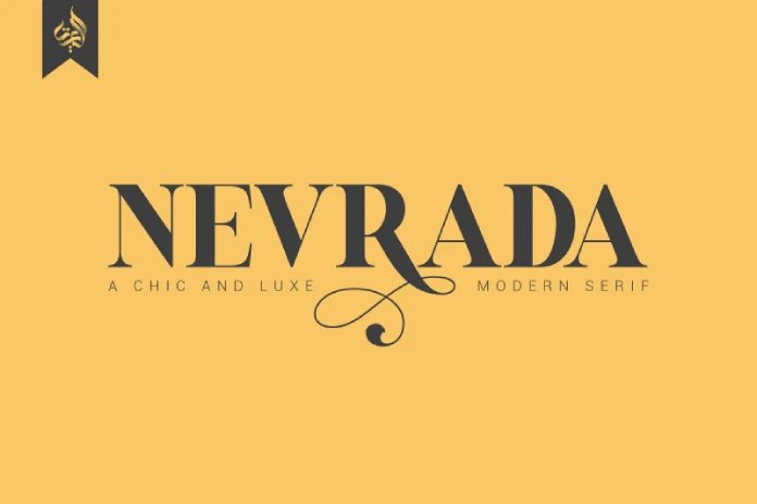
Free download only for personal use, Nevrada is a well-designed serif font that embodies a sense of refinement and elegance, making it a standout choice for luxury branding projects. This font is designed to evoke a high-end aesthetic, which is why it is frequently used in industries where prestige and sophistication are key to the brand’s identity. The graceful, classic proportions and delicate serifs of Nevrada give it a timeless quality, making it especially well-suited for branding that seeks to communicate a sense of exclusivity, quality, and elegance.
One of the primary features of Nevrada is its balanced, yet intricate design. The sharp contrast between the thick and thin strokes creates a dynamic appearance, but the delicate curves and well-placed serifs ensure a smooth flow across characters. This results in a design that is not only highly readable but also pleasing to the eye, which is crucial for high-end projects that must maintain clarity without compromising on style. Nevrada works particularly well in logos and packaging, where precision and aesthetic appeal are of utmost importance.
The luxurious feel of Nevrada is further enhanced by its versatility across various print materials. Whether applied to high-end fashion labels, exclusive perfume packaging, or premium wine bottle designs, Nevrada brings a distinct sophistication to every project. The elegant style of the font adds a subtle layer of refinement that resonates with consumers who value craftsmanship and attention to detail. It is not just a font but an essential design element that elevates the overall appearance of a brand.
In addition to its use in logos and packaging, Nevrada’s elegance makes it an excellent choice for print materials such as brochures, business cards, and invitations for exclusive events. The font’s refined nature makes it particularly suitable for industries like high-end real estate, luxury fashion, fine dining, and bespoke services. In these industries, where brand identity is built around a sense of exclusivity and timeless appeal, Nevrada helps convey the brand’s promise of quality and sophistication.
Nevrada’s ability to communicate a sense of heritage and tradition is another reason why it’s often chosen for luxury branding. The font feels classic, with subtle nods to traditional serif fonts, but it has been carefully modernized to maintain relevance in today’s design landscape. This balance between classic and contemporary design allows Nevrada to feel both timeless and fresh, a perfect fit for brands that want to convey a rich history while remaining forward-looking.
Moreover, Nevrada is highly adaptable, with a range of weights that allow designers to tailor the font to different needs within the same project. A lighter weight can be used for delicate body text or invitations, while the bolder weights are perfect for headlines or impactful statements that need to capture attention immediately. This flexibility makes Nevrada a versatile choice for luxury projects, as it allows for consistency across various mediums and design elements while offering the opportunity to experiment with different visual hierarchies.
The font’s refined nature also makes it well-suited for use in digital formats, particularly for websites or digital ads where luxury brands want to showcase their products in an elegant manner. The clear, well-formed serifs ensure that the text remains legible and easy to read on screens, while the sophisticated design ensures that the font maintains its luxurious feel even in digital environments.
Beyond just its aesthetic qualities, Nevrada stands out for its ability to convey a narrative of exclusivity and luxury. Typography plays a significant role in how a brand is perceived, and Nevrada’s design encapsulates the idea of high-end craftsmanship. The font is not just a tool for communication, but a vital part of the brand’s visual language that helps establish trust, sophistication, and a sense of premium quality.
In conclusion, Nevrada is an elegant serif font that offers a refined, luxurious design perfect for high-end branding and print projects. Its timeless style, with its sharp contrasts and graceful serifs, makes it an ideal choice for logos, packaging, and print materials where elegance and sophistication are key. Nevrada is versatile enough to be used across various weight options, making it adaptable to different branding needs while maintaining its luxurious character. Whether for fashion, real estate, or luxury goods, Nevrada helps brands convey a message of quality, exclusivity, and timeless elegance. Aluyeah Studio’s full version for commercial use can be found here.
13. Lil Stuart
Let’s move on with this high-quality selection of outstanding free fonts. Lil Stuart is a beautifully crafted collection of handwriting-style fonts that captures the charm and authenticity of handcrafted typography. It’s also available for free download only for personal use. Comprising over 160 ligatures, this font family offers an extraordinary level of customization, ensuring that each design feels personal and unique. The extensive set of ligatures—customized connections between letters—adds a natural flow to the writing, mimicking the fluidity of human handwriting. This feature allows designers to create organic, custom-looking typography without needing to manually adjust each letterform. The attention to detail in each ligature contributes to the font’s overall warm, inviting feel, making it an excellent choice for projects that require a distinct, handcrafted aesthetic.
Lil Stuart is particularly ideal for designs that need to evoke a sense of personal touch or a handmade quality, such as greeting cards, invitations, product labels, and boutique branding. Its unique character and expressiveness make it stand out in settings where traditional, formal free fonts might seem too stiff or impersonal. The handwriting-inspired style imbues a sense of intimacy and warmth, making it well-suited for occasions like birthdays, weddings, or celebrations, where personalization and attention to detail are paramount. For product labels, especially in industries like artisanal food, craft beverages, or handmade goods, Lil Stuart provides a font that speaks to the authenticity and craftsmanship of the products.
One of the standout features of Lil Stuart is the variety of weights and styles available. This flexibility allows it to adapt to a wide range of design needs, from large, eye-catching headlines to smaller body text. The font’s fluid curves and diverse ligatures bring out a sense of rhythm, making it ideal for projects that rely on text to drive the visual narrative. Whether used for branding, packaging, or any other design requiring a creative, humanized feel, Lil Stuart ensures that text doesn’t just serve its functional role but contributes to the story being told.
Furthermore, Lil Stuart’s ability to bring life and energy to design projects is supported by its ability to convey emotion and personality. The handwritten nature of the font allows for a more personal connection with the audience, making it a perfect fit for lifestyle brands or boutique services that emphasize authenticity and individuality. Designers can experiment with the font’s numerous combinations, using its ligatures and varied weights to create dynamic, visually compelling designs that still feel approachable and personal.
The versatility of Lil Stuart also extends to its application in more traditional print materials, such as posters and flyers. The organic flow of the font’s letterforms provides visual interest, especially when paired with simple layouts or large images. It can easily be used to create contrast between more structured elements and more whimsical, freeform design aspects. Additionally, the ample ligature options mean that the font can be used in a range of languages and typographic compositions, further enhancing its appeal for designers working on multilingual or diverse projects.
Beyond its aesthetic appeal, Lil Stuart’s flexibility makes it a great tool for digital design as well. It can easily be integrated into websites, social media graphics, or digital invitations. As digital platforms demand clear, readable free fonts that still retain personality and charm, Lil Stuart balances these needs by providing legible, flowing text with a distinct hand-crafted look. Its natural curves and diverse styles ensure that the font remains readable at various sizes and on different screens, further solidifying its practicality for both print and digital uses.
Given its broad utility and unique style, Lil Stuart is particularly appealing to designers seeking a font that can bridge the gap between digital and traditional media. Whether working on physical products or digital platforms, Lil Stuart offers a cohesive solution for those who want to infuse their designs with a touch of creativity and individuality. The font’s connection to the human hand, coupled with its technical versatility, makes it a powerful tool for conveying authenticity and personality through typography. The numerous ligatures and stylistic sets allow for greater flexibility, ensuring that each design can be perfectly tailored to suit its intended message, audience, and medium.
In conclusion, Lil Stuart is a highly creative and flexible handwriting-style font family that excels in designs requiring a handcrafted or personalized aesthetic. With over 160 ligatures, it offers a vast array of typographic options, providing a unique and fluid quality to every project it is used for. From greeting cards and invitations to product labels and branding, Lil Stuart’s natural, elegant design makes it a perfect choice for projects that emphasize authenticity, creativity, and a personal touch. Its versatility in both print and digital design ensures that it remains a valuable asset for a wide range of creative professionals seeking a font that can deliver personality and professionalism in equal measure. The commercial version is available here.
14. Perfect Moment
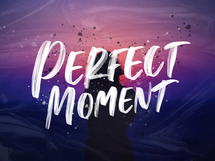
Perfect Moment (download) is a brush-style font that brings a natural, handcrafted aesthetic to design projects. With its dynamic brushstroke textures, this font delivers a raw, artistic vibe that’s both expressive and authentic. That’s why this typeface should not be missing from this list of the best free fonts for 2025. The fluidity of the brush strokes gives the font a sense of spontaneity, which is ideal for projects that need to evoke emotion, creativity, or an organic, handmade feel. Its design mimics the strokes of a real paintbrush, capturing the imperfections and variances that come with hand lettering. This level of detail allows the font to feel alive and vibrant, as though it were freshly painted on the canvas, making it a standout choice for designs that require a personal, artistic touch.
Perfect Moment is highly versatile, making it suitable for a variety of design contexts, but it truly shines in areas where boldness and creativity are key. Posters are one of the most effective applications for this font. The striking brushstroke design adds a sense of energy and movement, helping to create eye-catching visuals that can communicate a strong message at first glance. Whether it’s for a music festival poster, an art gallery exhibition, or an event that celebrates creativity, Perfect Moment’s dynamic appearance immediately grabs attention, making it perfect for advertising campaigns or event promotions that need a raw, unfiltered artistic expression.
Book covers also provide an excellent canvas for Perfect Moment. For books in the genres of art, memoirs, or even contemporary fiction, this font brings a unique flair to the cover design. The brush textures add an emotional depth, perfect for conveying themes of individuality, creativity, or a personal journey. This font helps set the tone for the content inside, providing an authentic reflection of the book’s themes through its handcrafted, one-of-a-kind appearance. The brush strokes give the cover a tactile quality that attracts readers by emphasizing the uniqueness of the book, inviting them to explore the story within.
In addition to posters and book covers, Perfect Moment is also ideal for designs that benefit from a more artistic, free-spirited approach. It can be used in social media graphics, logo designs, and product packaging that cater to artistic or lifestyle brands. The font’s brush-style character makes it perfect for projects associated with creativity, such as art exhibitions, tattoo parlors, and fashion brands that want to convey an artistic, personal edge. The fluid strokes provide a sense of authenticity, making it an excellent choice for anything that aims to evoke a handmade or DIY aesthetic.
Perfect Moment’s brush textures are realistic, capturing the essence of traditional painting techniques. This authenticity can be particularly powerful in designs where a connection to the tactile world is important. For instance, in packaging design for artisanal products, where the emphasis is on craftsmanship and individuality, Perfect Moment stands out by enhancing the connection between the consumer and the creator. Whether for a handmade candle brand, a small-batch coffee company, or a custom jewelry line, the font brings a sense of artisanal value, suggesting that the product itself has been created with care and attention to detail.
The font’s raw, expressive nature also makes it an excellent choice for branding purposes. Brands that want to distinguish themselves from more traditional or corporate competitors can leverage Perfect Moment’s handcrafted appearance to emphasize their unique identity. The font can help businesses communicate their creative spirit and individuality, appealing to consumers who value originality and personal expression. For startups in creative industries, such as graphic design studios, photography businesses, or fashion lines, Perfect Moment can help establish a strong visual identity that reflects their ethos of authenticity and creativity.
Perfect Moment also offers a touch of elegance despite its raw nature. It is not merely chaotic or messy in its strokes, but rather, it maintains an artistic balance that allows for legibility and style. This makes it suitable for projects that require both artistry and functionality, such as event invitations or promotional materials. The font’s balance between sophistication and spontaneity ensures that it can be used effectively without compromising professionalism. The inherent fluidity of the design means it can be scaled for various design formats, from small tags and labels to large billboards or banners.
Moreover, Perfect Moment can adapt to a variety of mediums. While it shines in print applications, it also works well in digital design. For websites and social media graphics, where quick engagement and aesthetic appeal are crucial, Perfect Moment’s expressive brushstrokes can create a memorable first impression. Its hand-lettered look adds a human touch to digital spaces that often rely heavily on more standardized, mechanical fonts. Whether it’s used for headings, quotes, or call-to-action buttons, the font brings a unique, organic quality that sets it apart from typical digital typography.
Despite its artistic flair, Perfect Moment remains flexible enough to accommodate a range of different design needs. Its boldness makes it an excellent choice for large, impactful titles or display text, while the finer details within its strokes allow it to retain readability even at smaller sizes. This versatility, combined with its distinctive brush texture, makes it a perfect option for designs that want to marry creativity with functionality. The ability to communicate both aesthetic appeal and clear messaging makes it ideal for both personal and professional use.
So, Perfect Moment is a brush-style font that brings a natural, handcrafted look to any design project. With its realistic brush textures and fluid strokes, it excels in applications like posters, book covers, and product packaging that benefit from a raw, artistic vibe. The font’s versatility and authenticity make it a standout choice for creative projects, helping to convey a sense of individuality and personal touch. Whether for digital platforms or print materials, Perfect Moment offers a unique, expressive style that captures the spirit of handmade artistry while maintaining the clarity and flexibility needed for effective communication.
15. Heming
Now we come to the last five typefaces of our handpicked selection of the best free fonts for 2025. Heming (download) is a monotype variable font that stands out for its clean, minimalist design and exceptional versatility. Ideal for modern design projects, it brings a balance of form and function to a wide range of applications. As a monotype font, it is based on a single, consistent style where each character is spaced evenly, contributing to a sense of uniformity and order. This makes Heming an excellent choice for designs that require clear, legible text, such as body copy in editorial designs, websites, or interfaces.
One of the most notable features of Heming is its adaptability. The font offers multiple weights and widths, all within a single typeface. This level of flexibility is essential for maintaining a coherent visual identity across various design elements, from headings and subheadings to body text and captions. With its ability to adjust weight and width while maintaining consistent characteristics, Heming can seamlessly fit into different design systems, providing a uniform aesthetic without sacrificing functionality.
The minimalist style of Heming makes it particularly effective for modern, clean design aesthetics. Its geometric forms and balanced proportions make it well-suited for contemporary projects that prioritize simplicity and readability. Whether used in a digital interface or printed material, Heming’s straightforward appearance ensures that the text remains legible even at smaller sizes. Its neutrality allows it to work in a variety of contexts, from corporate branding to artistic projects, making it a versatile choice for designers working across multiple industries.
Despite its simplicity, Heming is far from being plain. Its carefully crafted proportions and subtle details give it a sense of refinement, which allows it to add sophistication without being overwhelming. This quality makes it a perfect choice for high-end design applications where readability and visual appeal are equally important. Whether used in luxury branding, product packaging, or advertising, Heming brings an understated elegance to any project.
Heming is also a highly functional font for user interface (UI) design, especially in environments that prioritize clarity and easy navigation. The consistent spacing and balanced structure make it easy to read on screens, whether for web applications, mobile apps, or software interfaces. For UI design, it’s essential that the font maintains legibility at smaller sizes, and Heming delivers on this requirement. Its versatility across different weights and widths makes it adaptable to a wide variety of use cases, from call-to-action buttons to navigation menus.
In addition to its role in modern UI and web design, Heming performs equally well in print projects. Its ability to maintain legibility while retaining a contemporary style makes it an excellent choice for printed materials like brochures, annual reports, and business cards. The font’s monotype structure, which ensures even spacing between characters, helps establish a clean, organized look that’s essential in professional print design.
As a variable font, Heming allows designers to access a range of design possibilities while working with a single typeface. Variable fonts are an increasingly popular option because they offer more flexibility and reduced file sizes compared to traditional font families. With just one font file, designers can customize the weight, width, and even the slant of the font to suit specific design needs, all without needing to load multiple font files. This is particularly beneficial for websites and applications where performance and loading times are crucial considerations.
The minimalist aesthetic of Heming makes it an excellent choice for designs that aim to communicate professionalism and clarity. It pairs well with other free fonts, especially serif fonts, for projects that require a balance between modern and traditional design elements. For instance, Heming’s geometric sans-serif style contrasts well with the classic elegance of serif fonts, making it an ideal companion for editorial designs that mix body text and headlines. This pairing also works effectively in branding projects that need to convey a blend of modernity and trustworthiness.
Furthermore, the adaptability of Heming extends to its suitability for multilingual designs. Its clean, neutral design allows it to support a variety of languages without compromising legibility. Whether it’s English, Spanish, French, or languages with special characters, Heming maintains its integrity across different scripts, making it a practical choice for global projects.
For designers looking for a typeface that can handle a wide range of applications, from digital interfaces to print, Heming provides an all-encompassing solution. Its minimalism ensures that it won’t overpower the content, while its versatility allows it to adapt to different design contexts with ease. The fact that it offers multiple weights and widths makes it a font that can be tailored to fit specific design needs, offering both variety and consistency.
In conclusion, Heming is a monotype variable font that delivers a minimalist yet functional design, making it ideal for modern design projects. Its ability to adapt to various weights and widths makes it highly versatile, while its clean, geometric forms ensure clarity and readability in both print and digital mediums. Whether used in web design, user interfaces, branding, or editorial work, Heming proves itself to be a reliable and stylish typeface that meets the needs of contemporary design with precision and elegance.
16. Remboy
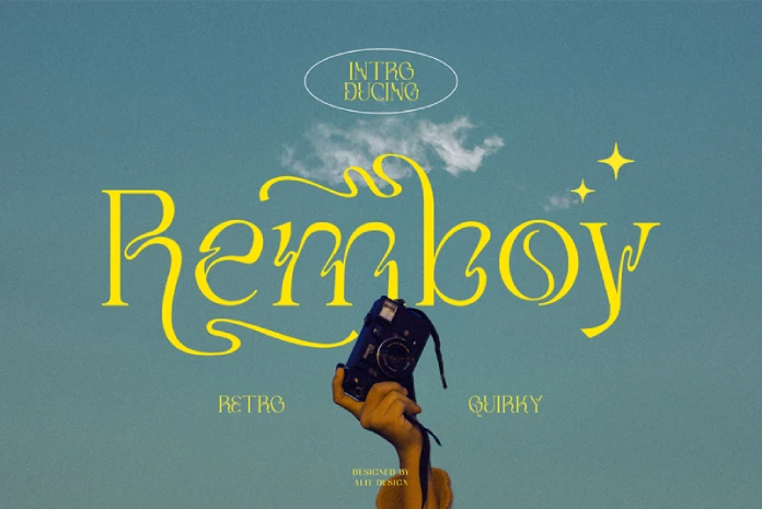
Remboy (only free download for personal use) is a striking and bold display typeface that brings a sense of modernity and visual impact to any project. Its design features thick, clean lines with sharp angles, making it a powerful choice for designs that require attention-grabbing headlines, branding, or any form of display text. The typeface’s unique structure creates a balance between being bold and legible, ensuring that it stands out in a way that remains visually effective without sacrificing readability.
Remboy’s appeal lies in its ability to command attention while maintaining a contemporary feel. As a display typeface, it excels in large sizes, making it perfect for posters, signage, packaging, and logos, where visual strength is paramount. The boldness of the typeface ensures that it has a strong presence in a crowded visual landscape, cutting through background noise with ease. Whether used for a product launch, an event advertisement, or a brand identity, Remboy provides an element of dynamism that demands the viewer’s attention. Its solid, geometric forms allow it to pair well with other more subdued free fonts, ensuring that it complements a range of design projects, from minimalistic layouts to those with more complex compositions.
One of the standout features of Remboy is its versatility in branding. Branding often requires a typeface that not only represents the brand’s identity but also creates an emotional connection with the target audience. Remboy accomplishes this by blending boldness with a sleek modern aesthetic. It’s not just about making a statement; it’s about conveying a sense of confidence and energy. This makes Remboy an excellent choice for brands that want to project a contemporary, energetic, and assertive image. Whether it’s a tech startup, a fashion label, or a music festival, Remboy helps communicate the essence of the brand in a visually compelling way.
In the realm of advertising, the typeface’s bold character helps to cut through distractions, which is especially important in environments where the viewer’s attention is divided. In a world filled with overwhelming content, Remboy stands out by drawing attention without needing intricate design flourishes. Its simple yet bold structure creates a direct and immediate connection with the viewer, which is crucial in poster design or digital advertisements where the message needs to be both strong and immediate. This makes it highly effective for call-to-action designs, making it clear that the viewer should take note.
The geometric nature of Remboy also gives it a contemporary, slightly futuristic vibe, which makes it adaptable across a range of modern design contexts. Whether used in fashion or technology, the font’s sharp angles and clean lines give it an edge that feels fresh and new. This versatility in tone makes it easy for Remboy to transition from high-fashion editorial spreads to cutting-edge product packaging. The same boldness that makes it ideal for event posters can also make it effective in smaller print sizes, maintaining its impact across various mediums and formats.
Another important aspect of Remboy is its suitability for digital design. While it’s commonly used in physical design formats like posters or product packaging, Remboy’s ability to maintain clarity and readability at larger sizes makes it an excellent choice for web design as well. With websites increasingly favoring bold and impactful free fonts that stand out in a digital landscape, Remboy fills this need perfectly. In web design, it can be used for headers, titles, and even call-to-action buttons, where it ensures that the key messages are not only seen but are immediately understood by visitors.
Remboy also works well in print media that demands both boldness and sophistication, like book covers or high-end magazine features. The thick lines and sharp edges can add a level of polish and professionalism, while still offering the attention-grabbing quality needed to stand out on a crowded shelf or in a publication. In editorial design, where fonts play a key role in establishing the tone and atmosphere of the publication, Remboy contributes to a modern, stylish feel without overwhelming the other design elements.
While Remboy’s bold character lends itself to a variety of different applications, it should be used carefully in more text-heavy designs. While it works excellently in large sizes for headers or display text, using it in smaller, body text applications can sometimes compromise readability due to its thickness and strong features. Designers should be mindful of this when considering Remboy for projects that involve long paragraphs or detailed descriptions. However, for designs where brevity is key and where the font’s boldness can shine through, Remboy excels in providing that much-needed visual punch.
To sum it up, Remboy’s bold, geometric, and modern design makes it a highly effective choice for projects that demand visual strength and a contemporary aesthetic. Its versatility across various design disciplines—from branding to advertising to editorial work—makes it a valuable asset for designers looking to create impactful, attention-grabbing designs. Whether used in posters, websites, product packaging, or logos, Remboy’s clean lines and bold presence ensure that it leaves a lasting impression. With its powerful aesthetic, Remboy is poised to be a go-to font for those who want to make a statement in 2025 and beyond. The full commercial version is available for purchase here.
17. OffBit
OffBit (a free trial version is available here) is a font that offers a sleek, modern aesthetic with its tech-inspired design. Featuring clean lines, sharp angles, and a futuristic structure, it makes an ideal choice for projects that seek to communicate innovation and progress. Its bold, geometric appearance captures the essence of digital and technological themes, positioning it perfectly for use in designs related to modern technology, digital platforms, and futuristic concepts.
This typeface’s design evokes the visual language of the digital age, where technology and communication seamlessly intersect. OffBit’s structured simplicity makes it highly legible, even at small sizes, which is crucial for applications like website headers, app interfaces, and product design. The straight lines and minimal curves contribute to its futuristic feel, while still maintaining a level of practicality that ensures readability. Its suitability for digital platforms is particularly evident in its clarity when viewed on screens, making it a go-to choice for web developers and graphic designers working in tech-related spaces.
For those designing tech branding, OffBit is an excellent selection. Its modern look is aligned with the branding of tech companies, startups, or products aimed at a cutting-edge market. The font’s clean, no-nonsense lines convey efficiency and forward-thinking, qualities that are highly desirable in the tech industry. Whether used in logos, company websites, or digital marketing materials, OffBit brings a touch of sophistication and innovation to a brand’s visual identity. In the competitive world of tech, where staying ahead of trends is essential, this typeface provides a visual representation of the company’s modernity and expertise.
One of the standout features of OffBit is its versatility across digital media. Whether it’s used on websites, mobile apps, or social media platforms, OffBit can easily scale from large, bold headings to small, readable text, without compromising its distinctive style. This adaptability makes it ideal for use in user interfaces, where clarity and structure are paramount. Digital designers often face the challenge of making their designs both attractive and functional, and OffBit meets both of these needs effortlessly. Its readability on screens, paired with its clean, contemporary design, ensures it is a reliable choice for creating intuitive, user-friendly digital experiences.
OffBit’s potential also extends to product packaging and promotional materials. As technology becomes increasingly embedded in everyday life, products that involve tech and innovation need to stand out in the market. OffBit’s modern look and tech-savvy vibe lend themselves well to packaging designs that target a youthful, tech-conscious audience. It’s the perfect font for packaging related to gadgets, electronics, or even services in the digital space, where companies are striving to appear fresh and innovative.
Beyond traditional branding and digital applications, OffBit is also an excellent font for futuristic-themed editorial design. Whether in magazine spreads, exhibition catalogs, or digital publications, OffBit adds a sleek, modern feel to the design. Its clean lines give it a high-tech, contemporary look that aligns with stories, articles, or features about innovation, new technologies, or emerging trends in the digital world. Its geometric structure also ensures it stands out in both body text and headings, making it suitable for a variety of editorial design formats.
OffBit is not only ideal for technology-based projects but can also serve in designs that evoke a sense of the future. Its digital, almost space-age feel makes it a strong candidate for projects related to science fiction, virtual reality, or anything that explores future possibilities. The font’s sharp, dynamic lines can make it stand out in movie posters, video game graphics, and virtual reality interfaces, helping create an immersive experience for the viewer or user.
Additionally, OffBit is a great option for startups and companies within the tech industry that are looking to establish a brand identity that reflects modernity and innovation. It’s not just a font; it’s an essential part of communicating the message of a brand. As more industries turn to digital platforms and look for ways to stand out in an ever-evolving technological landscape, a typeface like OffBit allows brands to distinguish themselves from their competitors. Its clean, straightforward design projects confidence and clarity, ensuring that the brand message is communicated clearly and effectively.
OffBit’s adaptability in various mediums also makes it a versatile choice. It can be used in both print and digital formats without losing its strong visual presence. In print materials such as flyers, brochures, and advertisements, OffBit can help create a clean and modern look. Its ability to stand out in both large display text and small informational blocks ensures that the message remains clear, even in more text-heavy designs. Its minimalist style also ensures that it won’t overwhelm the rest of the design, whether it’s used in small text or as part of a larger graphic element.
In conclusion, OffBit is more than just a font; it’s a powerful design tool for creating projects that speak to modernity, technology, and the digital future. Its clean, geometric lines and futuristic appeal make it a standout choice for tech-related projects, digital platforms, and innovative designs. Whether used in branding, product packaging, editorial design, or user interfaces, OffBit excels in communicating clarity, efficiency, and innovation. As technology continues to shape our world, OffBit provides the visual foundation for designs that want to stay ahead of the curve and make a lasting impact.
18. Canobis
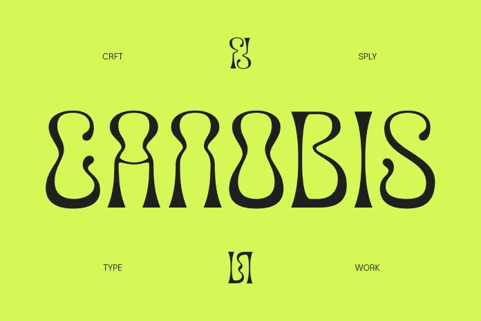
Canobis (free download for personal use) is a retro-inspired, psychedelic font that stands out with its bold and playful aesthetic. This typeface is deeply influenced by the design trends of the 1960s and 1970s, a time marked by vibrant colors, abstract patterns, and countercultural movements. Its distinct, curvy lines and eccentric forms immediately evoke the spirit of the psychedelic era, making it a perfect fit for projects that aim to capture a nostalgic, vintage look.
The font’s quirky character set and fluid shapes are ideal for designs that aim to add a touch of whimsy and energy. Whether used in headlines, posters, album covers, or branding, Canobis brings a sense of fun and spontaneity that is difficult to replicate with more traditional, restrained free fonts. Its playful elements make it especially suitable for projects related to music, art, and entertainment, where creativity and bold expression are key.
One of the font’s most notable characteristics is its ability to evoke nostalgia. The psychedelic design style, which was once associated with the cultural and artistic movements of the 1960s, remains a source of inspiration for modern creatives. In Canobis, the bold and swirling letterforms seem to capture the essence of psychedelic posters, album covers, and concert flyers from the golden age of rock ‘n’ roll. As such, it works perfectly for projects that are trying to tap into the nostalgia of past eras, while still offering a fresh, modern twist. Designers often use retro fonts like Canobis to create designs that celebrate or reference the past, yet still feel relevant to contemporary audiences.
For graphic designers and branding professionals, Canobis offers a unique opportunity to bring a touch of individuality to a brand. Its quirky, bold style is perfect for logos or brand identities that want to stand out from the crowd. The font’s flowing shapes and rounded edges create a welcoming, approachable feeling, while still maintaining a sense of uniqueness and intrigue. Whether it’s used for a new music festival logo, a quirky product line, or a branding campaign targeting a youthful, creative demographic, Canobis can help inject personality into the design.
In posters, the boldness of Canobis is particularly effective at grabbing attention. The distinctive shapes of the letters make it highly legible from a distance, which is important for attracting viewers at first glance. This makes it a popular choice for event promotion, where high visibility is a priority. Concert posters, club events, and music festivals are all excellent applications for Canobis. The font’s association with the psychedelic aesthetic also brings a sense of energy and movement to designs, which is important for making promotional materials feel dynamic and exciting.
In the digital space, Canobis can be used in social media graphics, website headers, and digital ads. Its distinctive retro charm makes it an excellent choice for content that aims to evoke a sense of playful nostalgia or stand out in a crowded digital environment. The psychedelic style lends itself well to vibrant, eye-catching designs that aim to capture a sense of freedom and expression. When used in these contexts, Canobis can help elevate digital marketing campaigns and create visuals that are memorable and visually appealing.
For product packaging, Canobis can be a bold and creative choice, especially for products aimed at a young, trendy, and artistic demographic. The font’s unique character set can easily enhance the visual identity of a product line, making it instantly recognizable. Whether used for clothing, accessories, or even a line of specialty food items, the retro aesthetic of Canobis helps build a brand identity that feels both playful and distinctive.
The typeface also lends itself well to editorial designs, particularly for magazines, zines, or publications that focus on culture, music, or design. Canobis works especially well for feature articles, headers, and pull quotes, where a bold, retro style is needed to stand out. Its quirky design adds an element of fun to the page while still maintaining a level of sophistication and uniqueness. For creative editorial projects that celebrate art and culture, Canobis offers a fresh and relevant type solution that engages readers visually.
Another area where Canobis shines is in its ability to pair well with other typefaces. Despite its bold, psychedelic design, Canobis is versatile enough to be combined with more traditional, neutral typefaces. This creates a dynamic contrast that allows the distinctive shapes of Canobis to stand out without overwhelming the design. For example, pairing it with a clean, sans-serif typeface for body text ensures that the playful, eye-catching elements of Canobis don’t distract from the message, while still maintaining visual interest.
In conclusion, Canobis is a highly versatile and creative typeface that adds a distinctive touch to any project. Its retro, psychedelic design brings a sense of nostalgia and energy to branding, marketing, and editorial work. Whether used for music-related designs, event posters, or digital campaigns, Canobis offers an eye-catching, playful aesthetic that captures the essence of the psychedelic era while remaining relevant to modern design sensibilities. For those seeking a font that adds personality, boldness, and fun to their designs, Canobis is an excellent choice. Its ability to stand out in a variety of applications makes it a valuable tool for any designer looking to infuse their work with a touch of creative flair. The commercial version is available here.
19. Nano
Nano (download) is a font that exemplifies the sleekness and minimalism of futuristic design, making it an excellent choice for modern projects that demand a forward-thinking aesthetic. The typeface is characterized by its ultra-clean lines, precise geometry, and dynamic form, making it particularly well-suited for design applications that aim to push boundaries and evoke a sense of innovation. In an era where technology and design are closely intertwined, Nano stands as a visual representation of this intersection, offering a contemporary and streamlined look that complements a range of digital and print applications.
One of the standout features of Nano is its lowercase design, which imparts a sense of fluidity and modernity. The simplicity of lowercase letters creates a relaxed yet professional appearance, ideal for settings where legibility and clarity are paramount. This makes it an ideal choice for use in logos, headlines, and other design elements where readability needs to coexist with style and impact. Its minimalistic approach allows it to maintain a clean and tidy visual identity, ensuring it works effectively across both large and small scales, from product labels to large billboards.
In the realm of branding, Nano’s futuristic design makes it a powerful tool for companies or projects that seek to communicate innovation, sophistication, and technological advancement. It’s particularly effective for tech startups, digital companies, and futuristic brands that wish to present themselves as forward-looking and progressive. When used in logos, Nano’s geometric precision gives a high-tech, cutting-edge feel that resonates with modern audiences. The fluidity of the letterforms, combined with its simple structure, ensures that the font adapts well to various digital interfaces, making it suitable for both websites and mobile apps, where user experience and readability are key.
In addition to its application in logos, Nano excels in headers and titles. Its clean, sleek appearance helps it stand out in a crowd of other typefaces, making it ideal for designs that require a strong focal point. Whether used in website headers, marketing materials, or product packaging, Nano’s bold yet minimalist style attracts attention without overwhelming the viewer. Its precise geometry ensures that it maintains its impact even when scaled down, ensuring that it retains its legibility and visual appeal at smaller sizes, which is often a challenge for many display fonts.
Nano’s versatility is another of its strengths. It doesn’t rely on heavy embellishments or intricate details, which allows it to seamlessly integrate into a wide range of design styles and project types. From corporate branding to digital artwork, Nano’s adaptability makes it a go-to font for designers who need a font that can do it all without compromising on style or clarity. Its sleek, modern aesthetic gives it the flexibility to be used across different industries, from fashion to technology, education, and beyond.
In terms of innovative design, Nano’s understated elegance plays a crucial role in making it the go-to choice for projects looking to evoke a sense of the future. Its simple yet striking form allows it to fit seamlessly into futuristic design concepts, where complexity is often avoided in favor of a clean and organized look. As such, Nano can be effectively used in speculative design projects, where the goal is to represent something new, experimental, or visionary. The font’s streamlined design lends itself to ideas of progress and forward momentum, making it ideal for use in projects that wish to challenge the status quo or envision new possibilities for the future.
The versatility of Nano extends beyond its aesthetic appeal. It’s a practical typeface that ensures optimal performance across a wide range of mediums. In digital design, for instance, it translates well to both web and mobile interfaces, where legibility on varying screen sizes is essential. The font’s geometric nature ensures that it retains its sharpness and clarity in pixel-based formats, making it a great choice for UI design and interactive digital environments. Additionally, its straightforward design helps with cross-browser compatibility, ensuring that it remains visually consistent across different platforms and devices.
In print design, Nano’s clean and structured appearance ensures it stands out, whether it’s used for business cards, brochures, or promotional posters. Its use in these types of print materials brings a contemporary, almost industrial feel, which is particularly suited to high-tech products, modern art exhibitions, or fashion lines that emphasize innovation. Nano’s minimalist nature also ensures that it doesn’t compete with imagery or other graphic elements in a design, allowing it to complement and enhance visual storytelling without detracting from the message.
When it comes to the overall impact of Nano, it represents a perfect marriage of form and function. Its geometric precision offers a modern aesthetic while also ensuring legibility and clarity across various mediums. Nano’s combination of futuristic appeal and minimalist design allows it to serve as a foundation for modern design projects, providing a sense of sophistication and professionalism without overwhelming the viewer. Its use of negative space and clean lines is a testament to the ongoing trend toward simplicity in design, where less is often more, and every element has a purpose.
In conclusion, Nano is a perfect choice for designers seeking a typeface that blends sleek, futuristic aesthetics with the practical demands of modern design. Its minimalist design, clean lines, and geometric precision make it highly adaptable across a wide range of applications, from logos and branding to headers and print materials. Whether used in digital or print formats, Nano offers a timeless, modern look that can elevate any project. With its ability to evoke a sense of the future and seamlessly integrate into a variety of design contexts, Nano continues to be a go-to typeface for designers who seek a font that is both functional and forward-looking.
20. Wriggle
Last but not least in our list of the best free fonts is the Wriggle typeface (download). It’s a lively and creative font that brings a sense of playfulness and energy to any project. With its distinct, irregular shapes and whimsical design, it stands apart from more conventional typefaces, making it a fantastic choice for artistic projects that aim to make a bold statement. The font’s curving strokes and exaggerated forms infuse it with character, offering a unique visual appeal that grabs attention. This playful nature makes Wriggle perfect for designs that aim to create an atmosphere of fun, excitement, and creativity. Whether it’s a poster for a music event, a branding project for a creative agency, or an illustration that requires a bit of flair, Wriggle injects personality into any design it graces.
One of the key strengths of Wriggle is its versatility in the artistic realm, which makes it a must-have in our list of best free fonts. Unlike other free fonts that might feel rigid or overly structured, Wriggle embraces irregularity. Its playful, fluid design allows it to adapt to a variety of contexts where a more formal typeface would feel out of place. It excels in artistic and creative industries, where there is often a desire to break away from the ordinary and embrace unconventional forms. For example, it can be used in the branding of fashion lines or contemporary art galleries where avant-garde design is appreciated. Its visual movement creates a dynamic flow, making it ideal for projects that need to evoke energy and motion.
Wriggle’s lively design also makes it ideal for use in promotional materials that need to capture the viewer’s attention quickly. Its unique character shapes are excellent for advertisements, event posters, or album covers where standing out is key. The font’s irregular yet legible letterforms ensure that it doesn’t become overwhelming, allowing the design to remain readable while also delivering a strong visual punch. In advertising, where the competition for attention is fierce, Wriggle offers a solution that breaks the norm without sacrificing the message’s clarity. Its playful nature draws the eye and invites further exploration of the design.
For projects targeting younger audiences, Wriggle is an especially fitting choice among our free fonts. The fun and energetic design appeals to the playful side of viewers, making it ideal for anything from children’s books to social media campaigns. Its organic curves and fluid style are often associated with creativity and freedom, which resonates well with a demographic that values self-expression and individuality. Additionally, because it doesn’t adhere to traditional type design rules, Wriggle appeals to those looking for originality and fresh perspectives in the design world.
Wriggle’s ability to evoke a sense of movement and fun makes it an excellent option for event posters and promotional content related to festivals, music events, and parties. Its exuberance mirrors the energy often associated with these occasions, making it a fitting font for marketing materials that aim to capture the spirit of a lively event. In this context, the font’s irregular spacing and unpredictable curves mimic the energetic, spontaneous nature of a celebration, which can bring a sense of excitement to any design. Whether used for an upbeat music festival, a vibrant fashion show, or an animated film release, Wriggle has the ability to convey the dynamic essence of the event in its visual form.
Furthermore, Wriggle is an excellent choice for projects in the entertainment industry, particularly those where the aim is to communicate creativity and excitement. The font’s unique character shapes allow it to stand out in both digital and print formats, ensuring that it will capture attention whether it’s on a website, social media post, or large print billboard. In movie promotions, particularly for animated films or quirky indie productions, Wriggle’s playful and dynamic design works well to evoke the energy and humor often associated with these genres. In this context, the font functions not just as a means of conveying information, but as a visual tool that sets the tone and enhances the overall atmosphere of the project.
Despite its creative and whimsical nature, Wriggle is surprisingly versatile. While its more energetic forms make it ideal for bold, attention-grabbing designs, the font can also be paired with more subdued elements to create balance. Designers often pair Wriggle with simpler, more straightforward free fonts to create contrast while maintaining the playful spirit of the design. This flexibility allows it to be integrated into a range of design projects, from editorial layouts to online graphics, without overwhelming the composition. The combination of creativity and legibility ensures that Wriggle can serve as both a headline font and a decorative element, depending on the needs of the design.
In conclusion, Wriggle is an excellent choice for projects that seek to make a visual impact while embracing a fun and creative aesthetic. Its irregular, lively design offers a refreshing break from more conventional free fonts. This typeface is ideal for artistic, energetic, and youthful designs. Whether used for promotional posters, branding materials, or social media campaigns, Wriggle’s playful nature adds personality and excitement to any project. Its versatility in the creative industry allows it to be adapted across various formats and contexts, ensuring it will always stand out and capture attention. If your design needs to convey a sense of fun, creativity, and energy, Wriggle is the perfect font to make your project truly shine.
These 20 free fonts are top picks for 2025, offering designers a broad array of choices to fit diverse creative needs. With styles ranging from sleek and modern to handcrafted and playful, these typefaces are accessible for personal and commercial projects. They demonstrate that free fonts can meet professional standards and enhance any design project with personality and precision. These selections not only offer aesthetic variety but also help brands and designers create lasting visual impact without compromising quality.
We also recommend checking out our selection of the 50 best fonts based on the top 10 typography trends for 2025.
Subscribe to our newsletter!

